Table of Content
Discover How You Can Use the Best Food Logo Ideas to Create An Amazing Logo
The food industry is often said to be the most profitable sector in the world. And it has grown quite rapidly in the last couple of decades, thanks to the emergence of new packaging techniques, smoother logistics, and more. Today, you can find several companies producing the same kinds of foodstuffs, making for a tougher competition.
And that is all before we get into the restaurant business, with fast food, health food, vegan, and even meat alternative products like Beyond Meat and Impossible Meat revolutionizing the industry.
Now, when we talk about such revolution in the food industry, we cannot forget the brands that played an important role in this change. From chocolate producer Cadbury, who changed the concept of chocolate sweets in the world, to brands like Campbell’s who became iconic with quality and affordable canned products, we have a lot of options.
However, that also begs the question. Why is it that only these brands had their food company logos become iconic? There have been many different brands who played as important a role in this revolution, yet their logos are long forgotten. Well, it is all about how the consumers perceive your brand with respect to your logos. Maybe those brands had a gap between their brands and the brand image their logos portrayed, resulting in their failure. That is often why smart businesses opt to hire a professional chicago logo design services provider.
In this article, we will how to create an amazing food logo that has a strong, positive impact on the consumers. Moreover, we will also look at some of the most iconic food logo ideas from top brands, and see how we too can replicate their journey towards success.
Let’s begin.
Why Should You Focus on Creating an Impactful Food Company Logo and Slogan?
It is a known fact that food logos play a huge role in defining a food business’s primary offerings. People usually build perception about a food business after looking at its logos. For instance, a pizza company would always try to depict an image of pizza in its logo, just as a tortilla chip company would highlight the chip in its food logos. And the quicker your logo is helping the consumer make that connection between the business and its offerings, the better the chance of it succeeding in the industry.
However, many times these businesses fail to design quality logos. As a marketer, you should always keep in mind that food company logos play a huge role in defining your brand identity. It portrays your USP, as well as helps you stand out among the competition with a flashy brand symbol.
It is therefore advised to always pay attention towards the designing of your logos. Especially, if you are connected with the food industry, then you should always opt for some unique food logo ideas. Not only that, but you have to also protect their identity by knowing how to copyright a logo officially.
Securing the rights to your food business logos is also an essential job. It makes sure that your brand symbols do not get copied anywhere without the permission. It provides an endorsement from the official authorities, allowing you to freely promote your business in the market.
How to Create Amazing Food Logos Easily – A Brief Process
Being a logo designer, you need to know how to design a logo with perfection. It is not a straightforward process, because it requires thorough analysis and research of the market. People often look for brands whose logos are obvious about what they do or offer, as it eliminates much of the guesswork as well as time spent making a choice. Therefore, you should take a sufficient amount of time, and invest as much effort as possible to ensure that your logo fulfills that criteria.
Here are some of the best tips that could help you to design unique food logos.
Know and Understand Your Target Audience
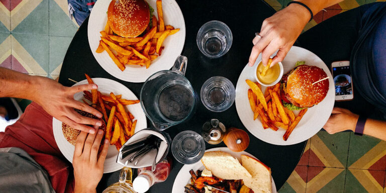
It is best recommended to keep in mind foodies while creating any restaurant logo. The reason is that it helps you to get different types of ideas related to your targeted audience. For example, if your restaurant offers seafood, then you should illustrate a cuisine that is most eaten by people. In this case, you can showcase shrimp, tuna and more others that are loved most by the foodies.
Choosing a market favorite dish allows your logo to grab people’s interest. We have seen numerous times how famous brands utilize a vector food art due to the very same reason. They know how to attract people’s attention by showing them the right delicious foods.
If you are a fast food company, then you have a lot of options to choose from. You can show a range of items in your logos, starting from burgers to pizzas and more.
Study Your Competition and Analyze Their Logos’ Strengths and Failings
Another best way to create engaging food logos is by looking at the emblems of your competition. For example, if you are running a restaurant, and want to create a logo for it, then you need to take a look at the top restaurant logos within your niche.
This evaluation process allows you to know the right color theme and style required for a particular logo. Now, people often get confused when it comes time to finalize what to include in their food logos, and what to omit. In such cases, a thorough evaluation of brand symbols from their niche can be quite helpful in making this decision easier.
For example, if you run a fast food restaurant, you can take a good inspiration looking at the McDonalds or KFC logo. Both of these food chains are rated as the giants in the world. Their logos have become a primary source of attracting customers, as they have become the ultimate symbols of fast food – quick and easy meal at a reasonable cost.
This shows the importance of quality food company logos and how they help generate continuous revenue for the global food chains. Thus, you can also take a good inspiration by looking at these logos. It will help you to get the idea how to design logos that can inspire crazy foodies.
Choose a Color Palette that Evokes Feelings of Desire and Hunger
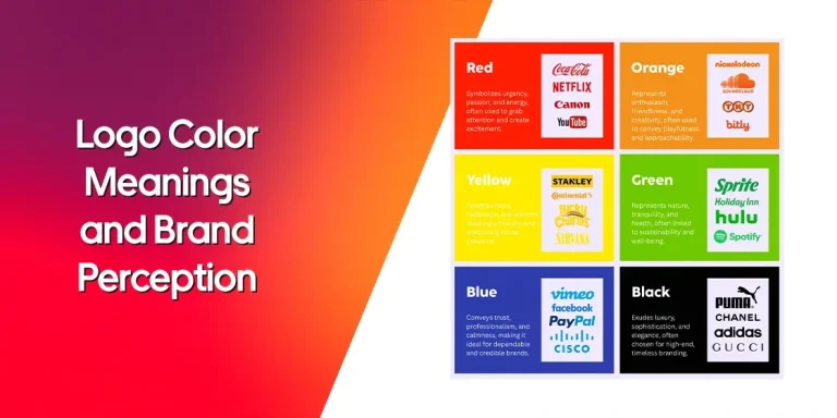
Color combinations are very important while designing any type of artwork. This just not only goes for logo designing, but everything that is related to your branding. These colors showcase specific meanings, allowing you to define a message through it.
The color selection for logos is indeed an important job. As a designer, you must need to know about color meanings and how they can relate perfectly with the brand theme. Many times, people select wrong colors while designing food logos. They do not pay attention towards the relevance or how the colors can attract eyeballs.
The best way to choose colors is by looking at the examples of top restaurant logos. It allows you to pick the right colors that will suit most with your logo. The examples of Dunkin Donuts, KFC and more others are quite evident in this regard. The color combination of these logos are very lively, which is why they look highly unique among others.
Focus On Choosing an Experienced Logo Designer
Nowadays, it has become easier to design everything related to business branding from scratch. The existence of various online marketplaces has made it easier for businesses to find a graphic designer that fits their budget. However, different designers are experts at different types of logos, meaning that there is no one-size-fits-all solution. Therefore its important to find a designer who knows how to execute your vision and turn it into a great food logo.
Now, let’s say that you are new to the entire logo design process. That means that without a clear vision, you cannot evaluate the designers. What are you to do then?
Well, its simple. You can hire a professional branding agency to help you with the process. These professionals are experts at building brands from scratch, and they will work with you to create the perfect food logos according to your brand’s USP and values.
Choose a Complementary Brand Slogan
Nowadays, many brands prefer to design a logo with a catchy slogan. It helps to define their business goal and how they are different from others. More importantly, these taglines help in their marketing campaigns, allowing them to define their brand identity with strong words.
But, to make that slogan work, it is important to craft them diligently. It is not a random one-liner that can be chosen easily. It is a very crucial sentence that sums up your whole business in simple 5-6 words. If a tagline doesn’t look catchy, then it builds a bad reputation on the overall logo. This will ruin all your hard work on the logo design that will also eventually impact your food branding.
Hence, always try to consider those slogans that look unique and interesting. If you don’t have much idea about writing a slogan, take a look at different restaurant slogan examples given on the web. It will give you great ideas to write a slogan that can define your brand voice properly.
What Design Styles Can Your Food Logos Take?
If you are not good at picking up different logo ideas, try to look at different famous food logos given on the web. These logos will help you to get tons of ideas, allowing you to translate them in your own design easily.
Here are some logo ideas that can help you to design creative art easily.
Simple and To-the-Point Food Logos
Those logos that are made simply with aesthetic designs always look great. It can be said as a tried and tested technique to design logos. The reason is that these logos are easy to understand and can be utilized anywhere.
For example, the logo of Burger King is very evident in this regard. It showcases a simple burger with a wordmark of a company name. This provides a clear illustration of the company and where does it specializes. It is a very popular logo in the world and many food enthusiasts instinctively trust it.
Similarly, the creative logo of Chick-Fil-A is also very simple. It is a wordmark that shows a chicken head designed uniquely at the start. This logo clearly illustrates the idea that the company offers top quality chicken foods made with delicious toppings. You can also take inspiration from this logo, as it shows great simplicity yet creativity in design.
Wordmark Food Logos
Today, a lot of food companies use wordmarks in their logos. It is termed as the simplest way to represent your business in the market. Not only food companies, but other businesses relating from different fields also choose wordmark as their go to style.
There are a lot of reasons why people prefer to use wordmarks, but the one most common thing is the need for simplicity. Some businesses like to represent their name decently in the industry, so that it can become easily recognizable.
Many food chains have also opted for this strategy to keep their market presentation neat. The top food brands like Heinz, Tostitos and more others are quite apparent in this case. Their logos are solely based on wordmarks designed with unique fonts.
It is therefore also important to choose the fonts wisely, as they are an important part of wordmark. Based on your brand theme, you can either go for italic fonts or simple straight ones. The font type can also range from Sans Serif to Helvetica and more depending on your brand theme.
While choosing fonts, keep in mind that the wordmark will be used on both digital and print publications. Hence, it should be best advised to pick those fonts that can fit compatible on both. The sizing and pixel quality also matters a lot while finalizing the wordmark, as they are directly related to the brand presentation.
Bold Food Logo Ideas
Next up, we would like to define the most wanted food logos in the market i.e. bold and strong logos. They are precisely created with glitzy colors to catch the customers’ attention. These logos provide a vibrant representation of a brand, allowing it to attain a unique footprint in the industry.
Some of the bold logos like Dunkin Donuts are very popular among the foodies. It is designed with a combination of catchy colors that precisely helps to grab people’s eyes, even on graphically rich food packaging designs. Similarly, the brand logo of Baskin Robbins is also designed in the same manner. The creative combination of Blue and Purple brings a stunning contrast in the whole logo offering a flawless presentation.
If you are looking to design any bold logo, it is highly recommended to choose the colors wisely. Any wrong selection can make the whole emblem look awkward, resulting in a bad business representation. You can find help from Google or professional graphic design agencies in this regard. They have got good experience and expertise in crafting different types of logos, rightly according to your custom demands.
Top Snack Food Logos That Have Inspired Generations of Businesses
Now that we have seen the process of creating a food logo, as well as the various shapes and styles that our food logo design can take, you are now almost ready to start creating your own brand symbol.
Almost.
Think back when we discussed the process of creating a creative logo for a food company. Step four of that process required you to research and study the successful food logos in order to understand how they managed to make their mark.
Now, we understand that it can be a time-consuming and difficult task, especially if you have never done that before. That’s where we come in to help. After evaluating numerous food brand logos, we have compiled a list of the top brand symbols from today’s top snack food brands.
Let’s dive in and take a look at their design.
Tostitos

Tostitos is a popular brand of corn tortilla chips from Frito-Lay, a subsidiary of PepsiCo. Now, although Doritos has captured a sizable market share, Tostitos and its accompanying tortilla chip option from Frito-Lay, such as Takis, have captured a large share too.
Now, its brand symbol is one of the more interesting food logo ideas on this list. Going for a wordmark, they incorporated a subtle imagery about sharing and enjoying tortilla chips together seamlessly. The middle three letters in Tostitos, namely “tit” is designed to look like two people sharing a tortilla chip, with the top dot of the “i” looking like a bowl full of salsa. Overall, it is one of the best food logos you will see on this list.
Pepperidge Farm
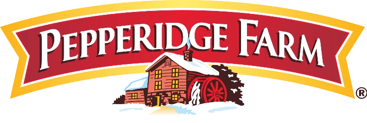
Pepperidge Farm is a commercial bakery founded in 1937 that is named after the farm property where its owner started this business. Known for their variety of artisanal baked goods, including bread items and cookies, they are mostly known for their Goldfish crackers, a popular item with kids.
Taking about its logo, those who know will instantly recognize it as a mill. And they would be correct – it is a flour mill, specifically the Grist Mill in Sudbury, Massachusetts. The reason the logo features that specific mill is because they provided Pepperidge Farm with 48 tons of whole wheat flour for baking each month, between the years 1952 to 1967.
This way Pepperidge Farm manages to not only promote their brand with the accompanying wordmark in their food logo, but it also appreciates the mill that made it possible for them to grow.
Cadbury

Who isn’t familiar with the British chocolate and candy brand Cadbury? One of the world’s biggest confectioners, and arguably the most famous chocolate producers in the world, Cadbury is known for some iconic sweets. The list includes the likes of Dairy milk chocolate bar, and the Cadbury Crème Egg, which was the world’s first chocolate Easter egg.
For a long while, the company used purple as their primary color, including for their wordmark too. However, today the brand uses a brushed metallic gold gradient for the wordmark, which gives it a regal feel. And when that aesthetic is combined with the brand’s handwritten-style of logo, it makes it all the more special.
M&M’s

MnM’s are a popular brand of coated dragée, filled with chocolate. Each piece has a little lowercase “m” printed on it, with each shell colored in a different shade, from red, green, yellow, blue, and more. Its brand symbol is one of the more iconic food logos in the confectionary world, and is made up of a simple wordmark.
The letters are in lowercase, with the “&” symbol made smaller than the letters and centered between them prominently. Although it uses an understated brown color, it represents the chocolate in the candy. Overall, it is one of the most iconic food brand logos in the world.
Jiffy Pop
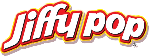
Jiffy Pop is a popular brand of stovetop popcorn in the United States, which has a slogan that says “As much fun to make as it is to eat”. Unlike other brands of homemade popcorn, which are usually microwaveable and in bags, Jiffy Pop comes in a disposable aluminum pan, with the top covered in wrapped foil. As the pan is heated over a stove or fire, the kernels pop, and the foil opens us to accommodate them until all kernels are popped.
When we talk about its logo, the design features a red and white food logo, with yellow accents. The wordmark features the name of the company in sans-serif lettering, arching at the top to give the logo a sense of depth.
Overall, this is one of the top food brand logos in the homemade popcorn niche in USA.
Iconic Packaged Food Logos that Have Carved an Unmatched Niche in the Industry
Besides the snack food industry, there are many popular food logos in the packaged food industry. These logos range from baking mixes, canned food, quick-and-easy meals, and more. So, join us as we explore the amazing world of popular food logo ideas in the packaged food industry.
Aunt Jemima

Aunt Jemima, now known as the Pearl Milling Company, is a popular brand of breakfast items such as pancake mixes, syrups, and other breakfast ready-mix options. Starting out in the late 19th century, the design of the logo featured a stereotypical matronly figure, colored by the racist perceptions of the Jim Crow era.
In 2020, after the social unrest regarding blatant racism against African-Americans, the company changed its name and branding to Pearl Milling Company. However, up until 2020, the company branding used an image of an African-American woman, with a stylized wordmark written in a classic font, evoking a sense of nostalgia and legacy into the food logo.
Uncle Ben’s
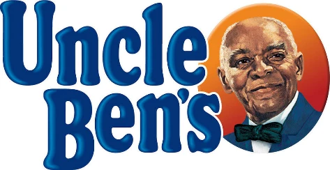
Uncle Ben’s, now known simply as Ben’s Original, is an American brand of parboiled rice and related items that has been in operation since 1943. Until the 1990s, the Uncle Ben’s brand of rice was the most popular in the United States, and is still popular today, due to its quick, microwaveable rice meals.
The old food company logo, from when the brand was known as Uncle Ben’s, featured a distinguished looking African man wearing a coat and a bowtie. The design was meant to represent an affluent rice farmer in the US, although there is no proof that there was ever a rice grower name Uncle Ben. The accompanying wordmark was written in a dark blue shade, with rounded edges and serifs. After the rebrand, the company still uses the same typography for the new logo.
SpaghettiO’s
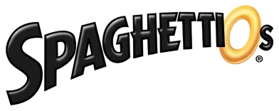
SpaghettiO’s are a popular brand of canned pasta in sauce, featuring pasta that is the shape of rings. Designed to be eaten easily with a spoon, the meal was targeted specifically towards kids who find eating pasta with a fork messy and difficult.
The design of their brand symbol is one of the most obvious of food logos on this list, featuring a black-colored wordmark, with just the letter “O” near the end designed to look like a pasta ring. Simple and to the point, the food company logo is quite easy to recognize in shelves packed full of similar products in the market.
SPAM

SPAM is arguable one of the most recognizable brands of canned meat products that rose in popularity during World War II due to supply chain difficulties and war-induced rationing. Produced in the United States, it was shipped to nearly all Allied forces during the war, as well as poorer war-torn areas such as Hawaii, Philippines, Thailand, Korea, and more.
With a nondescript packaging, the logo was designed to be visible instantly. That is why it featured an all-uppercase wordmark featuring the name of the brand. Using the color blue for the food logo, the design became so iconic that even today, decades after its formation, the company hasn’t changed the logo for the most part.
Campbell’s

Campbell’s has one of the most popular canned food logos of all time, representing a brand that is associated with many comfort food dishes from our childhood. From the iconic tomato soup and cream of chicken soup, to the more modern options released by the company, the brand is often seen at the forefront of canned and packaged meals.
The logo for Campbell’s has long been considered an artistically famous and well-known food company logo. And that is all thanks to Andy Warhol and his amazing piece of art featuring Campbell’s food cans. The design of the logo features a vintage, beautifully designed wordmark, colored a bright cardinal red over a white background.
Final Words
That takes us to the end of this blog in which we have discussed designing quality food logos easily. We all know that having the right logo representing your food business is quite important in terms of building brand reputation. And the food logo ideas we have discussed above will surely help you with that.
Therefore, you need to be very careful when creating your food logo for strong market recognition. Nowadays, every food company depends highly on creative branding. It allows them to promote their services and attract people towards the delicious food accordingly.
If you don’t have any knowledge in designing brand logos, feel free to take assistance from our experts. Our logo designing agency is pretty experienced in designing every type of food company logo, tailored to your requirements.
Frequently Asked Questions
| 1. Why food logos are important for branding? Food logos are very crucial for branding as they provide a strong recognition to your brand. Due to marketing activities, they are always considered very important as an essential identity of a food business. |
| 2. How to create stunning food logos? In order to create a unique food logo, you need to pay attention towards your expertise. If you are a fast food company, go for the demonstration of pizzas or burgers. Similarly, if you offer special cuisines, then try to create a special art according to it. |
| 3. How food logos can help to attract customers? It is a known fact that logos can attract customers if they are created in a unique style. Same thing goes for the food logos, as they allow you to grab eyeballs if designed with a catchy theme. |
| 4. Can I use online logo generators to create food logos? Yes, you can use online logo generators to design food logos. These automated tools are pretty efficient in creating different types of logos in a matter of time. |
| 5. Name some of the famous food logos known in the world? Looking at the vast food chain industry, you can find many names that are popular among the people. However, some of the top food logos include KFC, Subway, Hardee’s and more others. |
Conclusion
That takes us to the end of this blog in which we have discussed about food logos designing in detail. We all know that restaurant logos are quite important in terms of building any brand reputation. These logos help to build up a perception among the people that precisely results in greater brand engagement.
It is therefore advised to design the food logos carefully if you want to achieve strong market recognition. Nowadays, every food company depends highly on creative branding. It allows them to promote their services and attract people towards the delicious food accordingly.
If you don’t have any knowledge in designing brand logos, feel free to take assistance from our experts. Our logo designing agency is pretty experienced in designing every type of food logo, rightly as per your requirements.

Logopoppin
Logopoppin is a graphic design agency that specializes in logo designing, web development, video production and advanced branding services. We love to innovate businesses with new age technologies, allowing them to improve their visual reputation.

