Table of Content
How Amazon Started?
The CEO of Amazon, Jeff Bezos started Amazon at a time when online businesses were having a 2300% boom each year. According to him, “the late 20th century was a really great time to be alive on [the] planet.” Seeing the immense potential in the online marketplace, he began searching for the most sellable items. With over 3 million different books available at that time, Bezos soon realized that an online book store can be the most lucrative business, as unlike any physical bookstore, Amazon would be able to have a universal selection of books under one roof. Soon, he launched the company in his garage, like many of the other giant tech companies.
In the early months, it took some time for Amazon to gain a user-base. In fact, the company was also in dire need of a rebranding, because initially Amazon was named Cadabra. Which was, honestly, a name that no one would have ever taken seriously. On top of that, the way it was pronounced made it sound like cadaver. Fortunately, Jeff Bezos decided to change the name to Amazon, which proved to be quite lucky for him.
Back when the office was operational in the garage, they would have a bell in the office which would ring each time someone booked an order. Eventually, the bell rang so frequently that they turned it off. From thereon, the book store kept on gaining more and more popularity. Just within few months, the company was making $20,000 a week.
Why Amazon is a successful company?
The secret behind the Amazon’s success is the prioritization of customer satisfaction. Jeff Bezos firmly believed that a business needs to build trust with its customers, and that instead of asking for it, the business has to build that trust. Bezos also believed that by giving customers value through something new and innovative, Amazon would be able to gain massive success. And it did! Surprisingly Amazon barely ever made paid advertisements for the brand, owing all its popularity to word of mouth marketing.
Moreover, being an online store, using the .com domain in the brand name worked as a marketing tactic, assuring that whoever hears the name of the store also knows where to find it.
The Original Amazon Logo: From 1995-1997


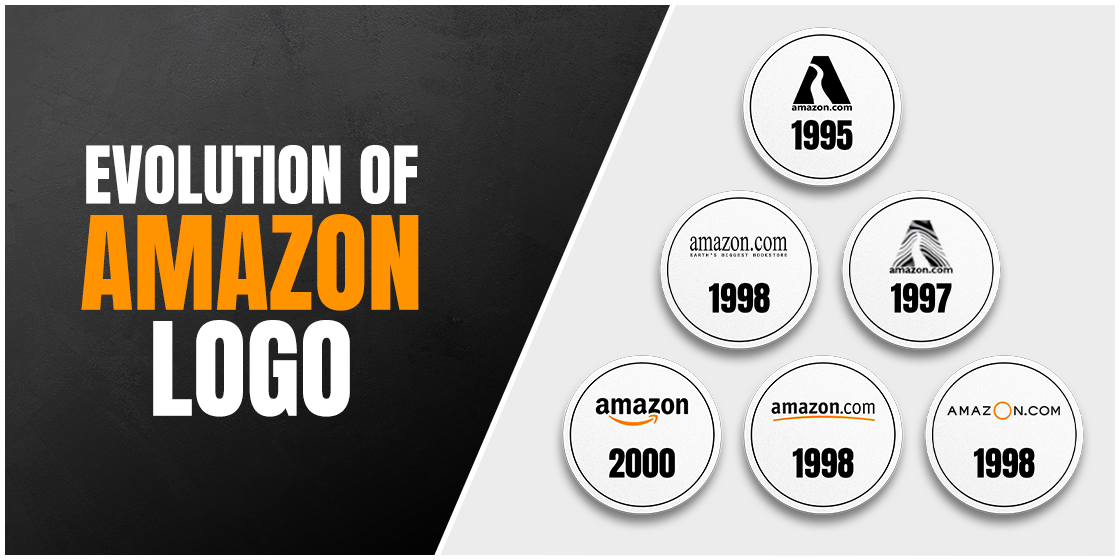
The very first logo made for rebranding was quite literal in its design approach. It sported a blue watery background with the capital letter ‘A’ center aligned over the background in low opacity. The Typography of the letter depicted a river stream that symbolized the Amazon river. This design was quite amateur because of how crowded it looked. At this point Bezos really needed a beginner’s how-to guide on logo designing. Moreover, the blue colored captions of amazon.com and Earth’s biggest bookstore in red affected the readability of the text.
It’s hard to believe that the design was approved because as a not so print friendly design it must have looked terrible on print. Thus, the design was later changed, removing the background and retaining everything else in a solid black color for better visibility on print.
The Ripple Effect: From 1997-1998

Another logo redesign was happened two years later with the addition of a ripple effect incorporated in the design. It’s difficult to tell what called for this change in the logo. But the addition of the ripples to the logo can be seen as a representation of trees. This version of the logo, however, did not last for long.
Amazon’s Continued Logo Hunt: Early 1998

In 1998, Amazon made multiple versions of its logo and tried two of these in the same year. This time the company had made drastic changes to its logo. Now completely letting go of the previous one, amazon opted for a wordmark. What’s the difference you ask? Well, the most significant difference in a logo and a wordmark is that the latter is entirely text-based and is absent of any images. Wordmarks are also referred to as logotype.
The first of these iterations was made in a black sans serif font, with the slogan Earth’s biggest bookstore written on it in all caps. This Logo was too plain, and had a slogan that was not a good representation of Jeff Bezos vision of having an e-commerce business that sold a variety of products instead of just books. This version was thus changed again for good.
Orange is the New Black: Late 1998 Design

In the second quarter of 1998, Amazon was all set to move into a new market and for that they yet again need a newer look for the company. Thus, the next logo was made in all caps, with a large yellow colored circle in place of the O in Amazon. This circle could be seen as representative of the vast range of products that Amazon began to sell on its e-commerce store. The new design was much better than the previous one in terms of the message it wanted to convey. Moreover, the orange O contrasted well with the all black text. Still, overall, something was odd about the way it looked. Brands do use clever wordmarks, but this one did not sit well with the URL based .com name.
A Step Closer to Perfection: From 1998-2000

Soon, Amazon came up with another logo that took inspiration from the contrasting orange and black color combination. This time, the designers did not opt for a fancy wordmark, rather gave it a fresh look with the use of a serif font and an arced underline in orange color. The lower-case alphabets gave the logo a laid-back feel, replacing the previous logo’s higher-case wordmark that depicted an authoritarian look. Thus, the new logo with its laid-back feel looked quite welcoming.
Say Cheese to The Iconic Amazon Smile Logo: From 2000-2012

The new design from 1998 lasted for a good 2 years before it was decided that it needed some changes. It’s designer, Turner Duckworth replaced the underline with an arced arrow that connected the letters A and Z of the brand name. In doing so, they effectively conveyed their brand personality for the very first time with a logo that perfectly depicted the enormous range of products that Amazon sold in its e-store. The smile-like arced arrow also gave the brand a humanistic feel and symbolized the joy of shopping at the world’s largest e-commerce store. Seems like Bezos got a quality logo design service for the very first time, because the new design in its essence has stayed the same till date with only a single variant.
Expansion from The Digital Realm: 2012-Present

In its final form, the .com domain extension has been omitted from the brand name. Perhaps that’s because Amazon, now a household and world renowned brand, no longer needs to advertise its web address in the brand name for effective marketing. The fact that Amazon was expanding its operations out from the digital world to the real world made the logo more relevant.
Today, with initiatives such as Amazon Go, it’s clear by the looks of the 2012 branding that Jeff Bezos had envisioned of taking the brand to new heights. Surely, with the ever-changing nature of the business, the renewed designs have helped showcase the growth of Amazon.
Amazon’s App Logo

With the idea to make the design more and more simple, and with the success of the arrow symbol, Amazon now simply uses the emblem on its packages, which has now become a mainstay for Amazon logos, representing what the brand stands for. Moreover, it’s very effective for use in app icons. Over the years Amazon has used it in a multitude of app icons.
The Infamous Adolf-Amazon Logo Controversy:

In 2021 Amazon faced immense backlash due to a logo redesign that according to some people on social media, resembled the face of Adolf Hitler. The logo design featured a paper-bag colored background with blue tape on top of the iconic smiley symbol. The blue tape somehow reminded people of Hitler’s patch mustache.
The controversy prompted Amazon to take quick action and change the logo for a second time in the month of January. They had very recently redesigned their 5-year-old logo that featured a shopping cart.
The company had in fact, announced the inspiration behind the logo redesign, saying that “We designed the new icon to spark anticipation, excitement and joy when customers start their shopping journey on their phone, just as they do when they see our boxes on their doorstep.”
The way this good intentioned logo was back-fired is also a good reminder of why designers need to be very careful with what their design can convey to the public. It is important for designers to put themselves in the shoes of others. Because they’re not designing logos for themselves, but for the public.
Frequently Asked Questions
| 1. Who designed Amazon’s smile logo? The smiley Amazon logo was designed by Turner Duckworth in 2002. The Smile is represented with an orange arrow that connects the letter A with Z in its brand name, suggesting a wide category of products that the company sells. |
| 2. What is the net worth of Jeff Bezos? Jeff Bezos is one of the wealthiest people living in the United States of America, with a whopping net worth of 179.2 billion dollars, as of 2022. |
| 3. What is Amazon Prime? Amazon Prime is based on paid subscription that provides its customers with multiple benefits and additional services that other Amazon customers can either not avail at all or have to pay a premium for it. |
Conclusion
Today, Amazon is worth 1.7 trillion dollars. It seems that Jeff Bezos came up with the right idea, on the right time, albeit, the amount of time consumed in finding the right logo seems to tell that the struggle for proper branding was perhaps greater than starting the business. Surely, the success of Amazon shows that the current Amazon logo design has been effective in portraying the company image in a good light, more so, because it hasn’t had any significant changes since the 2002 redesign.

Logopoppin
Logopoppin is a graphic design agency that specializes in logo designing, web development, video production and advanced branding services. We love to innovate businesses with new age technologies, allowing them to improve their visual reputation.


