Table of Content
Discover the Fundamentals of Design to How to Use Them to Boost Your Art’s Impact
We designers usually have a favorite saying; art is subjective. And for the most part, that is true. But no matter the type of art you create, there are some fundamentals in place that dictate whether its worthy of being considered good. In the art world, they are known as the principles of design.
There are a number of principles that designers use for various purposes, based on the factors needed for their style of art. Some are designed to make the final art pop, while others are created to ensure that the different elements in a design are all combined effectively.
In short, to the question of what are the fundamentals of design, we can say that they are the tips and tricks to ensure that your finished art isn’t just good, its great!
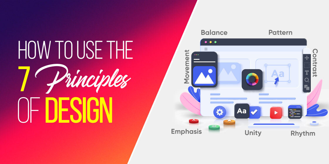
In this article, we will take a look at seven of the top design principles you need to know and use nowadays. But before that, let’s understand the concept of design principles in a little more detail.
The Importance of Principles of Design

If we consider the principles of design as fundamentals or guidelines, then we can say that the design principles are rules that dictate how to make your visual art a success. Now, that visual art can be an oil painting, a brand logo, a social media post, or even an app’s UI.
A great analogy for this can be that you are a pottery artist, and the principles your tools. Without the tools, you may end up with a version of the art you envisioned. However, it will be unrefined, and may be a hit or a miss. Using those tools however, will let you refine the design, and elevate it to something near that from your vision. In short, it will help you find the right balance in design for the piece you create.
Now, just like for any kind of art out there, no single piece of art uses all the tools available in the arsenal. Therefore, by understanding the context and impact of some of the most important of these tools, you will be able to appreciate which ones to use when you create your own design.
How is a Design Considered Good?
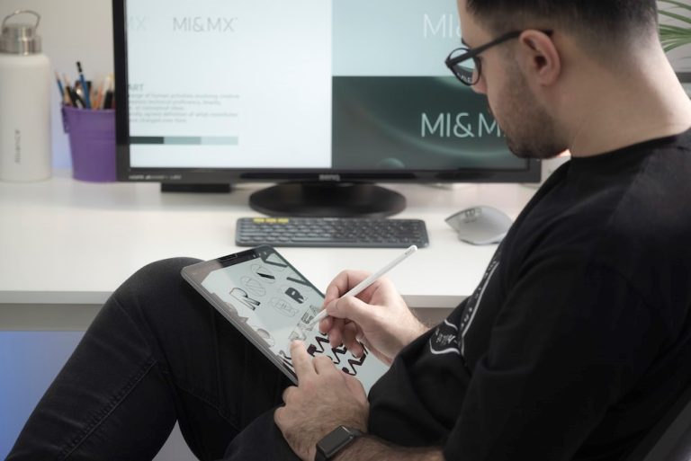
When we talk about good design, there is a little clarification required. Art is, for the most part, subjective to the eye of the beholder. That means that a design that works for one person, may not attract someone else at all. In fact, there are pieces of amazing avant-garde art loved by the aficionados, but actually abhorred by others.
Nevertheless, in spite of saying that, there are some criteria through which we can judge whether a piece of art is “meh”, or actually good. In general art, that might not matter as much, but for pieces of design with a specific purpose, such as brand logos created by professional logo design services, need to be judged on their merit.
However, until the 1970s, there was no defined criteria for gauging this. Near the end of the decade, veteran designer and legend Dieter Rams decided to come up with a solution to this problem. He asked himself an all-important question; how did his experience define a great design?
The answer – a ten-point criterion that defined what constitutes an awesome design. Little did he know that this criterion would go on to inspire even more design greats, like Apple’s very own Jony Ive, a product designer who is known for many great products.
His principles included:
- Innovation is key to a good design
- It works as intended
- It is aesthetically pleasing
- It is easy to understand a good design
- It is unobtrusive
- A good design is honest
- It is relevant for a long time
- It addresses each detail explicitly
- It suits the environment
- It does not overcomplicate the design
Now, you might notice that a lot of these may lean towards product design more than any other kind of design, and that may be due to Dieter’s affinity to the field. However, any good artist, let’s say a logo designer, will be able to map the majority of these onto their domain without issue.
Seven Important Principles of Design You Need to Know

Now that you know the importance of principles of design, and why you should understand and incorporate them, let’s take a look at some of the most important, and critical design fundamentals.
These design principles are ones that are the answer to the question “what are the fundamentals of design”, for a vast majority of visual arts niches. So, let’s dive in and understand what they offer us, and why we should incorporate them within our graphic design process.
Balance of Elements Aligned Perfectly
Whenever you design something, balance is the one element that is of utmost importance. Many different elements make up a design; shapes, colors, frames, and more. All of these combined and aligned properly, make for a great design.
Take the example of Coca Cola’s brand logo. Made up of a primarily cursive style of logo fonts, everything about it is balanced. From the way the letters loop and curl to the amount of white space needed to make the logo legible, the Coca-Cola logo design is a study in harmonious balance in design.
One thing to remember, however, is that asymmetry is also a form of balance. Deliberate asymmetry can help add perspective to the design, and is a difficult thing to master. Yet, if an expert uses it, the results are astounding.
Emphasize the Right Elements
Ah, emphasis. Such an important element in design, yet one that is often overlooked due to it being considered something obvious and inevitable. No design has every element emphasized in it, because then no element would pop out to have an impact.
Take a moment to think about a piece of art or design that you love. What pops into your mind the instant you think about it? Is it a specific geometric pattern in it? Is it the font, or the swirl of color in the corners? Your answer tells you the element that was emphasized in that piece of design.
As a designer, you need to know what your audience needs to look at and remember first. Then, once you know that, you can emphasize the desired element in order to incorporate the right impact in your design.
Use Contrast to Highlight
When we talk about emphasis, there are multiple ways you can provide that in your design. One way to do that is to use contrast to make the design pop. But how does contrast do that? It offers a space, a difference in depth between different elements of your design, by ensuring that the background is sufficiently different from your other elements in terms of light and color. That makes the design clear, legible, and easy to understand. That is one of the primary reasons that using contrast has been one of the leading graphic design trends for a long time now.
However, before using contrast in your design, you need to ensure that that you understand the weight of each element in your design, in order to balance it out perfectly.
Proportion for the Best Impact
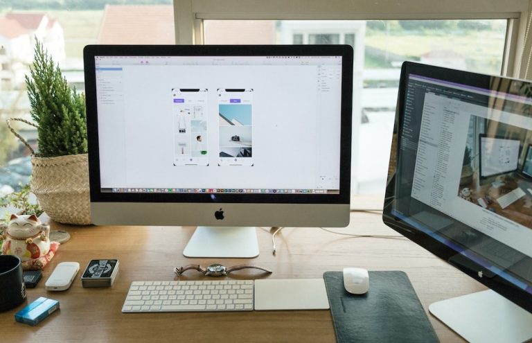
Proportion of each element is also important when it comes to creating the perfect design. It all boils down to having the right balance within your art. Proportion refers to the size and perceived weight of various elements in your art, and how they connect with and relate to each other. It allows you to break your design into smaller sections, giving you the freedom to focus on individual elements before combining it into one complete piece of art.
Proportion can help you emphasize specific sections of your art, such as the venue and time of a concert on a poster you have designed. However, in order to leverage proportion, you need to make sure that each element of your design is well-planned and executed. They should all be perfectly aligned, sized, and balanced in every way for your proportions to have the right impact. In fact, even your color combinations need to be planned out for your proportions to work the right way.
Negative Space is Your Friend
Every other entry on this list of principles of design deals what to add to your art. However, this is the only principle that deals with what not to add to it. Negative space, also called white space, is a great tool that can make even intricate designs some of the most visible and easy to understand pieces of art in the world.
It defines empty space as an important element to highlight and emphasize the visual elements of your design, bringing them into stronger focus. However, it requires an experienced hand to implement successfully. It creates a structure to your design, guiding the eye the way you intend your design to perceived. Despite that, it has seen a lot of success in recent years, with negative space logos becoming a popular trend in recent years.
Make Your Elements Dynamic
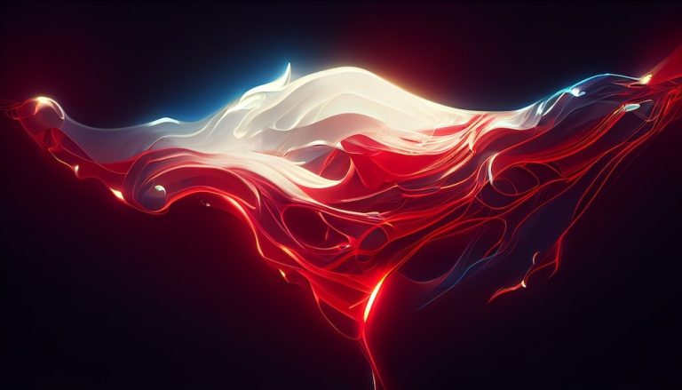
There are ways to make even static elements seem dynamic, by using the right angles and lines that draw the eye in a way that mimics motion. You’ll often see posters, and even digital art, mimicking a slight haziness to trick the eye into seeing movement, however slight, in your design.
When someone looks at your design, their eyes should travel the entirety of your art, while focusing on a section or two you have emphasized. However, if you feel that the viewer’s eye is getting stuck somewhere before perusing the entire design, that means there is a break in the flow of your art, which needs to be fixed.
Repeat, Reiterate, Reinforce
Finally, the concept of repetition can be a great option in order to reinforce an idea in the mind of the audience. Moreover, it denotes a theme to the piece of art, giving your design a sense of conformity. Let’s say you have a social media post image designed, where you use a specific typeface for things you want to emphasize. Now, when someone first looks at the design and see that typeface, their eyes will look for conformity and will seek out similar looking text.
However, if there were three or four different typefaces or fonts used in your design, chances are people are failing to get the entire message due to no conformity. That is why, you can incorporate the element of repetition in all types of design, from brand logos to product or packaging design.
People Also Ask (FAQs)
| 1. How can I create an event planning business logo? The seven elements of design include: – Lines – Colors – Shapes – Forms – Values – Space – Textures |
| 2. What are the 4 C’s of design? The four C’s of design refers to consistency, continuity, context, and complementary. |
| 3- What are the three main types of design? The field of design can be broadly categorized into product design, interface design, and visual design. |
Summing Up
In short, there are many different principles of design that we need to seek out and incorporate if we want our designs to be a success. However, it is your job as a designer to identify which of these is relevant to your niche.
Nevertheless, if you are unable to identify the relevant elements needed to uplift your designs, the fundamentals of design listed above are a great place to start.

Logopoppin
Logopoppin is a graphic design agency that specializes in logo designing, web development, video production and advanced branding services. We love to innovate businesses with new age technologies, allowing them to improve their visual reputation.

