Table Of Content
Know About the Best Tips to Create a Catchy Mountain Logo Design
When it comes to design tourism logos, designers have got different choices. They can play with various colors, shapes and styles to design them as per the given requirements. The primary purpose to do that is to make those logos attractive in looks. Among different types of styles used for tourism logo designing, mountain or highland shapes are preferred more. These figures offer a natural look to tourism logos, making them a perfect emblem to showcase the company background. Many renowned ventures use the mountain logo design due to this specific reason, which is why it should be mastered properly by the logo designers.
Using shapes like mountain in the logo requires good technical skills. You cannot just randomly put any highland shape in the logo without any research. It needs to be done precisely by using correct dimension and styling of colors. This is one of those things in which a professional logo design agency is preferred more over others. These guys know how to create a mountain logo design using all the correct aesthetics required to grab attention.
However, if you are a beginner, you can learn this art too by focusing on few important tips. These tips are simple, yet very crucial to design any mountain logo appropriately. It can be used to design other logos as well, provided all the tips have been followed accurately. In this blog, we will discuss about these tips in detail, so that every beginner can create a catchy mountain logo design. For inspiration, look to iconic mountain ranges like the High Tatras, Andes or Himalayas and imagine how their majestic peaks could be transformed into a memorable logo.
But, before moving straight into that, we will first discuss the importance of this logo shape. It will let us know why hilltop shapes are used in the logo and which companies prefers them most in their official emblem.
1. Where to Use a Mountain Logo Design?
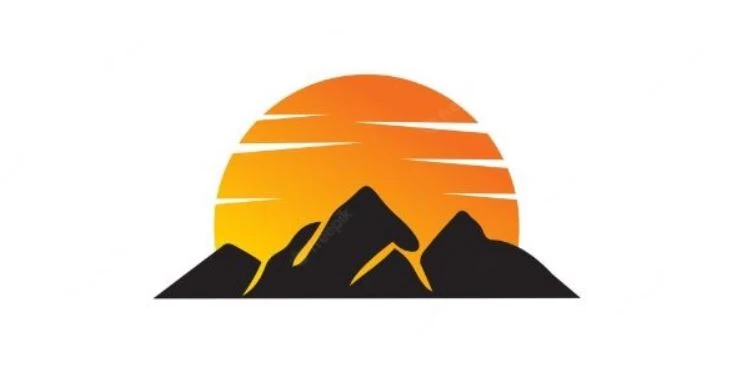
Using a mountain shape in the logo should not be done randomly. It is a specific shape that could only be used for those companies that are related to the field of travel and tourism. This is quite an understandable thing, as mountains, rivers and other similar natural stuff relates directly to these companies. It looks more proper with them, rather than being with any construction or law firm.
So, it should be always kept in mind that mountain logos are special, hence they should be used for only particular companies. Secondly, these logos require simplicity, because they do not look good with any flashy background or color theme. This is one of those things that should be remembered while designing the logo. If you will not pay attention to it, then your mountain logo will end up looking similar like other ordinary logos.
Besides these few points, there are some other tips related to mountain logo designing that will be defined below. Using these tips, you can effectively design a mountain logo with a correct shape and style. It will help you to master the art of logo designing, rightly as per the best market practices.
2. How to Create a Mountain Logo Design
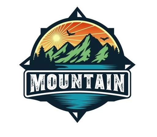
To create a mountain logo design, you need to focus on few important points. Without understanding them properly, you cannot expect to bring perfection in the logo. The reason is that it is not a simple logo that can be made quickly. It requires proper research, as well as skilled hands to complete the design work as per the given requirements.
If you do not know how to design a mountain logo, take a look at the tips defined below. It will let you know which points should be remembered while designing these logos, especially the ones that are related to the tourism sector.
Conduct Market Research
Before designing any illustrative logo, you need to first conduct a thorough research of the market. This practice is not just advised for logo designing, but for every project that involves technicalities. It helps us to know what type of practices are currently being used, so that we can modify our designing work according to them. It is crucial for logo designing, as research can help you to come up with a catchy design.
To make your research useful, try to look for those logos that are popular in the industry. The reason is that these logos have set a standard for others to follow. Many designers look towards these logos to take valuable inspiration. You can also take some good ideas from them, provided your project niche and category are similar to them.
Choose the Perfect Shape
Next up, you need to pick a shape for the given mountain logo. Here, you need to understand that generic hilltop shapes should not be used for the logos. A lot of beginners commit this mistake, thinking that any random mountain shape can be used in the logo. This is generally a wrong perception, because using simple shapes is now becoming an outdated practice for logo designing.
It is now recommended to use a custom shape for every logo design. It helps to give your logo a new identity, something that can separate it from rest of the others. You can design mountains in different styles to make these shapes perfect. Just make sure to always give them a steep look, so that they can portray a strong mountainy image.
Select Catchy Colors
Colors always play an important role in the designing of logos. They provide an extra impetus in the visuals of any design, no matter how simple or plain they are. Keeping a balance in the usage of colors is the main skill of a designer that is often tested to evaluate proficiency. It is therefore recommended to always choose the colors smartly, so that they can make the overall logo outlook attractive.
For mountain logos, you need to pick and use the colors very wisely. Many people think that only colors like brown or green can be used for mountain logos. Well, these colors are definitely the first choice, but are not the only one. You can try other color combinations as well to bring uniqueness in the logo. It will depend on your branding theme, as well as the core styling of the logo.
Select a Relatable Typography
Coming to the part of typography, you need to pick a lettering style that looks perfect with the background of a mountain logo design. Sometimes, logos only look bad due to having an inappropriate typography style. It is something that needs to look highly catchy, because the company names are precisely represented through them.
If you do not have any idea which font style should be used for mountain logos, take a look at the examples given on the web. It will let you know how many typography styles are there and which one should be used in the mountain logo. That is how you can make a good decision and select a font style that fits best with the logo.
3. Popular Mountain Logos for Design Inspiration
While working on any design project, you need some sort of inspiration to move forward. It becomes necessary for logo designing, because it helps you to get some ideas for the work.
Below, we have listed some of the top names that have mountain styled logos. You can get plenty of inspiration from them, as they exhibit an amazing class of logo styling. Let’s take a look at them below.
Adidas
Adidas is one of the top names in the industry of athletic wear. Its logo is designed creatively to represent a unique image of the company. If you will look closely, you will analyze that it has a triangular figure with a mountain-styled overall shape. It is a very unorthodox type of triangular figure that is separated by three white spaces. This is indeed a creative design artistry that makes the logo of Adidas quite unique among others.
Toblerone
The famous highland styled logo of Toblerone is a great example for learning purposes. This Swiss Alps-inspired logo illustrates how a mountain logo should be creatively designed. It does not have any flashy stuff, yet it looks very attractive to the eye. The perfect combination of colors and typography makes the Toblerone logo a one-of-its-kind company emblem. It still looks very unique, setting a model of explanation how a mountain logo should be made accurately.
Evian
Evian is a renowned French company that bottles mineral water from several natural sources. Its logo also includes a pictorial mountain design, colored with a combination of blue and white shades. This logo certainly looks very artistic, as it is designed in a very subtle manner. The logo also has defines the name of the company with a bold typography style. If you are designing a simple mountain logo, this the perfect example to take inspiration from.
Paramount Pictures

Paramount Pictures is a famous movie studio located in United States. Till to date, it has produced countless blockbuster pictures and is still dominating the boards in the Hollywood. The logo of Paramount Pictures showcases the iconic peak of Ben Lomond. It is a snowy peak near Odgen, Utah where Hodkinson (Paramount Pictures Owner) opened his theatre. This real representation of a mountain is quite exceptional, showcasing how nature can also be depicted in a fine manner.
Coors Light
Coors Light is a popular beer company with a footprint in all over United States. Its logo is yet another a proper representation how triangular mountain shapes can be used in the design. It is created in a unique style, blending typography with a triangle in a creative manner. All the beginners can learn plenty of good tips from this logo, as it defines how triangle can be smartly used to showcase a raw picture of a mountain in the design.
Final Words
That concludes our entire article in which we have discussed about mountain logo design in detail. It is one of those shapes that is used regularly by the designers. However, many of them do not know how to use it perfectly for logo designing. This blog will certainly help them to get that knowledge and rectify their mistakes in logo designing. It has defined some good tips that will let them know how mountain logos should be created using correct practices.
Meanwhile, if you are looking for a company that can help you design quality mountain-styled logos, just give us a call today. We have tremendous experience in designing different types of logos, rightly as per the given custom demands.
Frequently Asked Questions (FAQs)
| 1. Which type of design is used in mountain logos? Mountain logos are generally created with a design of mountains. They could be either created with a raw design, or could also depict some actual mountains in the logo. It depends on the choice of companies which type of mountain representation they want in the logo. |
| 2. Why are mountain logos popular in the industry? Many tourism companies prefer to use mountain-styled shapes in the logo. This is the core reason why mountain logos are quite popular in the market. They fit perfect for tourism companies, as well as for some hillside hotels. |
| 3. Which companies are using mountain logos? Mountain-styled logos are used by many companies. Apart from travel and tourism, companies related to other industries have also used this shape in their logos. Some of the popular name among them includes Adidas, Toblerone, Evian and more others. |
| 4. Which colors should be used in a mountain logo? Depending on the branding requirements, you can use any type of color in the mountain logo. However, it is best recommended to use combinations like blue/white, brown/white and more others. |
| 5. Which typography style should be used for a mountain logo? You can use different types of typography styles for mountain logos. There are definitely no restrictions for it, however some best recommendation includes masculine fonts, recursive typography and more others. |

Logopoppin
Logopoppin is a graphic design agency that specializes in logo designing, web development, video production and advanced branding services. We love to innovate businesses with new age technologies, allowing them to improve their visual reputation.

