Table Of Content
Know About the Complete History of Microsoft Logo in Detail
We all know quite well about Microsoft. It is one of those names that is highly prominent in the tech industry. Most of us even know about it from our childhood because of being familiar with Windows. It is a popular operating system that is used by majority of general computers in the world. Due to the popularity of Windows, the Microsoft logo is known to everyone. It is often the first thing that comes to our mind whenever we see Windows. The connection of this logo with the tech industry is quite strong, as it is considered second to none.
Talking about the prominence of Microsoft, it is one of those brands that always remain on the forefront of the tech market. From computers to enterprise software products, the footprint of Microsoft can be found everywhere. It is one of the major reasons why the company is so much popular in the world. Everyone recognizes Microsoft as a leading player that is taking the industry forward with its innovative products.
The Microsoft logo is therefore known to everyone. From adults to youngsters, anyone who is connected to the tech world know about this logo precisely. However, many of them do not have much knowledge about the history of Microsoft logo. They think that the four boxed logo that is seen today is the original emblem of Microsoft. Well, this is certainly not true, because Microsoft logo has seen various changes during the last few decades when company took logo design services from different sources.
In this blog, we will discuss about the evolution of Microsoft logo in detail, so that you can understand how this logo changed over the years. But, before going into that, let us first understand why Microsoft is quite popular in the world.
1. Why Microsoft Logo is Popular?
The popularity of Microsoft in the tech world is well understood to everyone. It is often considered as one of the pioneers of computers systems in the world. Starting from 1970s, Microsoft has come a long way and it is still doing quality work in different areas. Not just computers and laptops, but Microsoft is famous due to producing high quality enterprise software solutions. The most widely used product of the company, Microsoft Office, is a clear example why the brand is popular in the world. It is used by everyone who wants to write and manage different types of documents on computers.
Besides that, Microsoft is also engaged with different other tech organizations to build new products. The recent collaboration of Microsoft with OpenAI is an evidence of that fact. Similarly, there are a lot of other names that are associated with Microsoft. This precisely shows that the company is not just limited to itself, but it also builds effective association with emerging companies to produce new quality products.
When it comes to revenue, Microsoft is second to none. It has a direct competition with the other giant of the tech world i.e. Apple in the financial circuit. Both of them reaps billions of dollars every year, showcasing their immense strength in the commercial market. According to the recent report, the annual revenue of Microsoft in 2022 was $198.27 billion. This is certainly a gigantic number, illustrating the strong mark of Microsoft in the tech circuit.
2. History of Microsoft Logo
We all know pretty well about Microsoft logo. The four boxed famous emblem does not need any kind of introduction because everyone is familiar with it. However, many of us do not know about the other logos that came before this last version. This is because many people have not seen the era of 70s or 80s, which is why they are not familiar with the logos of Microsoft seen at that time.
If you are curious how the first few logos of Microsoft looked in general, take a look at the list given below. It will give you a brief overview about different versions of Microsoft logo from the beginning, so that you can understand its evolution over the years.
Microsoft Logo – 1975
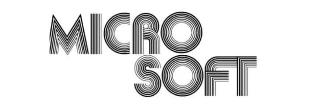
Microsoft was launched during the mid of 1970s. At that time, the tech market was still very nascent, as it has very few companies working in the industry. Microsoft was certainly one of them because it came into the market at that time when people didn’t have much knowledge about computers. The first logo of Microsoft was therefore launched in 1970, and it was perfectly created with a trending retro vibe of 70s.
The color theme of this logo was picked according to the classical trend of that time i.e. black and white. The designing of this logo also gave a bit of impression about maze, which is why many still remember it as a unique trippy design. This logo was made according to the graphic design trends of that era, which is why some people liked it. Though it didn’t looked nothing like a corporate symbol, but still it became an initial identity of the company. This logo was changed after some time, however, its elusive style is still memorable for everyone.
Microsoft Logo – 1980
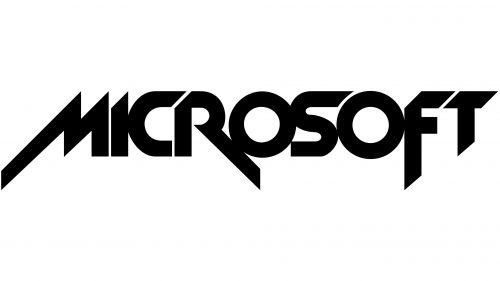
Coming to the 1980s, the design trends had started to change. Though the retro vibe of 70s was still there, but some new styling elements were also introduced in the industry. Looking at these new trends, Microsoft also decided to give its logo a new look. It is being said that Microsoft was always a forward-looking company that precisely wanted to stay ahead of the conventional bar. Due to this approach, they decided to do a rebrand, so that their identity can be presented in the market with a new fresh look.
To create a logo that can perfectly match with the style of 80s graphic design, Microsoft created a logo inspired from the sensation of rockstars. This was basically the time when metal bands were on the rise in the music industry. Their logos and brand names were created in a specific bold style. Microsoft imitated that flair by redesigning its own logo with a similar rock style. It was immensely appreciated by everyone, and people called it a good rebrand by Microsoft. This logo was really great which is why it remained the official Microsoft emblem for the next two years.
Microsoft Logo – 1982
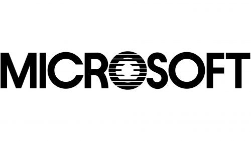
After two years of introducing rock-styled logo, Microsoft suddenly though to give its identity a more corporate touch. This was certainly a right thought because the 1980 logo didn’t had that professional look. The stakeholders of Microsoft correctly thought that the company is now growing, so it will need a better emblem logo to represent a professional identity. They again gave the redesigning job to the Simon Daniels who was the original designer of the 1980 logo. This time, the requirements were different and Simon & his team were aware of them very well.
The new logo that was introduced in 1982 was quite amazing. It was named as Blibbet because it had a unique tweak in the middle of typography. This logo quickly became popular, as people appreciated the thought and work of designer behind it. The growing Microsoft company again started to get attention with this stunning rebrand. Its color theme was not much different from the last design, as Microsoft again opted to go full black with this new logo.
Microsoft Logo – 1987
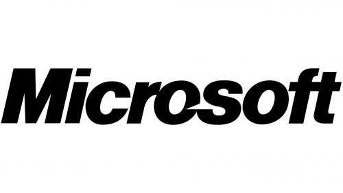
The Blibbet logo was a great redesign by Microsoft, however, it also needed a fresh overhaul to meet the new rising standards. It was the time when brand logos were being designed with more simplicity. The corporate giants were specifically paying more attention to their logos, so that they could exhibit a professional image. After closely monitoring these trends, Microsoft came up with an idea to design a complete straightforward logo. This time, they didn’t went with any unconventional style, as the focus was primarily on keeping the logo simple.
The logo that was introduced in 1987 was based on simple italic typography. It didn’t had any other symbol, as Microsoft precisely wanted to showcase its name in the new logo design. The color chosen for this theme was jet black. It helped to illustrate a strong identity, which was exactly the aim of Microsoft behind performing a rebranding. This new logo became so popular that it remained the core identity of Microsoft for several years. Though some versions came out afterwards with different colors and slogans, but the core styling remained the same.
Microsoft Logo – 2012
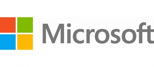
After representing the company identity with a solid black logo for 25 years. The stakeholders of Microsoft decided to overhaul the 1987 logo with a complete fresh look. In 2012, an innovative new logo was introduced in the market having a combination of both typography and symbol. The iconic and famous four boxes were included in this logo to give it a complete new identity. Many people said that this inspiration was directly taken from the logo of Windows which is itself a top product of Microsoft.
Another thing that made this logo quite prominent was the usage of different colors in the logo. This was the first time when Microsoft used multiple colors in its logo. The four boxes have four different colors, all picked precisely according to the shades of top Microsoft’s products. Till to date, this is the official logo of Microsoft that is being used everywhere by the company for branding.
Final Words
That takes us to the end of this blog in which we have discussed about Microsoft logo in detail. It is one of those emblems that is known to everyone in the tech industry. The popularity of Microsoft is simply second to none, because it is considered one of the pioneers of the modern computer systems. This is one of those facts that makes Microsoft special among others. Till to date, Microsoft is ruling the tech industry and its products are simply considered the best among all.
The logo of the company is itself quite amazing, giving its branding a strong boost to grab attention. If you also want to design an eye catching logo similar to the style of Microsoft, get in touch with us today. We are an experienced graphic design agency that will assist you to design quality branding materials as per the required needs.
Frequently Asked Questions (FAQs)
| 1. What is Microsoft? Microsoft is a leading tech company headquartered in United States of America. It is famous because the company has developed variety of IT products that has brought revolution in the tech industry. |
| 2. When was Microsoft founded? Microsoft was founded way back in mid 1970s. Initially, it worked as a software vendor for IBM, but when the started to grew more, it became self independent as well as a direct competitor to IBM and other tech organizations. |
| 3. Why is Microsoft logo famous? The official logo of Microsoft is quite famous because of its amazing design. Furthermore, its long association with the tech industry also gives it a prominent edge over others. |
| 4. Which color combination is used in the Microsoft logo? The latest Microsoft logo has multiple colors including green, blue, orange and yellow. All of these colors are picked precisely to give a reference of different Microsoft products. |
| 5. When was the last Microsoft logo was released? The last Microsoft logo was released in 2012. It completely overhauled the design of earlier logos, as the latest version is built with a combination of both typography and a symbol containing four boxes. |

Logopoppin
Logopoppin is a graphic design agency that specializes in logo designing, web development, video production and advanced branding services. We love to innovate businesses with new age technologies, allowing them to improve their visual reputation.

