Table of Content
Discover the Evolution of the Tampa Bay Buccaneers Logo, from Inception to the Present
The Tampa Bay Buccaneers have been around in the NFL since the mid-1970s. Based out of Tampa Bay, Florida, the Tampa Bay Buccaneers logo is one of the most iconic NFL symbols of all time, with both the original and present forms making their way onto lists of top NFL symbols of all time.
The Buccaneers are one of two teams in the National Football League who use a logo inspired by pirates. Both the Tampa Bay Buccaneers and the Las Vegas Raiders use a form of pirate imagery in their NFL logos. And both designs are inspired by different elements and reasons.
With the Buccaneers being the first team to be awarded a franchise after the AFL – NFL merger, they joined the AFC’s West division, as part of the NFL vision of having 28 teams in the league. And to balance the number of teams between the NFL and the AFL, a new franchise by the name of Seattle Seahawks joined the roster, but with the NFL’s West division.
So, the question we need to ask here is, what was the significance of the logo designed by the Tampa Bay Buccaneers? And how does it represent the Tampa Bay or Florida region with its design and color scheme?
Let’s discover the history, evolution, and impact of the Buccaneers logo over the years, and discover how a professional logo design services can capture that and incorporate it within its designs.
Tampa Bay Buccaneers – History of the NFL’s Flashiest Pirates
Before we begin with the logo, we need to understand the background behind the team’s expansion. Tampa Bay had been looking for an NFL franchise for a long time. And after the AFL – NFL merger in 1970, it was announced by the 1973 season that Tampa Bay would be the first region to be awarded a new franchise to fulfill the 28-team commitment made in the merger.
However, it wasn’t until late 1975 that the city was awarded the franchise, with the team making their debut in the 1976 season. Now there were multiple reasons for this delay. For the first few years after the merger, there was little effort done to fulfill the 28-team clause of the merger. And with the NFL having six more team than the AFL at that time, the league was a little lopsided. So first, they fixed it by moving some teams from the NFL to the AFL, making sure that both the AFC and NFC had 13 teams.
With that done, then came the clause of adding two more teams to the league to make an even 28-team roster. However, the NFL had some concerns regarding the home stadium facilities of a few established teams, including the Bills and the Patriots. Thus, for nearly two years, cities like Tampa Bay who wanted a franchise tried luring those teams with offers of better and bigger home stadium facilities.
However, with both franchises managing to improve their home stadiums, or built new ones, the NFL finally decided to award Tampa Bay and Seattle new franchises.
The first few years for the team in the NFL were quite rough, with the team facing defeat after defeat for the rest of the decade. In that era, the Tampa Bay Bucs were often considered the worst team on the NFL roster. For example, in their inaugural season, the team barely managed to score a meagre 125 points the entire season, finishing the season with a 0 – 14 record. Moreover, they continued their 26-game losing streak in the regular season into the next year, with a low 2 – 14 record.
It wasn’t until the last days of the 1978 season, that the team started showing some promise. With the 1979 season starting, the team stunned fans and critics alike by winning their first five matches consecutively. So successful were they, that by the end of the season with only four games left, the team needed only one win to make the playoffs.
However, this improvement in the team’s performance was short lived, and the team returned to playing poorly by the end of 1982 season. Up until the end of the 1996, they were again considered the worst team on the grid, in part due to the departure of their star quarterback Doug Williams. And it wasn’t until the death of the Bucs team owner Culverhouse in 1994, that their luck started to improve.
With the Buccaneers new owner Malcolm Glazer and head coach Tony Gundy at the helm, the team started their 1996 season. Their first half of the season was quite mediocre, finishing with a measly 1 – 8 record. However, their second half was much better, with a 5 – 2 record courtesy of a defense that was ranked seventh-best in the league for that season. Their iconic Tampa 2 defense strategy was so good that it became the foundation for many other NFL teams to build their defense strategies on.
With the 1996 season showing signs of progress, the next year was the one when the team made their push. Until the end of the 2001, the Bucs had improved a lot, but they still were not strong enough to be championship contenders. That, combined with the fact that Gundy had built a team where defensive players had too much responsibility to win matches compared to the offense.
Therefore, before the 2002 season, Glazer fired Gundy and looked to hire an offensive-minded coach. The time brought on newly-released Raiders coach Jon Gruden. Gruden, who had old ties to the Tampa Bay area and the Buccaneers, quickly took charge, and started reworking the team.
The 2002 season saw the Bucs achieve a 12 – 4 regular season record, their best ever. Moreover, they defeated the 49ers and then the Eagles to win their first NFC title. That win stunned fans and franchises across the NFL, highlighting that the 2002 Bucs were not a team to take lightly. Reaching the Super Bowl XXXVII, they faced Gruden’s old team, and defeated the Raiders 48 – 21.
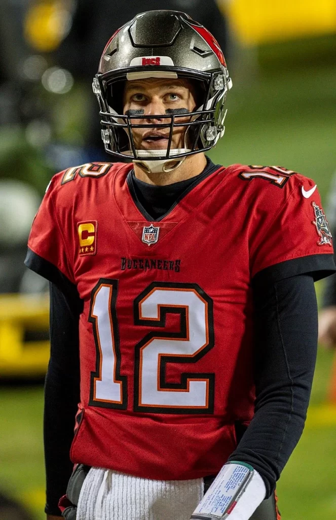
From 2003 to 2019, the team never became a contender for another Super Bowl, although they did prove to be a competitive team from time to time. It wasn’t until the 2020 season when the team, led by ex-Patriots superstar Tom Brady as QB reached Super Bowl LV, defeating the Kansas City Chiefs for their second Super Bowl championship, and Brady’s seventh.
2021 and 2022 were statistically good seasons for the Buccaneers, but with Brady retiring from the sport in 2022, the team has seen another decline in their fortunes. However, in all this time, the franchise has shown that it is capable of greatness, winning both Super Bowls in a surprise upset that shocked fans.
A Look at the Tampa Bay Buccaneers Logo and Its Significance
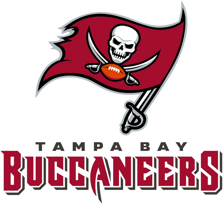
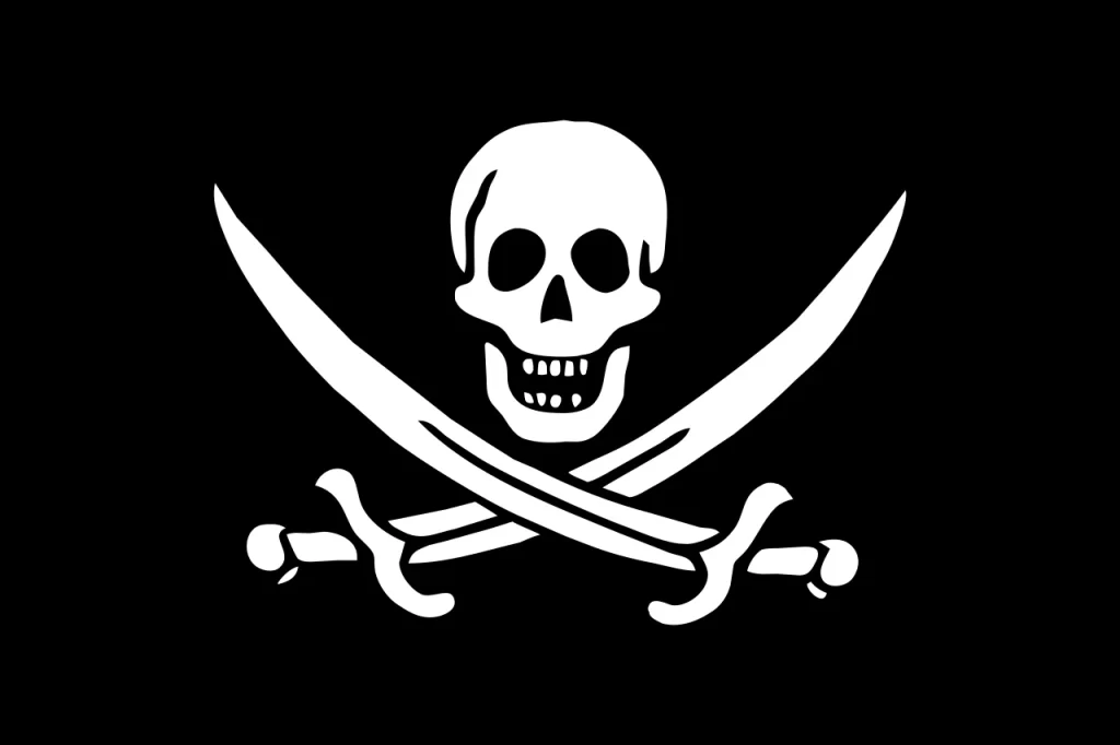
If we take a look at the Tampa Bay Buccaneers logo, it shows a variation of the Calico Jack corsair flag speared atop a sword. This logo pays homage to the history of the coast of Florida, which was often attacked and raided by these pirates, just like the 49ers logo pays homage to the people of the California gold rush.
For the team, the logo serves a double purpose. The inspiration from the pirate flag represents the team’s home state. The addition of a football underneath the crossed swords highlight that the team isn’t a conventional one, and does not play by the rules of others, and is completely unpredictable.
That is apparent in the fact that both of the Buccaneers Super Bowl wins come in a way that no one expected them to win the championship, let alone reach it. For the 2002 win, the team had posted a good regular season record after a string of mediocre results, and their win over the Eagles to win the NFC championship let everyone speechless. The same goes for their 2020 win, where they became the second team ever to win a Super Bowl championship after coming to the playoffs as a wild card.
In any case, the team has a kindred connection with the locals of Florida. People often joke that anything is possible if a Floridian is involved. And looking at the history of the Buccaneers, it does look like its true, doesn’t it?
Evolution of the Tampa Bay Buccaneers Logo through the Years
Now that we have taken a look at the history and evolution of the team and franchise, and its significance with the people and land of Florida, the next step is to see its logo transformation.
Generally teams that have been successful in their respective leagues rarely change their logos, often for superstitious reasons. But Tampa Bay Buccaneers have often suffered from a number of dismal seasons. That has resulted in them changing their logo a few times, in order to give their franchise a new look and aesthetic, a reason also used to justify the transformation of the Philadelphia Eagles logo.
Despite that, the team has drastically altered its logo only once, and since then has slightly tweaked for better design aesthetics. And the reason they made that drastic change at the suggestion of the NFL in order to make their identity more aggressive.
So, let’s take a look at the transformation of the logo over the years.
1976 – 1996
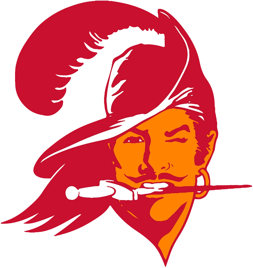
The initial Tampa Bay Buccaneers logo used by the team was released in 1976, and was called Bucco Bruce. It featured a corsair pirate, wearing a stylish hat with a feather in it, long flowing hair, hoop earrings, and a dagger clutched in his teeth.
The idea behind it was to portray a stylish and cavalier pirate, who is equally capable of using charisma as he is violence. However, the creamsicle color of the logo, combined with the somewhat tame aesthetic of the design meant that the logo didn’t have as strong of an impact.
However, it was still used for two decades, and was changed when the Buccaneers worked with NFL to change their logo for something more vicious and impactful. That is because when you hear words like Buccaneers or Pirates, you need to have a logo that matches that feeling of dread that accompanies them.
1997 – 2013
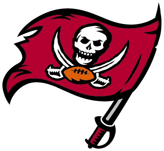
The second iteration of the logo used by the Tampa Bay Buccaneers was modeled on a modified version of the Jolly Roger, called Calico Jack. This was a pirate flag often flown by famed British pirate John Rackham, and it made the design somehow more scary than seeing a skull and crossed bones.
Calico Jack swapped out the crossed bones, and used a pair of crossed swords instead. Moreover, the skull was redesigned to make it look as if it was smiling, albeit in a gruesome manner. The swords were crossed just above their cross guards, which left a sense of foreboding and danger when viewed.
When it comes to the logo, this design is tweaked slightly to make it fit the aesthetic of professional football. At the point where the two swords met, there was a football added. The entire logo was designed on a red burgundy colored flag, with the skull and the swords, and the flag fluttered at the helm, speared onto a drawn sword. Overall, it was a great design, and made for a great monogram logo.
2014 – 2019
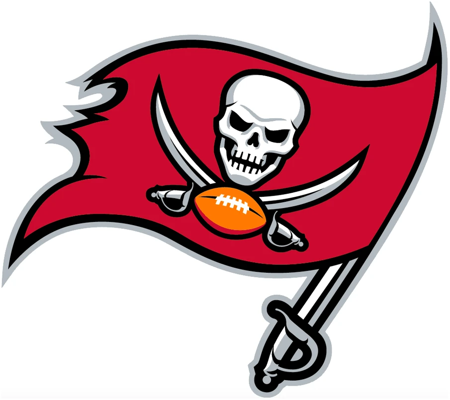
2014 saw the team revamp the Tampa Bay Buccaneers logo again. This time however, the purpose was to improve the initial design, now that digital design was more precise and could be used to create a design with better details.
For one, the hilt of the sword was now silver instead of red leather from the previous design. Next, the flag was colored a few shades lighter, and had less of a darker overtone, making it one of the few NFL red logos. Third, they tweaked the design elements on the Calico Jack flag.
The skull was made more realistic, with the eye sockets more prominent and expressive, and the shape of the jaws and the cheekbones of the skull looking eerily as if smiling. The crossed swords were also improved in design, and the football with them was now a brighter orange.
2020 – Present
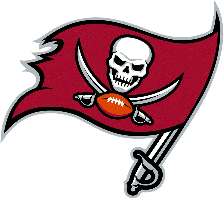
The year 2020 saw the teams make many drastic changes, such as the Buccaneers changing their logo and their uniforms. This time the major change to the logo was that the color of the flag was changed from the bright red shade of the previous design to one that was just a few degrees lighter than the 1997 shade.
Overall this is the design that best encapsulates the essence of Florida and the team. The bright red somehow took away from the impact of the logo, and that is why this logo is still being used three seasons later.
1997 – 2013 Wordmark

The 1997 Tampa Bay Buccaneers logo wordmark had the name of the team written in a typeface designed to look as if made from sword slashes. This kind of design is often used when designers want to show the aesthetic of being roughly carved into wood with a dagger or slashed in with a sword.
The color combinations were the same as the one used for the first Calico Jack logo design. The dark maroon-red was used in an angular background, with the name of the team written in silver-accented white letters.
2014 – 2019 Wordmark

The 2014 redesign of the primary logo also meant that the Buccaneers wordmark logo would also be revamped. The new logo featured a completely reworked wordmark, similar to the modern design like the one seen in Carolina Panthers logo wordmark.
Another major change was the color scheme. This iteration of the logo featured the name of the city in silver gray, while the team name was written in larger, bright red letters. Overall, the design looked more dynamic, but it didn’t have the impact of the wordmark used today.
2020 – Present Wordmark

The modern wordmark was released in 2020 along with the redesign of the primary Tampa Bay Buccaneers logo. the only change made to the design is the change in color palette, where the bright red is replaced with the darker maroon of the primary logo.
Moreover, instead of the city name written in silver gray letters, it was now in dark black, which made them more visible, for an overall raw feel to the logo design, like the Atlanta Falcons logo of today.
FAQs
| What was the Buccaneers old logo? The oldest logo used by the Tampa Bay Buccaneers was a design called the Bucco Bruce. It referenced a caricature of a buccaneer, a type of Spanish-origin corsair pirate who often raided the Florida coast. |
| What does the current Tampa Bay Buccaneers logo represent? For the team, it represents courage and grit in battle, while for team opponents it represents rightful fear and foreboding that something bad is about to come. |
Conclusion
To sum it up, the Tampa Bay Buccaneers logo is one of those few NFL team logos that has a rich history behind its inception. Unlike some team logos, such as the Detroit Lions logo, is just developed to complement the name of the team. There is no connection for the logo design to the host city, state, or team history.
However, there are some teams on the NFL, MLB, NBA, and the NHL, whose logo designs are actually inspired as a way to pay homage to something special about their home. Designs like the 49ers or the New Orleans Saints logo prove that using elements of history can go a long way to enhance the impact of a logo, especially ones that are strongly connected to consumer emotions.

Logopoppin
Logopoppin is a graphic design agency that specializes in logo designing, web development, video production and advanced branding services. We love to innovate businesses with new age technologies, allowing them to improve their visual reputation.


