Table of Content
Discover the Best Tried-and-True Bakery Design Ideas to Incorporate
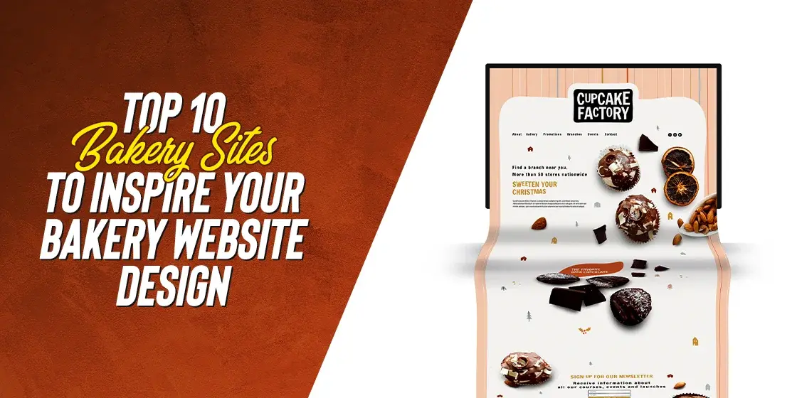
As for nearly everything in life, food too has a visual element that defines how the well its users perceive it. And it is not just about the perception. Food that looks good often tastes better, at least on a subconscious level. Therefore, a business that specializes in selling food items such as a bakery, needs a visual wow-factor to attract customers. And what better way to do that, than with an attractive bakery website design?
Now, some people believe that due to the nature of this business, businesses are limited in the styles of websites they can use. However, the truth is that the only limitation is your own creativity. In fact, in our compiled list of top bakery websites, we have curated a mix of styles, from minimalist to quirky designs, Michelin-star quality websites, to your friendly neighborhood vibe.
What actually dictates the style of the website you choose is the nature of your business offerings, and the vibe of your business. And incorporating that properly within your website design is what ensures how well your website does with potential customers.
Let’s take a look at some of the best examples of bakery website ideas, and discover what it is about them that makes them such a hit with their customers. Moreover, we will also discuss the elements that a professional web design company needs to incorporate within its food websites to ensure its success.
Bakery Website Design – The Concept behind the Design of Food-Based Websites
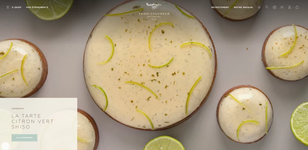
When we talk about the creation of a bakery website design, or any food-based or restaurant website in general, there are a few subtleties to navigate around in order to ensure its success. For one, the visuals need to be more than aesthetically pleasing. They needs to evoke feelings of hunger, want, and desire. The best way to do that is to leverage the inherent power of a good-looking dish, and combine that with the aesthetic sense of your target consumers for an awesome web design.
Think of the websites of popular restaurants like McDonalds, Panda Express, or Taco Bell. Their websites show their food in the best light. So powerful and luscious is the imagery that a viewer cannot help but get hungry looking at that. And despite the fact that more often than not, the product looks nothing like the one seen the website, these visuals are highly successful at getting repeat customers.
When it comes to food or restaurant imagery in web design, it all centers around the photography and imagery used. Some use it as an intrinsic part of their web design, using slideshows, videos, or stills throughout the page. Others may incorporate that imagery within an intuitively placed gallery, and incorporating a lighter, more abstract kind of visuals based on line-work or pencil-sketch style of minimalist design.
No matter what you choose, you need to know that even the best bakery website ideas may fail if there are no high-quality images accompanying them. Therefore, no matter what style you choose, you need to hire a professional photographer or photography studio who specializes in food photography to help you attract your target consumers.
Five Elements to Make Your Bakery Website a Success
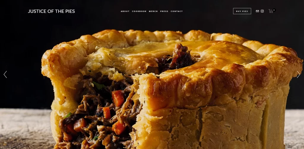
Now, while it is true that you can choose from a variety of styles to create your bakery website design, there are a few key elements that need to be incorporated, regardless of your choice. These elements are not ones that specifically deal with the UI or layout of your website, but rather the overall user experience of your website and business.
For a website with truly exceptional user experience, you need to ensure that whatever information a potential or existing customer may need is easily accessible to them, in a simple and efficient manner. For example, if you go to a website that describes and explains the benefits of its business, yet nowhere on the page could you find a signup form, what would be your experience?
Now, there could be several factors that dictate whether a site would be a success or a failure. However, if you incorporate the following five elements into your design, you will be able to give your website success probability a high bump.
Let’s take a look at the five bakery web design elements, and discover why they are so important.
1- Email List Sign-Up
The first element that needs to a part of your bakery website design is an email-signup form. You want your consumers to be able to keep up with the website and its services, and there is no better way to do that than with a regular newsletter.
So how could you do that? Well, for one, you need the consumers’ email addresses. The question however is how to get those email addresses from them in the first place. If we look at some established brand website, the email signup form appears in multiple forms, most commonly as small form on the sidebar, or a pop-up form that triggers at certain points of the webpage.
2- An Easy-to-Understand Menu
It is an understood fact that for a food-based or restaurant website, a menu is a necessity. Not just for the fact that its potential consumers would be searching for it, many brands are now using QR codes in place of physical menus. And once scanned, the QR codes redirect the user to their menu on the website.
These codes can also serve multiple purposes linking to special offers, showcasing customer reviews, or even capturing feedback after a purchase. Many bakeries now rely on some of the best QR code generators to create quick-access points for menus, contactless payments, or loyalty programs all integrated seamlessly into the customer experience.
In any case, a menu is a must-have. However, just having the menu isn’t enough. It needs to be easily legible and at the same time intuitive enough for people to use and order without much help. A bakery website without its item list or a restaurant site without its menu, is just asking to be a failed experiment.
3- A Beautiful, Centrally-Placed Gallery with Aesthetic Images of Your Baked Goods
As we discussed earlier, a gallery of aesthetically pleasing images full of mouthwatering delights is essential to the success of your bakery website design. That is because unlike other types of websites, a bakery, restaurant, or patisserie website needs no other attractive elements then their own offerings displayed in an aesthetically pleasing manner.
Now, how you use that depends on you. You can either have a dedicated gallery of images, this keeping your web design simple and light. Alternatively, you may incorporate that imagery as a core part of your web layout. In our list of bakery websites below, you will see a mixed set of either styles, displaying that its the presentation of the idea that counts. Overall, what matters most is that there should be balance in your design of webpage, no matter the style you choose.
4- Easy-to-Reach Contact/Order Forms
As a website that sells products, your design would also need to consider the addition of an order form. At the very least, your restaurant or bakery website design should have a contact form so that prospective customers could reach out to you with their queries.
Incorporating these forms need not be a hassle. You can integrate them within the flow of your webpage’s layout as a form of page breaks or calls-to-action, or even use them as popups after a certain length of time or by using scroll triggers. Moreover, you can also use a mix of a few different ways to ensure that the visitor has easy and handy access to a contact form no matter where they are on the page.
5- An About Us Page with Origin Story, History, and Testimonials for a Human Connection
Finally, success in business today is all about that human connection, meaning how the business relates to its target consumers. If consumers are able to connect with the business on an emotional level, then chances are that the business would be a success.
A great way to connect with your target customers is to relay your connection to them and the local community somehow. You could portray how the company has its roots in the local community, and how it started as a venture by some locals which has now grown into a large business, thanks to the local consumers.
You could even enhance the impact of your story by adding testimonials from happily satisfied customers, thus cementing your claims in the prospective customer’s good graces.
Inspiring Your Bakery Website Design – Top 10 Bakery Websites You Need to See
So far, we have discussed the idea behind the creation of restaurant and bakery website design, or food-based business web design in general. We have also looked at the some of the important elements that need to be included in a web design to ensure that it is a success.
Designing a website for a bakery or a restaurant may not seem like much of a difficult task. However, a few subtleties of it make the differences between them and traditional websites that much wider. For example, a designer may believe that its easier to design such a website because there isn’t too much text to consider. However, it is this lack of textual content that warrants the imagery to shine even brighter.
So, let’s take a look at a few examples of how to develop your bakery website ideas into successful business websites.
Example 1- OWL Bakery
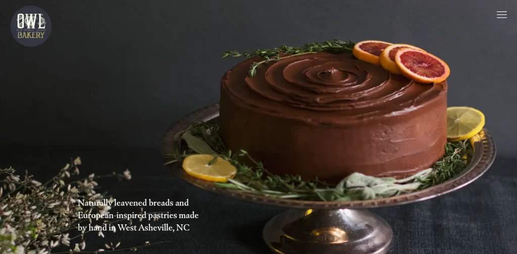
OWL Bakery, or Old World Levain Bakery, is a North Carolina based bakery that specializes in naturally leavened bread, as well as traditional European-inspired baked items. Their website is a great example of highlighting the offerings of the business, as well as the story behind them. This results in an unmatched visual and oral impact, one that manages to set the bakery’s website in a highly attractive light for the consumers, making it successful.
The way this website manages to project both aspects successfully, is by incorporating the technique of parallax scrolling. This way little bits of text can be scrolled smoothly, interspersed with high-quality images. Moreover, the option to add items to cart, and navigate the offerings is easy and intuitive, making for a great website design.
Example 2- Chambelland
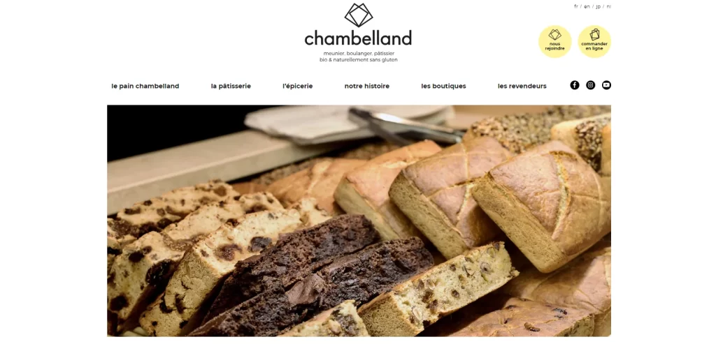
When it comes to style, nothing beats French patisseries. This next entry on our list of bakery website designs belongs to a Parisian patisserie called Chambelland. Located in the quaint neighborhood of Folie-Méricourt, the website design is clean and aesthetically pleasing. Its website design is developed to merge the modern appeal of the shop while still having a strong visual appeal that draws the eye and stokes the hunger.
The navigation on the website is quite interesting and intuitive. Clicking on any of the images in the grid takes the user to a specific product-listing page, such as for breads or cakes. There, the user can select the items they want to buy and add them to the cart.
Alternatively, they can scroll down and search through the patisserie’s history, its recipes, as well as the cooking process. Moreover, as an added accessibility measure, visitors can switch the website language from French to English, Japanese, or Dutch to address the needs of Paris’s tourists.
Example 3- Wildwood Bakery

The next bakery website design on our list belongs to the Wildwood Bakery. Located in the Melbourne suburb of Preston, this entry from the land down under is a great example of an eclectic web design to portray its quirky vibe.
The color combinations used here have an earthy and natural vibe, combined with the unique and attractive animations, which results in a look that is unmatched by its competition in the country. In fact, we can honestly say that no other bakery website on our list has a visual style similar to the bakery website design of Wildwood Bakery.
Taking a minimalist approach, the designers limited the number of interaction options available to a user. They limited them to the basics only, such as the store, deliveries, and subscriptions only. Most other features and special traits of the business, as their drive for sustainability, are placed further down, to prevent cluttering up the layout and information overload.
Example 4- Salt n Sprinkles
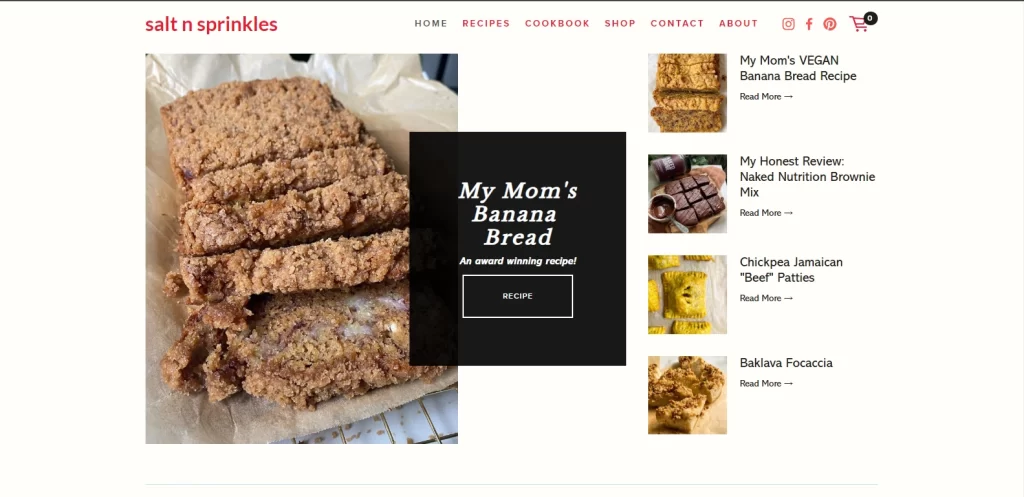
Salt n Sprinkles is combination of food blog and vegan baked treats. Powered by Squarespace, this website is a perfect example of a bakery website design that knows how to sell. The homepage is structured using a somewhat traditional grid style, which shows images of tasty foods, as well as snippets to the author’s top recipes and blog posts.
This is an example of utilizing a pure website design experience, rather than relying on gimmicks and tricks like animations and transitions. With a clean design, it draws focus on the core elements of the page, eliminating distractions.
Example 5- La Cannelle de Martini
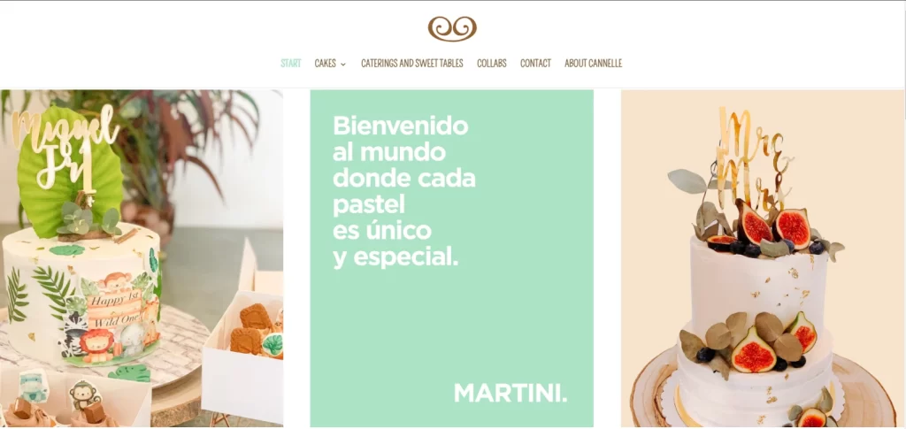
La Cannelle de Martini is a Barcelona-based bakery, which specializes in keeping its food as friendly and sustainable for a wider variety of consumers as possible. It produces a range of products that are vegan, sugar-free, gluten-free, and dairy-free, ensuring that both people with dietary or lifestyle restrictions are able to enjoy its treats.
Its single-page bakery website design is truly remarkable. Scrolling down reveals new images set against a neutral background, making them instantly recognizable. Its entire purpose to make a visitor’s journey from landing to placing an order as simple and short as possible.
Example 6- Sweet Mae’s Cookies
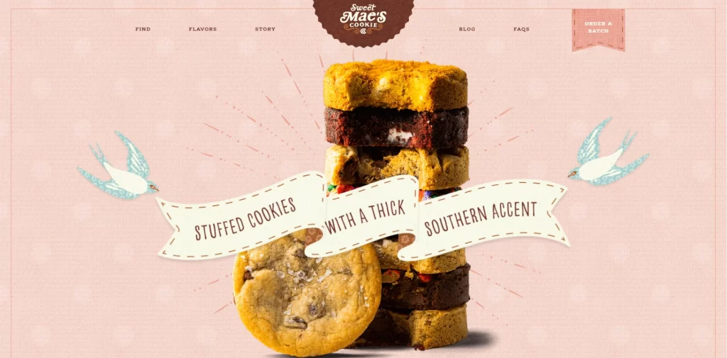
Unlike most of the previous iterations discussed so far, Sweet Mae’s Cookies uses a website design that uses smack-in-your-face visuals. Taking an avant-garde approach, it uses a maximalist style of website design that uses techniques like textures, layers, hover and transition animations, and mouthwatering closeups of sweet, tasty treats. And the best part, all of these elements combine into a cohesive whole, showcasing perfect balance in design.
The interesting thing about it is that it is built using WordPress, with the store powered by WooCommerce. Visitors can add as many of its “flavors” to the cart as desired, feeding into the consumers’ needs to stuff themselves full of sweet, decadent, and highly delectable treats.
Example 7- Its Jane Coffee Shop and Bakery
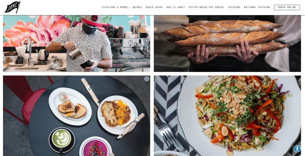
This website design takes the approach of letting images take the center stage to the max. Instead of a website that prioritizes imagery in its design, it centers its website layout on a page-long collage of aesthetically tasteful images of the business’s food.
Unlike other options on this list, Its Jane leaves its story and other information as a side note, deciding to focus on the aesthetic appeal of its offerings, and reaching customers’ stomachs through their eyes. For those who want to explore more, it does offer a side menu, though it is placed subtly enough as to not interfere with the collage, while still being visible.
Example 8- Dominique Ansel Bakery
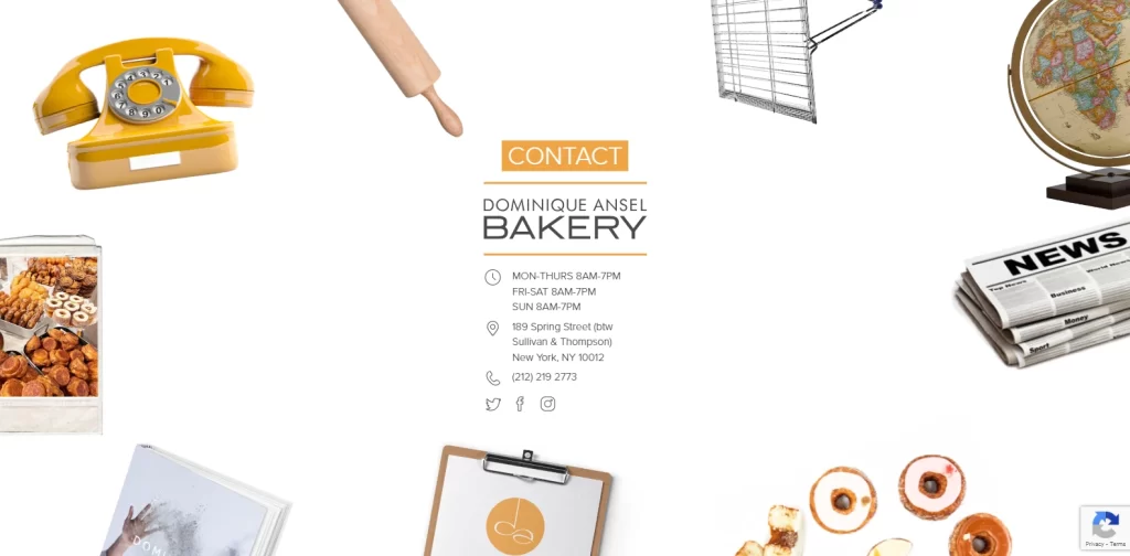
While many non-New Yorkers wont know the name of the Dominique Ansel Bakery, a large number of them would recognize the name of their iconic creation, the Cronut. Run by Owner-Chef Dominque Ansel, the bakery website design featured is truly one of a kind.
Instead of a traditional navigational menu, the homepage features a circle of different images, hovering over and clicking on each taking you to a different page of the website. The design is simple, clean, yet still interesting without being overwhelming.
Example 9- Balthazar Bakery
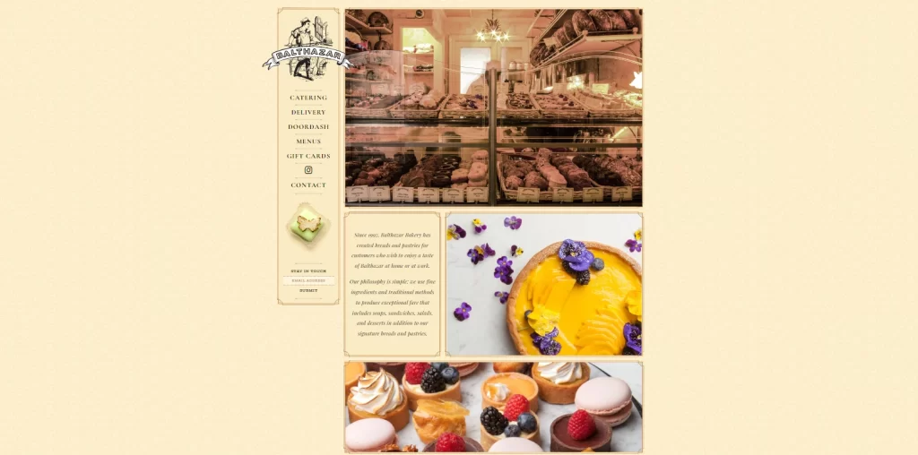
Balthazar Bakery is another offering on our list which is situated in the Big Apple. An NYC staple, the website for Balthazar Bakery proscribes to a more traditional, classic restaurant-style website design. With a delicate design, complemented by a pleasing sepia color scheme, it is a great example of portraying an old-world aesthetic the proper way via color theory.
Rather than opt for a modern minimalist design to highlight the bakery and its offerings, the company decided to go for a classic design. While it is simple, it has character suitable enough to portray the historical legacy of the bakery without being too old-fashioned or gauche.
Example 10- Gilles Marchal Patisserie
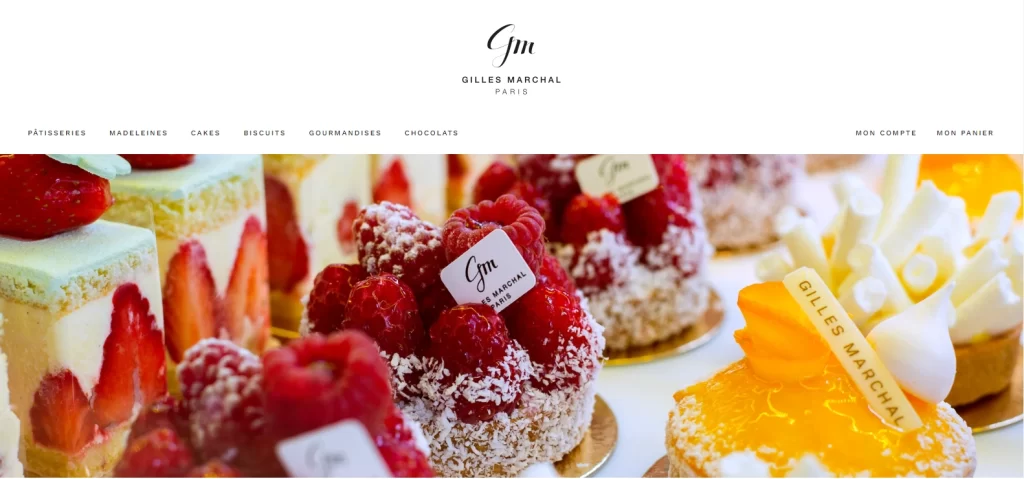
The final entry on our list, the Gilles Marchal Patisseries is another French business website that represents the bakery operated by chef pâtissier Gilles Marchal. It portrays a classic French style of food presentation, utilizing on clean backgrounds, ample whitespace to separate sections of the web pages.
Moreover, it also utilizes a set of high quality, well-positioned images of their pastry delights. These images draw the eye and stoke a visitor’s hunger, with their vibrant colors that contrast well with the plain background.
Related Resource: You may also check some of the top bakery logos for inspiration.
FAQs
| How do I start my own bakery website? The best way is to go about creating your own bakery website is to hire a professional web design firm, and work with them to bring your idea to life. They will help you develop your website, from design inception all the way to launch and maintenance if required. |
| Would adding a baking blog to my bakery website help me make money? It depends on the type and quality of content you are developing. Some bakeries do use a blog for their affiliate marketing campaigns, promoting different tools and ingredient suppliers to earn revenue. |
Conclusion
To sum it up, creating your bakery website design requires a bit of legwork and research. It requires you to understand the vibe of your business, and come up with potential designs that could complement that vibe.
That is because unlike traditional restaurant websites, bakery and pastry businesses require a greater creative flair. That is because among chefs, bakers and pastry chefs are considered at the top end of the creative bell curve in professional cooking.
In any case, if you research your competition’s and your own business carefully, and ensure that your web design has the basic elements mentioned above, you will end up with a set of successful bakery website ideas to choose from.

Logopoppin
Logopoppin is a graphic design agency that specializes in logo designing, web development, video production and advanced branding services. We love to innovate businesses with new age technologies, allowing them to improve their visual reputation.

