Table of Content
Transformation of the Symbol of Italy’s Iconic Luxury Sports Car Manufacturer
There are some car companies so iconic that they are the first thing that come to mind in that category. For example, if we talk about economic reliability, Toyota is the first company that comes to mind. For German automotive engineering, Mercedes-Benz would be the top answer. And for Italian luxury automobiles, what answer could there be besides Ferrari?
The Ferrari logo is said to be one of the most well-known automotive symbols of all time, alongside other legends like Volkswagen and the ones mentioned earlier. So what is it about them that has made them so iconic? Why would Mercedes be the first brand to come to mind when talking about German automotive engineering, when there are others like Audi, BMW, Porsche, and Volkswagen too?
Similarly, in the case of Ferrari, other Italian car brands like Lamborghini, Alfa Romeo, Pagani, Maserati, and more are also some of the top names in luxury cars. So why Ferrari, especially considering that Alfa Romeo outdates Ferrari by at least a decade.
Let’s dive in and discover what was it about Ferrari’s prancing horse symbol that made it one of the top car logos of all time. We will discuss the various elements of that design, demystify the origins of the name and the symbol, and learn how an amateur or pro logo design services provider implement those same techniques to enhance the impact of their logos.
From Scuderia Ferrari of Alfa Romeo to Ferrari S.p.A – The Journey of Enzo Ferrari’s
The Ferrari company has an interesting origin story, both in terms of the company as well as the Ferrari logo. Enzo Ferrari worked as a salesman and amateur racing driver for Alfa Romeo, and Italian automobile manufacturer and racing team. By 1929, Ferrari had enough influence as a member of the Alfa Romeo team that he founded a separate racing team called Scuderia Ferrari, which ran Alfa Romeo cars.
Now, the name of Scuderia Ferrari translates to “Stable of Ferrari”, and referred to the multi-horsepower engines used by the cars. Competing against the factory team was no easy task. But Ferrari persevered and went on. In 1933, when Alfa Romeo left automobile racing, this made Ferrari the official company team.
With Alfa Romeo supplying the cars, Enzo worked to get the best drivers of that era for those cars. However, in 1937, Scuderia Ferrari was merged in with Alfa Romeo, and Enzo was not too happy. Using is settlement from the company, Enzo started his own automobile manufacturing company called Auto Avio Costruzioni, as he could not use the Ferrari name for four years after the deal due to a non-compete clause within his settlement.
The company managed to produce only one car before World War II broke out, called the Auto Avio Costruzioni 815, which has only one race to its name due to Italian involvement in the war. During that time, the company manufactured aircraft engines and other machined parts, which payed quite well considering they were government wartime contracts. In 1943, as Allied raids threatened the factory, Enzo moved the factory to Maranello, where it remains to this day.
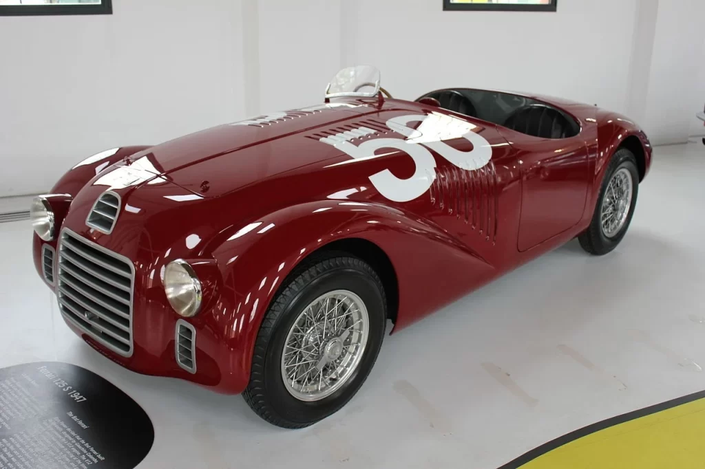
By 1945, the company had renamed itself as Ferrari, and was working on a V12 engine that would power their newest automobile called the 125 S. Based on Enzo and his team’s racing pedigree, the team started winning races as soon as they started participating. It won a number of races in 1949, as well as the 24 Hours of Le Mans in 1949 and the Carrera Panamericana in 1951. These victories were the ones that established that Ferrari was a high-quality automobile maker rivalling any in the world.
By the late 1950s, Ferrari was a favorite of the elite across the globe. At this time Ferrari was looking to produce a number of luxury sports car families, such as the Monza, America, and 250 series. With the increase in demand across the world, Ferrari was reorganized as a public company, and looked for a business partner to help with its manufacturing operations.
Their first choice was Ford, which was one of the biggest American car brands at the time, and started negotiations. However, they fell through and the company approached Fiat, who bought a 50% stake in Ferrari during 1969. The 1960s also saw Ferrari take an approach that was quite opposite to the company ethos at that time. They developed and revealed the mid-engine 206 GT, which was sold under the Dino brand. This made the car the first automobile by Ferrari to not be front engine.
Next was the introduction of the 365 GTB/4 the next year, which had a sleek, streamlined profile that redefined how Ferrari approached its automobile design concept for the decades to come. The 70s saw the emergence of a new Ferrari, a car brand that was difficult to catch up to even by the best of automobile manufacturers worldwide.
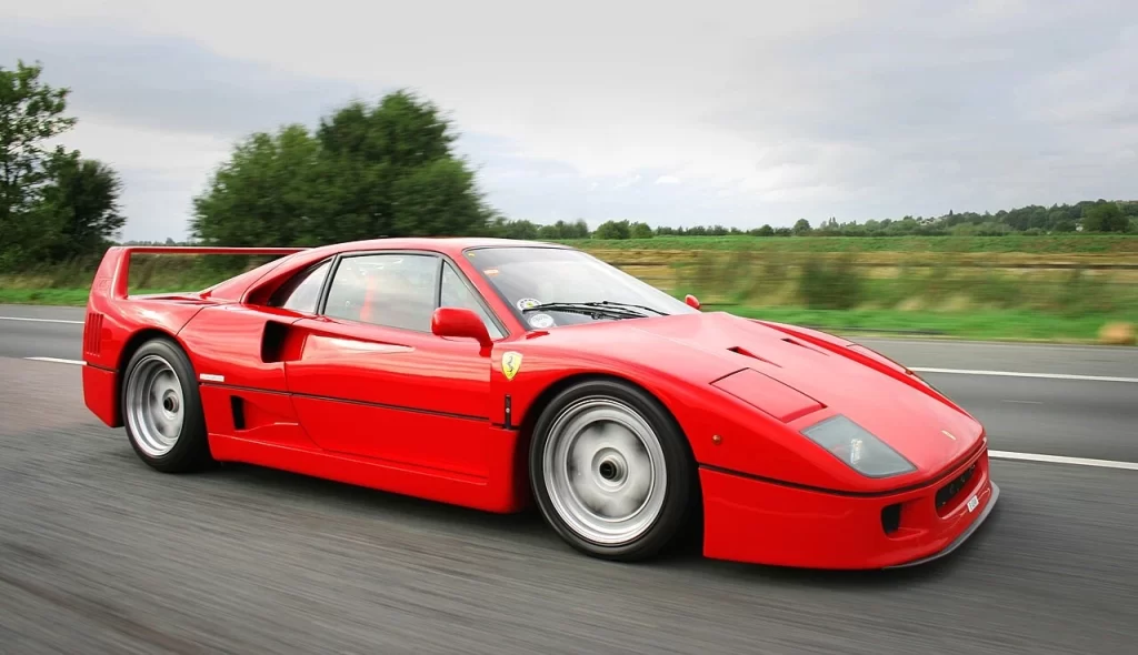
Ironically, it was after the death of Enzo Ferrari that the contemporary renaissance of the car company came to be. With Enzo’s death in 1988, the company was working on producing Enzo’s last approved car, a redefined take on the supercar approach that Ferrari had first pursued with the 288 GTO in 1984.
The F40 redefined the pure racing experience, and it became Ferrari’s most expensive car sold until that time. Priced around $400,000, it was five times as expensive as the 288 GTO it was meant to replace. Despite the cost, the car was, put politely, quite spartan. Critics said it felt like an open-wheel racecar with a plastic and Kevlar shell on top. The windscreen and windows were polycarbonate, and like professional racecars, the first fifty versions of the car had sliding Lexan windows, with later versions sporting roll-down windows.
Additionally, the cars didn’t have door panels, sound system, carpeting, glove box, and more. In fact, the cars didn’t even have any door handles, with all of these omitted to save as much weight as possible. And while it may not have been that well received at the time, it paved the way for other legendary Ferrari automobiles, including the F50, the Enzo, and the LaFerrari.
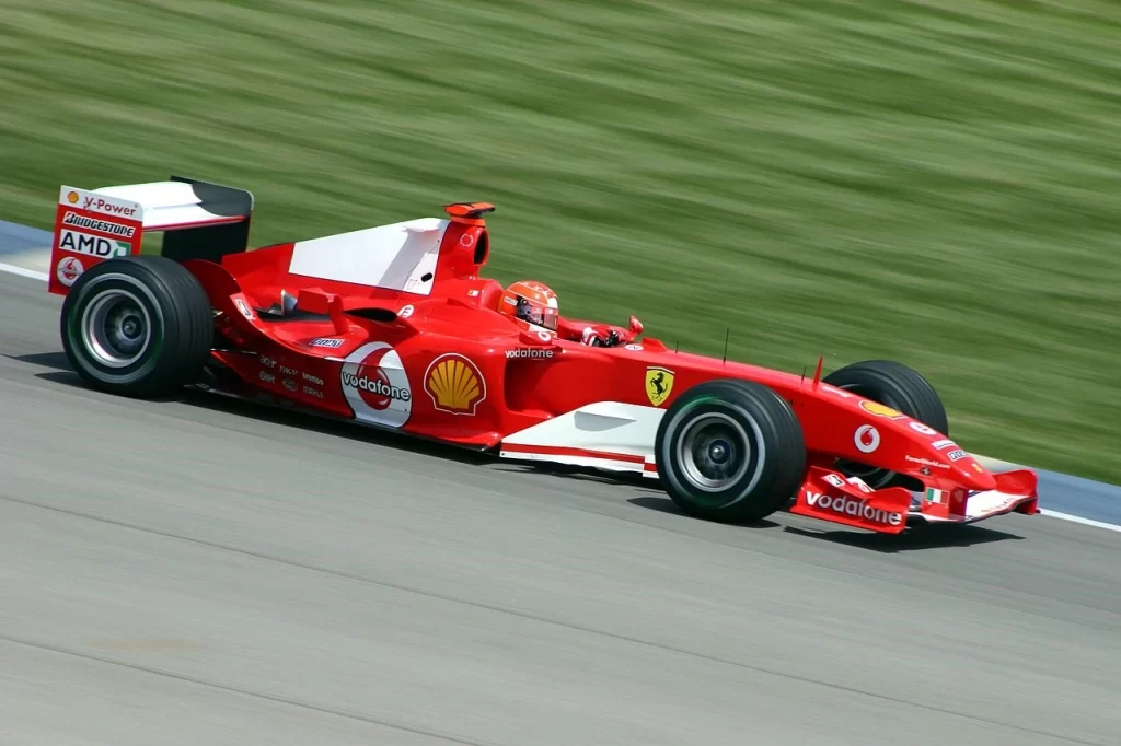
At the same time, this was the era where the new chairman of Ferrari, Luca de Montezemolo, revived the glory days of Ferrari as a leader of the pinnacle of motorsports. Hiring talent like Jean Todt and driver Michael Schumacher led to Ferrari winning Constructor championships six years in a row from 1999 to 2004, as well five driver championships from 2000 to 2004.
Moreover, it was also during Montezemolo’s 23-year tenure that Ferrari expanded massively, increasing its valuation by a factor of ten. Since his departure, his successors have seen Ferrari spin off from Fiat Chrysler Automobiles, as well as start development on a fully electric automobile. And with such a rich history of high performance and style, they won’t go wrong.
The Inception of the Ferrari Logo and the Inspiration Behind It
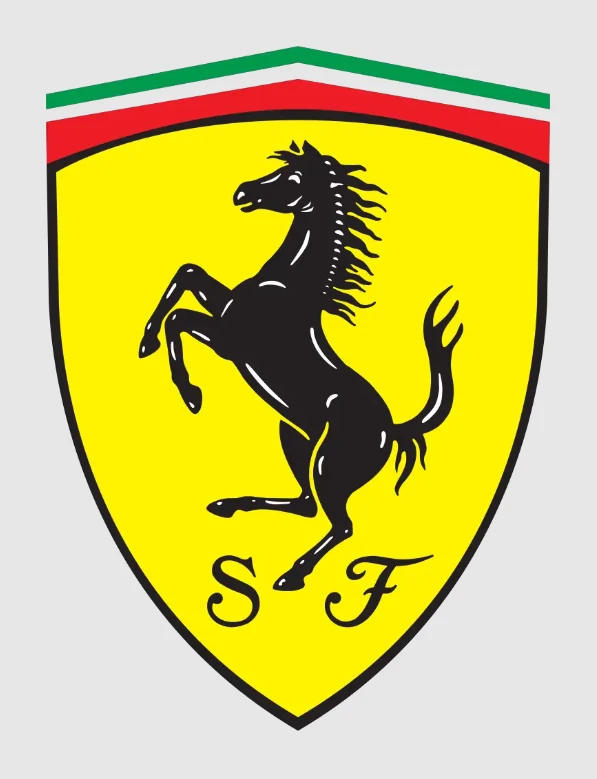
The Ferrari logo has long been considered the symbol of top-tier quality and luxury in automobiles. And with its origin and legacy steeped in automotive racing, there is also an expectation of power that goes along with the luxury.
Its inception harkens back to the early days of the brand, when Ferrari was nothing more than a racing team operating under Alfa Romeo. The prancing horse used as the team’s logo was actually inspired by deceased Italian World War I ace Francesco Baracca, whose family asked Enzo to use the symbol as a good luck charm.
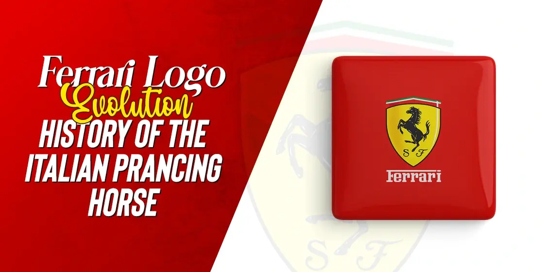
Accepting the request, Enzo added a canary-yellow background to the horse to represent his hometown of Modena, as well as the Italian tri-color at the top to represent its Italian heritage. And since then, the company has been using this design on all its cars, from 1932 to the present.
As for the modified version used by Scuderia Ferrari, the company’s racing division, the shield-like design is often used in tandem with the rectangular logo more commonly used. While the primary company logo is featured at the front and back of Ferrari’s performance models, the shield often features on the fenders of those cars, representing their racing pedigree as one of the top sports car logos of all time.
Evolution of the Ferrari Logo Over the Years – A Look at Its Transformation
Now that we have looked at the history of the company, as well as discussed the origins and inception of the Ferrari logo, you might be wondering how the logo has evolved with the brand over the years. Now, it’s understandable that after nearly a century of century, no brand would still be using the same logo without it losing its impact. But what’s surprising in how little the logo for Ferrari has evolved, despite such a long time passing since it first featured on a Ferrari-run car. And today, with little change, it is still considered as the pinnacle of horse car logos in the world.”
Let’s take a look at the various iterations of the Ferrari car logo that have been used over the years by Enzo and his successors.
1929 – 1931
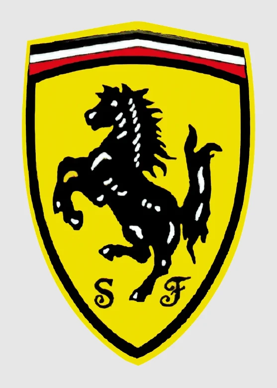
The first iteration of the Ferrari logo was first introduced in 1932, after Italian flying ace Baracca’s family asked Enzo to use it as a good luck charm. Compared to the Alfa Romeo logo at that time, this design was extremely non-traditional.
Featured in the shape of a shield, the background was bright canary-yellow, with the iconic prancing horse rearing on its hind legs in the center of the shield. At the top of the shield, made with a slight point at the top, and colored the Italian tri-color to establish itself as a top Italian automaker.
1931 – 1939
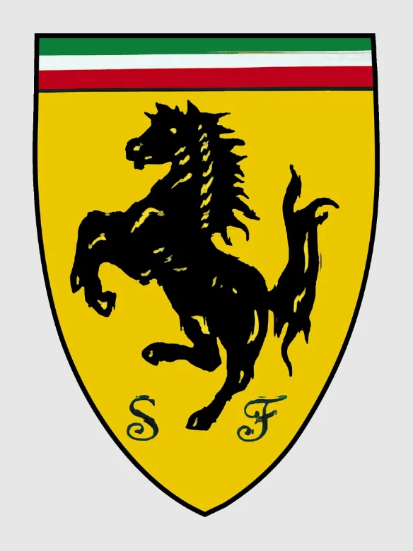
1931, the team tweaked their logo slightly, with the horse being sharper, and the pointed top of the shield now flatter. Moreover, the logo now featured a darker set of color combinations, and also had a dark black outline that ran the entire length of the imagery.
This change was brought on by the fact that the Ferrari team needed something more visible, and this darker colored and outlined automotive logo was a great option to achieve that. In any case, the straight tri-color, combined with the dark yellow background, the prancing horse, and the initials of the team at the bottom, was a great design, one that still inspired the Scuderia Ferrari logo today.
1939 – 1946
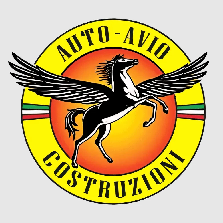
As we discussed earlier, Enzo Ferrari separated from the Alfa Romeo company in late thirties, as he wanted to be an independent automobile manufacturer. As a non-compete signed with the company forbidding him from using the name Scuderia Ferrari or its variants, Enzo came up with a temporary name for the company.
Called the Auto Avio Costruzioni, it featured a symbol that depicted a Pegasus (winged horse from Greek/Roman mythologies) flying high into the air. This new design, besides changing the prancing horse to the Pegasus, also featured some other changes.
First, the logo was now an overlaid set of two circles, with the large bottom circle having a smaller, orange-yellow circle centered over it, depicting a sun. the larger circle depicted a thick band of yellow all around the orange circle, with the tricolor on the left and right side of that yellow band. The name of the company was written all around the edges of the yellow band, forming a well-designed pre-Ferrari logo.
1947 – 1951

After the end of World War II, with the company now named Ferrari, the logo was revamped to become a vertical rectangular badge. At the bottom was the name of the company, with the top stroke of the letter F extended over the entire wordmark to form a base over which the prancing horse stood. Behind the horse was the bright yellow background; while across the very top ran the tri-color.
The edges of the logo were rounded off, making it somewhat similar to the modern iterations of the logo when compared to the next or previous iterations. This logo was first featured on Ferrari’s first production car, the 125 S. And with the iconic car representing something new and exciting in the world of automobiles, the logo was the perfect design to embody that legacy.
1951 – 1981
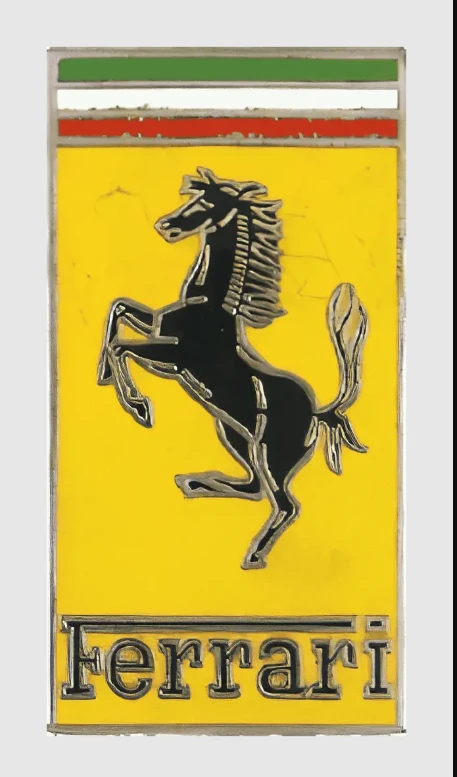
For the next version released in 1951, the team revamped the logo once again. This time the horse was made smaller, and the wordmark larger and more prominent. Now, rather than take up less than that a quarter of the entire logo, this new design featured a bigger sized font. This made the name easier to read, which was extremely important as Ferrari was fast becoming a global luxury performance brand.
Besides the wordmark, the tri-color was also made bigger. Moreover, each band of the tri-color, the prancing horse, the letters of the wordmark, and the entire outside edge of the logo, was outlined individually in silver-chrome raised borders. This design technique long used by the Porsche logo can make a logo stand out when done well.
1981 – 1994
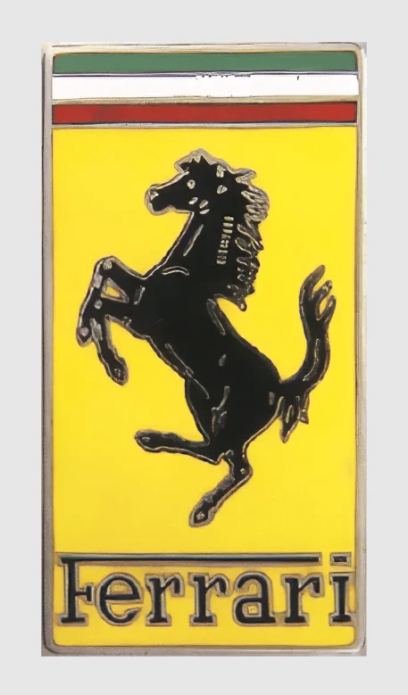
Improving on the previous design, the 1981 redesign made the outlines more prominent, the shades of color a little darker, and improved the overall cleanliness and visibility of the Ferrari logo. The little details on the horse, the small separation of the letter “i” in Ferrari, and the demarcation of each color’s band in the tri-color were more easily visible, making for an improved logo design.
1994 – 2002
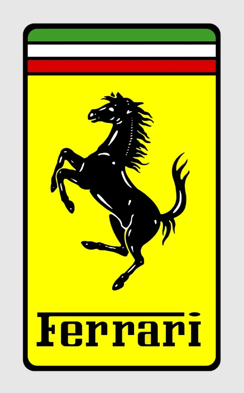
In 1994, as Ferrari was slowly moving towards more flat colors that complimented their design style, they were slowly removing those sliver-chrome design elements from their logos and branding. That, combined with the advancements of digital graphics design, meant that the resultant redesign was the sharpest and most clearly visible than any before it.
The logo design returned to the rounded edges of the 1947 design. But instead of a metallic outline, it was done in dark black. Moreover, the colors too were made more vibrant, with the canary-yellow standing out instantly, and the black wordmark and horse symbol contrasting beautifully to show even the tiniest of details in the design. This marked the first step towards the modernization of the logo for the most recognizable of Italian car brands in the world.
2002 – Present
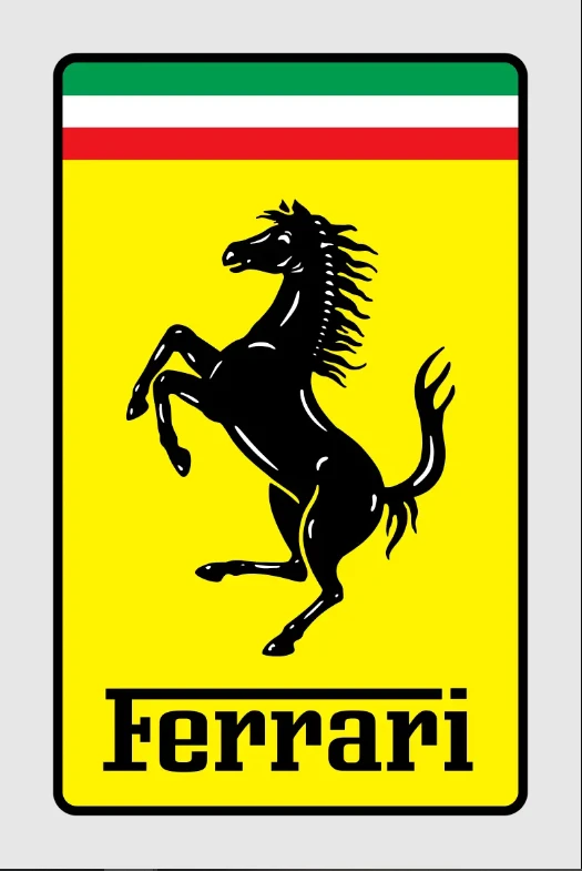
The 2002 Ferrari logo made the design a little wider horizontally, which increased the balance in design of the design elements. Another major change was that the outlines surrounding each band of the tri-color were removed, and the resultant design looked more like the Italian flag than it did with the individual bands.
This logo variant has been in use for more than two decades now, representing the Ferrari brand across various mediums successfully. And it is testament to its greater branding capabilities that after the 1951 variant, it is the longest-lasting design, and is still going strong.
Conclusion
To sum it up, the Ferrari logo is an iconic symbol of man’s drive to exceed the realms of possibilities and achieve the unknown. From its humble beginnings, it has managed to establish a racing dynasty unlike any other brand in the world, with other brands like Ford or Mercedes-Benz benchmarking their performance divisions against Ferrari’s cars at the peak of the brand.
Even today, when European car companies like Pagani, Koenigsegg, McLaren, and even Nissan have developed powerful cars that no one thought possible, Ferrari holds its own. Moreover, despite a number of electric car logos popping up in recent years, with options that may be more powerful than Ferrari’s cars, it hasn’t hurt the company. It is still considered the status symbol, and a leading name in high-end luxurious automobiles that offer a pure driving experience.

Logopoppin
Logopoppin is a graphic design agency that specializes in logo designing, web development, video production and advanced branding services. We love to innovate businesses with new age technologies, allowing them to improve their visual reputation.

