Table of Content
Discover the Secrets to Develop a Real Estate Website Design That Attracts Leads
For some people, real estate is nothing more than a smart financial transaction, while for others it is a much more emotional endeavor. Catering to a set of clientele that can vary so drastically across the spectrum can be a difficult challenge for a realtor or real estate agent. That is why it is important that they have a digital presence that somewhat paves the way for the transaction.
Now, there is nothing better than a website to establish a digital presence. And any real estate expert can find a plethora of real estate website ideas online that shows the popularity and success of this approach. However, finding the right ones that complement your business vibe can be somewhat tricky.
So how can you come up with the best real estate website design that helps your business grow by helping you connect with the right consumers? And how can they ensure that they get the maximum return on their investment for the website?
Let’s dive in and take a look at how to start the webs design process for a real estate website. Let’s decipher the secrets of some of the successful real estate websites to see how your web design services provider can incorporate them within your design.
Six Questions You Need to Ask Yourself to Find the Perfect Real Estate Website Ideas
For most real estate businesses, their website is a way for them to establish a digital presence, in order to boost their reach and attract leads. Moreover, there is also an aspect of establishing an authority for the business, by allowing and welcoming feedback from past customers as a way to generate trust in the market.
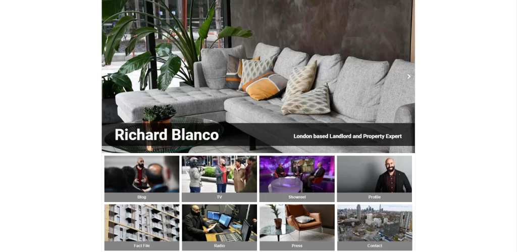
However, it is impossible for all businesses to have the same needs, even if they belong to the same niche. It means that no two websites are built the same. When it comes real estate websites, it is important that you stand out, especially if you are an independent realtor. That is because in such cases, your website isn’t just bringing in leads, it is also helping you establish a personal brand, like Richard Blanko’s website above.
So, the question that often pops up is that with such difference in needs, how can you find the right real estate website design ideas that can actually help you grow your business?
Well, in order to do that, you first need to assess your real estate business to find out exactly what it needs and expects from a website. That will help you find suitable real estate website designs, and help you establish a baseline for the effort and resources required to establish a solid website.
Now, there are many different questions you can ask of your business to establish a strong and accurate baseline. However, those who are new to the field would have no idea where to begin. While the questions would be adapted as per each real estate business, there are some queries that would remain constant.
- What are the goals for your real estate website? What do you expect from it?
- How much would this website design cost you in terms of time and resources?
- What type of consumer market do you plan to target – family homebuyers, vacation/second homebuyers, real estate investors, rentals, and etcetera?
- What is the vibe of your business? What message does your real estate slogans and branding portray?
- What type of content do you want to focus on in your website design – visual, AV, or textual?
- How easy should it be to add or update content to the website?
These are just some of the basic questions you need to ask yourself as a realtor business owner in order to create the perfect real estate website design.
Why Does a Realtor Need an Enchanting Real Estate Website Design?
So far, we have asserted that a real estate business, like any other business on the planet, needs a website to establish and grow itself. But the question is – how exactly does having a real estate website help its parent business?
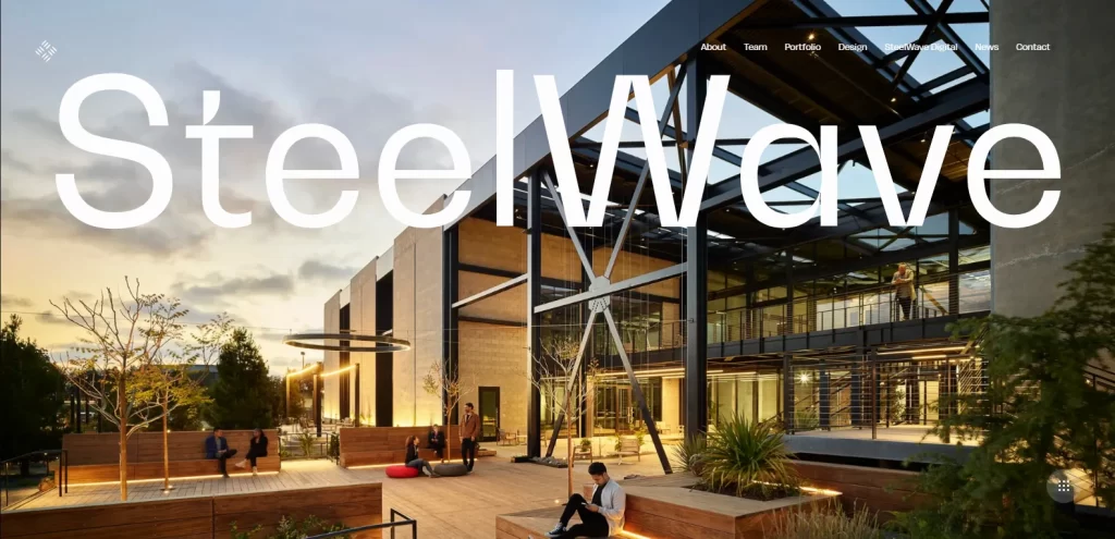
We all know the common adages that having a website helps establish a brand, bring in more customers, and more. But considering that the real estate industry is so hands-on and people-oriented, does having a website offer a significant advantage for a business to invest in it, like the Web3-style Steelwave website?
Well, it does. Let’s take a look at some ways as to how a well-designed, quick-loading real estate website can help your realtor business grow.
- Many realtor businesses have great real estate logos and slogans. In today’s digital world, a website allows you to get your brand message out to the target consumers, building relationships and generating leads.
- Most people use their phones to browse the internet on the go today. If they are able to look up your business and its services at any time of the day via a website, there is a greater chance of them becoming a lead.
- People today place a greater value in their time. That is why by optimizing your website for better functionality on mobile phones, you would be able to get more leads.
- Scheduling a call or visiting a realtor may seem like a big step for someone who is on the fence about getting a new property. However, if they have the chance to visit a realtor website that has rich visuals yet loads quickly (in less than two seconds), the realtor will have a better chance of fostering their interest.
Top Seven Real Estate Website Ideas to Teach You the Secrets to a Great Realtor Website
Now that we have seen why a realtor business needs good real estate website ideas, and the web design principles to develop the perfect real estate website design, we are ready for the next step. This next step consist of evaluating the websites of successful real estate businesses, those that match our brand vibe, and deciphering their secrets for success.
That is because unlike you, these businesses have already navigated the turbulent tides of business and found a solution that works well for them. Learning from their experience will help you get a leg up in establishing a strong online presence, while making it somewhat easier for you to one up those established realtor businesses.
To make this process easier for you, we have compiled a list of some amazing realtor websites to inspire your website’s design. Let’s dive in and discover the stories that they tell.
The New England Real Estate Company
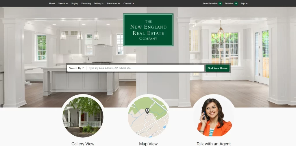
Let’s start with the first website on our list. This real estate website represents The New England Real Estate Company, and it is a treat to behold. Buying a house can be a stressful task, whether you are buying one to live in or as an investment. And with their clean, friendly-looking design, the company aims to make the process easier for their clients.
Visiting the website greets you to a pristine white interior of a house, with an airy and open floor plan perfect for a family home to establish your roots. The color combinations used are aesthetically calming, with a dark green on white motif all across the site’s design.
Centered in the hero section of their homepage is a search bar that allows potential customers to browse their list of available properties. The search button subtly plays on the buyer’s emotions, with the words “Find Your Home” on it. Moreover, in order to make the process easier for their consumers, the search bar allows them to search according to various parameters of choice. Those parameters include zip code, neighborhoods, cities, schools and school districts, county, special keywords, architectural feature, or even a direct address.
The most sought-after information, including the gallery and map view of desired area are available just beneath the search bar. Moreover, the contact page is also grouped with these two, in order to get a hot lead to contact the company right away. Overall, this is a great website to emulate if you desire clean layouts and easy navigation.
Beach & Bartolo
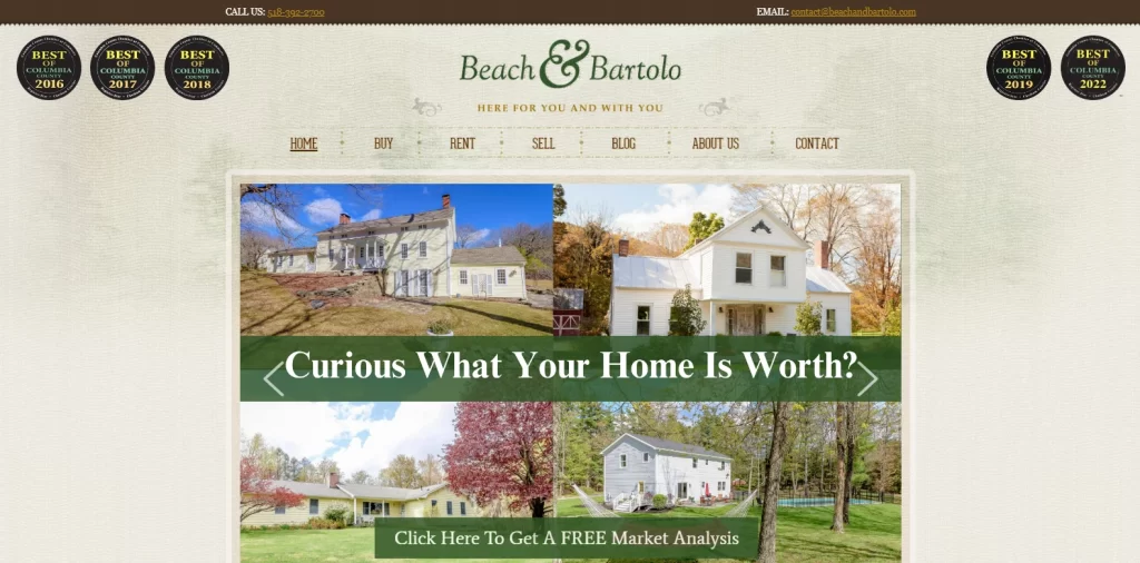
Next on our list is Beach & Bartolo Real Estate Company. Earlier we talked about your realtor website helping your company establish trust within the customer community. And there is no better example of it than this website here.
Unlike some of the other entries on this list, the website for Beach & Bartolo is focused solely on its service area. When it comes to optimizing your website for a specific locale, local SEO is one of the favorite real estate marketing ideas used by companies.
Their website’s background is patterned to look like a heavy, textured paper, over which is centered a bordered window that displays the web content. Their homepage displays a set of badges proclaiming them the top realtor group in Columbia County five times out of seven years. Moreover, the page’s hero section displays the perfect hook to draw in customers – a free market analysis for a client looking to sell their property.
Overall, the way this website aims to connect with its target consumers is something rarely seen addressed in web design.
Long & Foster Real Estate
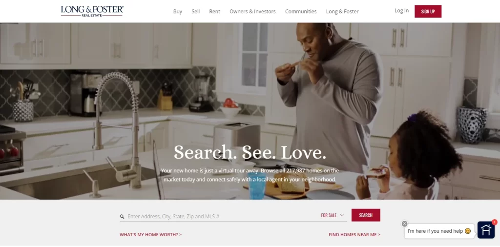
Long and Foster Real Estate company is another real estate company that has assessed its target consumers extensively, and has crafted a website that perfectly plays to their emotions. Primarily targeting people looking to buy the perfect home for their families, their entire imagery is based on families enjoying each other’s company within great homes.
The design is simple, yet expressive. The only element designed for visual impact is the hero fold, where a slideshow of GIFS loops around showing families enjoying their homes. Overlaid on that imagery is a simple tagline that appeals to the target consumer’s desire – to make the buying process easy and simple.
Represented by the words “Search. See. Love”, the search bar just beneath the headline makes it easy to find your desired property, or put one up for sale. Catered mostly towards buyers, the search bar allows you search available properties based on city, state, zip code, MLS number, and even direct address. Moreover, if you are using it on a mobile phone, you can easily use its GPS feature and use the option to “Find Homes Near Me”.
The ease of navigation, as well as the overall vibe of the website makes it one of the best real estate website ideas catered towards homebuyers with families.
DMG (Dawn McKenna Group)
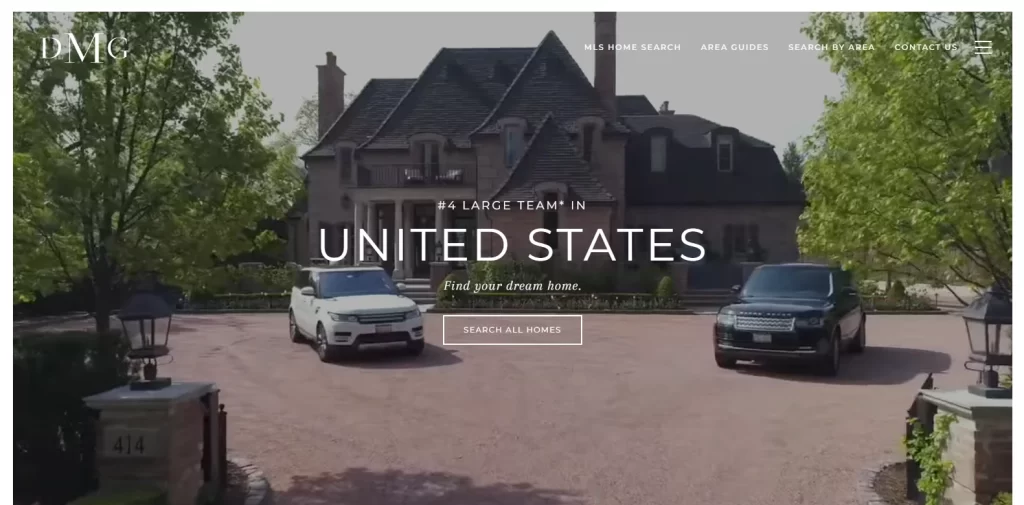
Dawn McKenna Group, known as DMG, is a realtor company that specializes in upper class clientele who have money to spend on luxury summerhouses and beachfront properties. Ranked the 4th largest realtor group in the United States, the company website is designed to portray this to perfection.
The background of the website is a full-sized GIF that flows through a set of glorious views of beachfront properties and luxurious homes and villas, subtly portraying their message to the right clientele. Understanding that catering to a set of potential customers with little to no financial constraints requires a different approach, they let their imagery and subtle messaging do the work.
The result is one of the more premium real estate website ideas on the list that sets the right tone perfectly for its target consumers.
Sage Homes
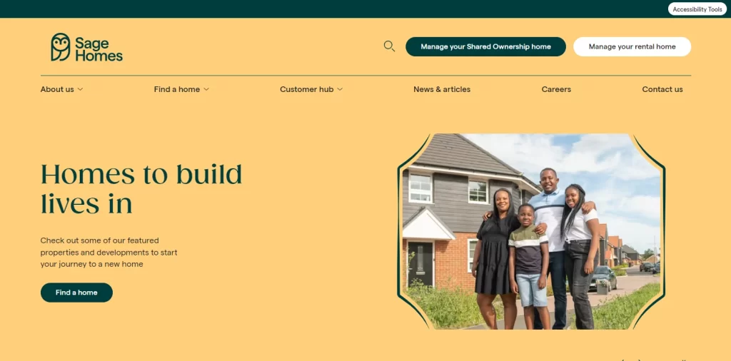
The real estate website for Sage Homes takes using color theory to target the right emotions to the next level. Catering primarily to families just like a few other companies we discussed earlier, they have gone for a simpler style of web design rather than one focused primarily on visuals.
The core of their design is their use of pastel shades for their background, including eggshell, light pink, and pale orange to give the design a homely vibe. The use of line-art for picture frames and sectional demarcations, as well as the use of a soft, yet stylishly modern font, makes for a website that easy on the eyes, especially for people with families.
Overall, this real estate website design is the perfect example of marrying simplicity with subtle aesthetics to create a visual impact that is more than the sum of its individual parts.
Sharlene Chang Real Estate
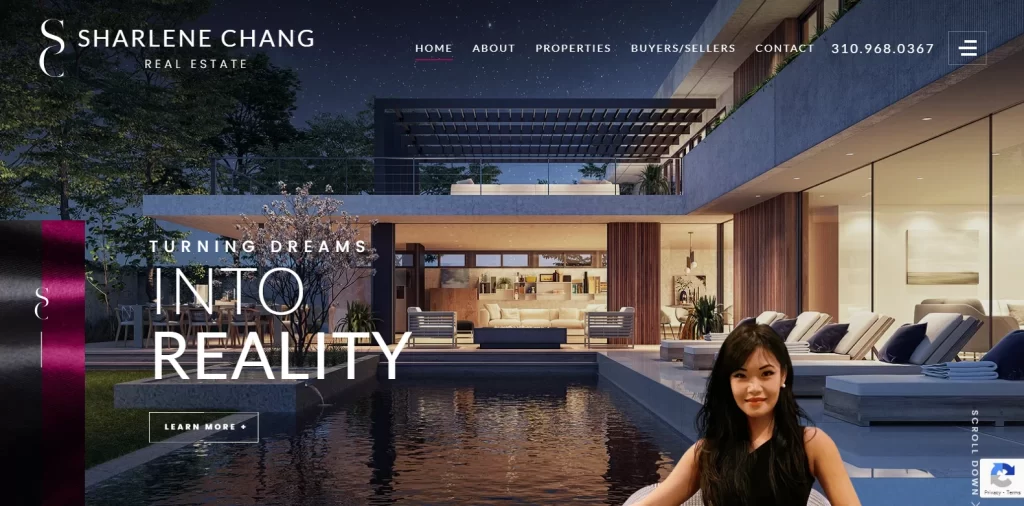
Coming to the last two on our list, Sharlene Chang’s real estate website is the perfect harmony of personal branding examples and business development. Managed by sole realtor Sharlene Chang, the company deals with upscale properties, catering to clients with purchases dictated by their desires rather than budgets.
The website opens up to a hi-res image of a large house with a full-sized pool and sundeck, and a covered patio attached with a raised fire pit surrounded by comfortable seats. The lighting is perfect, which exudes a sense of luxury and prosperity, perfect to attract the right client. The first image is a classic example of a decadently luxurious design concept, a process that you will rarely find in any web design guide, but one that leverages visuals to the max.
Rather than playing on the emotional need for a home, a common tactic of realtors targeting family homebuyers, this luxury realtor site claims to turn dreams into reality. And this imagery is further enhanced by a large portrait of Sharlene herself overlaid over the design, flanked by a royal purple and black bar displaying her stylish logo. Overall, if indulgent luxury is what you are after, then this real estate website design is perfect for you.
Aaron Kirman
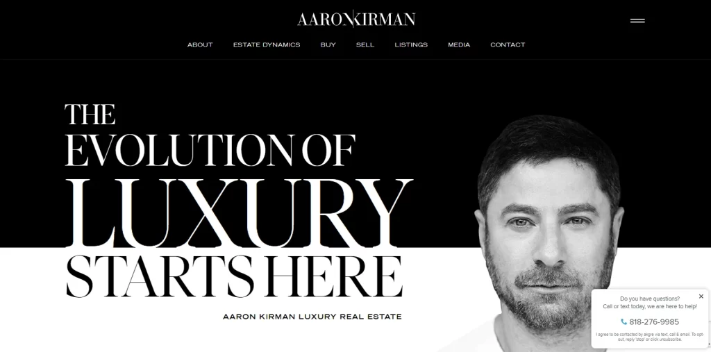
The last one on this list is Aaron Kirman’s real estate website. Another luxury real estate website, this design takes a different approach to the one a couple of others on this list have chosen. Rather than go for rich colors or great aesthetic imagery, this real estate website design is all about that elite, luxury vibe.
With most modern high-end design now featuring monochromatic themes like stainless steel, or shades of black or white, this website targets customers who are into that chic modern style. The white and black color scheme makes for a harmonious balance in design, making it a treat to look at. And that sentiment is echoed by the addition of the business tagline featured at the top of the homepage.
Starting out in big, bold letter, the words “The Evolution of Luxury Starts Here – Aaron Kirman Luxury Real Estate”, this website let’s its visitors know exactly what it offers. Opting for minimalism in its design as well as other aspects, the textual content gets right to the point. On the right side of the page is a portrait of Aaron Kirman himself, and the bottom cornet has the company’s contact information clearly visible for all.
Overall, while it may seem simple, this is one of the hardest real estate website ideas to pull off, and this website has accomplished it successfully.
Further Reading:
Conclusion
Nevertheless, if you still find that process difficult, then the article above will be a great guide to start developing your real estate website design.
To sum it up, for someone new to it, finding the right real estate website ideas may be a bit difficult. However, if you understand your business and its needs, as well as the expectations you may have from that website, you will be able to start that journey easily. Also, if you are looking to sell your web design services to startups then this guide will serve as an inspiration for you to create visually appealing websites.

Logopoppin
Logopoppin is a graphic design agency that specializes in logo designing, web development, video production and advanced branding services. We love to innovate businesses with new age technologies, allowing them to improve their visual reputation.

