
Table of Content
Discover How to Create an Awesome Landscaping Website Design That Draws the Eye
Having a lawn or garden is of little use if it is not taken care of properly. Even if you want it to grow wild, you still need to instill a little order into that bastion of floral will to ensure that you are able to enjoy it. More often however, is that people require landscaping and gardening services to keep their gardens kempt and in tiptop shape to enhance the beauty of their homes.
Now, most businesses who are not serious about growth and expansion tend to ignore the benefits of a good website. Some understand that a website is important, but fail to leverage its full potential. The ones who are serious about it, however, inspire some great landscaping website ideas. And they are the ones you should look to when creating your own landscaping websites.
Today, landscaping services are a dime a dozen. However, among the rabble you will find the occasional gem that will transform your patch of grass and shrubs into a garden of peace and Zen. In order to find that service, people often turn to the internet. And that means that they would be evaluating those businesses based on their landscaping websites.
The question however, is that what it is about these landscaping websites that makes them such a hit with their consumers? And what elements does a web design services professional need to implement to create a landscaping website design that rivals these giants? Let’s dive in and discover the answer to these question and more.
The Need for Landscaping Website Ideas and Their Impact on Business Success
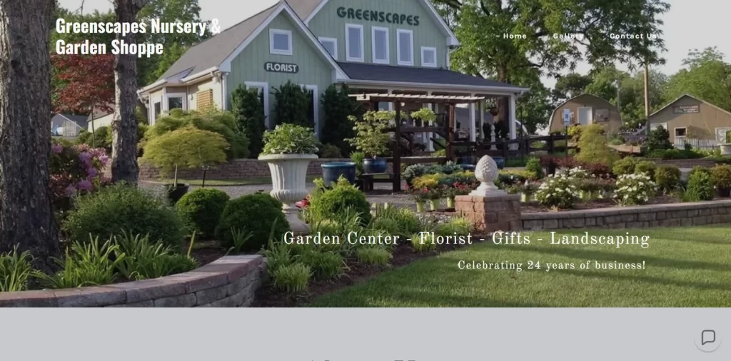
Let’s start the topic on one of the simplest yet most commonly asked question – why does a landscaping business need a website?
Well, to put it simply, the digital-centric global society of today has made it necessary to have a website, especially if it is a business intent on growing, such as Greenscapes. Nearly everything, from business discovery, to communication, review-based shortlisting, and more, is done online nowadays. And people expect a successful company to have a website and at least one well-maintained and updated social media account.
That means that old practices such as word-of-mouth marketing, or searching through the classifieds to find the services you required, and more, are now of no use. In fact, even the old practice of using area-centric landscaping and lawn care business names, has been somewhat phased out, although it is still a highly potent technique. And that is a good thing.
While it may be true that developing a website for your landscaping business may be a hassle, but the opportunities that brings are great. From helping establish a strong online presence, to providing customers with an opportunity to garner reviews that are easy to find, and will help improve your conversion rate, websites are important.
Now, what that will do is set you apart from a large portion of your competition, as they would have no website to compete with. Moreover, it would allow you to target the right kind of customers your business desires, as well as fulfilling a lot of the pre-work that goes into converting a potential lead. And, it would make it easier for you to target a far larger potential market through your website, than a business relying on traditional marketing and promotional techniques would.
These are just some of the reason why you should be looking at the top landscape website ideas when looking to create your own.
What Questions Should Your Landscaping Website Design Answer for the Customer?
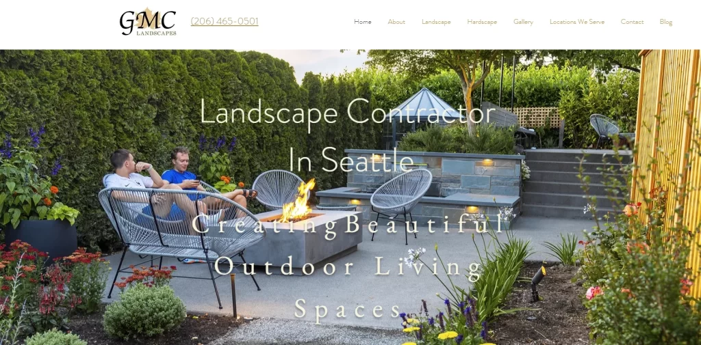
We have looked at some of the reasons why a landscaping business would need to discover some great landscaping website ideas. And one of the things we mentioned earlier was that a website helps a business do a lot of the pre-work before the lead lands into your office for conversion.
Now, when we talk about-pre-work, it can include everything from subtle messaging, to attractive graphics that draw and retain the gaze, making it hard to go back, like in GMC’s website above. And it includes the ability to showcase your customer testimonials and portfolio.
In fact, pre-work here refers to all the information and work required to turn a casual lead into a hot one, ready for conversion. And that requires your website to answer some burning questions that a potential customer may have. But what are these questions that your landscape website design needs to answer?
Here are some of the most common ones that need to be answered in your design if you want your website to be a success.
- Does your business provide the exact services that a customer is looking for? This requires that your major service or services set be mentioned clearly near the top of the homepage, so that a potential customer is able to tell whether you are a business suited to their needs.
- Does the business serve the customer’s geographical region? Physical services like these are bound to the business’s geographical location. That means there is a limit as to how big of an area your landscaping business may serve. Your service area should be clearly mentioned on your homepage, and as near to the top as possible to ensure that irrelevant leads are weeded out.
- Does your business do a good job? While times have changed, people still desire to know the reviews of a business they plan on patronizing. While there are external services that provide a review function of businesses in an area, they are generally used to provide transparency. However, you can use your customer testimonials on your site to develop a trust and connection with a potential customer, boosting conversion.
- Do your business prioritize quality? Visuals provide a much better assessment of your quality of work than words. That is why a gallery of images and videos that gives a before-and-after, or even the end-results of beautifully planned and maintained landscapes, is a great way to show your quality.
- How can a customer connect/schedule an appointment with your business? At the end of the day, no matter how good you design your website to portray your services in the best light, it would be a failure if the customer weren’t able to contact you easily. Ensure that a potential customer knows how to book an appointment as soon as they visit your website.
Top 7 Landscaping Website Ideas to Inspire Your Own Design
So far, we have learned why a landscaping business needs to come up with suitable landscaping website ideas, and looked at some brief design directives to ensure a successful landscaping website. However, some websites follow these directives to a T and still fail to convert or attract the right customers to their business.
That is because businesses like landscaping have different niches, with a wide difference between the needs and aesthetics of the target markets. Some would want nothing more to make their front lawn or backyard garden into something more aesthetically pleasing, while others look for a landscaper that turns their vast expanse of lawns into something fit for royalty.
That is why, you need to assess your business and discover what type of target consumer it serves, and mold its design accordingly. And in order to do that successfully, you will need to find the right website design ideas that suit your vibe perfectly.
To get you started on this journey, we have compiled a list of some amazing landscape website designs. Let’s take a look at the secrets they have to offer.
H&M Landscaping LLC
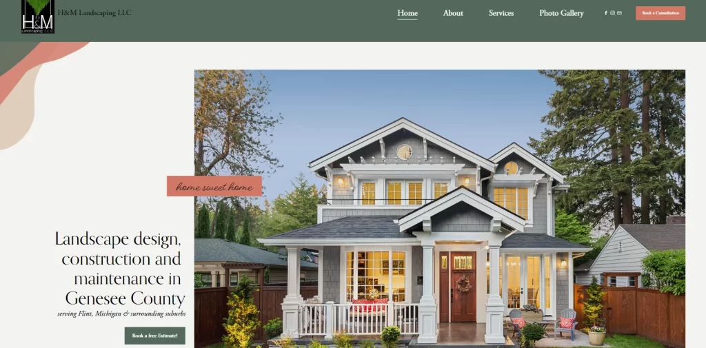
The first landscaping company on our list is H&M Landscaping LLC. At first glance, their website may seem a bit simple, but that is exactly the type of charm it is going for. The landscaping website design is a mix of hi-res imagery, attractive colors, and stylish fonts that are perfect for to capture the eye of their target consumers – regular homeowners and small-to-medium businesses.
The layout and structuring of the website is quite traditional, with the content interspersed with calls-to-action, and each fold a part of a carefully planned visitor journey. From the first fold which offers a free consultation, to the subsequent folds which direct a person to the company’s services and contact pages, it shows that the designers have put some thought into it.
Generally, you would assume that a landscaping company would use shades that are more commonly associated with foliage; that is green or brown. However, considering that they are catering to homeowners, the added pop of shades of pink in the design give it a more homely feel, creating a perfect harmony between the shades used in these unorthodox color combinations.
Talley Landscape Architects
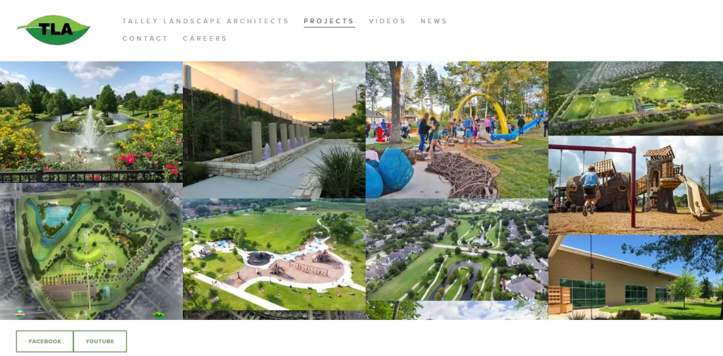
Next, we have the website for Talley Landscape Architects, who opt for an entirely different approach compared to the last landscaping website we discussed. Unlike H&M Landscaping, who offered services for homeowners and SMBs, Talley primarily works on larger commercial projects.
These projects include the design and development of community parks, nature parks, and hiking trails. And as their work encompasses a large variety of publically accessible examples, they have opted to let the quality of their work speak for itself.
Tally LA decided to forgo the traditional website style that consists of a mix of visuals and text, and instead opted for a portfolio style design layout. This makes it one of the unique landscaping website ideas out there, and even on this list.
Opting for a plain white background, the hero of the page isn’t just a single image, but rather a grid of images with hover actions displaying the name of the project. Moreover, you could even click on those pictures to view the details of that project, as well as open up more images of their landscaping for that project. Overall, this is a great website design to emulate.
Branch Out – Landscape Design by Jenny Crawford
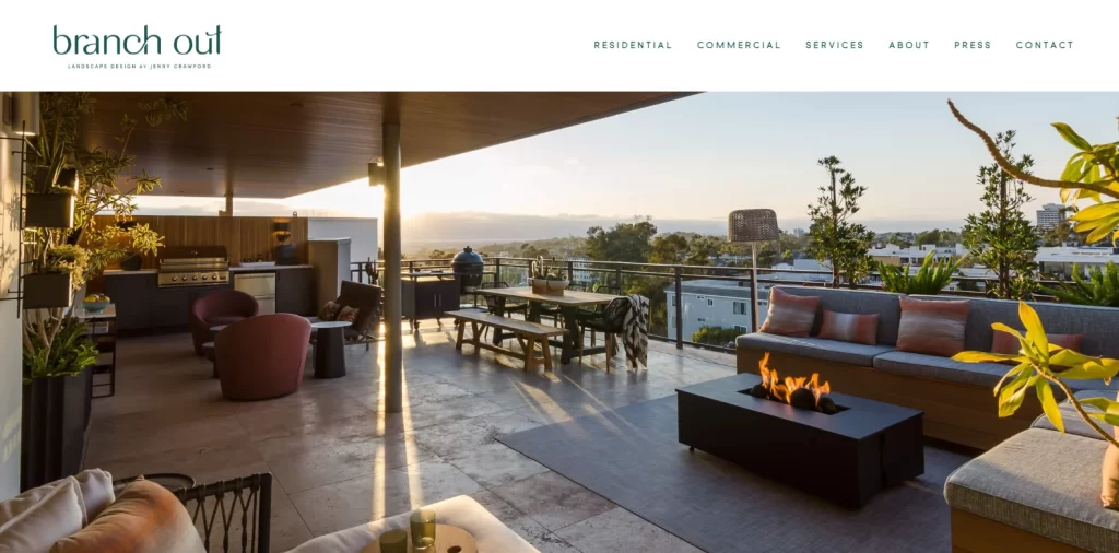
Branch Out is an interesting addition to our list of landscaping website ideas, as this is more of a mix of landscaping with luxe living. Managed by expert landscaper Jenny Crawford, Branch Out serves both residential and commercial clients.
However, unlike the first one on this list, their target consumers are vastly more affluent. As such, Branch Out’s approach towards web design and the strategy to get their message across is quite different from that one.
For one, the hero of the website’s homepage is a slideshow of high-resolution images that are stretched out to the width of the page, showcasing the aesthetic quality of Crawford’s work. The designs are not just portrayals of her work with flora, something many landscapers end up doing. Rather the images focus on the landscaping elements like pools, patios, and other creature comforts and how they interact with the surrounding greenery tastefully.
Overall, if you wanted to know what it takes to create a landscaping website designed for the affluent, then Branch Out is the perfect landscaping website design for you to follow.
Elizabeth Pena Landscape Designer
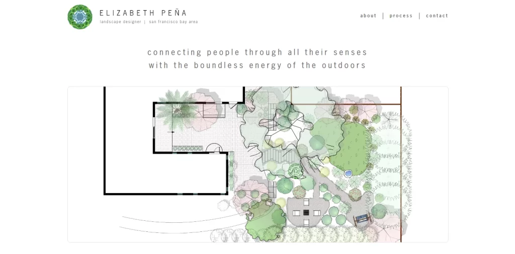
If unorthodox designs are what you are after, then the website for Elizabeth Pena Landscape Designer is perfect for you. Unlike the landscaping websites we have discussed so far, which rely heavily on hi-res imagery, this website relies on simple digital graphics made to look like landscape layout plans to get their message across.
As Elizabeth Pena is primarily a landscape architect, it makes sense that rather than relying on the end results, she would focus on her strengths to target the right customers. The simple, pastel color scheme, interspersed by dark black strokes markings on the layouts, make for a great visual aesthetic that is unmatched by other landscaping website ideas on this list.
Overall, this website shows the essence of a professional business website that also serves as one of the best personal branding examples in this niche.
Rainforest LA
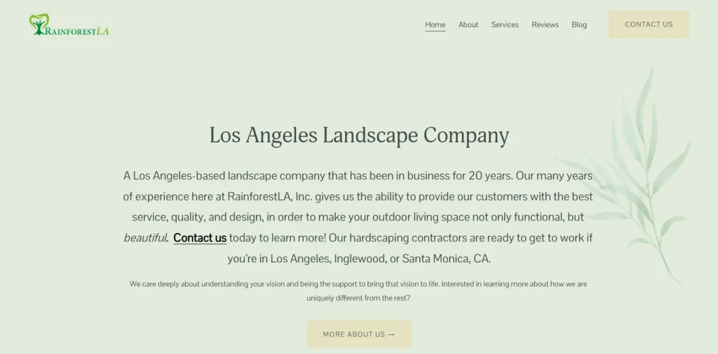
Next up is a website that takes minimalism and simplicity and raises it to an art form. With a background that is light pastel green with a light image of a couple of small plants embossed at one end, the Rainforest LA website opts out of using an image for its hero. Instead, it relies on a paragraph-long piece of text, which surprisingly works better than an image would have at that point.
Even the subsequent folds have an equal distribution of text and images, which makes this one of the most text-focused landscaping website designs we have ever seen. However, the layout of the website somehow makes it work, keeping the visitor hooked to the end of the page. Moreover, with the name and logo of the website following the theme of minimalism and simplicity, the overall vibe of each element complements the other.
That shows that while text-heavy sites are often disparaged, if designed well, they can work quite well.
Sydney Gardenscapes
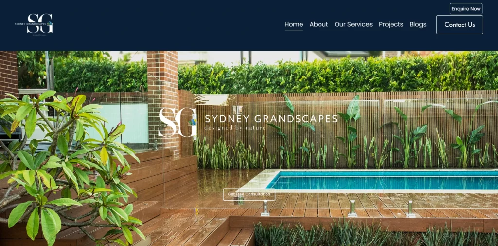
Sydney Gardenscapes is a landscape design company that shows the importance of embodying its primary service in all its elements. From the company’s name to its website imagery, every element asserts that the landscaping company deals exclusively in garden design for homeowners and small businesses. And the logo is one of the most luxurious lawn care logos we have ever seen.
There is an element of elegance in the company’s portrayal. That shows that they cater to customers who have a little money to burn to bring their dream gardens to life, sparing little expense. Even the website’s hero image displays an aesthetic image of a house’s pool, surrounded by dense ferns in a well-planned design. Paneled in dark wood, the area surrounding the pool contrasts sharply with the blue of the pool, and the white-gray marble at its edges.
At the center of the image is the name of the company, flanked by the company slogan “Designed by Nature”, and a small button beneath it offering a free initial consultation to the customer.
Hess – Landscape Architects
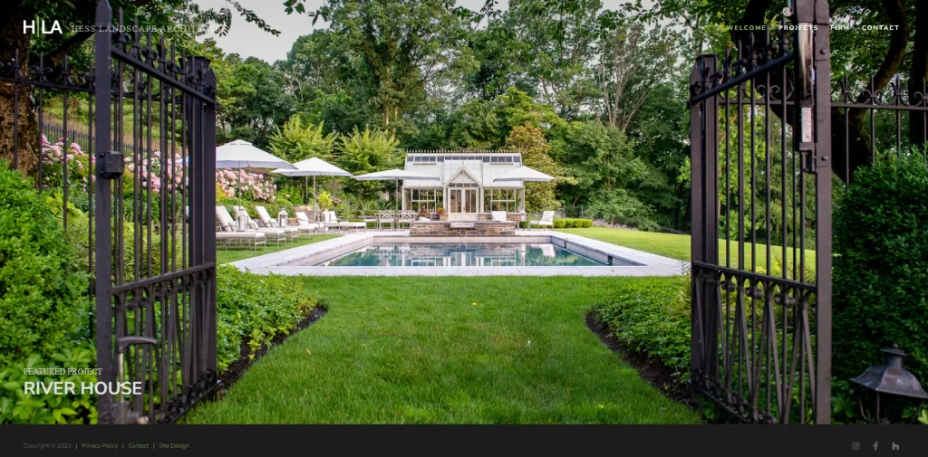
Finally, we come to the last entry on this list. Hess Landscape Architects deals primarily with a premium set of clients, as evidenced by one of the only chic-elegant landscaping logos on this list. Instead of focusing on backyards and small lawns, they primarily deal with large residential properties, designing and building exotic landscapes meant to transport you out of this world.
From elaborate Zen gardens to themed, hidden garden style projects, Hess LA has a website that perfectly displays the quality of its services as well as the type of clients it serves. That is evident by the hero of its homepage, which is a slideshow of its top projects, displaying amazing photographs that show them in all their glory.
What sets Hess apart is that rather than just building something simply pleasing, they work to bring amazing visions to life, building one-of-a-kind landscapes that are hard to forget. Overall, if you want to develop a website that caters to a high-end clientele, this is a great website to emulate.
Conclusion
To sum it up, the perfect landscaping website ideas depend entirely on your landscaping business’s niche. If your business’s vibe aligns well with the landscaping websites you are researching, then they would be the ideal sources of inspiration for you. However, if your specific niche doesn’t match, chances are that your resultant landscaping website design would not be able to represent your brand properly.
If you look at any web design guide on the internet, one of the things they all stress on is to find inspiration from sources that match your brand as closely as possible. That way, you would actually be learning from someone who has established their brand within the same or similar target market as yours. And their experience will actually help you get a leg up on your closest competitors.
So, if you are looking to create a landscaping website, this article is a great place to start.

Logopoppin
Logopoppin is a graphic design agency that specializes in logo designing, web development, video production and advanced branding services. We love to innovate businesses with new age technologies, allowing them to improve their visual reputation.


