Picture this: a hungry customer grabs their phone, searches for a great place to eat tonight, and lands on your restaurant’s website. Within seconds, they’ll decide whether to make a reservation or bounce to a competitor. That snap judgment isn’t based on your food (they haven’t tasted it yet). It’s based entirely on your restaurant website design.
And the stakes are high. According to Restaurant Dive, 69% of U.S. adults say a restaurant’s website directly influences their decision to dine in, while 30% are deterred by an outdated look alone. Meanwhile, 70% of customers prefer ordering directly from a restaurant’s own website rather than through third-party delivery apps.
So if your website still relies on a clunky PDF menu, stock photography, and a generic template, you’re leaving money on the table. In this guide, we’ll walk through the best restaurant website design ideas to inspire your next redesign, along with the must-have features and trends that are defining great web design for restaurants in 2026.
Why Does Your Restaurant Website Design Matter So Much?
A great restaurant website design is the digital equivalent of curb appeal. It’s the first impression that determines whether a customer walks through your door (or taps “Reserve a Table”). Here’s why investing in your site is non-negotiable.
Customers research before they eat. Research shows that 88% of diners search online before choosing a restaurant. Your website is where they’ll look for your menu, hours, location, and ambiance. If they can’t find this information quickly, they’ll move on.
Websites outperform social media for conversions. While Instagram and TikTok are great for discovery, your website offers a more controlled, immersive experience. It’s the place where browsing turns into booking. You control the narrative, the layout, and the user journey from landing page to reservation confirmation.
Direct ordering saves you money. Third-party delivery apps charge 15–30% commission on every order. A well-designed website with integrated online ordering lets you keep more of your revenue. 67% of consumers prefer ordering directly from a restaurant’s website or app, and 61% say they do it specifically to support the restaurant.
Bad design actively repels customers. A poorly designed restaurant website doesn’t just fail to attract customers; it pushes them away. According to industry research, roughly one-third of consumers are discouraged by poor navigation, and nearly as many are turned off by outdated design elements. Your website should reflect the quality of your food and service.
Restaurant Website Design Ideas to Inspire Your Next Redesign
The best restaurant websites share something in common: they translate the dining experience into a digital format. But how they do that varies wildly based on cuisine, price point, and brand personality. Here are 10+ restaurant website design ideas organized by style, each with a takeaway you can apply to your own site.
El Pez Kitchen: Fusion Cuisine, Fusion Design
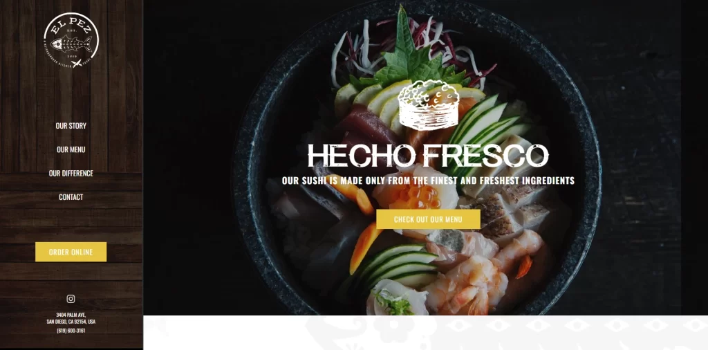
El Pez Kitchen in San Diego blends Japanese and Mexican cuisine, and their website reflects that creative pairing perfectly. One side of the page features warm wood-panel textures (reminiscent of a sushi bar), while the logo incorporates distinct Mexican styling elements. The dish photography bridges both cultures seamlessly.
Takeaway: If your restaurant combines multiple culinary traditions, let your website design tell that story visually. Use textures, colors, and imagery that represent each influence without overwhelming the visitor.
The Fat Duck: Avant-Garde Storytelling
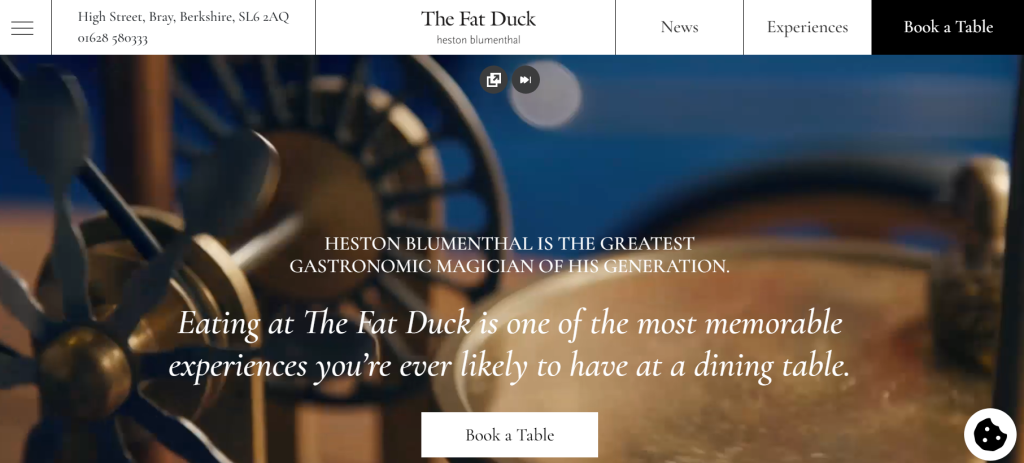
Heston Blumenthal’s three-Michelin-starred The Fat Duck takes a bold approach: there’s barely any food photography on the homepage. Instead, the site uses hand-drawn illustrations, subtle animations, and a storybook aesthetic that mirrors the restaurant’s famous multisensory dining experience.
Takeaway: For high-concept restaurants, sometimes less food photography is more. Focus on conveying the experience and story rather than simply showcasing plates. This approach works best for destinations where the dining journey itself is the product.
KOI Dessert Bar: Upscale Elegance Through Slideshows
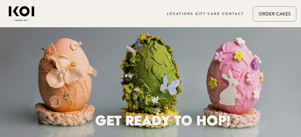
Chef Reynold Poernomo’s KOI in Sydney presents a rolling slideshow of high-resolution images showing the restaurant’s interior, plated desserts, and dining atmosphere. The overall feel is sophisticated and aspirational, perfectly matching the fine-dining dessert concept.
Takeaway: A well-curated image slideshow on your homepage can communicate your restaurant’s ambiance instantly. Invest in professional photography and rotate images that highlight different aspects of the experience: the food, the space, and the people.
Le Bernardin: High-Resolution Food as Hero
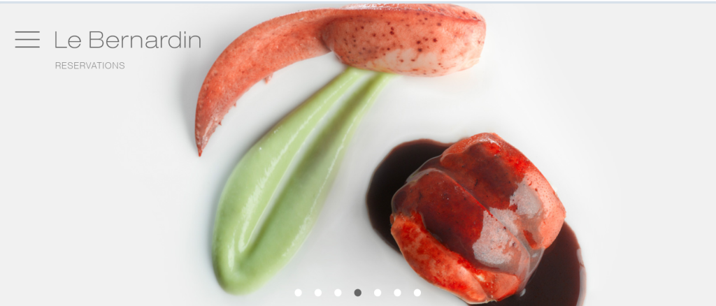
Eric Ripert’s Le Bernardin uses a neutral background to let high-resolution images of their dishes do the talking. Sharp pops of color from the food contrast against dark and light shades, creating a visual effect that is both appetizing and refined.
Takeaway: When your food is visually stunning, make it the hero of your website. Use a clean, neutral background and let full-width, high-quality food photography take center stage. This is especially effective for fine-dining or seafood-focused restaurants.
El Catrin Destileria: Always-Visible CTAs
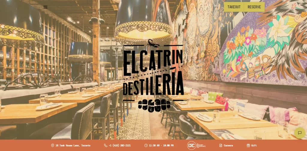
El Catrin Destileria, a Mexican restaurant and distillery, does something incredibly smart with its restaurant website design: no matter where you scroll on the page, the buttons for “Order Takeaway” and “Reserve a Table” are always visible. The site’s Latin-inspired color scheme and food photography are interspersed with concise text snippets.
Takeaway: Persistent, always-visible call-to-action buttons are one of the most effective conversion tools for restaurant websites. Make it effortless for visitors to book or order from any point on the page.
Cantilever Chippy
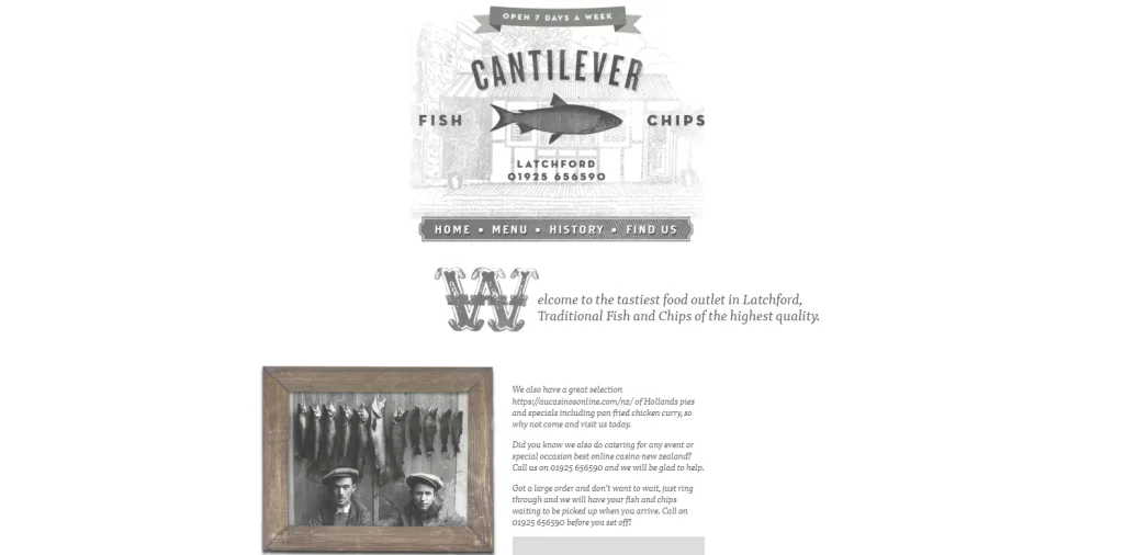
This New Zealand fish-and-chips shop goes all-in on a vintage, newspaper-style design with a monochromatic color scheme. The restaurant logo is one of the strongest on this list, perfectly communicating the brand’s identity — proof that great visual branding, from restaurant signage to web design, makes all the difference. The page layout draws your eye naturally from section to section.
Takeaway: A unique design theme (like vintage or retro) can set your restaurant apart, especially for casual dining or takeaway concepts. Just make sure the design doesn’t sacrifice usability. Your menu, location, and order buttons should still be easy to find.
Jungsik
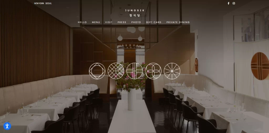
Jungsik, a pioneer of modern Korean fine dining with locations in Seoul and New York, features a clean, minimalist website. A full-sized image of the restaurant serves as the homepage hero, overlaid with Korean calligraphy. Navigation is simple and intuitive, and the site includes accessibility options for visitors.
Takeaway: Minimalism works beautifully when paired with strong cultural identity. If your cuisine has distinct cultural roots, weave those elements into your design through typography, symbols, or color palettes without cluttering the layout.
Noma: Seasonal Storytelling
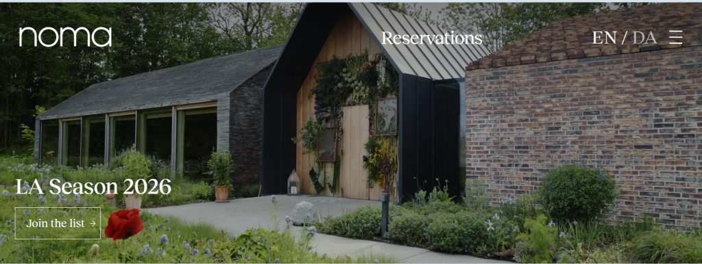
Noma’s website is a masterclass in minimalist restaurant web design. The imagery changes based on the current season, reinforcing the restaurant’s deep connection to nature and its commitment to seasonal ingredients. Online reservations, a waitlist, and contact details are all easy to access.
Takeaway: Updating your website imagery seasonally keeps the site feeling fresh and signals to visitors that your restaurant is active and evolving. It’s also a subtle way to promote seasonal menus.
Mida: Color as Brand Identity
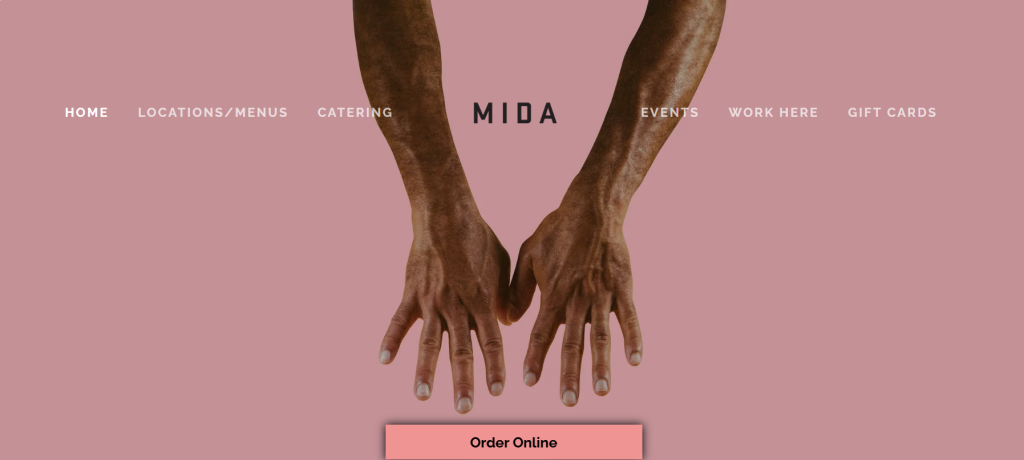
Boston’s Mida uses a distinctive Millennial pink background, sleek sans-serif fonts, and moody photography to create a cool, urban identity. The effect is immediately clickable and memorable, perfectly suited for a trendy Italian spot.
Takeaway: Don’t be afraid to use an unexpected or bold color combination as your primary brand identifier. When done right, a distinctive color palette can make your restaurant instantly recognizable online.
Girl & the Goat: Smart Navigation
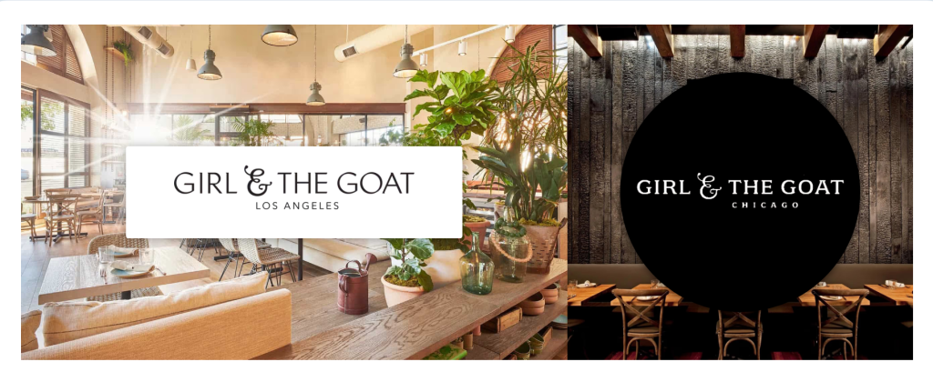
Chicago’s Girl & the Goat uses a sleek side navigation bar that keeps all key links visible without competing with the visual content. The layout is clean, and information hierarchy is clear: what you need is always one click away.
Takeaway: Navigation can make or break a restaurant website. Side or sticky navigation menus keep essential links accessible without scrolling. This is especially valuable for restaurants with multiple locations or complex menus.
Atelier Crenn: Narrative-Driven Design
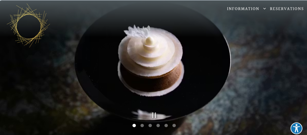
Chef Dominique Crenn’s Atelier Crenn uses a black-and-white theme that puts the focus on the chef’s personal story and philosophy. It reads almost like a digital memoir, drawing visitors into the world behind the food.
Takeaway: For chef-driven restaurants, brand storytelling through the website can be a major differentiator. Share the chef’s journey, culinary philosophy, and the ‘why’ behind the restaurant. A memorable restaurant slogan can tie this narrative together across your website and beyond
What Are the Essential Elements of a Great Restaurant Website?
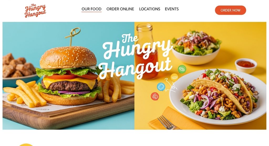
Beautiful design is important, but a restaurant website also needs to function as a practical tool. The most effective restaurant website designs balance aesthetics with usability. Here are the elements you can’t afford to skip.
Clear Contact Information and Hours
The number-one reason people visit a restaurant’s website is to find basic details: your address, phone number, and hours of operation. Put this information front and center on your homepage, not buried in a footer or “About” page.
Web-Based Menu (Not a PDF)
PDF menus are one of the most common mistakes in restaurant web design. They’re clunky on mobile devices, can’t be crawled by search engines, and create unnecessary friction. Build your menu as a native webpage with clear categories, prices, and dietary labels (vegan, gluten-free, etc.).
Online Reservation and Ordering Integration
With 87% of restaurant operators now using some form of technology to manage operations, integrated reservation and ordering systems are expected by customers, not optional. Tools like OpenTable, Resy, or built-in ordering platforms should be seamlessly woven into your site.
Mobile-First Design
Most customers discover and browse restaurant websites on their phones. If your site isn’t responsive and fast-loading on mobile, you’re losing potential diners before they even see your menu. In 2026, mobile-first design is the baseline, not a bonus.
Professional Photography
High-quality food and interior photography is non-negotiable. Research shows that 65% of customers say menu photos influence where they eat. Invest in a professional shoot that captures your dishes, space, and team.
Social Proof and Reviews
Integrate your best reviews from Google, Yelp, or TripAdvisor directly on your website. You can also embed your Instagram feed to showcase user-generated content. With 88% of diners trusting online reviews as much as personal recommendations, social proof is a powerful trust builder.
How to Build Your Restaurant Website: A Step-by-Step Process
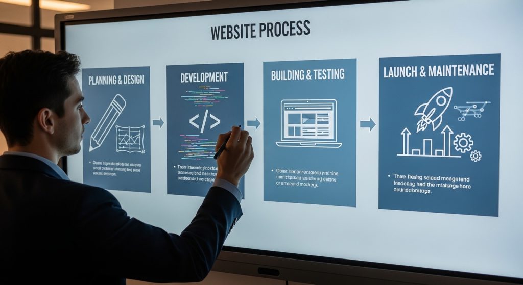
Whether you’re working with a professional web design agency or using a website builder, understanding the process will help you communicate your vision clearly and achieve better results.
- Gather restaurant website design ideas and inspiration. Browse the examples in this guide, save screenshots, and note what appeals to you. Pay attention to the overall mood, navigation style, and how each site handles menus and reservations.
- Choose a CMS or website builder. WordPress offers the most flexibility for custom restaurant websites. Squarespace and Wix are solid options for simpler builds. If you need integrated POS and ordering, platforms like Toast or BentoBox are purpose-built for restaurants.
- Invest in professional photography and branding. Before you build anything, get professional photos of your food, interior, and team. If you don’t already have one, develop a strong brand identity with a cohesive logo, color palette, and typography.
- Design your pages around your customer’s journey. Start with the homepage (first impression and navigation hub), then build out your menu page, reservations/ordering page, about page, and contact page. Every page should have a clear purpose and a call to action.
- Integrate ordering and reservation tools. Set up online ordering (if applicable) and connect your reservation system. Make sure the process is smooth on both desktop and mobile.
- Optimize for mobile and speed. Test your site on multiple devices. Compress images, minimize code, and ensure your site loads in under three seconds. Google’s Core Web Vitals matter for both rankings and user experience.
- Launch and monitor performance. After launch, use Google Analytics and Google Search Console to track traffic, bounce rates, and conversion rates. Regularly update your content, images, and menu to keep the site fresh.
Restaurant Website Design for Fine Dining vs. Casual Concepts
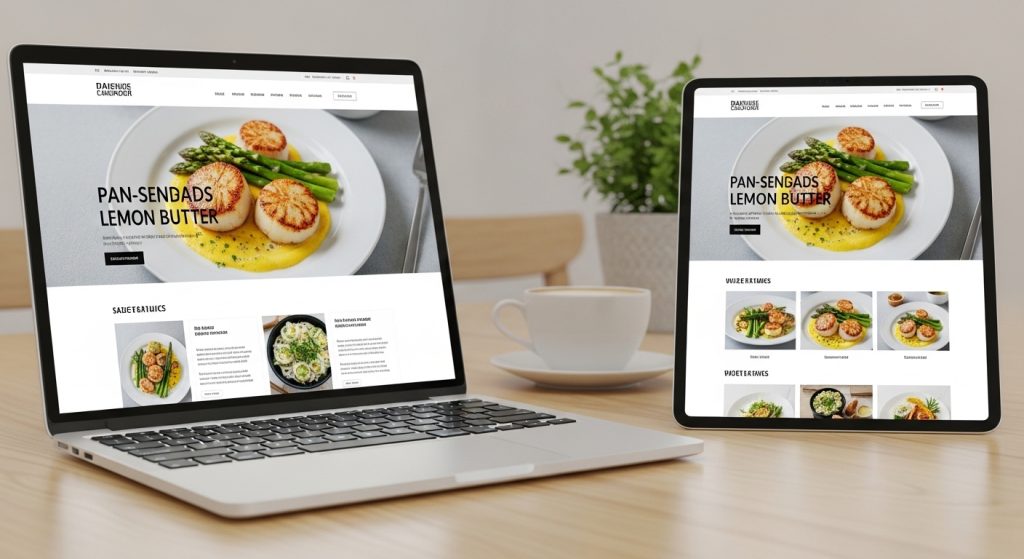
Your restaurant website design should match the dining experience you deliver. What works for a Michelin-starred fine-dining restaurant won’t work for a fast-casual taco shop, and vice versa.
Fine dining websites tend to favor minimalist layouts, dark or neutral color palettes, editorial typography, and sparse but stunning photography. The focus is on atmosphere, exclusivity, and the chef’s vision. Examples like The Fat Duck, Noma, and Atelier Crenn show how restraint can communicate luxury. Navigation should be clean and unhurried, mirroring the pace of a fine-dining meal.
Casual dining and quick-service websites can afford to be more colorful, playful, and information-dense. Bold fonts, vibrant imagery, prominent ordering buttons, and dynamic video work well here. The goal is energy and accessibility. Examples like Mojo’s Tacos, Salt Life Food Shack, and Cantilever Chippy show how personality-driven design can be just as effective as refined elegance.
Regardless of your concept, the principles remain the same: make information easy to find, ensure mobile responsiveness, invest in quality visuals, and keep your CTAs prominent.
Common Restaurant Website Design Mistakes to Avoid
Even with the best intentions, many restaurant websites fall into the same traps. Here are the most frequent mistakes we see.
- Relying on PDF menus. They’re hard to read on phones, can’t be indexed by search engines, and require downloading. Always use a web-based menu.
- Hiding essential information. If a visitor has to click three times to find your hours or address, your design is working against you.
- Slow loading speeds. Unoptimized images and bloated code are the biggest culprits. Aim for a load time under three seconds.
- Ignoring mobile users. If your site looks great on desktop but is unusable on a phone, you’re alienating the majority of your audience.
- Using generic stock photography. Nothing undermines trust faster than a website full of stock images. Customers want to see your actual food, your actual restaurant, and your actual team.
- Neglecting SEO. If your website isn’t optimized for local search terms (like “best [cuisine] restaurant in [city]”), you’re missing out on organic traffic. Make sure each page has unique titles, meta descriptions, and structured data.
- No clear call to action. Every page should guide the visitor toward a specific action: make a reservation, order online, view the menu, or contact you.
Frequently Asked Questions
| How much does restaurant website design cost? Restaurant website design costs vary widely depending on complexity. A basic template-based site using Squarespace or Wix might cost $500 to $2,000 to set up. A custom-designed restaurant website from a professional web design agency typically ranges from $3,000 to $15,000 or more, depending on features like online ordering, reservation integration, and custom photography. |
| What is the best website builder for a restaurant? It depends on your needs. WordPress is ideal for fully custom designs with maximum flexibility. Squarespace offers beautiful templates with minimal technical effort. BentoBox and Toast are purpose-built for restaurants and include features like ordering, reservations, and POS integration out of the box. |
| How often should I update my restaurant website? At minimum, update your website whenever your menu, hours, or contact information changes. Beyond that, refreshing your photography and homepage content seasonally keeps the site feeling current. Restaurants that maintain an active blog or events page should update at least once or twice a month. |
| Should my restaurant website have a blog? Yes, if you can maintain it consistently. A blog helps with SEO by targeting additional keywords, provides content for social media, and positions your restaurant as an authority. Topics can include recipes, chef interviews, event recaps, and behind-the-scenes content. |
| How do I make my restaurant website rank higher on Google? Focus on local SEO: claim and optimize your Google Business Profile, use location-specific keywords throughout your site, build citations on directories like Yelp and TripAdvisor, and ensure your site is fast, mobile-friendly, and uses structured data (like FAQ schema and local business schema). Publishing regular content and earning backlinks from local publications also helps. |
Conclusion
Your restaurant website is more than a digital menu. It’s the first chapter of your customer’s dining experience, and it needs to make them want to keep reading (and eating). The restaurant website design ideas in this guide show that there’s no single formula for success. What matters is that your website reflects your brand — backed by solid restaurant brand marketing ideas — makes essential information easy to find, and gives visitors a compelling reason to choose you.
Whether you’re designing a site for a Michelin-starred tasting menu or a neighborhood taco joint, the fundamentals remain the same: invest in professional photography, build for mobile first, integrate ordering and reservations, and never stop optimizing.
Ready to create a restaurant website that drives reservations and revenue? Our web design team specializes in building custom websites for restaurants and food brands that look stunning and convert. Get a free quote and let’s bring your restaurant’s digital presence to life.

Logopoppin
Logopoppin is a graphic design agency that specializes in logo designing, web development, video production and advanced branding services. We love to innovate businesses with new age technologies, allowing them to improve their visual reputation.

