Table of Content
Discover How to Create Awesome Construction Website Designs That Ensures Success
We all know that no matter what the business, it will not be as successful today if it doesn’t have a website. And that is especially true for predominantly B2B businesses, as they cater to far smaller target markets than B2C businesses. However, that also means that building such sites needs the designer to factor in elements different from a B2C website.
For example, the construction website ideas for a company that only builds high-rises would be quite different from the ones for a company that builds houses, additions, renovations, and more. And that is just within the construction niche itself!
The reason for that difference is quite simple. A construction company that deals in developing high rises has a far smaller, yet infinitely more lucrative client base compared to the latter kind of construction companies. Moreover, that kind of clientele often knows what they want, and you need to convince them why you are the better choice by overcoming their discerning capabilities.
So, the question is, how can you create the perfect construction website design for your business type? Moreover, how can you ensure that it stands out for your target consumers, making them choose your website over those of your competitors?
Let’s dive in and discover the answer to these questions, and see how successful construction websites have used professional web design services to ensure their online success.
Why Do Construction Businesses Need Construction Website Ideas for Their Site?
As we mentioned earlier, every business today needs a website. Not only does it allow you to display your past work, it also aids in attracting leads, and based on business model, allow partnering up with other businesses.
Coming to the crux of the matter, any good construction company needs a website so that they can market their services to a wider range of clients. A good website allows a business to establish a strong and reliable online presence, and one that can be quite helpful in attracting new clients to the business. In short, these websites help expose your construction business names to wider range of clients compared to conventional marketing techniques.
Moreover, it also establishes a communication channel between your business and clientele, allowing you to convey important information to them, or receive valuable feedback from them. Both of these would allow you to evaluate what is it about your brand’s services that you need to tweak and improve upon, as well as insight on how to improve your site’s impact on users.
Now although it is important to research different ideas before getting down to creating your own construction website design, the simple fact is that web design isn’t as easy as that. The competition is quite tough nowadays, with brands finding different ways to ensure that their website has a leg up in design over their competition.
Therefore, the only way to ensure that your construction website is successful, you need to use construction website ideas that suit your aesthetic and branding elements like construction logos, and enhance your message. Moreover, you need to follow a user-first design philosophy, which focuses on the importance of UX and UI, and allows your site to establish its construction credentials in the best light possible.
What Elements Define the Greatest Construction Website Examples?
Now that you understand why companies need construction website ideas to successfully compete in today’s market, the question is – what constitutes a good construction website design?
Let’s dive in and take a look at some of the greatest web elements that need to be integrated within your construction websites for them to be considered a success. Let’s find out what they are.
Navigation Bar
Navigation is an important part of a website, no matter what its for. Moreover, nobody cares where the navigation options are on the sidebar, or at the top of the webpage. What matters however, is that the navigation is easy to reach.
That means that it shouldn’t matter who visits the website, whether it is a tech-savvy youngster, or an older user, they would find it easy to navigate through the website without issue.
A Prominent Header
Construction websites, like other service providers, tend to showcase their skill and expertise on their website. Now, for businesses like software development or design agencies, that is easy, as they can display their work on their websites. Construction businesses too can work similarly by using high-resolution imagery in their designs.
Specifically, their header should highlight their best project, and it should be large enough to be the hero of the page. Moreover, it should be the most prominent thing that a user sees when they visit their website, and can be the place to display your construction slogans.
Linked to Your Social Media Accounts
While a website is great for establishing an online presence, and to reach a wider customer base, true customer engagement is only possible via social media. It is because that is the primary function of these platforms in the first place.
There are many ways to incorporate your social media handles into your construction website design. Some sites have a floating button for Facebook or WhatsApp that goes along one side of the page. Others may use their footer as the place where users may find their social media handles. In any case, no matter how you incorporate them, it’s necessary to factor them into your web design.
Professional Photographic Images
Just like it is important for the header of your website’s pages to feature a great image, it is just as important for the rest of your site to feature high-quality imagery that showcases your skill. However, what’s important here is to have these photographs taken professionally, so as to show your finished construction in the best possible light.
What these images do is set you apart from your competition, and that too on the quality of your work. Maybe it would be your signature style or aesthetic in construction that sets you apart and brings more customers to you.
Mobile-First Design
Mobile devices have become the primary mode for web browsing for the vast majority of the world. According to Statista, Q4 for 2022 saw nearly 60% of all web users use mobile phone to access and browse the web. That means that in order to make it easier for more than half of our client base, we need to make our designs suitable for mobile view as well.
The best way to do it is to take a mobile-first approach, where the website is designed for mobile first before being optimized for PCs and tablets. However, you can still optimize an existing website to be better functioning on mobile devices.
7 Construction Website Ideas to Inspire Your Construction Site
So far, we have discussed why companies need construction website ideas, and we have discovered the elements that make a construction website design successful. Now, you are almost ready to begin designing your own construction website.
There is one thing you still need to do in order to understand what design aesthetics would suit your website. And that is to look at and study some of the top construction website examples and see how they have managed to establish themselves in the industry.
To help you, we have compiled a list of seven of the top construction websites that we believe can help you explore the different directions you can take for your website’s design. Let’s dive in and take a look at them and see which ones you prefer.
Granite Construction
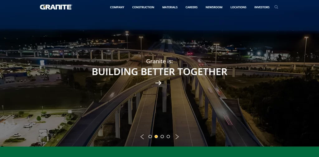
The first one on our list is called Granite Construction. They are a comprehensive construction and construction materials company that specializes in transportation, water-related infrastructure, and mineral exploration for clients throughout the North and South American regions.
For such a large, well-regarded company in the industry, they have kept their website comparatively simple. That is because they understand that someone looking for their services has done their homework and knows what they want. Now all the company has to do is showcase why they are the best option to bring their vision to life.
Their homepage starts with a large slideshow of high-res images of finished and in-progress projects, with a simple tagline over them displaying their mentality – “Building Better Together”. Below that, they talk about their ranking, their work process, how they source their materials, their commitment to safety, and finally, a link to their job portal for those who want to join the company. Overall, it provides a great visual journey, and is an awesome construction website design to emulate.
Suffolk Construction
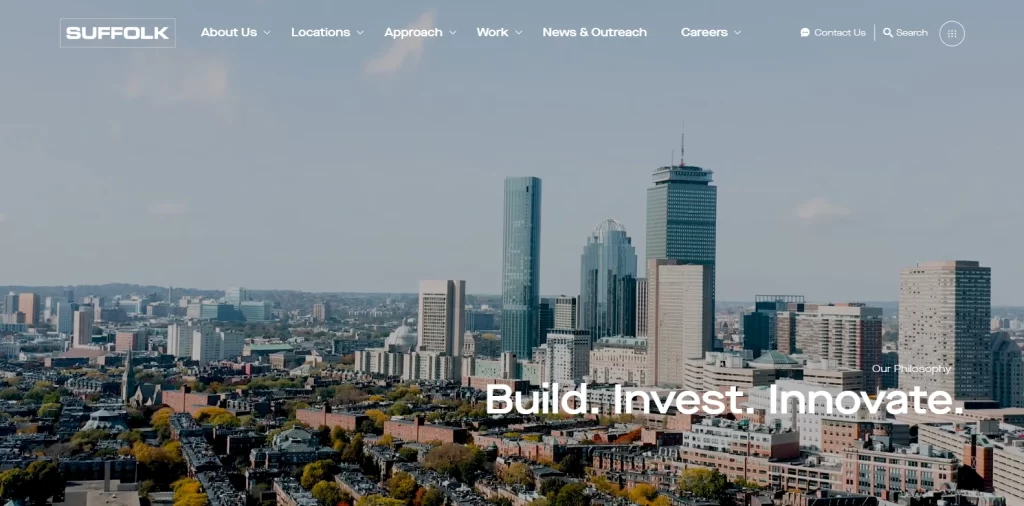
Next up we have another construction company by the name of Suffolk. They are a company based in the United States, with offices in Boston, New York, Dallas, Estero, Miami, Tampa, West Palm Beach, LA, San Diego, and San Francisco. They use a style similar to the one used by Granite Construction, but they went for something with a greater visual impact.
The homepage opens up to a slowly panning image of the city skyline, with the words “Build. Invest, Innovate” displayed at the bottom right quite prominently. It represents the company’s mentality towards their construction projects, and shows why they are a success.
Scrolling down, you are faced with section like company story, work processes, their featured construction sectors, company locations, and finally, a section to display company news and updates. Again, this is a great site to add to your list of top construction website ideas, especially if you want to go for a more visual approach compared to the previous website we discussed.
PCL Construction
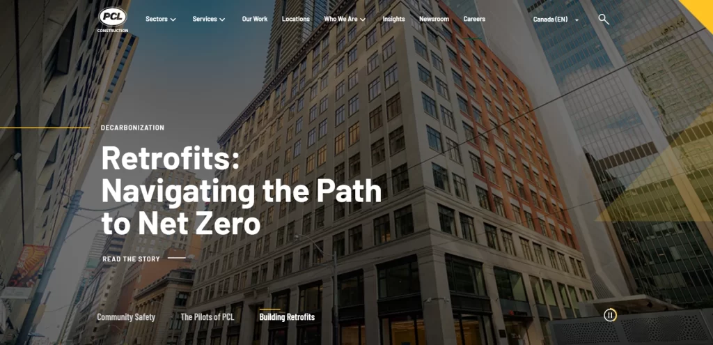
PCL Construction is the next construction website on our list. Now, while the other two websites were somewhat different to the traditional website pattern, PCL Construction’s website goes for the classic layout, albeit with a few upgrades.
First, let’s start with the hero of the homepage. The header features a full-sized image slideshow, which changes from day to day. Now, the images displayed here are not random. Instead, the slideshow features three of their topmost stories from their community news and updates section.
The rest of the design features an About section, company locations, the service sectors they serve, types of construction they do, messages from senior management, and a community news section. At the end is a call-to-action that asks if the visitor is ready to work with them, with two buttons, one that is designed for potential clients, and one designed for potential employees.
And although the structure may seem classical, the minor changes and upgrades subtly increase the impact of the construction website design.
Alston Construction
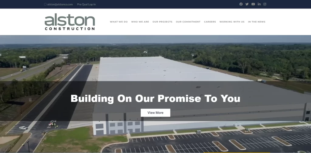
Up next is the website for Alston Construction, which has gone for a design that is quite different from the ones we have discussed so far. The layout is what you would expect from your typical service-centric website, with the elements laid out cleanly with high visibility.
Starting with the hero of the homepage, the website features a slideshow of images panning across different buildings finished and under construction both. Across the images are small translucent banners that have a simple tagline designed to appeal to the user, and a button to view more.
Scrolling down, you are greeted by a bar that mentions the company’s stats, with the number of completed projects, the percentage of repeat clients, and the number of fortune 500 clients. After that, is a small gallery of their latest projects, following which you can view the services provided by the company.
Next, they have the market sectors they serve, followed by the client testimonials, popular clients, and the company news. All in all, though it may seem like a traditional layout, it is still one of our top options for construction website ideas.
Hensel Phelps Construction
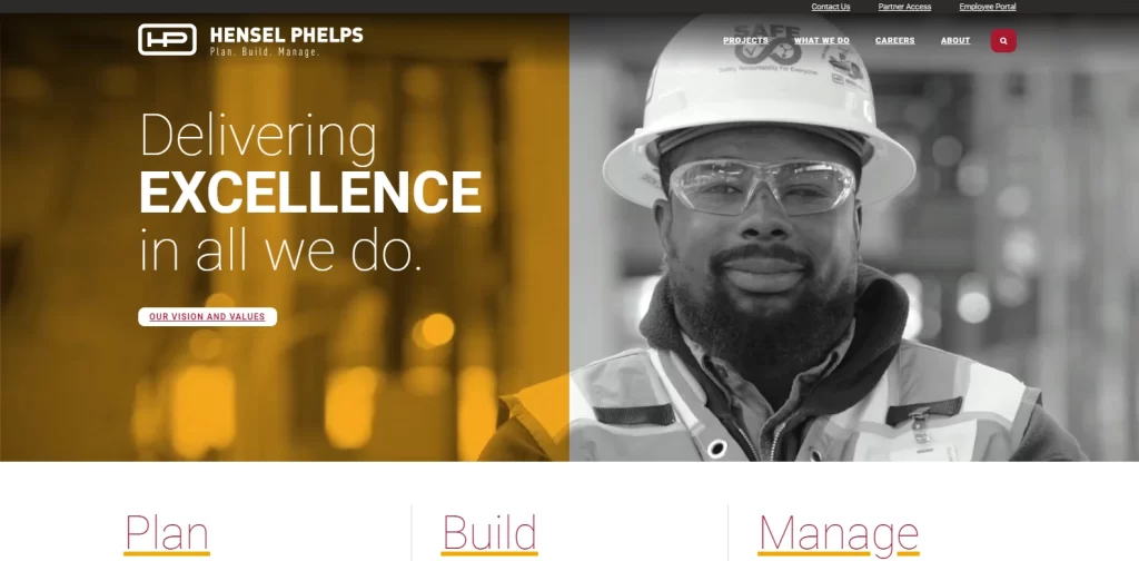
The website for Hensel Phelps is an excellent example of construction website design that is designed specifically for the right customers. Their web design is great, and goes straight to the point so that potential clients who visit their site do not as if their time was wasted.
The hero of the homepage features a full-sized image with a two-tone overlay. The color combinations used here are light orange and white, and are perfect for the construction company’s website, as those are the colors often associated with the construction field. The hero also has a small tagline, and a button that takes the visitor to the comp any vision and values page.
Scrolling down, you are greeted by a their three-step working model, featuring sections for Plan, Build, and Manage, as well as a button to visit that page to read the sections in detail. After that, the website features a few case studies for different industry sectors they have worked for, and a button that takes the visitor to their entire project catalog. The homepage rounds off with news and updates section, which makes the design look clean and professional.
Overall, if you want to establish your construction company as a professional market leader, then there is no better option on this list of construction website ideas for you to follow.
McCarthy Construction
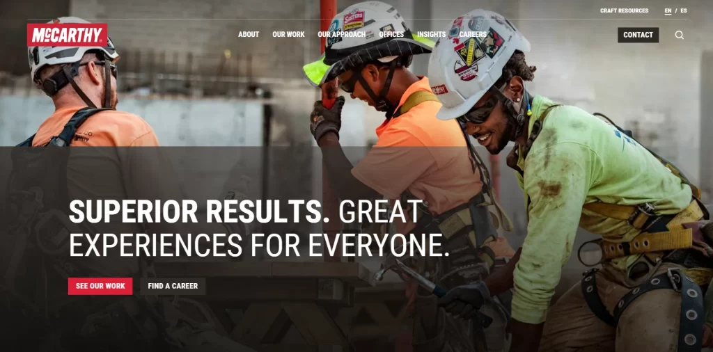
There are a few websites that showcase actual construction crews as part of their homepage’s hero, as most prefer to display finished projects to impress potential clients. However, McCarthy Construction’s website stands apart in this instance, as their hero showcases a full-sized image of a crew laughing and working together happily.
A tagline reads “Superior Results, Great Experiences for Everyone”, with two buttons below it, one leading to their project portfolio, and the other to their careers page. This highlights their ambition towards making an enjoyable and fulfilling work experience for both their people and their clients. Following that, we have the About section, a Company process section, a few case studies, company values and promises, news and updates section, and finally, CTAs to their career and contact pages.
Overall, this style of design is what makes it a valuable addition to our list of construction website examples.
Harper Construction Company
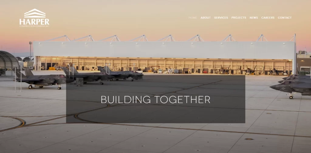
Finally, the last construction website example is that of Harper Construction. This website may seem like some of the others on this list, but it has by far the most minimalist design of all. Relying on its years of experience and the most potent of minimalist techniques found in any reliable web design guide, the company managed to create an amazing construction website design.
The homepage starts off with a full-sized image of a United States Air Force installation, one of their most lucrative projects. This image serves as a testament to their expertise and quality of work, as being a contractor for the government is a big achievement.
Scrolling down, you are greeted with a small about section, with the option to read more underneath it. Following that, we have the services section, a small gallery of projects, and a section to view the latest project catalog, with the design rounding off with the Contact page.
Overall, if minimalist effectiveness is what you are after, then this website should be at the top of your list of construction website examples.
Conclusion
To sum it up, if you are looking for some great construction website ideas to develop your construction website, then finding the right inspiration is critical to your success. However, your construction website design should be predicated on your company’s perception, and your potential customer needs.
In any case, if you are looking to create an awesome construction website but do not know where to start, then this is the perfect article for you.

Logopoppin
Logopoppin is a graphic design agency that specializes in logo designing, web development, video production and advanced branding services. We love to innovate businesses with new age technologies, allowing them to improve their visual reputation.

