
Table of Content
Discover How to Use Popular Sports Website Examples to Create Your Own Athletic Site
Sports websites are a broad categorization of sites that includes everything from websites that sell sports accessories and apparel to those representing a sports team. However, in all these cases, there is one thing that’s common – an energizing message that accompanies them all.
Now considering that this category contains such a vast variety of sites, it’s no wonder that there is no standardized sports website design. However, some styling cues and elements proclaim that this specific site is related to the world of sports. And the surprising fact is that, despite all of these sites being from different niches, visually they do look like they belong to the same family.
So, the question is, how are web designers managing to do it? How are they able to match the vibes of websites from such different backgrounds? Are they using some design cues or elements that are helping them achieve this effect? Or is there something more to it?
Let’s dive deeper into this topic, and see how professional web design services, whether big or small, have been managing to achieve this amazing feat. We will also look some of the top sports website examples and see how they managed to achieve their energetic visuals. So, without further ado, let’s begin.
Sports Website Design – Discovering the Purpose of Athletics Website Development
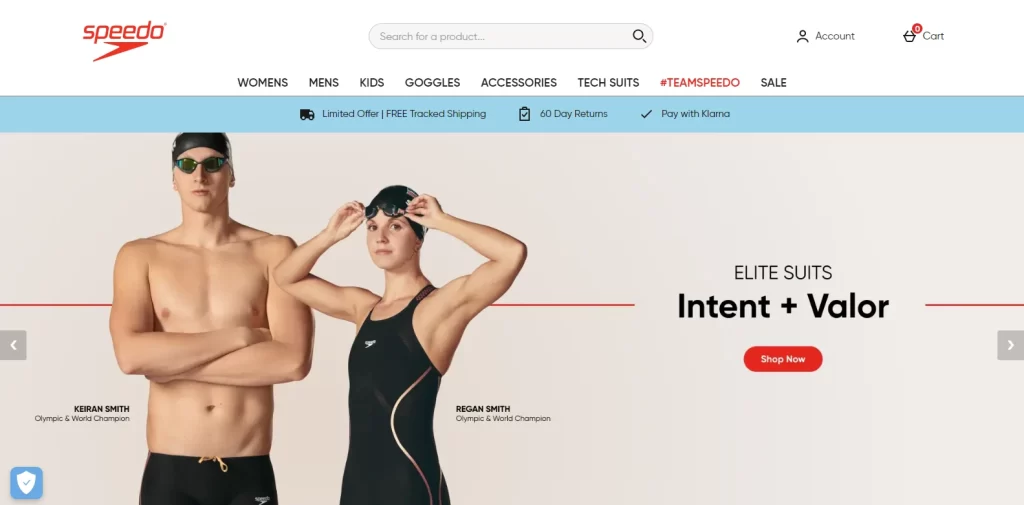
Right off the bat, the first thing that strikes us about any good sports website is that it has an energetic and dynamic vibe. Even when these sites have static elements, the design elements are structured in a way that gives a sense of movement. And it is this exact vibe that these websites want to put forward, just like the design for Speedo here.
It doesn’t matter if it is a sports website that sells active wear, or one that represents a CrossFit gym; in both cases the purpose of the site is to attract those who are, or are looking to get fit. So having a website design that has a dynamic vibe is perfectly warranted.
Moreover, the color combinations would also feature shades with proven energetic and passionate perceptions. You will often see shades like red and black, accented by white, which lend to a minimalist, sustainable, and active lifestyle that these business advocate for. Some sites, such as those focused on yoga, may also feature calming, peaceful shades like green, blue, pink, and more.
However, the majority of designs adhere to a minimalist monochrome design that allows the other visuals on the site to sing. In any case, we can safely say that a prerequisite for ensuring that your website belongs with the likes of the top sports website examples is to make sure that it has a dynamic, energetic page layout.
Seven of the Best Sports Website Design Ideas You Need to Know and Use Today
Now that you understand what it takes to turn your web design into a sports site, you are now capable of choosing the best sports website design ideas for your website. However, where would you find these design inspirations?
The internet is full of sports websites from all relevant niches. However, not all of them are a success. How are you, someone who is new to the field, supposed to evaluate which ones are designed for success, and which ones are too generic to be of much use?
Don’t worry. That is exactly why we have compiled a list of some of the best sports website examples currently online, according to us. Let’s take a look at their web layouts, and see which elements are worth the time and effort to incorporate within our website designs.
Nike
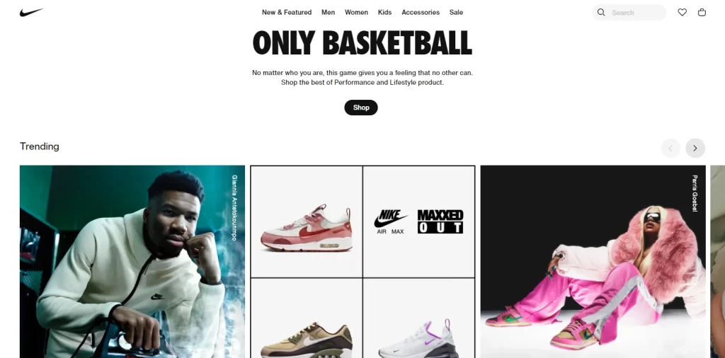
Let’s start with the first one, and there is none better to begin this list with than the Nike website. Nike has long been associated with athletics and sports, starting out with creating sneakers and other articles of active wear. Today, they are still known as one of the top brands for athletic gear, being the NFL’s official uniform supplier for the past decade, as well as sporting one of the most popular sports logos of all time.
Although they have ventured into the luxury and collectible segments as well, their website is still focused on this rich athletic legacy. Visiting their homepage, you see images of people in different styles of active wear, from tracksuits to shorts, dry-fit tees, and above all, top of the line sneakers.
The layout is clean, with a plain white background over which the plain, no-frills text and the subtly placed logo stand out clearly. Moreover, the neutral background provides a much-needed contrast against the visual oomph of the imagery used. All in all, this website design is a masterclass in implementing some great website design ideas.
RaceFace
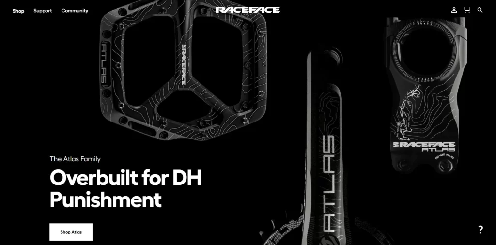
RaceFace is an athletic company that specifically caters to cyclists. Selling a wide variety of equipment necessary for different flavors of biking, the company portrays itself as helping you tailor and own your cycling experience.
The background of the website is black, with the logo and the text written in white. The site features images of items like their carbon pedals, and lug holders on the hero of their homepage, as well as the other sections.
What’s great about this type of web design is that it takes a fine hand to balance the difference between a bland, uninspired design, and a regal, exclusive brand website design with a premium vibe. And this website has balanced that perfectly. Despite the black colored items over a black background, they are designed to be perfectly visible, and stand out no matter what device you view it on. Overall, if you want to go for a hardcore yet premium feel, this is one of the top sports website examples for your inspiration.
Black Sheep Studios
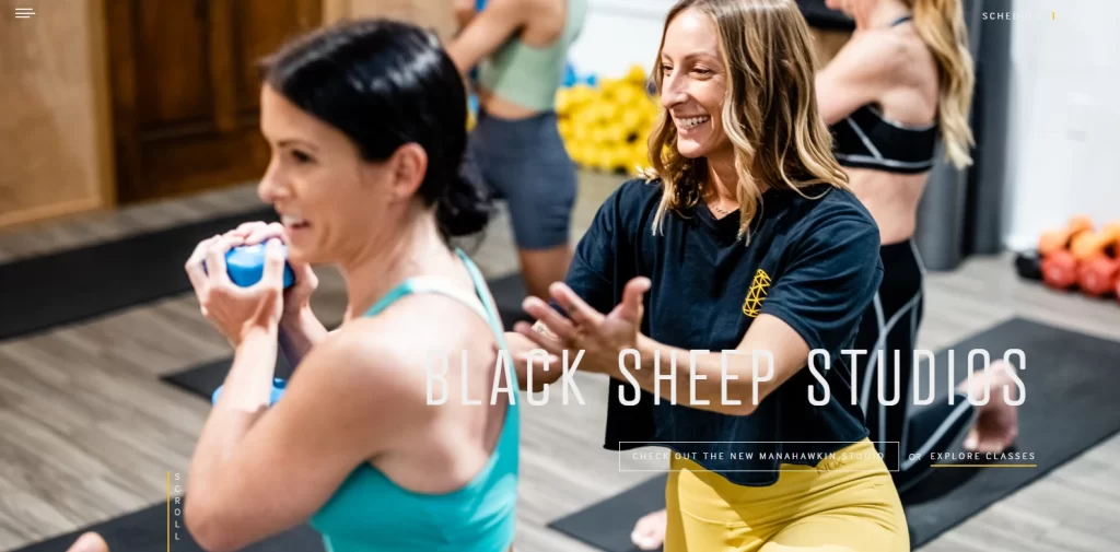
Next, we have the website for Black Sheep Studios. Black Sheep Studios is a fitness association that helps people come to terms with their true self, and helps them reclaim their self-assurance by guiding them towards a fit and healthy lifestyle.
The reasoning behind their name is quite interesting, and it plays into their entire branding. The reason they call themselves Black Sheep is because their methods are somewhat unorthodox. And they are unashamedly proud of it. They adhere to a feeling of individualism and individual freedoms, pushing their clients to drop their fake facades and unleash their actual selves.
The design of their website is quite traditional, with a few unusual elements. For example, the next section after their hero is the about section, which explains a little bit about the company. Now, most fitness websites will have a little text for this section. However, Black Sheep uses a video to describe it, helping their potential clientele connect better with the brand.
Overall, this is one of the most fun sports website examples on this list, and the perfect inspiration if you want to design a gym website.
Hyper Lite
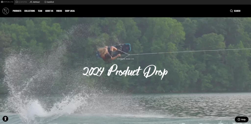
Not all sports are built equal. And there is nothing better on this list that exemplifies this, than the website for the water sports equipment company called Hyper Lite. Visiting the website is an entire experience in itself.
The hero of the website’s homepage is a seamless slideshow of short clips of videos showing people enjoying different water sports in slow motion. This not only highlights their products used by those athletes, but it also sends a vibe of fun and excitement for those who use them too. This allows the potential customers to associate the concept of fun on the water with Hyper Lite’s equipment, which helps boost sales and revenue.
Even the rest of the design and page layout is something unorthodox yet fun, and as you scroll down you are greeted to large photographs of different water sports. Each of those photographs represents a separate range of products, and is clickable to allow the user to be taken to that product range. The website is clearly light on textual content, and it isn’t until you scroll down to nearly the end of the page that you find your first and only paragraph of content, showing the company mission.
Overall, if you want to do something different, and want to let your products speak for themselves, then this is one of the best sports website design ideas to use in your website.
Reebok
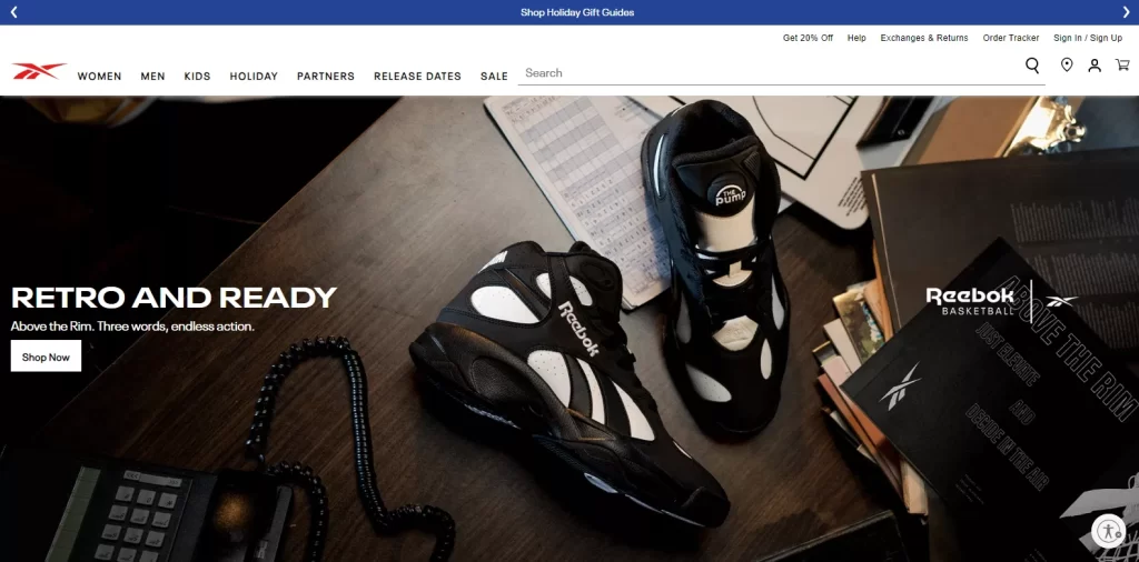
Reebok is another sports equipment and apparel website that has a design heavily inspired by athletic websites. In fact, it is even more sports inspired than the first one on our list, which was Nike. Reebok’s entire design in predicated on their apparel range and the different style of athletic shoes they manufacture, with their brand symbol being as synonymous with athletics as the Adidas logo.
From classic designs meant to serve as a throwback, to modern shoes for everyday and those made specifically for sports or outdoors, the Reebok site showcases them prominently. The layout of the sports website is great, with fold after fold exposing the consumer to new and exciting deals in order to convert them.
Overall, you should include the Reebok website to your list of top sports website design examples to inspire your own website’s design.
Assos
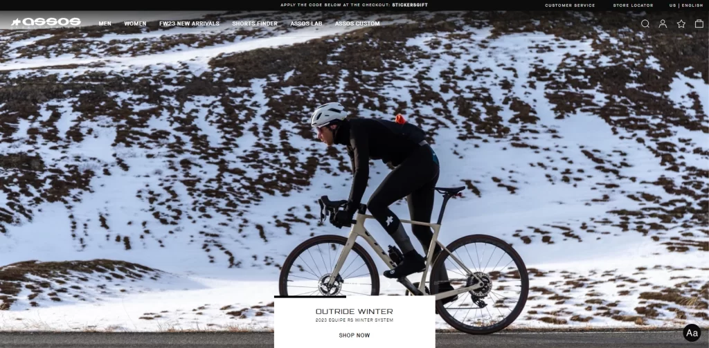
The next website we are going to look at is called Assos. Assos is a company built around the culture and camaraderie of bicycling, and aims to make the sport and its followers safer and more comfortable. The company primarily sells cycling apparel like shorts, shirts, inner wear, socks, boot cover, and more. Moreover, they also sell items like eyewear, water bottles, backpacks, helmets, and more.
While primarily an apparel and accessories store, its design is not one we have ever seen on such business websites. Rather, this is a design often seen on professional athletic websites. And taking their design cues from such websites, Assos managed to come up with a design that is both emphasizes the sport, and tells the consumer that they are there to make the experience more enjoyable.
And that is what makes this one of the most unique sports website design ideas to emulate into your websites.
Bodybuilding.com
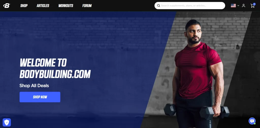
Anyone ever bitten by the bodybuilding bug, man or woman, has visited Bodybuilding.Com at least once. They are one of the biggest names in this sport, and boast some of the top trainers and educators in the field, including the likes of Jim Stoppani.
The website is a mix of training regimens, articles on various health and bodybuilding topics, and supplement store. Combined, websites like this have a tendency to become kind of haphazard and confusing. Not in this case though. The design of the website is natural, with each new section perfectly segueing in from the previous one, providing a cohesive browsing experience. Moreover, the sports fonts used give the design a sense of strength and agility.
Now, we understand that this type of website is quite rare to find in the sports niche, and many of the top sports website examples generally stick to one specific angle. However, some of the top sites in this genre have been around for so long, that they have branched out into other fields as well.
And it is for circumstances that you need a sports website design like this one to inspire your web layout and design.
How to Create Your Own Sports Website Design
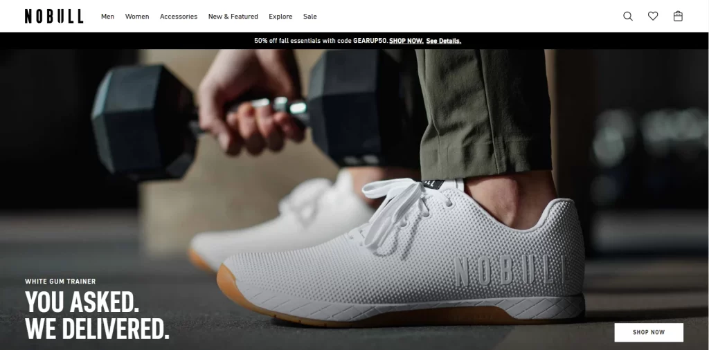
So far, you have discussed why companies need sports websites in the first place, and have looked at some of the top sports website design ideas to see how they managed to make their mark. Now, you are ready to create your own website, an effective website like the one for NoBull above.
But how can you do that? Let’s take a look at the step-by-step process to see how you can create the perfect sports website for your brand easily.
- First, you need to check and see whether the domain name for your business is available. In case it is, you need to buy it. Your website’s domain name should be easy and memorable, so that people have an easier time remembering it.
- Next, you need to find a hosting service or platform for it. You can use from a number of such platforms online, from WordPress to Wix, and see which one is the best for you.
- Choose your web template or layout style. There are many different types of websites in the sports niche, and you need to find the right ones for your specific niche. You can use them as inspiration, or you can ask your web developer to use it.
- Hire a professional web designer and developer to create the perfect website design that is implemented correctly as well.
Conclusion
Summing it up, we can say that in order to build a great sports website design, you need to factor in a number of things, including the vibe they present, to the style of website that would work the best. Moreover, the designers would also need to create a website design that perfectly blends the brand’s essence, and still matches their niche perfectly.
So, if you are looking to create your own sports websites, this article is the perfect place to start, with the right sports website examples as well as a guide to creating your own sport website.

Logopoppin
Logopoppin is a graphic design agency that specializes in logo designing, web development, video production and advanced branding services. We love to innovate businesses with new age technologies, allowing them to improve their visual reputation.


