Table of Content
Discover the Merits of Single Page Websites and Learn How to Create One for Your Brand
We are all familiar with traditional website design, where the content of that entire website is broken down into smaller chunks, and each chunk is then incorporated within its own separate webpage. Then, all those webpages are structured in a hierarchal manner, with the navigation between them optimized for a great user experience. However, it doesn’t always need to be that day.
Today’s digital world is one where simplicity reigns supreme, and where we bring you the wonders of one page websites. These sleek and minimalist designs redefine how we think and engage with websites in general, condensing the entire site experience into a single, scrollable page. But why?
Why would a brand forgo the traditional, more approachable style of website for something so unorthodox? Well, to find that answer, join us as we explore the charm behind opting for single page web design, and the reason for its recent popularity. We will also explore how top web design services merge elegance and minimalism to create impactful single page websites that elevate their businesses’ brand profiles.
What are One Page Websites?
If you explore the various websites on the internet, you will discover that most of them will feature multiple webpages within their structure. So, in a digital world where complexity and traditionalism reigns, one page websites are a breath of fresh air. Memorable for their simplicity and efficiency, these websites contain all of the necessary information within a single, scrollable page.
The minimalist approach of single page websites is focused on delivering your brand’s core message without having the users go through several web pages, which results in an engaging experience. Moreover, by keeping things simple, you ensure that the consumer finds little to no distractions, which makes converting leads easier.
In traditional, multi-page setups, you have to be careful about ensuring that the user journey is seamless, guiding leads to conversion points. And with multiple pages, it can be hard to accommodate various possible interactions and user journeys, thus increasing the chances of dead zones on your website. However, with a one page website, the journey is all linear, as all the user has to do is scroll up or down to get to the next piece of information.
That makes them a great choice for brands that want to keep things simple.
Why Do Some Brands Prefer Single Page Websites?
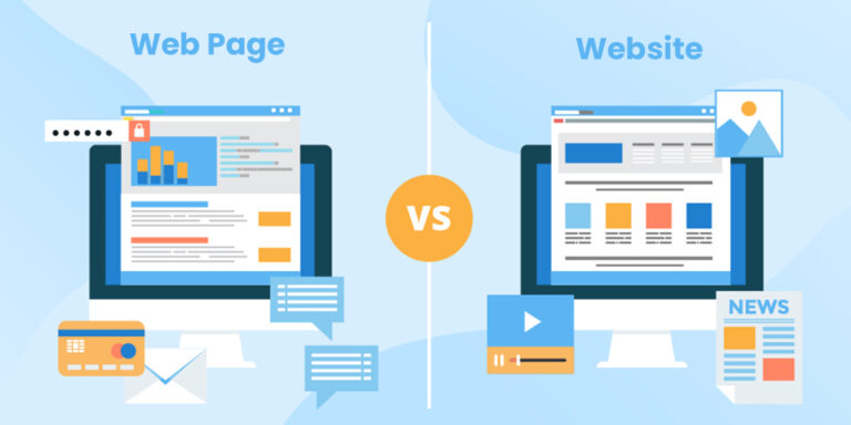
Now that you understand the difference between traditional, multi-page websites and single page websites, you might be asking why modern brands are preferring the latter over the former. While there are many different reasons why a specific brand chooses one over the other, it all boils down to one simple factor – simplicity.
But how does simplicity help these brands stand out? Well, there are four major ways that the simpler one page websites have gained prominence over multi-page sites.
- The single page design offers a more predictable and streamlined user experience
- As there is only so much information you can add to a web page before it starts to feel too long, one page sites cut out all forms of fluff, which means faster overall load times for the site
- As there is only one page to the website, its easier to optimize it for mobile screens, with a lower probability of issues and problems arising
- As the structure of the website is simpler in single page format, calls-to-action are more effective at converting, preceded by all the right information, and no distractions.
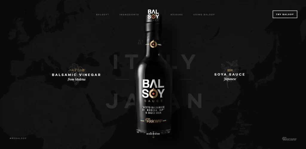
Look at the website for Balsoy above. The company is promoting a novel product, the result of hybridization of two rich culinary cultures – a sauce that is a mix of Italy’s native balsamic vinegar, and Japanese soy sauce. In this company’s case, the development of a multipage website would have been counterproductive. Therefore, a simple yet striking one page website works well for it.
Streamlined User Experience
One page websites redefine user experience by showcasing all relevant information in a seamless and efficient manner. The streamlined design structure allows consumers to scroll through the content effortlessly, with no need for complex navigation actions. And it is this simplicity that allows the forging of a deep connection between the brand and its consumer.
Quicker Load Times
Its easy to understand why a single page website would have a quicker load time compared to the classic multipage websites. With fewer pages to load, one page websites are often able to boast faster loading times and overall speed. In today’s digital age where site speed is a crucial parameter to a website’s success, this approach ensures that users access information swiftly, leading to a great overall user experience.
Mobile-Friendly Design
There is a simplicity inherent in one page websites that makes them inherently mobile-friendly. And as mobile browsing is rapidly becoming predominant in the world, brands are co-opting this design strategy to ensure a consistent and enjoyable experience across devices, catering to the diverse preferences of their audience.
Clear Calls-to-Action
One page websites have a clear advantage in delivering a clear and focused call-to-action. Whether it’s making a purchase, filling out a form, or contacting a brand representative, the linear design guides users toward the desired action, minimizing distractions and optimizing conversions.
Top 8 Amazing One Page Websites That Embody Minimalist Elegance
Now that you have a clear idea why modern brands are opting for one page websites over a multi-page spread, you might be wondering if that is the right approach for you too. Maybe you are looking to revamp your existing website for simplicity, and are looking for interesting website redesign ideas to inspire yourself.
Well, we have got your back there. We have carefully compiled a list of eight of the most amazing single page websites, ranging in theme from portfolio websites to product and service promotions. So, sit back, and enjoy this journey towards transformative inspiration, with websites that have achieved the perfect balance in design and minimalism.
Garden Studio
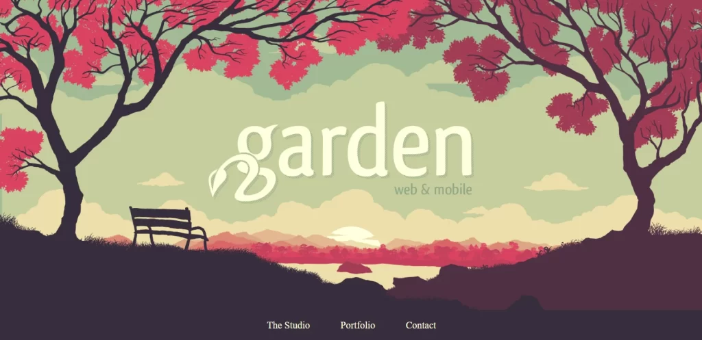
Garden Studio’s one-page website is an exquisite display of web design creativity. The clean layout and beautiful visuals of the website flawlessly guides consumers through their entire portfolio, subtly portraying an air of creativity and pioneering in design. Overall, the entire feel of this single page website creates an immersive experience that aligns with the company’s creative brand identity.
And Apartments
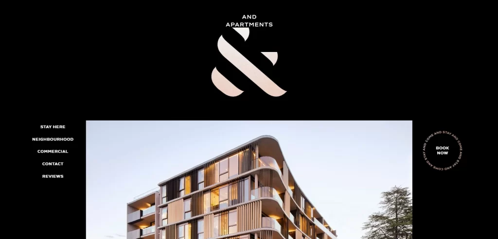
And Apartments is an apartment listing site that manages to capitalize on the one-page format, and its ability to present its message perfectly, clearly, and elegantly. The minimalist design actually guides the visitor’s focus on the properties showcased on the site, creating an effortless, immersive, and visually appealing journey. Moreover, the large, central brand symbol also serves as a way of guiding the visitors’ gaze to the center of the design, making it one of the few real estate logo designs that prefers subtlety.
Josef Kjærgaard
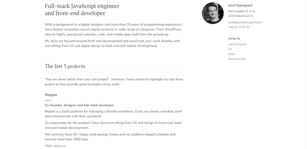
There are many different types of websites out there that can utilize a single page format, with one of those styles being the portfolio site. The personal portfolio website of Josef Kjærgaard is the epitome of simplicity married to a splash of artistic flair. One of the cleanest one page websites we have seen, the single page design showcases his work effortlessly, highlighting his achievements and contact info for potential clients. Moreover, its sheer effectiveness in displaying his skills and personality in a compact space successfully makes it a great case for single page sites.
Portrayalist
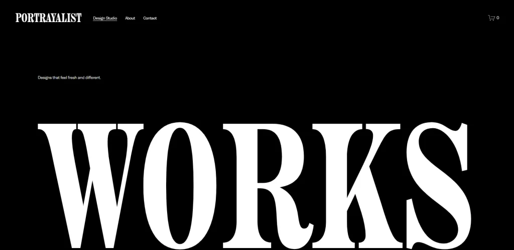
Portrayalist’s one-page website is a great example of the power of visual storytelling. While traditionally, brands rely on effective web copy to enchant their visitors, this site takes a different approach. They let their work speak for itself. Through carefully crafted sections of the website, they show their photography expertise, meanwhile combining it all into a captivating story that captures the visitors’ attention. And the best part is that it’s this linear, visual-based storytelling style that communicates their unique approach better than any copy-based website or multi-page site would’ve been able to.
Freelance Brain
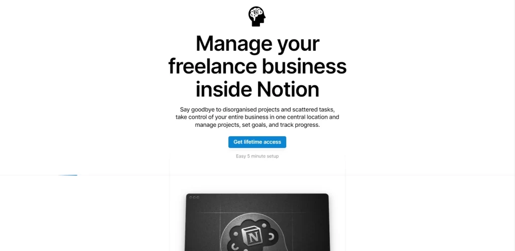
Freelance Brain has one of the few one page websites that effectively and efficiently highlights how to communicate all of the important information about services, skills, and contact details concisely. The minimalist approach contributes to a delightful user experience that emphasizes clarity and professionalism.
SubZero Ice Cream
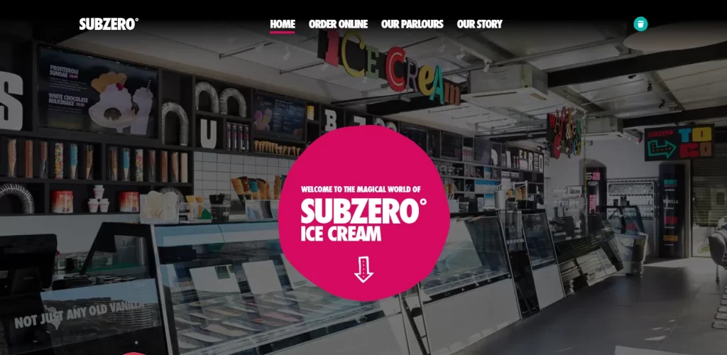
SubZero Ice Cream’s one-page website has a mission to stand out from the competition in the market. Moreover, its eclectic design perfectly aligns with its brand identity. The vibrant design of the logo, coupled with just the right amount of information, manages to captures the essence of their unique offerings, and enticing visitors to explore their delicious products in greater detail.
Dolox Inc.

Businesses too can benefit from single page websites, as evidenced by the website for Dolox above. Dolox Inc.’s one-page site combines professionalism with creativity. The strategic layout communicates the company’s services and values effectively, leaving a lasting impression that reflects their commitment to excellence.
Roma Domestic Workers Organization

Non-profit organizations are another one that can use the power convincing power of one page websites to spread their message successfully. In this case, this non-profit organization called Roma’s one-page website is a masterclass in impactful simplicity. Effectively communicating its mission, initiatives, and ways to get involved, the website fosters a sense of community. Moreover, the use of impactful imagery encourages the viewer into performing the desired engagement.
How Can You Create Your Own Single Page Websites?
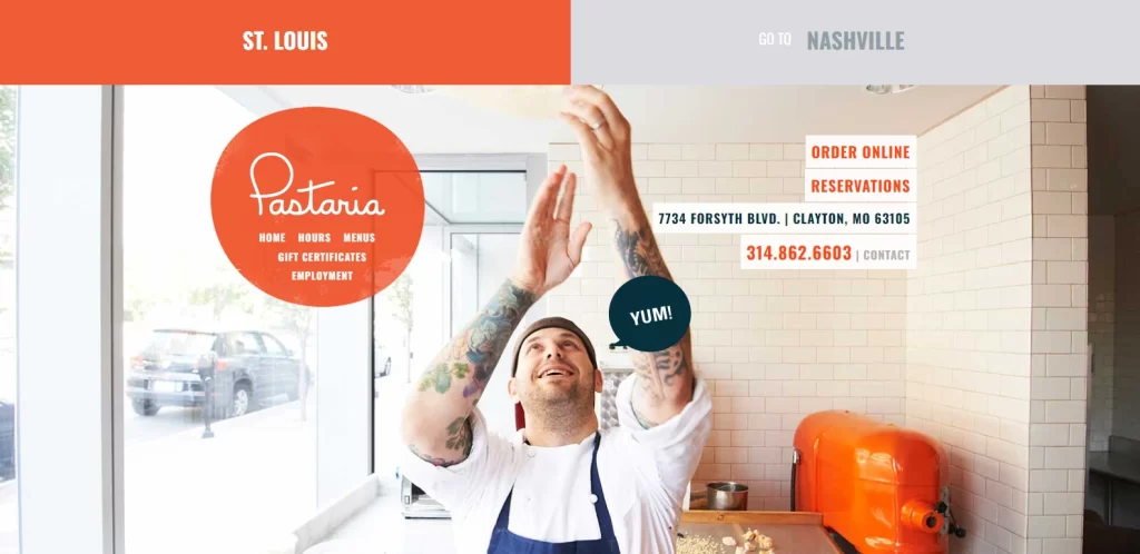
So, now that you have seen the various types of single page websites, you might be thinking about developing one for your brand too. However, you might be looking for the perfect web design guide to help you with this journey.
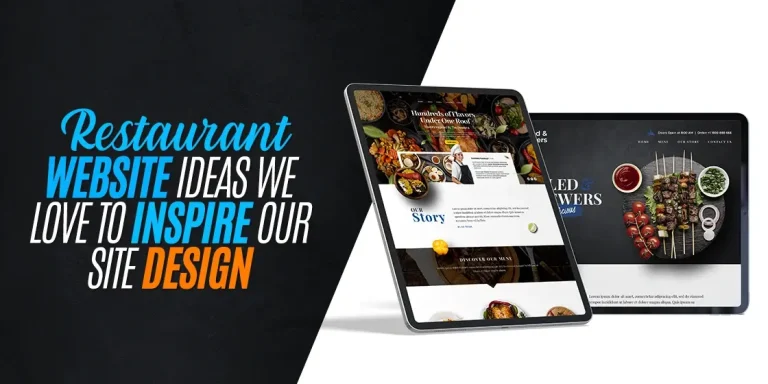
Do not worry; we have got your back. Listed below is a detailed process that will help you create amazing, highly optimized, and effective at conversion websites that have all the desired information into a single paged, scrollable format. So, it won’t matter if it’s a restaurant site you desire, like the one above, or a product promotion website. You will be able to turn your ideas into a highly functional website easily.
Choose the One Page Website Template That Suits Your Needs
The first thing you need to do is select a template that aligns with your brand identity and displays your content effectively. Consider the visual elements, layout, and overall aesthetic of those templates to see which one best represents your brand.
Create a Content Structure Plan
Organize your content logically to ensure a smooth and natural flow as users scroll through your one-page website. Develop a content structure that highlights key sections, such as an introduction, key services or products, portfolio/testimonials, and contact information.
Add Suitable Scrolling Effects
You can increase user engagement with small and subtle scrolling effects that reflect your brand’s aesthetic. Consider parallax scrolling, fade-ins, or other animations that add a touch of dynamism without overwhelming the simplicity of the design.
Create an Anchor Menu for Quick Scrolling to Relevant Sections
You can make navigation easier by incorporating an anchor menu into your site that allows users to jump to specific sections without having to scroll through the preceding ones. Through this, you will enhance the user experience, providing quick access to the information they seek, and increasing the chances of conversion.
Develop Powerful Calls-to-Action
Draft actionable calls-to-action that guide users toward desired interactions or conversions. Whether it’s encouraging a purchase, filling out a form, or contacting your brand, ensure that the calls-to-action are strategically placed and visually appealing.
Design Your Footer to Be Catchy and Converting
Optimize your footer to include essential information and encourage further exploration. Include a concise summary of your services, contact details, and links to important sections or social media pages. A well-designed footer will result in an overall cohesive user experience.
Add Links to Your Social Media Pages
Integrate your company’s social media links into you website, ideally around the footer, for seamless brand visibility and market coverage. This won’t just enhance your online presence but will also provide visitors with additional channels and avenues to explore and engage with your brand.
Optimize the Entire Site for SEO
Implement SEO best practices to enhance your single page website’s visibility on search engines. Focus on adding relevant keywords, meta tags, and a clean UX structure to improve your website’s search engine ranking.
Make Your Website Dynamic and Mobile Friendly
Ensure responsiveness and dynamic elements to provide an optimal experience across devices. Test your one page websites on various screen sizes to ensure that it retains its elegance and functionality on desktops, tablets, and smartphones.
FAQs
| What is a one-page website called? Single page websites are also known as parallax websites. |
| Are one page websites a good idea? Yes, one page websites are a great idea if you want to increase the impact of your brand message quickly. |
| Are one page websites considered professional? If your single page websites are designed well, then they can easily be considered professional websites. |
Conclusion
To sum up this discussion on the merits of one page websites, we can conclude that the elegance and efficiency of this design approach is perfectly placed to captivate brands and users alike. And taking inspiration from the eight single page websites mentioned above, you can be sure that following that same design approach for your site will lead to success.
And why not? With streamlined and concise content, captivating visuals, and an overall aesthetic of minimalist perfection in web design is what we should all hope for in our brand sites. So, if you follow the best practices described here in alignment with your brand identity, you will be able to create a one-page website that communicates your message effectively.

Logopoppin
Logopoppin is a graphic design agency that specializes in logo designing, web development, video production and advanced branding services. We love to innovate businesses with new age technologies, allowing them to improve their visual reputation.

