Table of Content
Discover How the Iconic Super Bowl Logo Evolved With the Times for Brand Retention
The Super Bowl stands as an iconic event in American sports culture, drawing millions of viewers each year to witness the pinnacle of football competition. In fact, the Super Bowl screening has over two-thirds of Americans putting on the game every year, if only to see the amazing half-time celebrations. And that alone would have made the Super Bowl symbol one of the most iconic NFL logos we are familiar with.
However, integral to the branding and visual identity of this tournament are the Super Bowl logos themselves, which have evolved over the years with changes in design trends, cultural influences, and technological advancements. The result is a brand identity that while associated with one of the Big-Four American sports, has a sizable following of its own.
So, let’s dive into the history of various Super Bowl tournament logos, following their journey from the humble beginnings to the iconic designs of today. We will also discover how the addition of professional logo design services into the creation of these logos helped them became such great icons.
The Birth of Super Bowl Logos and Their Pioneering Years
The early years of the Super Bowl saw the introduction of simple and straightforward logos, primarily featuring basic typography and minimal graphics. The inaugural Super Bowl logo, for example, showcased the Roman numerals of the game alongside a simple football motif.
As the Super Bowl grew in popularity, so too did the complexity of its logos, with subsequent iterations incorporating elements such as stars, helmets, and football imagery to enhance visual appeal and brand recognition.
Broadly speaking, these sports logos can be categorized into three distinct eras; the beginning years, the design revamp of 1980s-90s, and the modern design era. Let’s take a look at the first grouping of these Superbowl logos.
1967 Super Bowl Logo

1967 was the year when the first Super Bowl was played. This was a tournament whose winner was crowned the ultimate champion of the sport that year, played between the rival American Football League and the National Football League.
The logo was nothing but a banner-like wordmark showing that this was the first world championship game between the AFL and the NFL, done in blocky, sans-serif fonts. The logo’s color was black, with the AFL and NFL colored red and blue respectively.
1968 Super Bowl Logo

The next year, the second of the Superbowl logos was introduced. This time, rather than going for a descriptive phrase for the wordmark, the logo featured the word “Super Bowl II”, with the roman letter “II” depicting the second of these tournaments, a theme still continued today. The color was a bright red with thin blue outline, written in a smooth yet blocky font.
1969 Super Bowl Logo
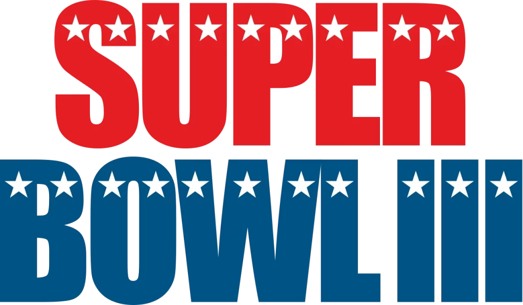
The 1969 Super Bowl was the third iteration of the championship tournament, and the first to bear the trademarked “Super Bowl” name. Going for an all-American red, white, and blue motif, the design featured the wordmark in two lines, with the word “SUPER” in the top line colored red, and the bottom “BOWL III” colored blue. Across the letters, at the top section of each letter in both lines, were white stars, which were the only logo symbols missing in this American-themed design.
1970 Super Bowl Logo
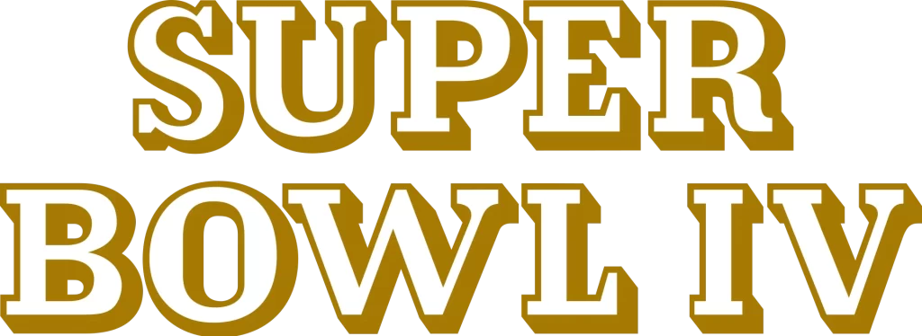
The 1970 design was one of the few Superbowl logos that had a significantly different design aesthetic to their previous and future iterations. It featured the wordmark “SUPER BOWL IV”, depicting the fourth iteration of the tournament, in two lines, similar to the previous design. However, that is where the resemblance ended. The letters were a dark gold and used a serif font. Moreover, the letters had a depth of shadow to them, rather than the flat letters used previously.
1971 Super Bowl Logo

The first Super Bowl to be held post the AFL-NFL merger, the 1971 Super Bowl logo had another unique design, but one that had some resemblance to the earlier designs, if only through color combinations. Going for a unique, yet highly aesthetic design of line art, the resultant logo looked to be made in the style of neon signs. The rounded shape and the two-color lines make for an interesting look for the era.
1972 Super Bowl Logo

The 1972 Super Bowl logo had a classically old-west style to its design. Using the American West inspired style of wrought iron craft, the logo uses vintage fonts with interesting serifs and embellishments, colored a brassy gold, for an interesting symbol. This was the second design since the tournament’s inception that didn’t use any color from the American flag as part of the design.
1973 Super Bowl Logo

The next year, the new newest of the Superbowl logos reverted back to its red and blue color scheme. Going for an unorthodox font that balanced smooth and well-rounded corners with sharp angles, the result was a single line wordmark with tightly grouped red and blue lines, and heavy blue shadows underneath.
1974 Super Bowl Logo

The 1974 Super Bowl logo again reverted to the neutral color palette, opting for a thick black designed outlined in alternating white and black lines, with an interesting font. The typography style of the font was designed to mimic a modern style of quill-based writing, with strokes that had a characteristic slant to them at the edges. Overall, while having no defining color scheme, the design is one of the more memorable ones.
1975 Super Bowl Logo
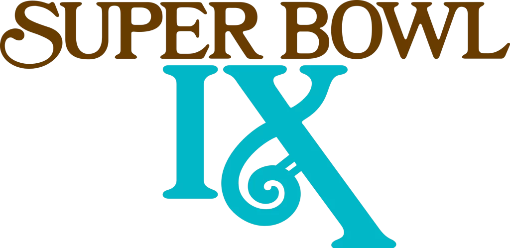
In 1975, the Super Bowl logo again featured a unique refresh. Ignoring the thick lines of the previous design, the new logo featured an ornate serif font colored a dark bronze, featuring the words “SUPER BOWL”. Underneath it were light blue colored roman letters “IX”, showcasing the ninth Super Bowl tournament. In both lines, one side of the wordmark had some loops and letter flairs, with the top line featuring it to the left, while the bottom line has it towards the right.
1976 Super Bowl Logo
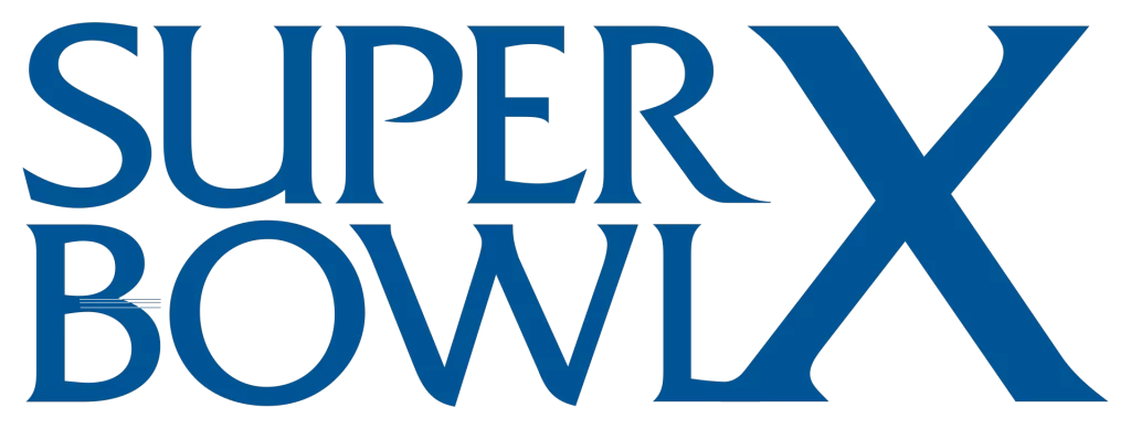
The 1979 Super Bowl logo reverted back to an American-colored theme, with a distinctive blue design to it. This style had a unique approach. Rather than going for a traditional one-liner or two-liner design, the logo had the words “SUPER” and “BOWL” in separate lines. Meanwhile to their right, the giant Roman numeral “X” flanks their side to form a great design that celebrates the decade-long milestone.
1977 Super Bowl Logo

A year later, the next iteration in a long series of Superbowl logos was introduced. The 1977 Super Bowl featured a blue wordmark that featured a thin, red and white outline that emphasized it’s the font’s interesting features, and added a little creative flair to an otherwise monochromatic design.
1978 Super Bowl Logo
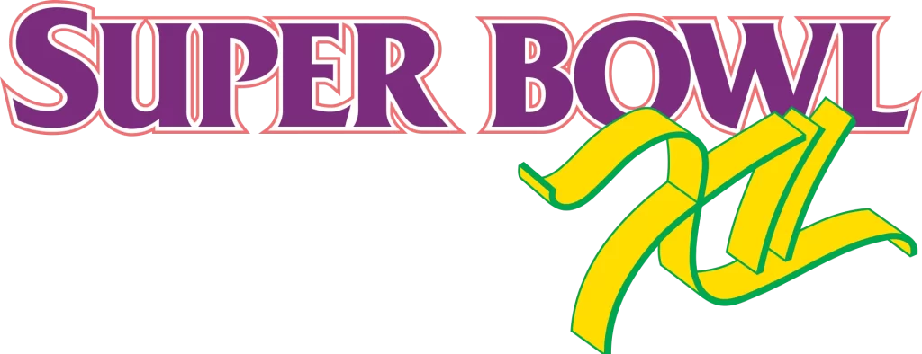
The 1978 Super Bowl logo saw another major redesign. This marked the first time that the wordmark featured two different writing styles, with the main design featuring a flat typographic style, while the Roman numerals featuring a distinct, three-dimensional design. Moreover, the colors used were unique too, going for a purple and yellow color scheme, with red and green accents.
1979 Super Bowl Logo
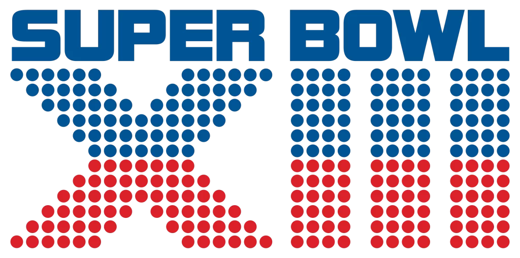
Finally, the last of the Superbowl logos of the early era was the one revealed in 1979. This featured another return to the iconic red and blue scheme, with the words “SUPER BOWL” back in a simple, blocky font within the same line. Underneath, the Roman numeral “XIII” was made up of small dots, the top half colored blue and the bottom, red.
Iconic Designs of the Super Bowl Logos of the 80s and 90s
The 1980s and 1990s marked a period of significant evolution in the design of Superbowl logos, with a shift towards more elaborate and dynamic compositions. Logo designs from this era often featured bold typography, vibrant color schemes, and iconic imagery related to American football culture.
Notable examples include the Super Bowl XXIII logo, which depicted a football bursting through a goalpost, and the Super Bowl XXXII logo, which incorporated imagery of the Vince Lombardi Trophy and a football field.
Let’s take a look at what this era holds.
1980 Super Bowl Logo
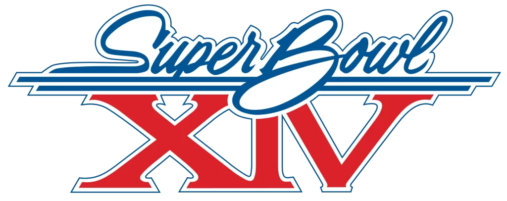
The 1980 Super Bowl logo represented the start of the second era of Super Bowl symbol design. it featured a distinctive style of typography, one that can be seen in many designs, especially California or Miami-themed designs of that era. With some loopy, handwritten fonts, and a distinctive blue, red, and white color scheme, this was a great logo to start the era with.
1981 Super Bowl Logo
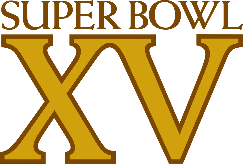
In 1981, the Super Bowl logo again featured a redesign, and one that clearly drew upon one of the earliest departures from traditional Superbowl logos. It featured classic serif font in a lighter weight for the main wordmark, while the Roman numerals had a thick and heavy feel to them. This design was one of the earliest to highlight the number of its Super Bowl more than its name, and featured a dark gold and bronze scheme.
1982 Super Bowl Logo
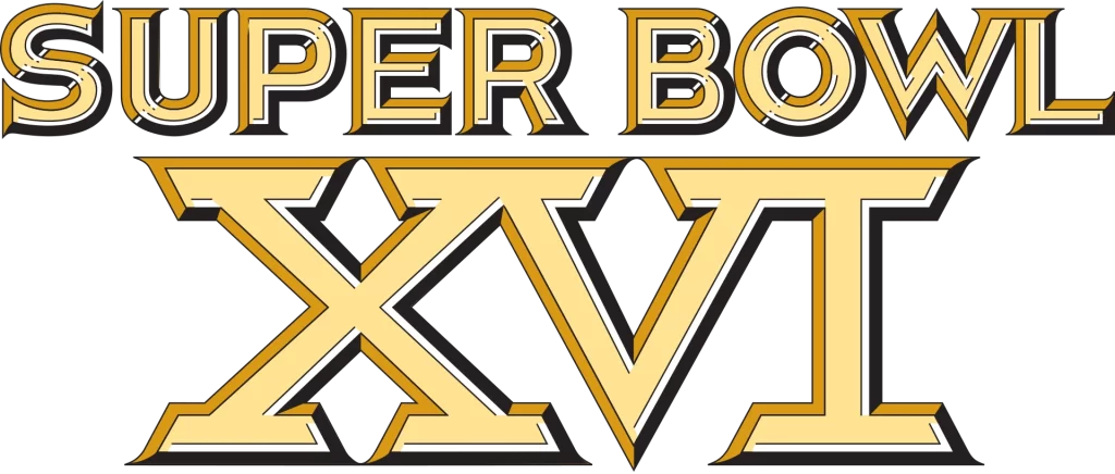
The 1982 Super Bowl symbol refined the previous design to be more appealing. It found the perfect balance in design between the sizes of the main wordmark and the Roman numerals, while it changed the color scheme to have a stronger impact while retaining that same metallic feel. Now with a thick outline that covered each letter of the logo, the overall design was more visually striking.
1983 Super Bowl Logo
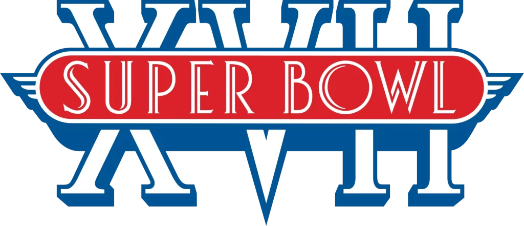
The 1983 logo for the Super Bowl again saw the design change drastically. Gone was the highly focused design highlighting the number of Super Bowls. The new one was inspired by car logos, and was designed to mimic the badges on cars from that era. However, it still used a red and blue color scheme, with white serving as its accent.
1984 Super Bowl Logo
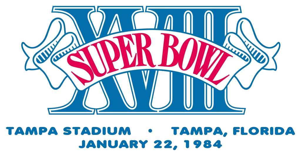
The 1984 Super Bowl enhanced on the previous idea to create an elaborate logo for that year’s tournament. The Roman numerals were kept at the back just like the previous logo, while the car badge-like design was changed to a ribbon banner that curved across the numerals with the words “SUPER BOWL”. The color scheme took blue as the primary color, while the only red was used for the wordmark.
1985 Super Bowl Logo
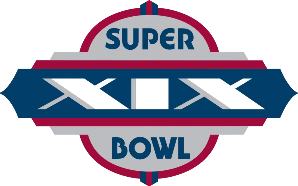
In 1985, the design again reverted to a car brand-like design. Using a darker color palette with red, blue, gray and white, the wordmark featured a rounded, less defined typography, while separating the two words of the wordmark was a stylized bar that featured the Roman numerals.
1986 Super Bowl Logo
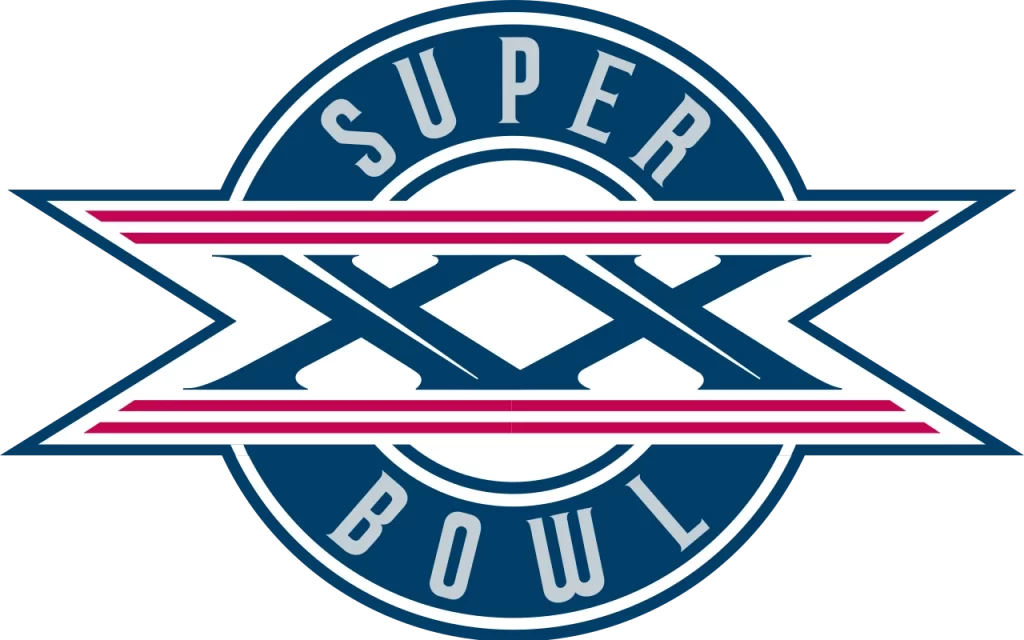
The next year, in 1986, the design changed, but kept the aesthetic theme the same. Looking suspiciously like the old Cadillac logos from the 60s, the new design would have been perfect for an automotive company than as a brand symbol for a football league.
1987 Super Bowl Logo
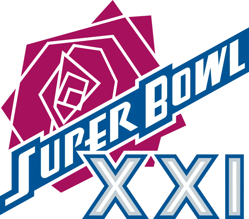
The 1987 Super Bowl was held at the Rose Bowl Stadium in Pasadena, California. And to honor that, the new Super Bowl logo included a geometric design of a rose in its symbol. Going for a more modern look than the symbols used previously, the new design featured a set of futuristic fonts, at least for that era, and used it to right the wordmark in blue at an angle across the rose. The result was unusual, yet highly memorable.
1988 Super Bowl Logo
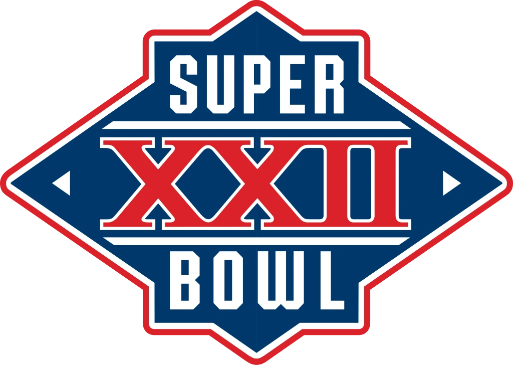
The 1988 Super Bowl logo started a new style of logo, with clean lines and visuals. The logo fonts used here were modern, with a classic late 80 to early 90s vibe to them. The dimensions of the symbol made it perfect for use anywhere desired, from advertisements to merchandise, perfect with the dark blue and red color scheme.
1989 Super Bowl Logo
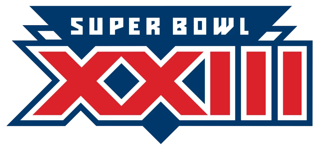
The next logo for the 1989 Super Bowl featured a blocky, sharply angled set of Roman letter with a dual triangle background. The letters were colored red with an alternating band of white and blue outline, while the triangles at the back were overlapped, with the back triangle white with a blue outline, and the front triangle a solid blue.
1990 Super Bowl Logo
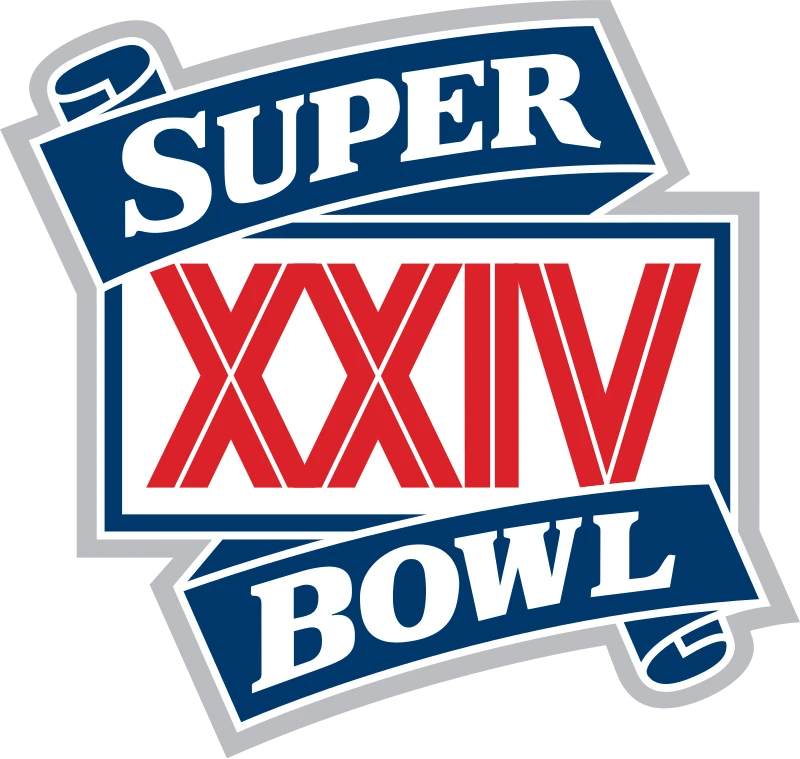
The 1990 Super Bowl logo went back to its roots of vintage logo design. Gone were the highly angular shapes of the previous designs. In their place was an amazing combination of rectangular framed logo, with a ribbon banner wrapped around it. The ribbon had the words “SUPER BOWL” in white, bold serif font, while the frame had the Roman numerals “XXIV”, colored red with a thin white line through each stroke.
1991 Super Bowl Logo
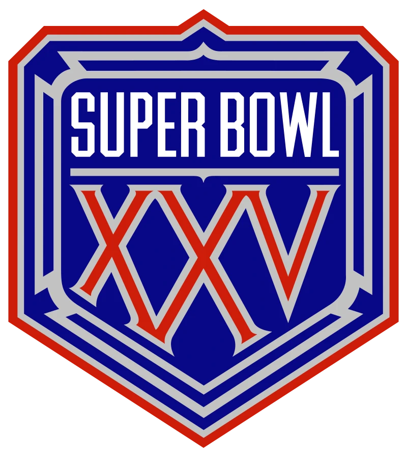
The 1991 design is one of those few Superbowl logos that feature a shield-like design. Complementing the NFL shield quite well, this red and blue design had a more aggressive look to it, with geometric line work inside it to give it a more primal look.
1992 Super Bowl Logo
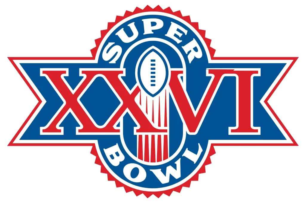
In 1992, the Super Bowl logo reverted to a more classic style again, a choice that clashed horribly with the design aesthetic of the 90s. Despite that, the swiftly rising football incorporated within this innovative design, as well as the over style of the logo, made this a memorable version.
1993 Super Bowl Logo
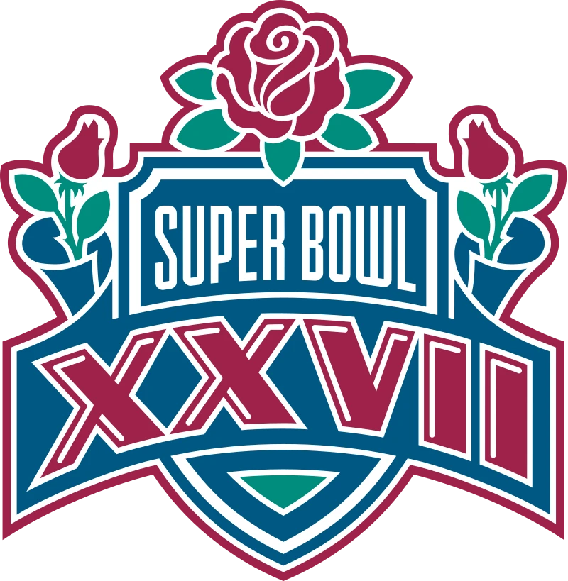
The 1993 Super Bowl was played at the Rose Bowl, and just like its previous iteration at that stadium, it featured the rose flower prominently. Rather than a single rose as the emblem like in the previous design, this time around they chose to accent the design with roses, along with replacing the red color with rose pink. While vintage, this shield-like logo embodied a cultured and elegant vibe.
1994 Super Bowl Logo

The 1994 Super Bowl eschewed the use of red in its design completely, going all blue for the newest iteration of the Superbowl logos. Using two shades of blue, light and dark blue, the company created a badge-like ribbon for its logo, with the central feature being a ripe orange in the middle, representing the Orange Bowl venue.
1995 Super Bowl Logo
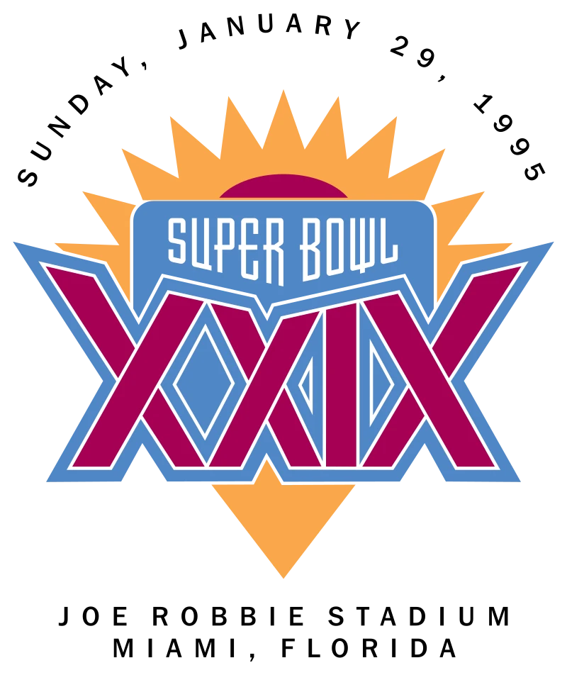
Held in Miami, Florida, the 1995 Super Bowl featured a bright and vivid orange, dark red, and blue design that caught the eye instantly. As the venue was Miami, there was nothing better than a bright sun setting over the horizon across the sea. And that is exactly what the logo represents.
1996 Super Bowl Logo
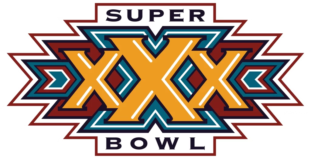
The blocky, sharply angled wordmark designs of the mid-90s were affecting the Superbowl logos as well. The 1996 Super Bowl logo featured a yellow, red, and blue design that was designed to look shiny and three-dimensional, but as if witnessed from the top rather than at an angle.
1997 Super Bowl Logo
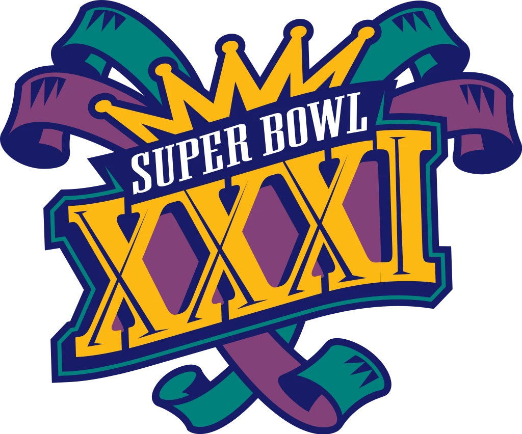
The 1997 logo for the Super Bowl reverted back to a somewhat vintage design, which was a visible departure to the previous, modern design. Going for a purple, blue-green, and gold color scheme, the design featured a pair of banner ribbons, along with a gold wordmark that featured a crown.
1998 Super Bowl Logo
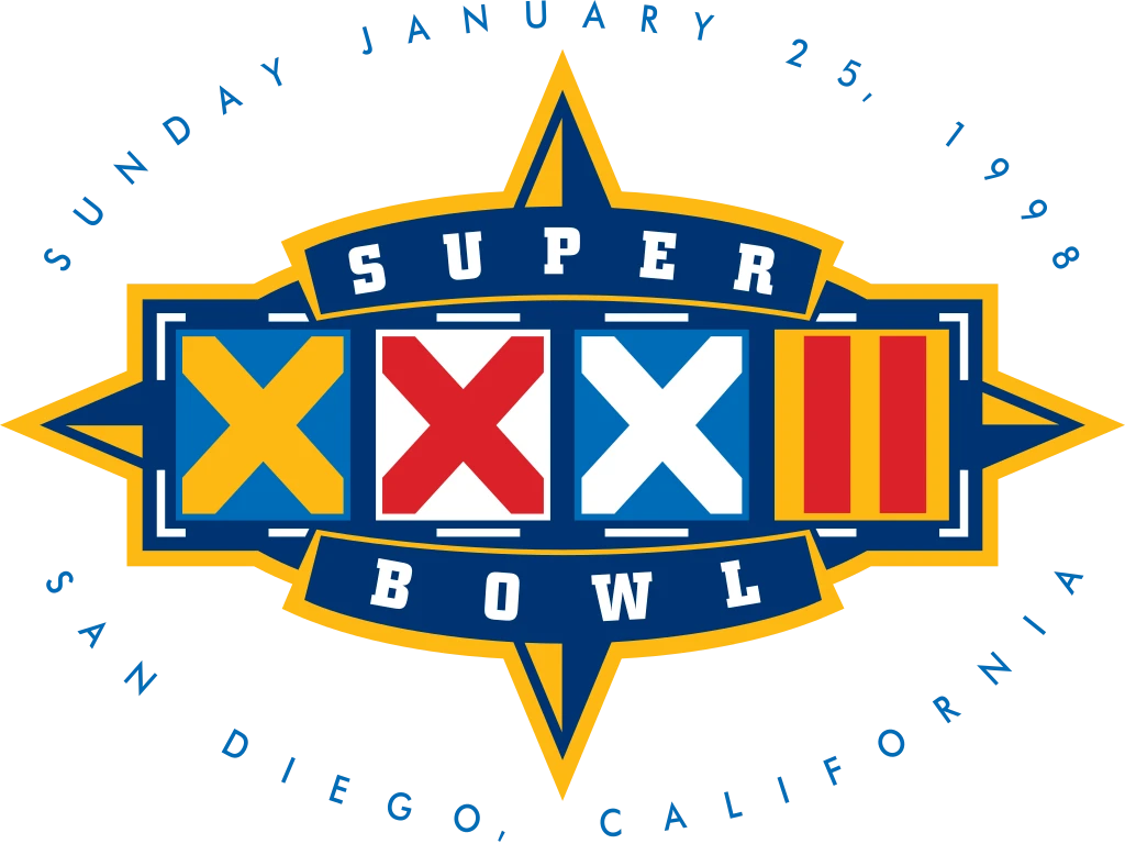
The 1998 Super Bowl featured a return to the modern design aesthetic. The new design featured an interesting compass-like design, with the Roman numerals designed with digital strikes (crosses), used to show eliminations in a tournament. The color scheme featured light and dark blue, red, white, and even yellow, for a colorful and impactful design.
1999 Super Bowl Logo
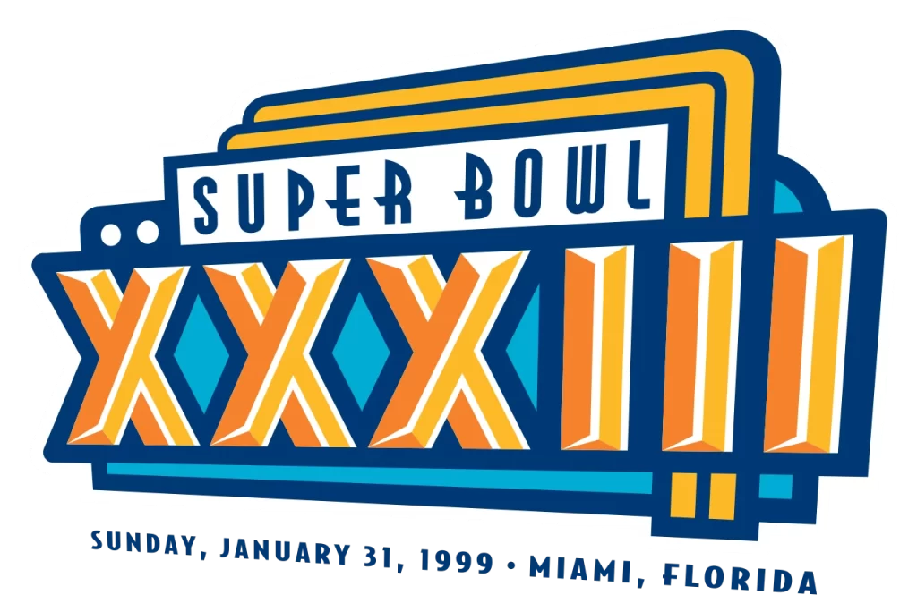
The 1999 Super Bowl logo was simpler and more modern than many of the previous designs we have seen. However, its simple yellow-gold and light blue color scheme makes it less memorable too, with the various logo elements used doing nothing to improve its impact.
Modern Era of Super Bowl Logos in the 21st Century
In the 21st century, Super Bowl logos have embraced digital design techniques and multimedia elements to create visually stunning and dynamic compositions. Logos from this era often feature intricate graphics, sleek typography, and vibrant colors, reflecting the high-stakes nature of the event and the evolution of design trends.
Examples include the Super Bowl XLVIII logo, which utilized a sleek metallic design to convey a sense of prestige and sophistication, and the Super Bowl LII logo, which incorporated bold typography and dynamic imagery to capture the excitement and energy of the game.
Let’s take a look at the modern Superbowl logos from the 21st century.
2000 Super Bowl Logo
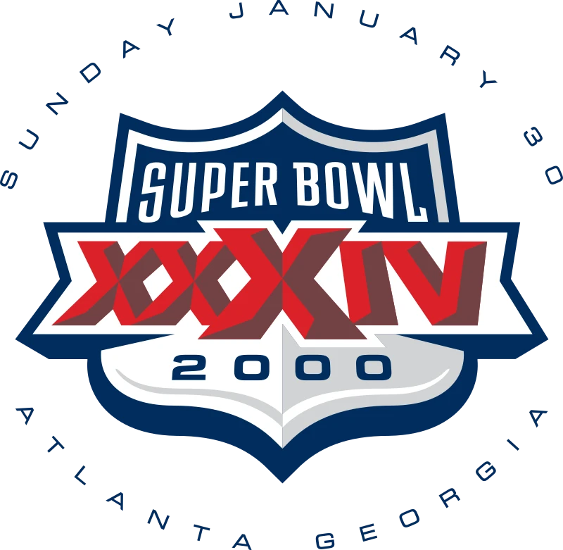
Y2K was a transcendental year in more than one way. For one, it introduced the new design aesthetic of consumers, which forced designed to rethink their designs. The 2000 Super Bowl logo featured a classic shield design, but one that had a pleasing, modern look to it, with a clean red, white, and blue color scheme.
2001 Super Bowl Logo
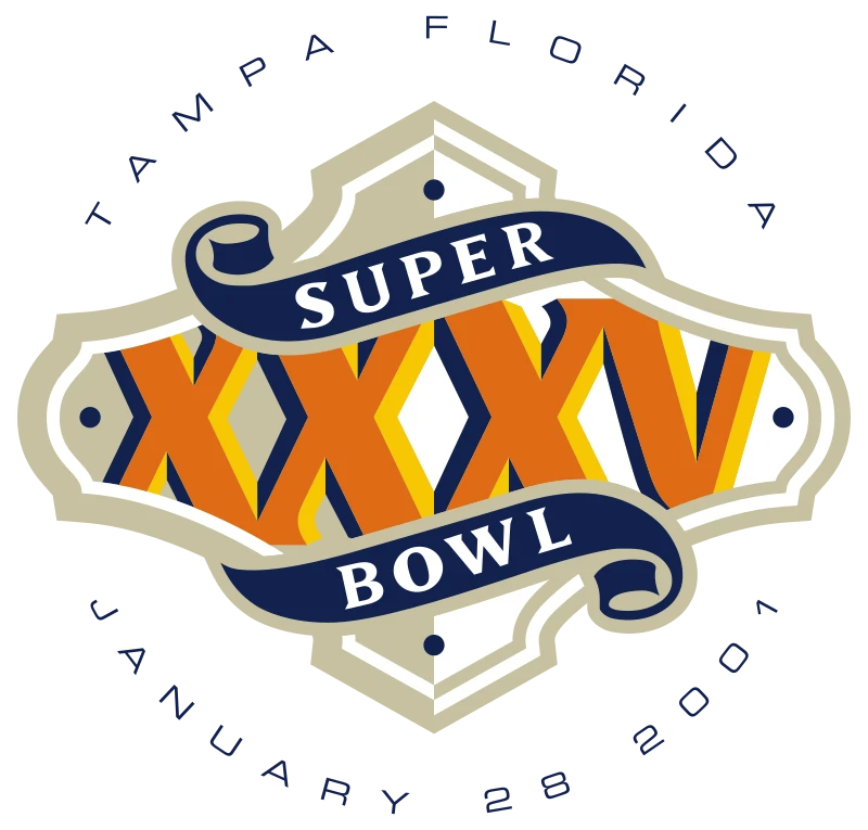
The 2001 Super Bowl logo was made in the design of a cast-iron metal plate, using a simple white-gray, gold, and dark blue color scheme. Although you may think that the resultant design would be bland or unappealing, you would be incorrect. The design catches the eye instantly, and its clean design makes it highly memorable.
2002 Super Bowl Logo
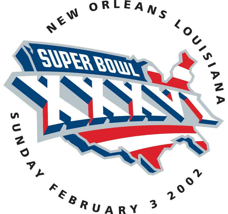
The 2002 Super Bowl logo was the next iteration of Superbowl logos that highlighted the modern aesthetic of the 21st century. The new design incorporated the outline of the state of Louisiana, the host of the tournament. Using a red, white, and blue color scheme with silver-gray accents, the design managed to give off a metallic sheen that raised the impact of the logo.
2003 Super Bowl Logo
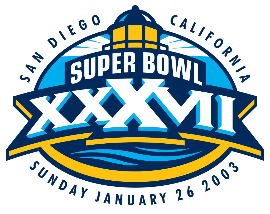
The San Diego Super Bowl of 2003 featured another one from the blue, white, and yellow Superbowl logos. The design showcased the benefits of computer-generated graphics, and incorporated a famous landmark from the city into its design, along with highlighting its proximity to the sea.
2004 Super Bowl Logo
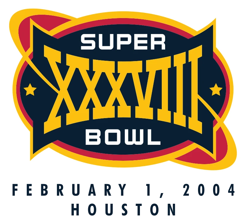
The 2004 Super Bowl held in Houston, Texas showcased the old-west vibe of Houston logo design aesthetic. Featuring an attractive red, navy blue, and yellow color scheme, the cattle brand-style design of the Roman numerals, along with the lasso-like design elements, make it highly memorable.
2005 Super Bowl Logo
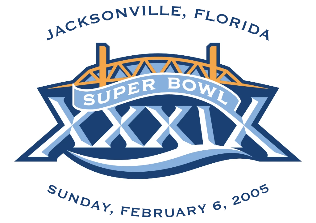
The 2005 Super Bowl continued San Diego’s tradition of incorporation a city landmark in its design. Going for a similar blue, white and yellow color scheme, the top of the design features the famous bridge of the city; while underneath it, the logo looks as if written using the waves of the water.
2006 Super Bowl Logo
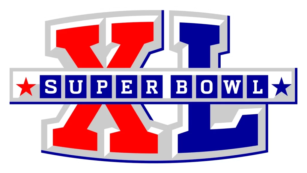
The 2006 Super Bowl logo on the other hand, went for a simpler design. The design looks like it is made of raised metal stamping, which raises each letter of the Roman numerals up distinctly. Moreover, the strip of metal band running across it horizontally has the wordmark on it, for a simple yet effective Super Bowl logo.
2007 Super Bowl Logo
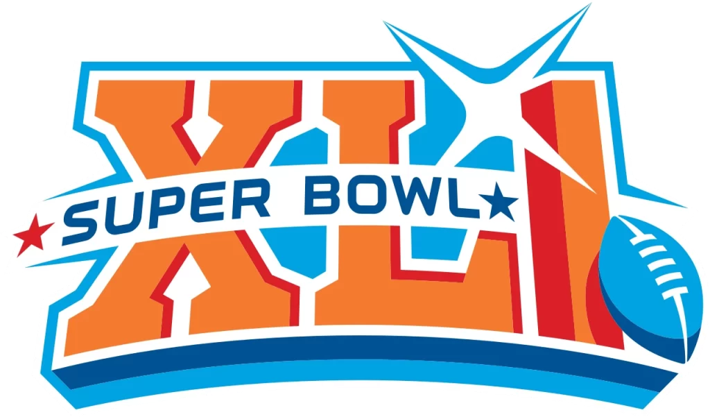
In 2007, the new logo for Super Bowl XLI decided to go for a logo that found the balance in design concepts of simpler symbols like the previous one, and more elaborate logos from a few years back. The result was a blue, orange, and white logo that featured a football in its design.
2008 Super Bowl Logo
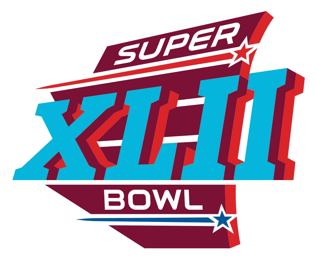
The 2008 Super Bowl logo showed a multilayer logo. The bottom of the design features a dark maroon plaque, accented by red and blue streaks, and a white wordmark. These elements are subtle, with the impact being taken by the light blue Roman numerals that slide across that plaque, in a dynamic fashion that makes it look like the logo’s moving at fast speeds.
2009 Super Bowl Logo
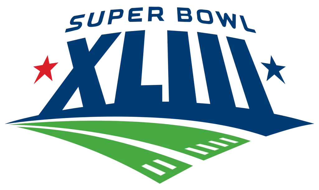
Another logo playing with perspectives, the new design for the 2009 Super Bowl showed dark blue wordmark placed at the side of the football field in huge, towering letters. The perspective shows as if you are looking up at them standing on the field, which results in a fisheye like curving of design.
2010 Super Bowl Logo
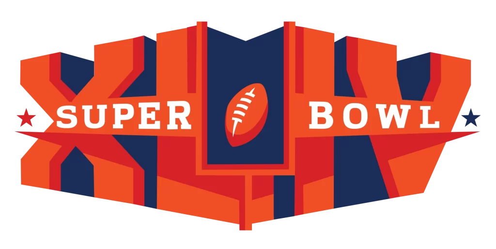
The 2010 Super Bowl was a massive departure from previous designs in terms of the logo. Using a massive, three-dimensional design colored orange and navy blue, the logo also incorporated the goalpost and a football in its design. The first of its kind, it is highly memorable.
2011 Super Bowl Logo
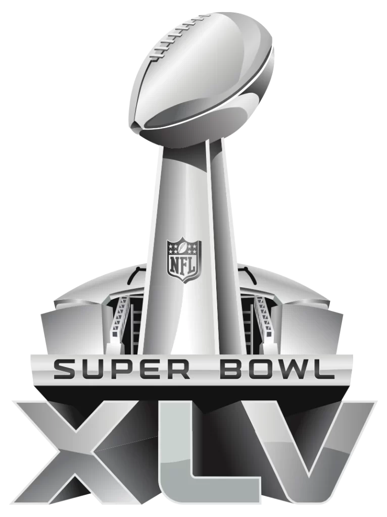
2011 saw another massive shift in the logo aesthetic of Superbowl logos. Done in all polished silver, it featured the Super Bowl trophy as its central image, behind which is the host stadium, and under it the wordmark.
2012 Super Bowl Logo
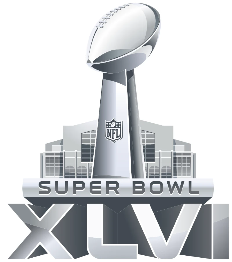
Designed to be the same as the previous logo, the only change was a slight lightening of the color, as well as the shape of the stadium behind, and the Roman numerals underneath.
2013 Super Bowl Logo
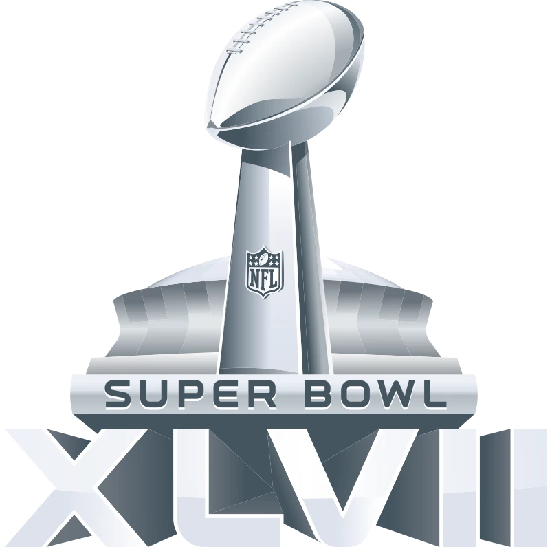
The 2013 Super Bowl logo saw no major, except for the change in the stadium’s design behind and the Roman numerals at the bottom of the trophy.
2014 Super Bowl Logo
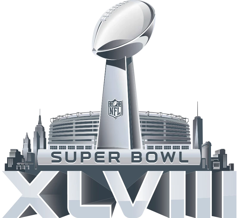
Virtually no change was featured in 2014 design either, with the Super Bowl host stadium being added to the design, and the number of the tournament changed at the bottom of the design.
2015 Super Bowl Logo
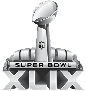
The 2015 Super Bowl was the last to feature this type of design with no additional embellishments. Besides the stadium at the back and the Roman numerals, nothing changed in its design.
2016 Super Bowl Logo
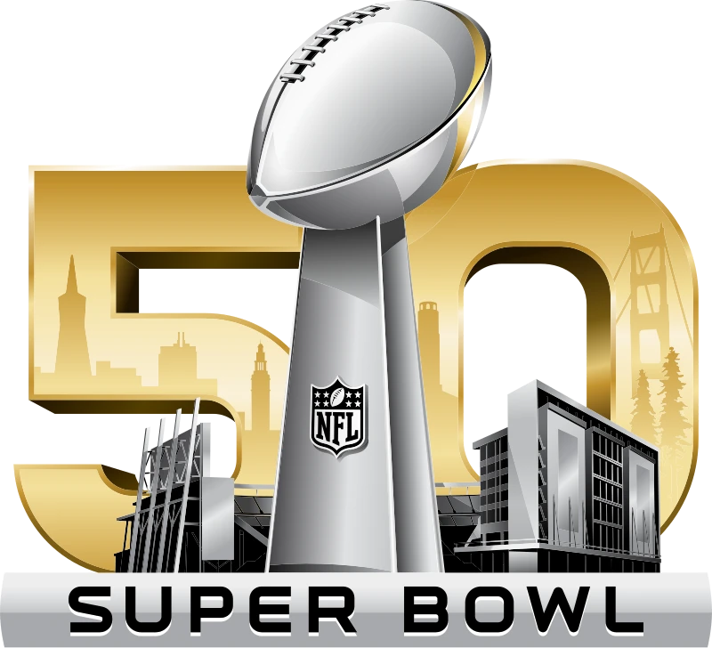
In 2016, the Super Bowl celebrated its 50th anniversary. To commemorate that milestone, a giant, metallic gold “50” was added to the logo’s background rising above the stadium’s image. Another change from the previous designs was the removal of the Roman numerals from the bottom of the logo.
2017 Super Bowl Logo
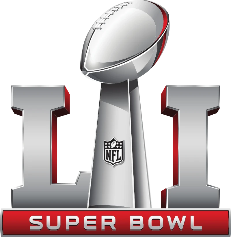
In 2017, the new style of Superbowl logos inspired by the 2016 design was debuted. The trophy remained in the design, but it was flanked on both side by Roman numerals depicting the tournament’s iteration. At the bottom was the wordmark, with a red background on it.
2018 Super Bowl Logo
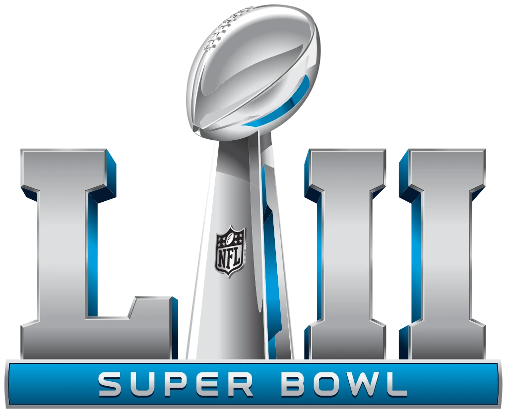
Changing the dimensions of the Super Bowl trophy on the logo slightly, the new 2018 Super Bowl logo featured a blue and silver color scheme. The design concept remained the same as the previous one, therefore no major change was witnessed.
2019 Super Bowl Logo
The 2019 Super Bowl saw a similarly styled logo as the previous iteration, with the only differences being the slight darkening of the blue color, and the change to the Roman numerals.
2020 Super Bowl Logo
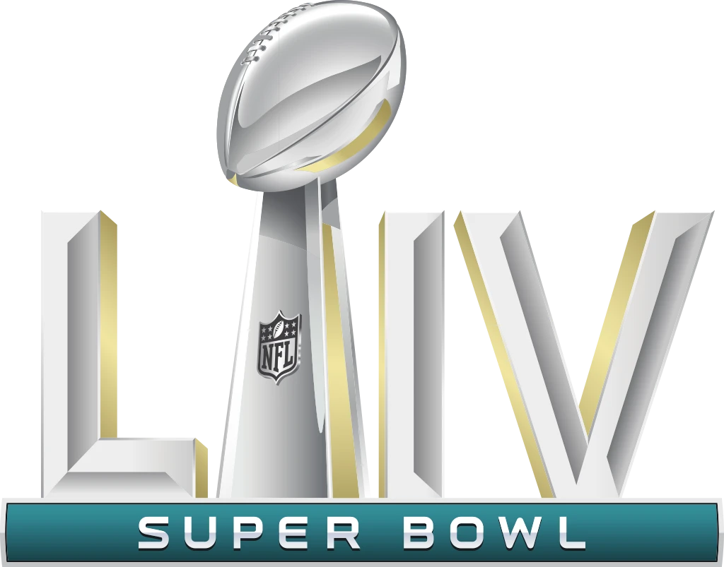
2020 also saw slight change to the color scheme, with the blue now lightened several shades, with the saturation reduced slightly as well. Besides this as the numerals, there was no other change.
2021 Super Bowl Logo
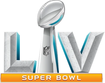
The 2021 Super Bowl logo changed it up somewhat, replacing the blue background for the wordmark with a dark orange-gold. The Roman numerals were given a slight texture in color, similar to Italian marble, with blue accents in their shadows.
2022 Super Bowl Logo
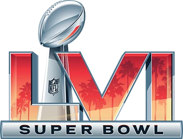
2022 saw the first massive change in design in nearly a decade. The silver/marble Roman numerals were turned it stained glass designs with metallic frames, with glimpses of a yellow and orange beachside vistas of palm trees in LA, California. The trophy was now offset a little to the left, with the translucent letters showing the outline of the trophy covered by the letters.
2023 Super Bowl Logo
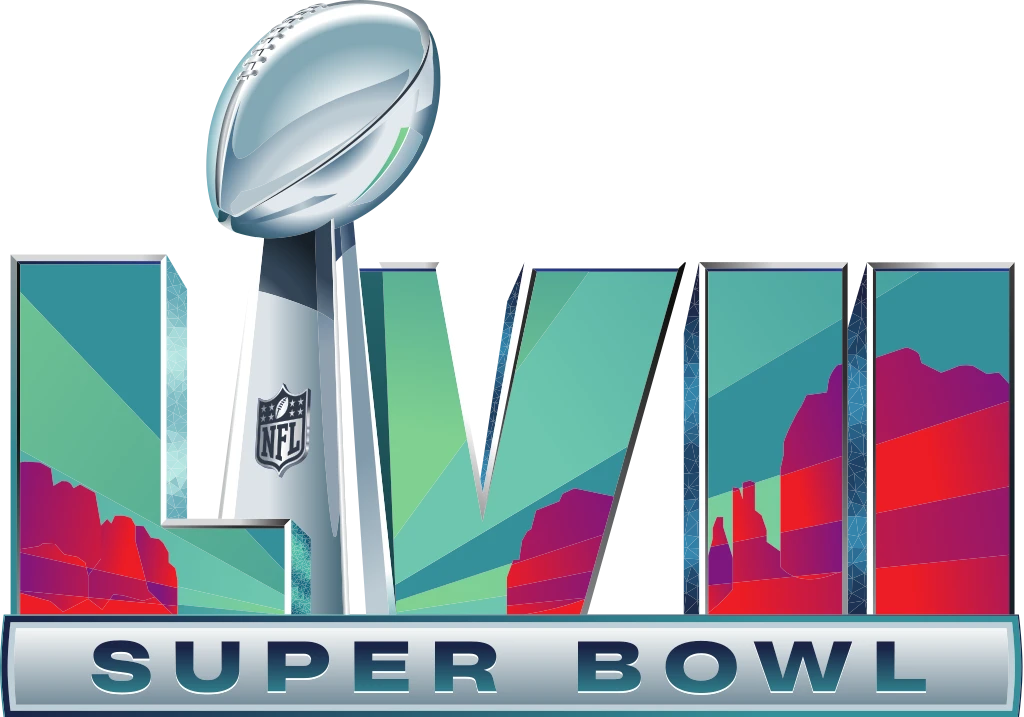
The 2023 Super Bowl also kept the same design scheme. But instead of see-though stained windows, they turned the letters into screen that portrayed glimpses of craggy cliffs and mountains that Arizona is known for. The color scheme was now blue, green, and red for the letter, which the rest remained the same.
2024 Super Bowl Logo
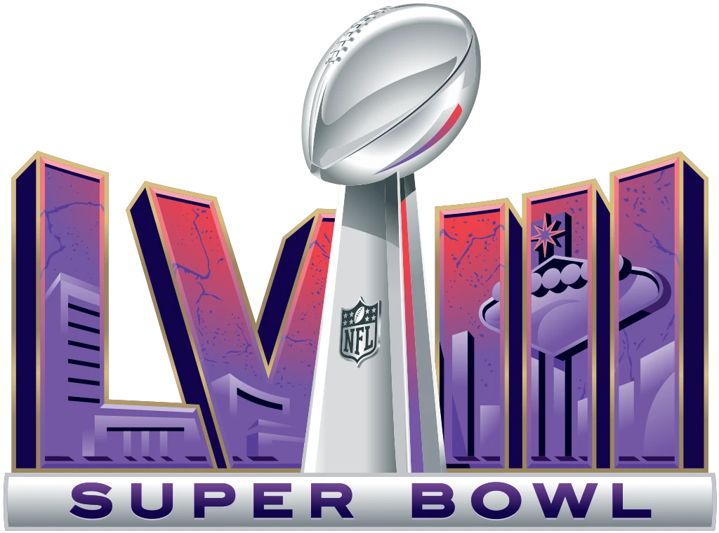
The 2024 Super Bowl was the first Super Bowl to be held in the state of Nevada. As such the newest Superbowl logo represented that quite well. With the Roman letters now arranged at an angle converging towards the trophy on both sides, they depicted the cityscapes of Paradise, Nevada, the tournament’s host. The color scheme was an appealing red and dusk, making for a great design.
2025 Super Bowl Logo
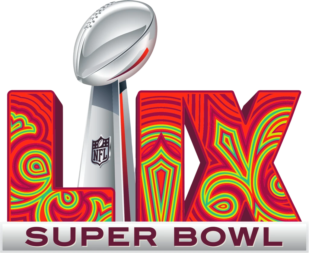
The next Super Bowl, to be held in 2025, is planned to be hosted in New Orleans, Louisiana. The design features an appealing abstract line art done in shades of yellow, green, red and dusk, with a few swirls in the design looking like a fleur-de-lis, the symbol of New Orleans. Overall, it is another great design in the list of Superbowl logos of the 21st century.
Super Bowl LIX & Beyond: How Will Future Logo Design Trends Affect the Logo Design
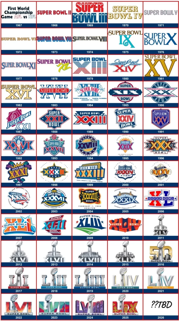
As we look towards the future of Super Bowl logos, we can expect to see continued innovation and creativity in design. With technological advancements and changes in tastes, future Superbowl logos may incorporate augmented reality elements, interactive features, and personalized experiences to engage audiences in new and exciting ways.
However, one thing remains certain: Super Bowl logos will continue to serve as iconic symbols of American sports culture, capturing the essence of the game and its enduring legacy.
Conclusion
The evolution of Superbowl logos reflects not only changes in design trends but also the evolving cultural landscape of American sports. From simple beginnings to dynamic and iconic designs, the Super Bowl logo has played an integral role in shaping the visual identity of America’s most-watched professional sport.
As we celebrate the history and legacy of the Super Bowl over the last six decades, we look forward to seeing the evolution of its logos, which will continue to inspire audiences for years to come.
Frequently Asked Questions
| Did the NFL change the Super Bowl logo in 2023? Since 2022, the NFL has updated the imagery in the Superbowl logos each year to reflect the host state/city. |
| What color is the 2024 Super Bowl logo? The 2024 Super Bowl logo features a red and purple color scheme. |

Logopoppin
Logopoppin is a graphic design agency that specializes in logo designing, web development, video production and advanced branding services. We love to innovate businesses with new age technologies, allowing them to improve their visual reputation.

