Discover Amazing List of Colors Starting with C and See How They Enhance Your Palette
The wonderful world of colors offers a never-ending adventure in vibrant shades. Just like we have discussed colors that start with A and B, have you ever wondered what colors start with C?
Well, don’t worry if you haven’t. We have done the legwork for you. Prepare to dive into a dazzling journey, giving us a glimpse of some amazing shades to use from a long list of colors starting with C! From familiar colors like crimson that you use every day, to the bright and vibrant shade of citrine, let’s discover a range of new shades to help your professional graphic design services stand out.
Common Colors that Start with C – The Workhorses of the Alphabet’s Color Palette
Before we get to the new and unique shades from our list of colors that start with C, let’s first explore some of the familiar shades that we encounter every day. These colors are the workhorses of the palette, often used in design and everyday life. Think of vibrant Crimson, soft Champagne, or the calming hues of Celeste.
Keep in mind though, these are just a few examples we have chosen for our list. In reality, each of these shades boasts a spectrum of variations, offering endless possibilities for a unique creative expression, depending on their specific color meanings. In any case, let’s take a look at some common colors that start with C.
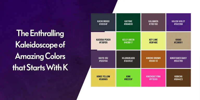
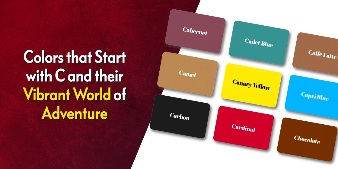
Crimson (#DC143C)

Crimson is a rich, deep shade of red that exudes power, passion, and a touch of luxury. Said to be more vibrant than its parent shade in colors that start with R, crimson is perfect if you want to make a bold statement, whether it’s a logo, a dress, or even a luxurious velvet sofa. Moreover, it works even better when paired against cool neutral colors like eggshell white from colors that start with E.
Cerulean (#007BA7)

Cerulean is a calming and serene shade of blue that reminds the viewer of a clear summer sky in the morning. It evokes feelings of peace, tranquility, and trust, which is perfect if you want your viewers to be at ease. That helps make cerulean a popular choice for color combinations used in soothing spaces like bedrooms or meditation rooms.
Canary Yellow (#FFEF00)

If you want a bright and energetic pop of color in your designs, then canary yellow is the shade for you. “One of the more vibrant shades of yellow color, canary yellow can be said to be a burst of sunshine personified! This bright and cheerful yellow injects a dose of optimism and energy into those that view it, making it perfect for cafes, kitchens, or a playful children’s room.
Chocolate (#7B3F00)

There is nothing better than indulging in a luxurious bar of chocolate, or drinking a hot mug of rich hot chocolate. Chocolate is one of the warmest, most comforting shades of brown color that evokes feelings of strength and indulgence. Think of a cozy leather armchair or a rich, decadent chocolate cake, and feel how it makes you warm and comfortable instantly.
While other shades from this family like fawn, a beautiful shade of brown from colors that start with F, also convey a sense of warmth, lighter shades like fawn convey a sense of coziness. On the other hand, darker shades like chocolate give a sense of instant warmth and fulfillment that suffuses the entire body.”
Camel (#C19A6B)

Camel is a versatile and sophisticated neutral hue from shades of beige color inspired by the sandy tones of the animal’s coat that the color is named after. Camel adds a touch of warmth and soft earthiness, helping it compliment a variety of color schemes easily. That versatility is what makes camel a great choice for many designs, from design accents to everyday wear, or even in the interior design color palettes for a cozy den or living room.
Cobalt Blue (#0047AB)

Cobalt blue is a deep, vibrant shade of blue that is often associated with the feelings of trust, reliability, and intelligence. While its parent, from colors that start with B, has one of the largest varieties of shades of any color in use today, cobalt blue is one of the richest hues from that bunch. That makes it perfect for a crisp business suit or a captivating seascape-themed design.
Coral (#FF7F50)

Coral is a vibrant orange-pink shade inspired by coral reefs, offering a color that looks like one of the light shades of orange color with a distinct pink overtone. Coral is the perfect shade to use in your designs if you want to exude a sense of warmth, energy, mixed with a touch of the exotic. To understand what it feels like to view this color, imagine a refreshing summer cocktail on a sunny day, or the feel of the sand and the sea at a tropical beach near sunset.
Cream (#FFFDD0)

When we talk about calming pastel shades that offer a neutral background, cream is one of the top options on that list of colors starting with C. A versatile and calming shade of off-white that is warmer than shades of white color like eggshell, cream is often associated with purity, comfort, and sophistication. Often used to denote a simple elegance, cream is a popular option for a classic wedding dress or a soothing spa, especially when paired with shades like dusky rose from colors that start with D.
Transform Your Business with Professional Logo and Branding Services
Revamp My Brand
Beyond the Colors that Start with C – Exploring the Unconventional Shades and Colors
Now that we have gone through the common list of colors starting with C, we will now move on to some of the more unconventional and lesser-known shades. And although the world of colors that start with C has many popular shades in it such as charcoal from shades of black color, we are confident that the following will be quite a welcome surprise for you.
So, buckle up and get ready for a journey into the world of some unique and intriguing hues from the C palette.
Carmine (#960018)

Carmine is a vibrant shade of red that has historically been used by royalty and aristocracy, similar to natural pigments like Egyptian brown or Tyrian purple, one of the most regal shades of purple color. And just like the latter was derived from powdered mummies from Egypt, carmine, or cochineal red, is manufactured by crushing the cochineal insect!
A vivid hue with undertones of violet and pink, carmine has an elevating impact on anything that its used for. From art to attire, the use of carmine adds an elegant sophistication to the design, intrinsically increasing the value of that item.
Carnation Pink (#FFA6C9)

A soft and delicate hue from shades of pink color named after the carnation flower, it is more visually appealing than its parent from colors that start with P. Symbolizing the feelings of love, affection, and gratitude, the soft appeal of this shade adds a lot of emotional connection to the elements its used on. Picture it in a romantic bouquet of carnations in the hand of your lover, or a romantic bedroom accent to a girl’s bedroom.
Celadon (#AFE1AF)

Celadon is one of the more interesting shades of green color that we will see on any color list. Named for the classic color of glaze found on old Chinese ceramics, the calming and sophisticated blue-green hue inspired by the ancient eastern civilization make for a great addition to any color palette. Its delicate and subtle variations into colors that start with G (with a greater greenish hue), offer a touch of elegance to traditional décor or a calming spa environment.”
Chartreuse (#DFFF00)

A vibrant yellow-green color that reminds us of the liqueur of the same name, or even a darker Limoncello, chartreuse is often associated with freshness, liveliness, and something unexpected. One of the more popular tertiary colors, the shade is associated with the emotions and feelings of spring and summer, it makes for a great addition to designs that needs a pop of color, doing better than many of its yellow siblings from colors that start with Y
Citrine (#E4D00A)

A bright and vibrant yellow with a slight greenish tinge, citrine is named so due to it resembling the color of the citrine gemstone, a semi-precious stone that is a variant of quartz. The color is often associated with feelings of joy, optimism, and creativity. With a summery vibe to it, imagine it as a sundress or a brand logo against a darker background where the vibrant citrine pops instantly. Incidentally, some also use citrine within their spectrum of mood ring colors.
Cyan (#00FFFF)

One of the purest, clearest shades of blue color often used in printing and digital art, cyan represents the feeling of calmness, peace, and clarity. The color of a bright summer sky, or the clear waters of tropical paradises like Maldives or Madagascar, the color is often associated with serene coastal landscapes. That is why cyan is often featured in beachside businesses, where businesses use its inherent logo color meanings to enhance the impact of their logos and branding.
Crimson Lake (#9F3543)

Crimson lake is one of the most interesting shades of red color on this list, in the sense that it is a slight variation on one of the earliest colors we discussed – crimson. A slightly lighter and cooler shade compared to regular crimson, it has a completely different vibe to it, and is often used in traditional paintings and art for its depth of emotions.
Curry (#F9C906)

A warm, yellow-orange color with distinct warm shades of gold color reminiscent of the spice blend, curry evokes strong feelings of warmth and comfort. It instantly brings to mind something hot, filling, yet with a spice that makes the whole experience memorable. Imagine a delicious curry dish or a vibrant sunset over the desert, and that is what curry offers your designs in terms of vibe.
The Psychology and Emotional Impact of Popular C Colors
Every color triggers specific emotional responses that influence how people perceive your designs and brands. Understanding these psychological effects helps you make intentional design choices.
Calming and Trust-Building Colors
Cerulean and celeste create immediate feelings of peace and reliability. Studies show that soft blues like cerulean reduce stress and promote focus ; ideal for healthcare brands, meditation apps, or financial institutions. Cream and champagne offer subtle warmth without overwhelming, making viewers feel comfortable and welcomed. These work perfectly for spa branding, wellness blogs, or professional services websites.
Energizing and Urgent Colors
Crimson, candy apple red, and cardinal command attention and trigger urgency. These intense reds increase heart rate and create excitement perfect for clearance sale banners, call-to-action buttons, or sports brands. Use sparingly; too much red can overwhelm. Citrine and canary yellow inject optimism and energy, ideal for motivational content, children’s brands, or creative agencies looking to inspire action.
Professional and Authoritative Colors
Charcoal, cobalt blue, and corporate grays project competence and stability. Charcoal gray is the go-to for law firms, corporate websites, and executive branding because it signals seriousness without the harshness of pure black. Cobalt blue strikes the perfect balance between approachable and authoritative. Think IBM, Facebook, and LinkedIn. These colors tell customers, “You can rely on us.”
Warm and Comforting Colors
Chocolate brown, caramel, and cinnamon evoke feelings of comfort, security, and indulgence. Brown tones remind us of earth, wood, and chocolate triggering nostalgia and trust. Coffee brands, bakeries, and home goods companies use these shades to create cozy, welcoming environments. Coral adds a playful warmth that feels friendly without being childish see how these apply in our food logos showcase.
Cultural Considerations
Colors carry different meanings globally. Chinese red symbolizes luck and celebration in Eastern cultures but can signal danger in Western contexts. Cream represents purity in Western weddings but signifies mourning in some Asian cultures. When designing for international audiences, research your color choices carefully.
Practical Applications
- Call-to-action buttons: Use crimson or candy apple red to boost click rates
- Background colors: Choose cream or champagne for readability and elegance
- Trust elements: Incorporate cerulean or cobalt in testimonials and guarantee sections
- Product packaging: Match colors to the desired emotional response. Chocolate brown for indulgence, celadon for natural products
Understanding color psychology helps you design with intention, creating stronger emotional connections with your audience.
How to Use Colors Starting with C in Logo Design and Branding
Choosing the right color can make or break your brand identity. Colors that start with C offer diverse options for different industries and brand personalities.
For Tech and Innovation Brands Cobalt blue and cyan project trust and innovation. Use cobalt blue for enterprise software or fintech companies where reliability matters. Pair it with champagne or cream for a sophisticated, modern look. Cyan works brilliantly for SaaS startups and tech companies that want to appear cutting-edge and accessible.
For Luxury and Premium Brands Crimson, cardinal, and copper deliver instant luxury appeal. Crimson evokes passion and exclusivity perfect for high-end fashion, jewelry, or premium automotive brands. Copper adds warmth to luxury wellness brands or artisanal product lines. Combine crimson with charcoal gray for maximum sophistication.
For Natural and Wellness Brands Celadon, celeste, and cream signal calm and natural authenticity. Celadon green works beautifully for organic skincare lines and wellness centers. Cream provides a clean, minimalist backdrop for health-focused brands. These colors pair naturally with earthy browns and soft grays from shades of brown color collection.
For Food and Hospitality Curry, cinnamon, and chocolate brown trigger appetite and comfort. Curry yellow adds energy to casual dining concepts, while chocolate brown conveys richness for premium coffee shops or bakeries. Coral brings tropical warmth to beach resorts and summer beverage brands. Explore more options in our guide to restaurant logos.
Color Combination Tips
- Professional services: Charcoal + cerulean + champagne
- Eco-friendly brands: Camel + celadon + cream
- Beauty and cosmetics: Coral + champagne + carnation pink
- Food and beverage: Chocolate + caramel + cream
Remember: color consistency across all brand touchpoints strengthens recognition and builds trust with your audience. Learn more about creating cohesive brand identities in our branding ideas guide.
Conclusion
From the common and familiar to the unique and intriguing, the array of colors that start with C offers a vibrant and diverse palette to choose from. As we explore color theory deeper, we discover the endless applications, cultural significance, and the power that these shades hold in evoking specific emotions and inspirations.
So, what new shades from the list of colors starting with C discussed above would we see featured in your color palettes soon?
FAQs
| What blue starts with C? There are multiple shades of blue in the list of colors starting with C. Some of the more common ones include cobalt blue and cyan. |
| What are some red colors that start with C? Some popular shades of red that start with C include crimson, carmine, and crimson lake. |
Latest news you want to know!
Subscribe for cutting-edge design inspiration at Logo Poppin! Elevate your brand with updates on logos, branding, web design, and video animation.
Note that by clicking “subscribe,” users may agree to our privacy policy and consent to Logo Poppin to use your contact data for newsletter purposes.
Logopoppin
Logopoppin is a graphic design agency that specializes in logo designing, web development, video production and advanced branding services. We love to innovate businesses with new age technologies, allowing them to improve their visual reputation.