
Table of Content
Discover How the Dodgers Logo Transformed Since its Formation in the Late 19th Century
The Major League Baseball is one of the oldest professional sports league in the world, and the oldest of the Big-Four sports in the US, with its origins in late 19th century. Of the thirty teams that make up the MLB, divided equally between the National League and the American League, the Dodgers are one that have played the sport for nearly the league’s entire lifetime.
Originally from Brooklyn, the Dodgers logo and name has evolved multiple times in over a century of gameplay. From the Bridegrooms, to the Superbas, the Robins, and finally, the Dodgers, they have used many great MLB logos.
Coming back to the design of the logo, its understandable that over time, even without moving host cities, the franchise logo would need to be revamped and refreshed. So how has the team been able to keep it so interesting, despite all those changes? How have these team logos designed by professional los angeles logo design services managed to incorporate the history and legacy of the previous designs into the modern aesthetics of the newer logo?
Let’s dive in and discover how the Los Angeles Dodgers logo evolved into its iconic modern shape.
The Dodgers Logo – A Retrospect
Before we begin with the history of the Dodgers logo, let’s take a look at the design of the modern Los Angeles Dodgers logo, and see what it looks like.
The current logo for the Los Angeles Dodgers features their iconic wordmark using a cursive typography common in many popular baseball fonts. Combined with that wordmark is a simple set of imagery depicting a baseball soaring up into the air, with streaks of air behind it depicting its motion.
The red and blue color palette of the design is quite striking, despite the fact that compared to the logo from many of the other sports leagues in the US, the designs are quite old-school and plain. However, for the true fans, that’s where the true beauty of the sport lies.
One of the hallmarks of many baseball teams, especially in the major league, lies in incorporating their legacy and history into their logos. It is one of the biggest reasons you see many old MLB teams sporting vintage-looking logos, even some considered outright weird by the fans.
So, let’s take a look at the different versions of the logo used by the Dodgers over its career.
The Different Eras of the Los Angeles Dodgers Logo and What They Represented
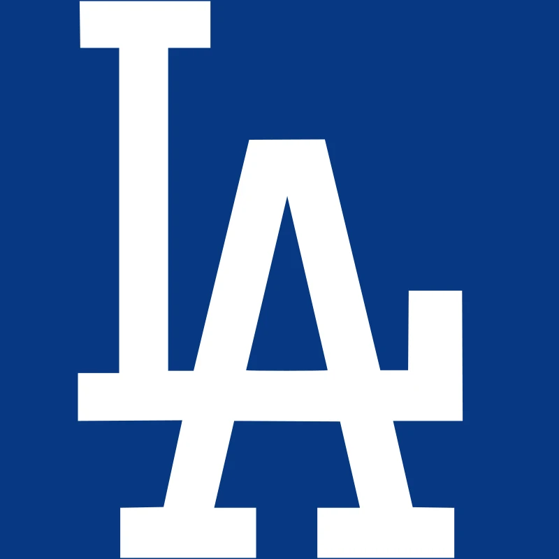
In the life of the Los Angeles Dodgers, there have been four distinct phases where the names and the logos have changed for the franchise. Three of those phases have been in its original hometown of Brooklyn, while the fourth and last one has been in their current home of LA.
So let’s take an overview of each of these phases before moving on to the evolution of the Dodgers logos.
Brooklyn Superbas
The Brooklyn Superbas was the name the team came used when they came up with their first logo in 1899. Having gone through various names like the Bridegrooms, the Grooms, Trolley Dodgers, and more in the years before that, this phase lasts until the end of the 1913 season.
And in this time, the team known as the Dodgers today saw a total of five distinct logos, with one of them only being used for a single season.
Brooklyn Robins
In 1914, the name of the team was changed to the Brooklyn Robins, and saw the start of the next phase of the Dodgers logo. This phase lasted until the end of the 1931 season, and it too saw five major logo changes in this time.
However, this era has two different logo versions that were used for just a single season each before being discarded for a new logo.
Brooklyn Dodgers
The third phase for the Dodgers is also the first time that the Dodgers name was unveiled. In 1932, the team was renamed from the Robins to the Dodgers, marking a new era in the history of the franchise. This phase lasted until the end of the 1957 season, and saw four distinct logo variants being used in that time.
Los Angeles Dodgers
Finally, the modern Los Angeles Dodgers phase for the team began with the start of the 1958 season. This phase was signaled by the franchise’s move to Los Angeles from their original hometown of Brooklyn to explore new horizons, and has featured five different logos so far.
The Brooklyn Superbas Era Dodgers Logos
The Superbas was the first known name for the team, and the first one to be associated with a logo in the franchise’s history. Let’s take a look at the various logo designs used in this era.
1899 – 1901

The first logo for the Brooklyn Superbas, the ancestral version of the modern Los Angeles Dodgers logo, was the first logo in the franchise’s history. Incidentally, it is also the only design that can be categorized as one of truly red logos unlike the later prominently blue ones. It featured an elaborate design of the letter “B”, designed to represent the host city.
1902 – 1908

Just two seasons later, the franchise decided to tweak their logo slightly. Rather than going for something major, the Superbas decided to recolor the design a dark blue to replace the red. In the end, this start to the new color scheme paved the way for future Dodgers logos.
1909
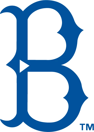
Six years after the second logo for the Brooklyn Superbas was released, the team decided to revamp its symbol yet again. This time, they went for something more ornate, going for a look that uses the style of popular gothic vintage fonts to give their symbol a unique flair.
1910 – 1913
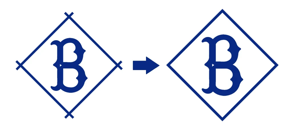
A year later, the logo was given an additional design flair to give it a more logo-like appeal. Adding a rhomboid stick frame to the previous logo design made the logo stand out better, but the crossed ends of the sticks on each corner looked a little unrefined.
This was rectified in 1913, when the ends were joined seamlessly to form a smooth geometric frame for the logo, resulting in a great visual symbol.
Changing the Team to the Brooklyn Robins with a New Set of Team Logos
Nearly a decade and a half after the release of their first logo, the Brooklyn Superbas decided to change their name to the Brooklyn Robins. This change in name heralded a new direction for the logo as well. So let’s take a look at the logos used in this phase of the Dodgers’ life.
1914 – 1925
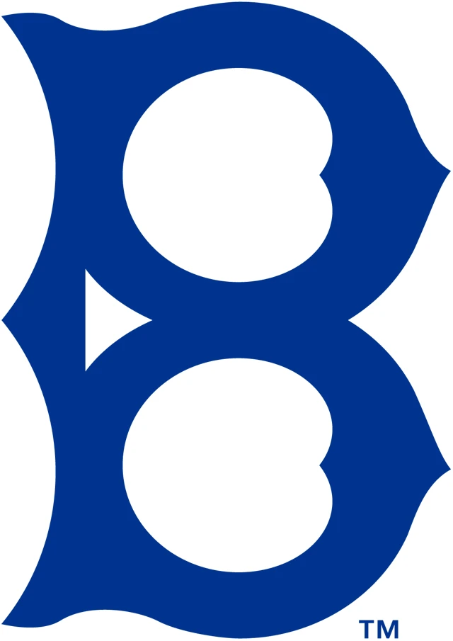
The first logo for the Brooklyn Robins featured a design similar to the 1909 Brooklyn Superbas logo. The main differences were that the color blue was changed from a sunnier shade to a darker, deeper shade of blue. Moreover, the lines were thicker, giving the logo a heftier feel.
1926 – 1927
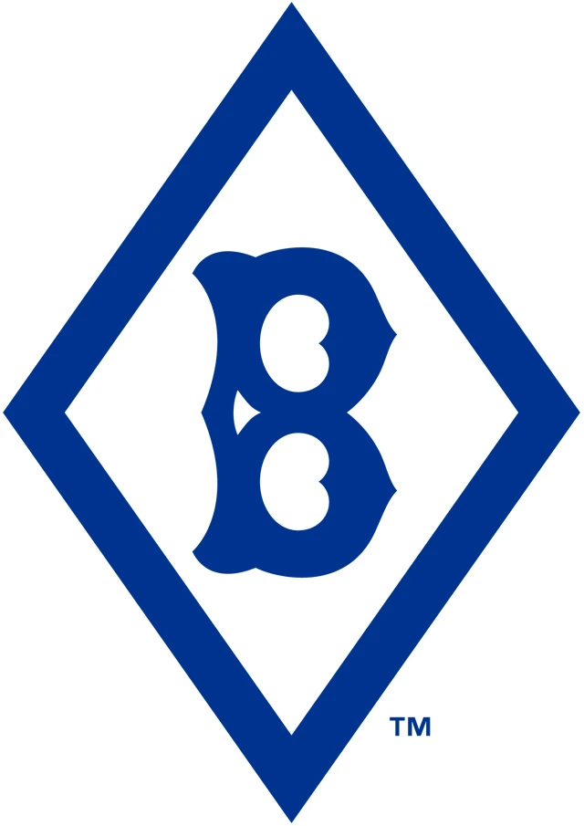
More than a decade after the previous redesign, the second logo for the Brooklyn Robins was revealed. It too took inspiration from the Superbas era logos like the last logo. However, it decided to combine the concepts of the 1913 Superbas logo, as well as the previous Robins logo.
The result was an elongated diamond frames with heavy lines, featuring the thick logo from the previous logo iteration inside. The dark blue color combined with the thick strokes resulted in a design perfect for the monogram logos used in many sports.
1928
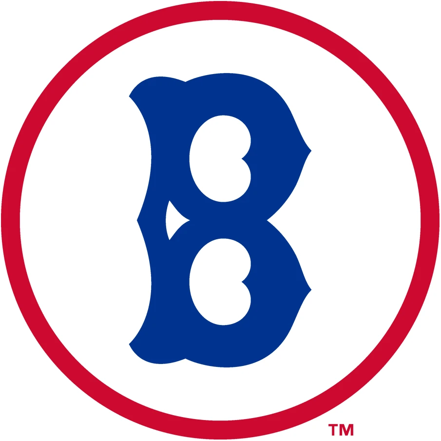
The previous logo however, was used only for two years before the team decided to revamp the design again. This time, they tweaked the outer frame, replacing the thick blue diamond frame with a red circle to five the logo a more balanced appeal.
1929 – 1930
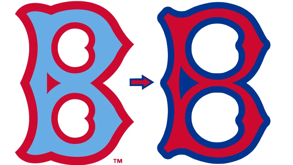
A year later, the logo was changed again, this time forgoing the outer frame altogether. Instead, the red and blue color combinations were used in the inner “B” design itself, with the red serving as a thick outline, and a light powder blue shading the inside.
However, this new combo did not go over well, and the very next season, the team redid the logo, flipping the color scheme with the insides now red, and the border a dark blue. This 1930 version of the Robins logo was far better received.
1931
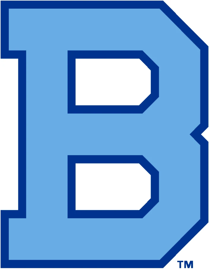
Still, despite the constant changes, the team couldn’t come up with a logo that they could agree represented the franchise well. So, 1931 saw another logo released for the Robins. It featured a giant, blocky, uppercase letter “B” colored a lighter blue inside, with a dark blue outline. The design was simple, yet its lack of visual embellishments meant that it had better visibility.
Renaming the Team to Dodgers and the New Brooklyn Dodgers Logos
T932 marked the third phase of the Dodgers logo. Imagine, you aren’t even halfway through the team’s life, and already we have reached the third phase of the Dodgers’ logo. This was incidentally the first time that the team was called the Dodgers, changing their name from the Robins.
Let’s take a look at the various logo designs used in this era.
1932 – 1936
For the first logo of the Brooklyn Dodgers, the team decided to bring back the 1914 design of the gothic style “B”. However, this time, the design was refined by making the gaps inside the lines greater, which added clarity to the design and made it look more versatile. This version of the logo was used for the next four years without change.
1937

In 1937, the team brought back a design similar to the 1931 Robins logo. However, this one was colored a dark green, and featured thinner strokes that added a certain charm to the new logo. Despite that, this version of the Dodgers logo was used for just one year.
1938 – 1944
The 1938 Dodgers logo was the first to feature the iconic wordmark many of us know today. And it set the stage for the vintage logo design aesthetic followed by the franchise since then. The loopy, cursive script looks amazing, and when combined with the dark blue color and the swash that goes under the entire wordmark, makes for an amazing logo for a team like this.
1945 – 1957
In 1945, the previous logo was tweaked, and another logo element was added to the design to make it look more pleasing. The soaring ball featured for the first time in this iteration of the Dodgers logo, and has been a part of it since then.
The wordmark was made thinner by a large percentage, looking as if written with a fountain pen rather than a calligraphic pen of the previous design. Moreover, the design of the ball was highly detailed, with each stitch on the ball clearly visible. This marked the las Brooklyn Dodgers logo, as the franchise moved to Los Angeles at the end of the 1957 season.
Moving to Los Angeles and Introducing the Iconic LA Dodgers Logo
Finally, the era of the Los Angeles Dodgers logo had begun, and the team was looking to retain their nearly seven-decade long history and legacy by incorporating it within their new identity. So how did they do that? And was it a success? Let’s find out and discover the evolution of logo for the Los Angeles Dodgers.
1958 – 1967
The first logo for the LA Dodgers was a revamped version of the previous Brooklyn Dodgers logo, with a few small differences. The first difference was the ball itself. Gone were the stitch marks on the ball, to be replaced with smooth line signifying the edges of those stitches. And the ball was made a little higher, giving it a more dynamic look.
Moreover, the wordmark was made slightly thicker, to give it that old calligraphic vibe that was missing in the previous design. Overall, this version of the logo looked much better than the previous iteration it took inspiration from.
1968 – 1971

The next Los Angeles Dodgers logo kept the design more or less the same as the previous iteration of the logo. The only difference was the wordmark was made even thicker, and the ball made slightly smaller. That meant that the new logo now looked as if it had the wordmark painted using a calligraphy brush, giving it a more elegant feel.
1972 – 1978
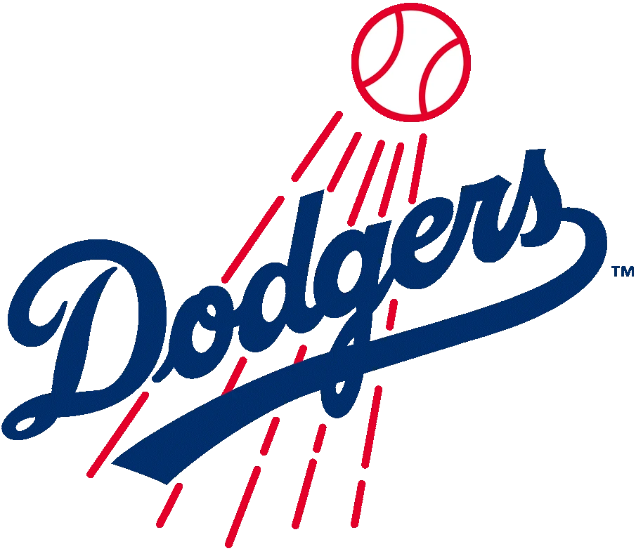
For many people, the 1972 logo was the same as the previous Los Angeles Dodgers logo. However, eagle-eyed fans picked up immediately a subtle difference. The color for the wordmark was changed from a dark, deep blue, to a royal blue. This change, while small, signaled the new color for the team.
1979 – 2011
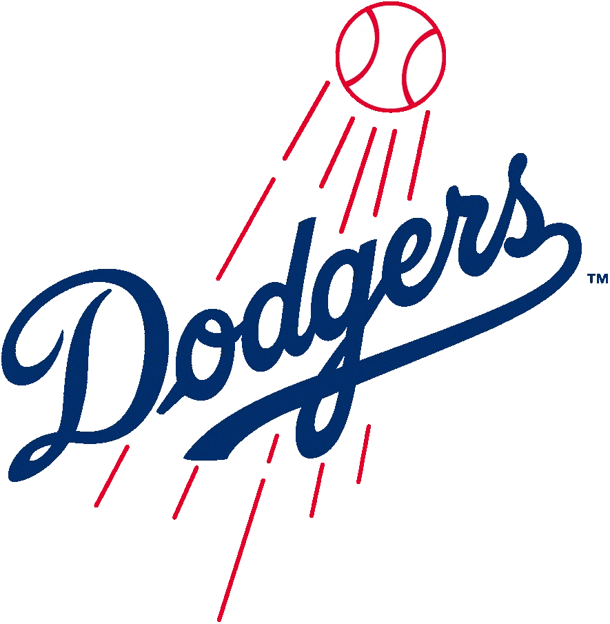
The 1979 Dodgers logo made the wordmark slightly bigger, and the stroke thinner, to give it a more streamlined look as well as greater visibility. Moreover, the lines of the baseball and the streaks behind it were made thinner, making it stand out more from the wordmark.
2012 – Today
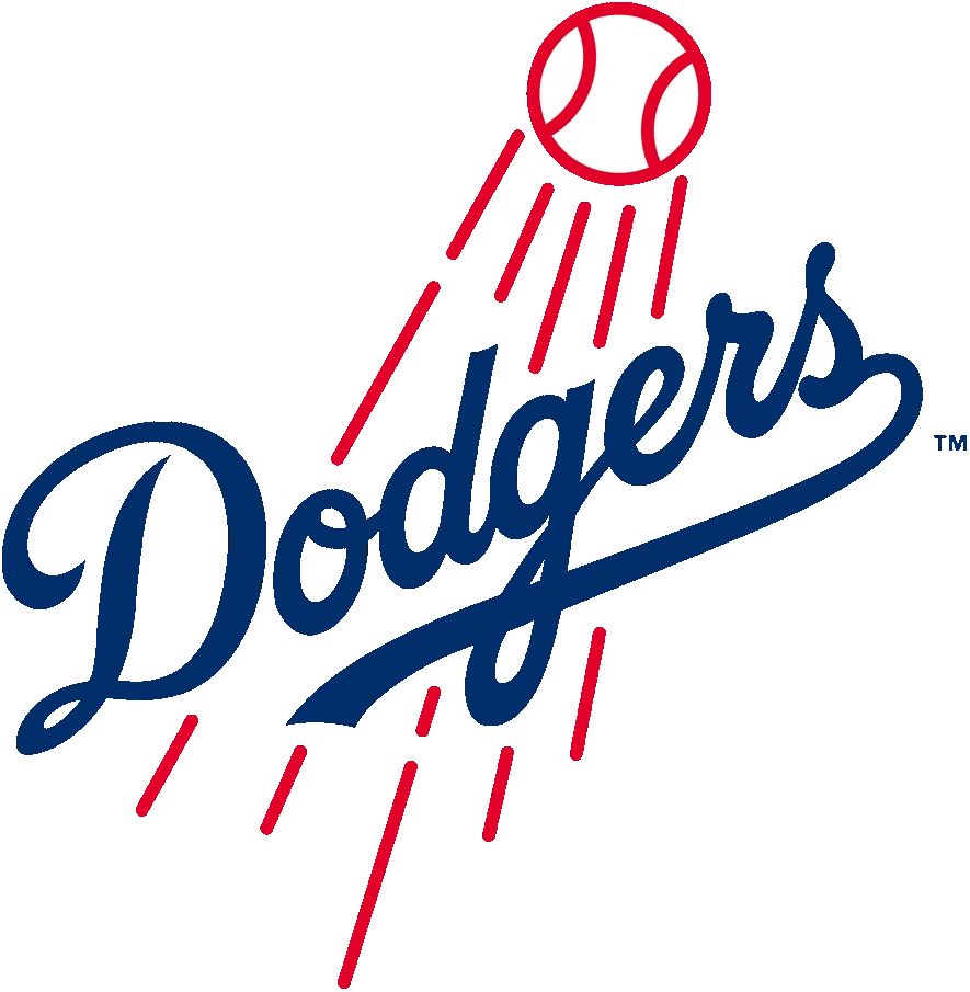
Finally, the 2012 version of the Los Angeles Dodgers logo is the one we all know and love today. The shade of the royal blue was lightened very slightly, with the rest of the wordmark left the same. The lines of the ball and its streaks were made thicker, and the overall logo looked more modern and visibly striking.
FAQs
| Why are the LA Dodgers called the Dodgers? The term dodgers relates to the early 20th century term “trolley dodgers”. This phenomenon was a rising awareness of the dangers of the new electric trolleys that were replacing the horse-drawn carriages. |
| What is the LA logo for the Dodgers? The interlinked LA Dodgers logo refers to the insignia on the Dodgers Cap that has been in use for a long time now. This white on blue design is quite iconic, and allows for quick visibility even at large distances. |
Conclusion
To sum it up, the various Dodgers logos used by the franchise since its inception in the late 19th century have represented the team and its values well. Whether the logo featured the name Superbas, Robins, or Dodgers, the simple design of the logo ensured that the logo was easily to remember and recall.
So, if you want to know how to design a logo that is evergreen and long lasting for your sports team, then taking inspiration from the Los Angeles Dodgers logo is a great way to achieve that.

Logopoppin
Logopoppin is a graphic design agency that specializes in logo designing, web development, video production and advanced branding services. We love to innovate businesses with new age technologies, allowing them to improve their visual reputation.

