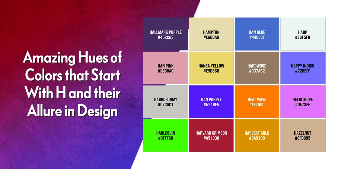
Looking for a complete list of colors that start with H? There are dozens. The most familiar are hot pink, hunter green, honey, harvard crimson, halloween orange, hazelnut, heather, harlequin, heliotrope, and half-and-half — but the full list runs well past 45 named shades spanning every major color family. Below, you’ll find a sortable reference table with hex and RGB codes, a deep look at the most useful H-colors for design, and answers to every common question about this letter.
This guide is part of our complete A–Z color series. If you’re building a palette, you may also want to explore colors that start with G, colors that start with I, or jump to our hub on color combinations and color theory fundamentals.
Quick Reference: 45+ Colors That Start With H
Pro tip: Copy any hex code below straight into Figma, Adobe Illustrator, or your CSS. We’ve grouped them by family so you can spot the right shade fast.
| Color Name | Hex Code | RGB | Family |
| Harvard Crimson | #A51C30 | 165, 28, 48 | Red |
| Heatwave | #FF7A00 | 255, 122, 0 | Red-Orange |
| Heidelberg Red | #960018 | 150, 0, 24 | Red |
| Hibiscus | #B43757 | 180, 55, 87 | Pink-Red |
| Hot Pink | #FF69B4 | 255, 105, 180 | Pink |
| Hollywood Cerise | #F400A1 | 244, 0, 161 | Pink |
| Heartbreaker | #E8B4B8 | 232, 180, 184 | Pink |
| Halloween Orange | #EE5921 | 238, 89, 33 | Orange |
| Hi Jinx | #F37736 | 243, 119, 54 | Orange |
| Heat Wave Orange | #FF7A00 | 255, 122, 0 | Orange |
| Honey | #EBA937 | 235, 169, 55 | Yellow-Gold |
| Hansa Yellow | #E9D66B | 233, 214, 107 | Yellow |
| Harvest Gold | #DA9100 | 218, 145, 0 | Yellow-Gold |
| Honeysuckle | #EDFC84 | 237, 252, 132 | Yellow |
| Heart Gold | #8B7500 | 139, 117, 0 | Yellow-Gold |
| Harlequin | #3FFF00 | 63, 255, 0 | Green |
| Hunter Green | #355E3B | 53, 94, 59 | Green |
| Hooker’s Green | #49796B | 73, 121, 107 | Green |
| Holly | #011D13 | 1, 29, 19 | Green |
| Hemlock | #5E5D3B | 94, 93, 59 | Green |
| Honeydew | #F0FFF0 | 240, 255, 240 | Green |
| High Country | #2D5A27 | 45, 90, 39 | Green |
| Han Blue | #446CCF | 68, 108, 207 | Blue |
| Honolulu Blue | #006DB0 | 0, 109, 176 | Blue |
| Havelock Blue | #5784BA | 87, 132, 186 | Blue |
| Horizon Blue | #5A7D9A | 90, 125, 154 | Blue |
| Heron | #4C596A | 76, 89, 106 | Blue-Gray |
| Heliotrope | #DF73FF | 223, 115, 255 | Purple |
| Han Purple | #5218FA | 82, 24, 250 | Purple |
| Heather | #A484AC | 164, 132, 172 | Purple-Taupe |
| Hyacinth | #9683EC | 150, 131, 236 | Purple |
| Hullabaloo | #A4327D | 164, 50, 125 | Purple-Magenta |
| Hot Magenta | #FF1DCE | 255, 29, 206 | Purple-Pink |
| Hazelnut | #CFB095 | 207, 176, 149 | Brown-Tan |
| Hardwood | #937A62 | 147, 122, 98 | Brown |
| Hairy Heath | #6B2A14 | 107, 42, 20 | Brown |
| Hickory | #9C7A54 | 156, 122, 84 | Brown |
| Hacienda | #98811B | 152, 129, 27 | Brown-Yellow |
| Hemp | #907874 | 144, 120, 116 | Brown |
| Hazel | #8E7618 | 142, 118, 24 | Brown |
| Hematite | #6D2114 | 109, 33, 20 | Gray-Brown |
| Haast Shale | #515664 | 81, 86, 100 | Gray |
| Harbor Gray | #C7C6C1 | 199, 198, 193 | Gray |
| Heavy Metal | #2D3032 | 45, 48, 50 | Gray-Black |
| Heathered Gray | #999A8E | 153, 154, 142 | Gray |
| Half and Half | #FFFFE4 | 255, 255, 228 | White-Cream |
Need more shades? Explore our dedicated guides on shades of pink, shades of green, shades of blue, shades of brown, and shades of gold.
Popular Colors That Start With H (Familiar Favorites)
These are the H-colors most designers, brands, and everyday consumers already recognize. Each one carries strong cultural associations, which makes them powerful — and also potentially overused, so context matters.
Halloween Orange — #EE5921

It’s impossible to think of Halloween without picturing this vibrant shade. Halloween Orange embodies the playful spirit of the season — jack-o’-lanterns, candy pumpkins, pumpkin spice, and costumes. In design, it injects energy and, used strategically, grabs attention and creates a festive atmosphere. It pairs well with deep black, charcoal, and rich purples for seasonal marketing campaigns.
Hardwood — #937A62

The warm, inviting tones of hardwood evoke comfort and tradition — the foundational neutral in most interior design color palettes. Picture a living room grounded by rich hardwood floors. In branding, Hardwood signals stability and craft, which is why it shows up so often in woodworking logos and artisan packaging.
Hot Pink — #FF69B4

Hot Pink is the boldest, most energetic entry in the shades of pink family. It commands attention, broadcasts confidence, and reads as modern and youthful. Brands use it for everything from fashion to fintech disruptors. It pairs surprisingly well with black, white, navy, and deep teal.
Harvard Crimson — #A51C30

Harvard Crimson is a deep, scholarly red synonymous with the Ivy League school of the same name. It’s one of the most distinguished shades of red, carrying authority and tradition. In branding it lends gravitas — think law, finance, education, and old-money sports teams. Pair it with cream, gold, and deep navy for a heritage feel, or with pure white for a sharper, more modern read.
Hazelnut — #CFB095

Hazelnut is a warm, nutty brown — versatile and quietly luxurious. It sits comfortably in the shades of nude color family and the shades of tan family. Imagine a cozy armchair upholstered in rich hazelnut fabric: a space that invites relaxation. In design, hazelnut adds warmth without screaming for attention, making it ideal for skincare, wellness, and coffee branding.
Heather — #A484AC

Heather is one of the softest, calmest shades of taupe — a muted purple-gray that evokes tranquility. Picture a field of heather swaying in the breeze. In design, Heather promotes relaxation and works beautifully in spa, yoga, and wellness brands. It also doubles as a sophisticated neutral in editorial layouts.
Honey — #EBA937

Honey is a golden yellow that leans more toward the shades of gold family than pure yellow. It evokes warmth, sweetness, and natural abundance. In design, Honey adds cheerfulness — perfect for food branding, bakeries, and any warm, inviting palette. Pair it with cream, soft greens, or rich browns.
Lesser-Known H Colors Worth Knowing
Beyond the household names, the letter H hides some of the most distinctive shades in any palette. These are the ones that elevate a design from generic to memorable.
Harlequin — #3FFF00

Harlequin is a playful, almost-neon green that sits at the very edge of the shades of green family. It works against oranges, blacks, and pure whites, lending a strong sense of movement and energy. Picture a Harlequin diamond-patterned floor: whimsical and visually loud. Use it as an accent — not a base.
Hematite — #6D2114

Hematite is a metallic, iron-ore shade that reads as a darker, browner shade of burgundy. It’s strong, sophisticated, and rare in branding, which makes it useful. Imagine a sleek hematite vase adding modern elegance to a minimalist room. In digital design, it works as a moodier alternative to standard maroon.
Heliotrope — #DF73FF

Heliotrope is a vivid pink-purple with significant blue undertones that give it a cool, almost magical quality. The name comes from the heliotrope flower, which was once believed to have mystical properties. In design, it adds luxury and mystery — useful for beauty brands, wellness, and creative agencies looking to stand out from the standard purple palette.
Hemlock — #5E5D3B

Hemlock is a deep, muted evergreen — similar in mood to dark forest green, but more muted and grounded. It promotes a sense of calm and works beautifully in nature-inspired and outdoor-lifestyle branding. Try it with cream, terracotta, and warm wood tones for an organic palette.
Hemp — #907874

Hemp is a natural, earthy brown that lives in the same neighborhood as the shades of tan family. It signals sustainability and eco-consciousness — think hemp tote bags and recycled-fiber packaging. In branding, it grounds a palette without competing for attention.
Heron — #4C596A

Heron is a cool, grayish-blue that sits in the shades of gray family. It’s a heron perched on a still lake: serene, dignified, and slightly melancholy. Use it as a calmer alternative to navy in financial, professional, and editorial work.
Hibiscus — #B43757

Hibiscus is a vibrant red-pink that lives at the warm edge of the reddish orange family. It evokes tropical paradise — beach resorts, summer cocktails, hot-climate fashion. In design, Hibiscus reads as energetic and feminine without tipping into hot-pink territory.
Holly — #011D13

Holly is a near-black green that becomes recognizable only when paired with red. Wreath leaves, Christmas ornaments, classic holiday packaging — that’s Holly. Use it sparingly during the holidays for instant seasonal recognition, or year-round as a sophisticated dark accent.
Honeysuckle — #EDFC84

Honeysuckle is a sweet, delicate yellow-green from the lightest end of the shades of yellow family. It evokes spring and renewal — fresh-cut flowers, new beginnings, garden brands. Honeysuckle is light, airy, and slightly nostalgic.
Hunter Green — #355E3B

Hunter Green is a deep, rich green that resembles forest green from the F-color family. It conveys timeless elegance — think old leather-bound books, English country estates, classic motoring. In branding, Hunter Green is the go-to for heritage, luxury, and outdoor brands. It pairs effortlessly with gold, cream, and deep red.
Half and Half — #FFFFE4

Half and Half is a creamy off-white from the shades of white family. It’s warmer than pure white and reads as soft, inviting, and human. Use it as a backdrop for bolder colors, or as a base in editorial and minimalist palettes.
More H Colors at a Glance
Several more H-shades deserve a mention even if they don’t need a full breakdown:
- Han Blue (#446CCF) — a historic Chinese pigment, cooler and more refined than royal blue.
- Han Purple (#5218FA) — intense, electric, ancient — a synthetic pigment dating back over 2,000 years.
- Hansa Yellow (#E9D66B) — a clean, slightly muted artist’s yellow used widely in fine art.
- Hooker’s Green (#49796B) — a classic watercolor green: balanced, leafy, and forgiving.
- Honolulu Blue (#006DB0) — the sharp, athletic blue made famous by the Detroit Lions.
- Honeydew (#F0FFF0) — the palest, mintiest green — barely a tint, perfect for backgrounds.
- Hot Magenta (#FF1DCE) — a screaming neon pink-purple, useful only in tiny accent doses.
- Harvest Gold (#DA9100) — a vintage 1970s mustard-gold that’s now back in editorial design.
H Colors by Color Family
Looking for a specific kind of H-color? Here’s how the list breaks down by family — useful when you’re trying to match an existing palette.
Red & Pink H Colors
Harvard Crimson, Heidelberg Red, Hibiscus, Hot Pink, Hollywood Cerise, Heartbreaker, Heatwave.
Orange H Colors
Halloween Orange, Hi Jinx, Heat Wave. These shades skew warm and high-energy — great for festive and youth-oriented design.
Yellow & Gold H Colors
Honey, Hansa Yellow, Harvest Gold, Honeysuckle, Heart Gold. The H-yellows lean golden rather than acidic, which makes them friendly choices for food, wellness, and hospitality brands.
Green H Colors
Harlequin, Hunter Green, Hooker’s Green, Holly, Hemlock, Honeydew, High Country. This is one of the strongest H-color groups: every shade from screaming neon to near-black evergreen is here.
Blue H Colors
Han Blue, Honolulu Blue, Havelock Blue, Horizon Blue, Heron. These shades range from the sharp athletic mid-blue of Honolulu to the soft, atmospheric Horizon — a useful spread for designers building blue-dominant palettes.
Purple H Colors
Heliotrope, Han Purple, Heather, Hyacinth, Hullabaloo, Hot Magenta. The H-purples cover everything from delicate, dusty Heather to the electric intensity of Han Purple.
Brown & Tan H Colors
Hazelnut, Hardwood, Hairy Heath, Hickory, Hacienda, Hemp, Hazel. The H-browns are some of the warmest, most grounded neutrals in the alphabet.
Gray, Black & Neutral H Colors
Hematite, Haast Shale, Harbor Gray, Heavy Metal, Heathered Gray, Half and Half. Useful when you need a sophisticated neutral that isn’t plain black or white.
How to Use H Colors in Design: Pairings That Work
Picking a single H-color is the easy part. Building a palette around it is where most designs succeed or fall apart. A graphic design agency will typically start by identifying the dominant H-color, then build a 60-30-10 palette around it. Here are five reliable pairings drawn from real-world branding.
- Hunter Green + Hazelnut + cream — heritage and luxury. Works for hospitality, leather goods, and law firm branding.
- Hot Pink + black + Half and Half — bold and modern. Used widely in beauty and fashion.
- Honey + Hemlock + white — warm and natural. Perfect for food brands and wellness packaging.
- Heliotrope + charcoal + soft gray — editorial and modern, especially for tech and creative agencies.
- Harvard Crimson + Half and Half + deep navy — classic, authoritative — the heritage-institution combo.
For more pairings, see our deep-dive guides on color combinations and logo color meanings.
Conclusion
The letter H delivers one of the strongest, most versatile color ranges in the alphabet — heritage reds like Harvard Crimson, electric greens like Harlequin, atmospheric blues like Heron, and grounded neutrals like Hazelnut and Half-and-Half. Whether you’re refreshing a brand, designing an interior, or just hunting for a specific shade, this list should have you covered.
Want to keep exploring the alphabet? Move on to colors that start with I, or step back to colors that start with G. And if you’re building a complete brand palette from scratch, our team at Logo Poppin offers custom branding packages that include professionally designed color systems.
Need a Color Scheme That Pops, But Can't Find the Right Shades?
Our free color shade generator provides endless possibilities to create stunning and cohesive palettes for your project.
Color Match!
Latest news you want to know!
Subscribe for cutting-edge design inspiration at Logo Poppin! Elevate your brand with updates on logos, branding, web design, and video animation.
Note that by clicking “subscribe,” users may agree to our privacy policy and consent to Logo Poppin to use your contact data for newsletter purposes.
Logopoppin
Logopoppin is a graphic design agency that specializes in logo designing, web development, video production and advanced branding services. We love to innovate businesses with new age technologies, allowing them to improve their visual reputation.