Table of Content
Discover How the Land Rover Brand Logo Has Evolved Over the Past Six Decades
Land Rover, a renowned British automotive brand, has long been synonymous with ruggedness, adventure, and off-road capability. Since its inception in 1948, it has established itself as a leader in the off-road SUV market, producing iconic vehicles that have conquered terrains around the world, from warzones to mining operations. The Land Rover logo, a visual representation of its historical identity, has played a crucial role in shaping its brand perception and appeal.
Now over the years, the brand logo has undergone several transformations, reflecting the brand’s evolution and its changing market position, yet it still retains that original hardy aesthetic. From its early days as a simple, wordmark logo badge to its current, upscale incarnation, the Land Rover logo has remained as a recognizable and trusted symbol of off-road adventure.
Join us as we explore the history of the Land Rover brand logo, following its journey from inception to the present day. We will examine the key elements of each version of the brand symbol and understand the symbolism behind them as represented by their contracted logo design agency.
So, let’s begin our journey to gain insights into the brand’s evolution and its enduring appeal.
A Brief History of the Land Rover Brand
Land Rover was born out of the need for a rugged, versatile vehicle that could be used for agricultural and military purposes, similar to the Willys Jeep. In 1948, the Land Rover Series I was launched, a simple, barebone yet capable SUV that quickly gained popularity. Over the years, Land Rover has expanded its product lineup to include a range of luxury SUVs, such as the Range Rover and Discovery models, rivalling American-made models like the Escalade sporting the Cadillac logo.
Throughout its history, Land Rover has maintained a strong focus on off-road capability and rugged durability. The brand’s vehicles have been used for everything from exploring remote wilderness areas to serving as military transports. Land Rover’s reputation for quality, reliability, and adventure has made it a highly respected brand in the automotive industry.
Evolution of the Land Rover Logo – Symbol of British Automotive Ruggedness
Over the years, the Land Rover logo has undergone several transformations every few years, reflecting the brand’s evolution and its enduring commitment to its target consumers. And while some variants of the Land Rover car logos have lasted less than a decade, others have been used much longer, such as the 1948 logo and the 1986 logo.
Let’s take a look at this evolution in a little more detail.
1948 – 1968
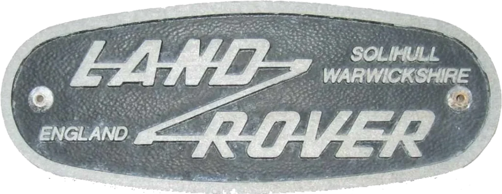
The original Land Rover logo featured the company wordmark crossed through with an offroad track in the shape of a large “Z”. The simple yet effective logo highlighted the British automotive sensibilities as well as the no-nonsense nature of the brand. The logo’s simple and minimalist design was easy to recognize and reflected the brand’s focus on functionality and durability. That is why the logo was used for two decades, from 1948 to 1968.
1968 – 1978
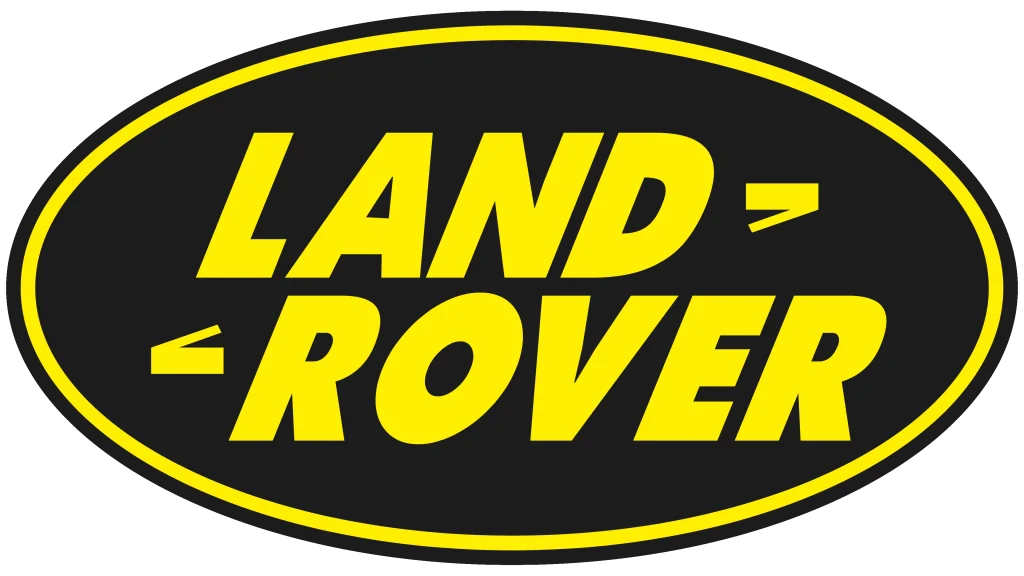
In 1968, Land Rover introduced a new Land Rover logo featuring a larger “Land Rover” script. This script was more elegant and sophisticated than the previous logo, as well as easier to read. Gone was the crossing “Z”, which was instead replaced with just the two edge corners now designed to look like the arrows in a compass. The design used a similar aesthetic to many circular car logos of that era, relying the generally easy-to-fit oval shape for its outline. Moreover, the company’s new logo featured a new black and yellow color scheme that made the design pop, standing out even when caked with mud and dirt.
1978 – 1986
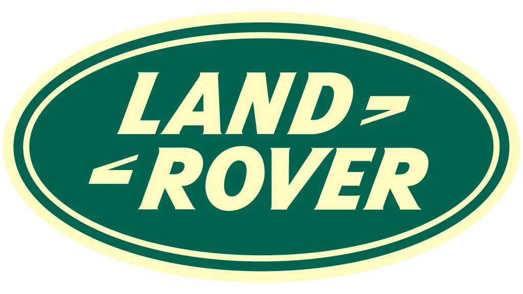
In 1978, Land Rover introduced a new logo design featuring a stylized green and cream color scheme. This dark green was quite close to the iconic British Racing Green from shades of green color, a color that represents the pinnacle of automotive engineering from the UK. The wordmark was refined as well, with the letters now gaining slight serifs to signify the shift of the company towards producing more upscale, luxury vehicles as well. This new logo is the one many of us who grew up with the early Range Rovers are familiar with.
1986 – 2013
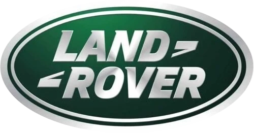
In 1986, and just shy of a decade since its last redesign, a new Land Rover logo was introduced that redefined the style aesthetic completely. Gone was the flat matt colors, instead replaced with a dark, deep metallic green and the cream white replaced with chromed silver. The result was a modern logo that rivaled the top American car brands from that time.
This logo has so far seen the longest run out of all the Land Rover brand logos, its 26-year run reflecting the brand’s growing global presence and its commitment to innovation and progress.
2013 – Present
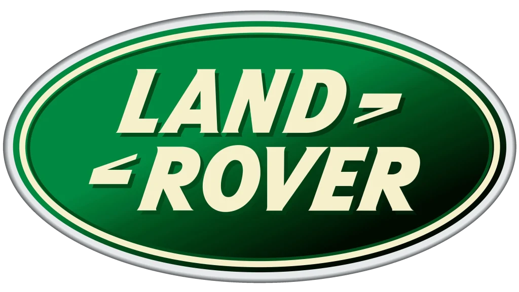
The current Land Rover logo was revealed in 2013, continuing the same design as the previous logo, but with a more modern and updated look. The logo’s color palette has also evolved over time, reflecting the brand’s changing aesthetic. The dark green has lightened a little, while the inner silver band and the wordmark itself have reverted to the cream color from the old palette, reserving the silver for the outer band. Despite these changes, the Land Rover logo remains a powerful symbol of off-road ruggedness, adventure, and British automotive heritage in the same vein as the Bentley logo.
Conclusion
The Land Rover logo has undergone a remarkable transformation over the years, reflecting the brand’s evolution and its enduring commitment to ruggedness and adventure. From its early days as a simple, design to its current minimalist incarnation, the Land Rover logo has become a recognizable and trusted symbol of off-road capability and luxury.
The logo’s enduring appeal lies in its ability to capture the essence and meaning of the Land Rover brand. It evokes a sense of adventure, exploration, and connection to nature. The green and gold color palette, combined with the bold and dynamic design, creates a powerful and memorable visual identity.
As Land Rover continues to innovate and expand its product lineup, the logo will undoubtedly play a crucial role in shaping the brand’s future. The iconic Land Rover logo remains a symbol of British automotive excellence and a testament to the brand’s enduring legacy.

Logopoppin
Logopoppin is a graphic design agency that specializes in logo designing, web development, video production and advanced branding services. We love to innovate businesses with new age technologies, allowing them to improve their visual reputation.

