Table of Content
Discover the Evolution of the Manchester United Logo Through History
Manchester United, one of the most iconic football clubs globally, boasts a rich history that is deeply intertwined with its distinctive logo. Over the years, the club’s logo has evolved, reflecting the changing times and the club’s growing stature. From its humble beginnings to its current status as a global brand, the Manchester United logo has become a symbol of passion, tradition, and success.
The Manchester United logo is more than just a visual representation of the club; it is a powerful symbol that evokes strong emotions among fans worldwide. The logo’s design elements, such as the red devil and the club’s crest, have become synonymous with the club’s identity and its values of courage, determination, and teamwork.
Join us as we explore the history of the Manchester United team logo, tracing its evolution from its early days in the late 19th century to its current form. We will examine the key elements of each logo version and understand the symbolism behind the various iterations. And thus we will unearth and gain insights into the club’s rich history and discover how a professional logo design agency can make recreate its enduring legacy.
The Transformation of the Manchester United Logo From the Late 19th Century to Today
The Manchester United team is one of the most popular soccer teams, or as the Europeans and the British call it, football teams, in the world. Featuring global icons such as Christiano Ronaldo and David Beckham, the team has been a major phenomenon in both British football scene, as well as the European and the global stage as well.
Playing since the latter half of the 19th century, Manchester United has faced its share of ups and downs. Following the disastrous Munich disaster in 1958, when the team lost seven players and a few supporting members in an ill-fated flight crash, the team slowly rose back to prominence. And since then, it has made its mark as one of the most successful British football clubs, as well as a highly lauded club team globally.
So, for a team as essential to the history of the country, its understandable that they would be sporting one of the grandest sports logo. And that the Manchester United logo would have evolved multiple times in its nearly a century-and-a-half lifetime so far.
Join us as we explore this transformation, and discover how its current design iterations came to be.
The Early Years of the Manchester United Logo (1878-1902)
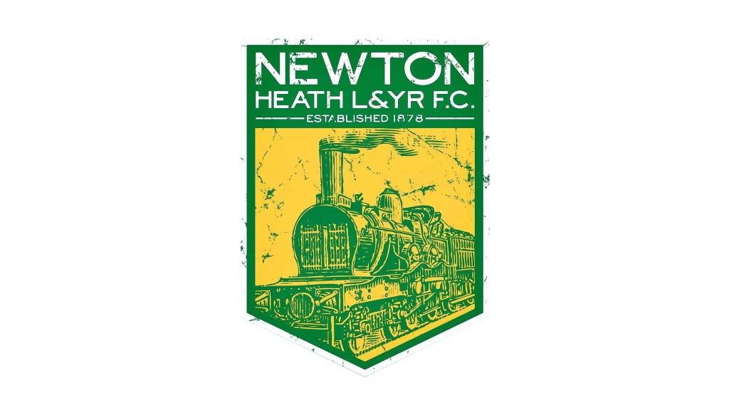
In the early days of the club, known as Newton Heath LYR Football Club, there wasn’t a formal logo. The club’s identity was primarily associated with its name and its affiliation with the Lancashire and Yorkshire Railway. However, unofficial representations often used the club’s name in a simple, stylized font, and the overall design looked like something out of the old NFL logos from the early 20th century.
The Heraldic Shield of the Manchester United Logo (1902-1943)
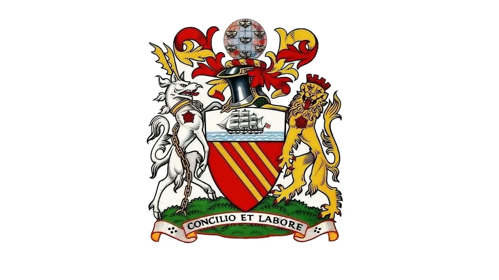
In 1902, the club rebranded as Manchester United and adopted a new logo featuring a heraldic shield similar to the Salford crest, a symbol of courage, determination, and defiance. This iconic image has remained one of the central branding elements of the club’s branding ever since. The iconic design was inspired by the Lancashire Fusiliers, a local regiment known for its bravery.
The Wartime Years for the Manchester United Logo and the Advent of the Red Devil (1943-1960)
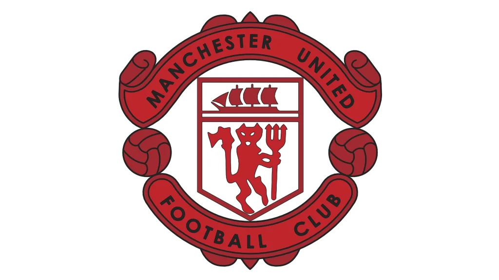
During World War II, Manchester United’s logo underwent a minor redesign. They adopted a new logo featuring a red devil, a symbol of courage, determination, and defiance. This iconic image has remained a central element of the club’s branding ever since, and the overall design became more streamlined and darker with shades of burgundy color. This period marked a challenging time for the club following the Munich air disaster in 1958, but the logo remained a symbol of hope and resilience.
The Second Coming of the Busby Babes (1960-1970)
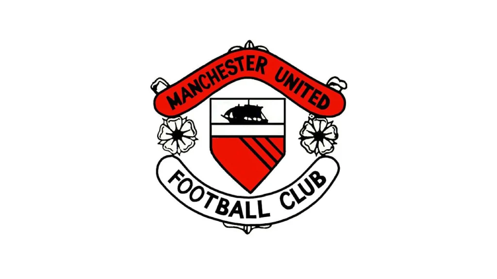
The 1960s was a reformation era for Manchester United, with the legendary reincarnation of the Busby Babes team slowly rising to dominate English football after the ill-fated 1958 Munich disaster. During this time, the club’s logo changed, with the red devil no longer continuing to be featured. Instead, the city’s coat of arms was incorporated into the design, flanked by a pair of white roses similar to Yorkshire roses. Moreover, the logo’s design became more polished and refined, looking more and more like the popular monogram logos from club soccer at that time.
A Brief Departure from Tradition for Manchester United With the Salford Crest (1970-1973)
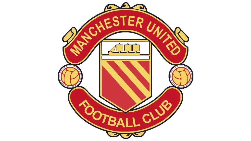
In 1970, Manchester United adopted a new logo featuring elements of the Salford crest, which is the official emblem of the city of Salford, where the club’s home ground, Old Trafford, is located. The Salford crest includes a pair of red and yellow footballs, a tri-mast ship, and a pair of banners that showcased the wordmark, symbolizing the team’s history and heritage.
The Return of the Red Devil to the Manchester United Logo (1973-1998)
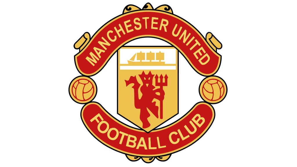
Recognizing the popularity of the traditional red devil logo, Manchester United reverted to this iconic design in 1973. This version of the logo featured a more modern and dynamic red devil, with sharper lines and a more aggressive stance. The logo also incorporated the club’s name in bold, sans-serif fonts.
The Modern Logo (1998-Present)
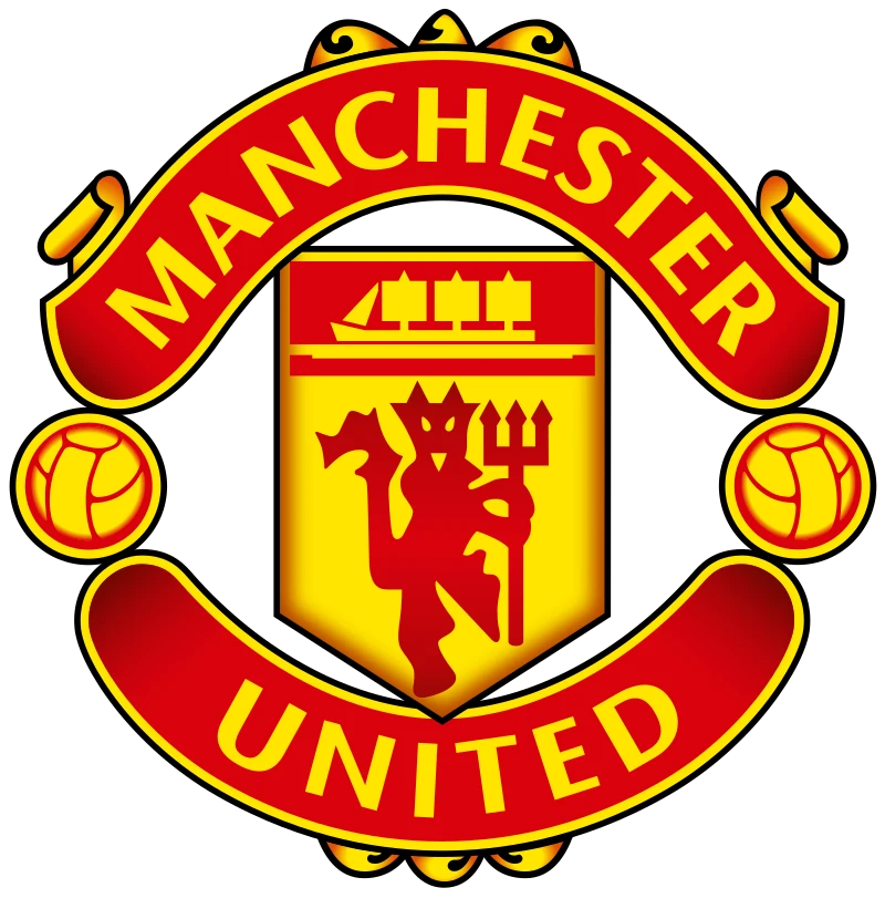
In 1998, Manchester United introduced a new logo that combined elements of the Salford crest with the red devil. The logo features a stylized red devil standing on top of a football, with the Salford crest in the background. The Manchester United logo has become one of the most recognizable icons in the world of football, widely associated with team’s success and global appeal. In fact, this version of the Man U’s logo may be more popular and well known than the FIFA World Cup logos themselves, alongside other club logos like Real Madrid, Barcelona, Bayern Munchen, and more.
The Symbolism Behind the Manchester United Logo
The Manchester United logo is rich in symbolism and has evolved over time to reflect the club’s history and values. The central element of the logo, the red devil, is a powerful symbol of courage, determination, and defiance. It represents the club’s fighting spirit and its relentless pursuit of victory. The club’s name, often accompanied by the Latin motto “Quaerere Fortes” (Seek the Brave), further emphasizes the club’s values and its commitment to excellence.
The key elements of the logo and their symbolism are:
- The Red Devil: The red devil is the most iconic element of the Manchester United logo. It symbolizes the club’s courage, passion, and fighting spirit. The devil is often depicted with a fierce expression and a determined stance, reflecting the club’s competitive nature.
- The Salford Crest: The Salford crest represents Manchester United’s connection to its home city and its roots in the local community. The red rose, ship, and worker symbolize the city’s history and heritage.
- The Football: The football in the logo represents Manchester United’s primary activity and its commitment to excellence in the sport.
- The Tri-Mast Ship: The tri-mast ship, which was used in the 1970s logo, symbolizes the club’s journey and its ambition to conquer new horizons.
The Lasting Legacy of the Manchester United Logo
The Manchester United logo has played a crucial role in establishing the club’s brand identity and global appeal. It is a recognizable symbol that is instantly associated with the club’s success, heritage, and values. The logo has helped to create a strong sense of community among Manchester United fans and has solidified the club’s position as one of the most iconic and popular football clubs in the world.
The Manchester United logo is a testament to the club’s enduring legacy and its ability to adapt and evolve while remaining true to its core values. It is a symbol of excellence, tradition, and fighting spirit that made Manchester United one of the most successful football clubs in history.
Conclusion
The Manchester United logo is a powerful and iconic symbol that has played a significant role in the club’s success. The logo’s evolution reflects the club’s journey, from its humble beginnings to its status as one of the most globally recognized football brands. The red devil, the Salford rose, and the three lions are all symbols of Manchester United’s heritage, values, and achievements. The enduring appeal of the Manchester United logo is a testament to the club’s rich history and its ability to connect with fans on a deep emotional level.

Logopoppin
Logopoppin is a graphic design agency that specializes in logo designing, web development, video production and advanced branding services. We love to innovate businesses with new age technologies, allowing them to improve their visual reputation.

