
Table of Content
A Quick Look at the History of Famous Sci-fi Horror Hit of Netflix
Launched in 2016, Stranger Things is a popular Netflix show that became hugely popular all over the world. Starring the famous Gen-Z celebrities like Millie Bobby Brown, Stranger Things centers around a fictional American town tangled with supernatural activities. People who love sci-fi pictures precisely liked the concept of the show which is equally suspense-filled and intriguing. The Stranger Things logo therefore became popular among many Americans, showcasing a creative horror-themed identity of the show.
Till to date, four seasons and 32 episodes of the show have been aired on Netflix. This defines the vast demand of the series that started to grow quickly just after the release of first season. The logo of Stranger Things has seen little tweaks after the first season as well. Though the core logo remained the same, but the contrast of colors and bordering got little updates. Created by professional logo design services, this emblem perfectly exhibits a dark identity of the show that is smartly directed by the well-known Duffer Brothers.
In this article, we will take a look at the history of Stranger Things logo. We will let you know the concept of this logo, as how it was created and what inspired its dark identity in the design. Let’s start from the basics understanding why Stranger Things is popular and watched by many people around the world.
What Makes the Stranger Things a Netflix Hit?
Stranger Things became a global sensation largely due to its ability to evoke nostalgia while offering universal appeal. The show skillfully recreates the vibe of 1980s era, beautifully demonstrated by retro fashion, synthesizer-heavy soundtrack and more other stuff. For audiences who lived through the 1980s, it offers a delightful trip down memory lane, while younger viewers are drawn to its rich storytelling and immersive world-building. By striking a balance between past and present, Stranger Things appeals to multiple generations, bridging gaps in taste and cultural background.
The series expertly combines elements of science fiction, horror, mystery, and drama. Its compelling storyline, centered around a missing boy, a telekinetic girl, and the looming threat of a parallel dimension called the Upside Down. Moreover, the show’s well-developed characters such as the brave and resourceful group of kids, the determined mother, and the gruff yet kind-hearted sheriff ensure that audiences form strong emotional connections. This mix of suspenseful narratives and heartfelt relationships creates a binge-worthy formula that resonates universally.
Stranger Things also thrived due to the way it captured the zeitgeist of the streaming era. Its release on Netflix allowed for immediate global access, encouraging fans to discuss and share their theories online. The show became a cultural phenomenon, inspiring fan art, memes, merchandise, and even themed events like Halloween costumes. Its young cast’s relatable charm and their interactions on social media also helped build a dedicated fan base. This interconnectedness between the show amplified its popularity, turning Stranger Things into more than just a Netflix series.
The Mystical Plot of Stranger Things
Set in the fictional town of Hawkins, Indiana, Stranger Things begins with the sudden and inexplicable disappearance of a young boy, Will Byers. As his family and friends frantically search for him, the town is drawn into an unsettling mystery involving secret government experiments and supernatural forces. The investigation leads to the discovery of a young girl with a shaved head, known only as Eleven. Her arrival hints at the existence of a dark parallel dimension known as the Upside Down, which is connected to Will’s disappearance.
The show follows a group of kids as they band together to uncover the truth behind the strange events in their town. While they rely on their friendship, courage, and love of science fiction to face the unknown, Hawkins is increasingly plagued by bizarre phenomena, including monstrous creatures and eerie disturbances. Meanwhile, adults like Joyce Byers, Will’s mother, and Jim Hopper, the town’s police chief, undertake their own dangerous investigations, uncovering layers of conspiracy tied to a secretive lab on the outskirts of town.
As the story unfolds across multiple seasons, the stakes grow higher. The group confronts sinister forces from the Upside Down and those who seek to exploit its powers. While their adventures often lead to thrilling and heart-pounding moments, the show also explores themes of friendship, loyalty, and the resilience of ordinary people faced with extraordinary challenges. The plot weaves together science fiction, horror, and human drama, leaving viewers eager to see how the fight against the otherworldly threats will unfold.
History of Stranger Things Logo
The logo of Stranger Things has not changed much since it first came with the show in 2016. A few little tweaks have been done in the logo in each season to keep the branding of the series fresh. Besides that, the core dark themed identity of the Stranger Things logo has remained the same during the last nine years. Let’s take a look how the logo evolved in each season below.
Stranger Things Logo – 2016
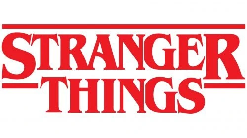
When Stranger Things premiered on July 15, 2016, it introduced audiences to a compelling storyline and a distinctive visual identity. Central to this identity was the debut of its original logo, a minimalist design that quickly became recognizable. The logo featured a clean, simple wordmark rendered in a retro-font of 1980s horror and science fiction. Notably, it stood alone without any additional graphics, relying on its stark typography to convey the show’s mysterious and nostalgic tone.
This understated design choice set the stage for Stranger Things to establish its unique brand identity, resonating with fans and aligning perfectly with the series’ throwback aesthetic. The absence of supplementary imagery allowed the logo to maintain a timeless quality, making it both versatile and memorable. Over time, this iconic wordmark logo has become synonymous with the show’s eerie, supernatural themes and its homage to the pop culture of the 1980s.
Stranger Things Logo – 2017
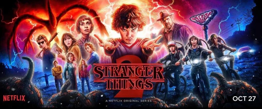
When the second season of Stranger Things premiered in 2017, it brought not only a continuation of the gripping storyline but also an evolution of the show’s logo. The updated design retained the iconic lettering style that fans had come to recognize, maintaining the retro-inspired font reminiscent of 1980s horror and science fiction. However, this iteration introduced a fresh twist, the wordmark was executed in gradient lines transitioning from orange to red.
Accompanying the revamped wordmark was a bold and striking numeral “2”, designed in a dark gradient that shifted from deep red to black. This enlarged numeral served as the focal point, placed prominently in the background of the logo to signify the continuation of the story while adding a sense of weight and intensity. Together, these design elements combined to create a logo that felt both familiar and refreshed, perfectly capturing the heightened stakes and darker themes of the show’s sophomore season.
Stranger Things Logo – 2019
As with the earlier seasons of Stranger Things, Season 3 debuted with an updated logo that reflected the evolving narrative of the series. This iteration retained the signature wordmark style that had become synonymous with the show but introduced a new layer of visual impact. The wordmark was redesigned with a bold red outline, creating a striking appearance that hinted at the darker events coming forward. This subtle yet significant change reinforced the sense of foreboding that had become integral to the series’ tone.
The updated design with numeral “3” in the center not only built on the established branding of Stranger Things but also visually communicated the emotional weight of the third season. The choice of the vibrant red outline emphasized themes of danger, loss, and turmoil. This careful attention to detail in the logo design mirrored the show’s commitment to crafting a richly immersive experience, ensuring that every element, including the logo, played a role in setting the mood and deepening the connection with fans.
Stranger Things Logo – 2021
Coming to 2021, Stranger Things came up with a new season renewing the suspense and horror theme of the show. For this season, the show unveiled a refreshed badge design that encapsulated the series’ continued evolution. The lettering retained the familiar contoured serif style that had become a hallmark of the show’s visual identity. However, this time, the wordmark received a subtle yet impactful update. This addition added a sense of depth and dimensionality, lending the minimalist logo a more dynamic and polished appearance.
A prominent feature of this new badge was the enlarged numeral “4” which served as the dominant background element. Bold and commanding, the numeral underscored the gravity and significance of the season, signaling a new chapter in the saga while maintaining visual continuity with previous logos. The interplay between the transparent lettering and the bold numeral created a harmonious design, symbolizing both the familiar essence of Stranger Things and the darker, more complex themes explored in Season 4.
Font of Stranger Things Logo
The logo for Stranger Things draws its inspiration from the iconic ITC Benguiat font. Designed by acclaimed New York typographer Ed Benguiat, the vintage font was first introduced to the world in 1977 through the International Typeface Corporation. Its distinctively elegant curves, and dramatic flair evoke a sense of nostalgia, making it a fitting choice for the series, which pays homage to the pop culture and aesthetics of the 1980s.
Ed Benguiat’s creation is celebrated for its versatility and timeless appeal. By leveraging this typeface, Stranger Things seamlessly bridges past and present, capturing the retro essence of the show while lending a cinematic quality to its branding. The use of ITC Benguiat in the logo not only establishes a connection to the era the series emulates but also underscores its commitment to authenticity and detail.
Frequently Asked Questions
| Why Stranger Things series is popular in the world? Stranger Things is popular worldwide due to its thrilling storyline that includes a blend of light horror and suspense-filled events. Its mix of sci-fi, horror, and heartfelt friendships creates a unique, emotionally engaging viewing experience. |
| Who is the lead star of Stranger Things series? The lead star of Stranger Things is Millie Bobby Brown, a girl with telekinetic powers central to the series’ plot. Her performance has been widely acclaimed, making her one of the standout faces of the show. |
| How many seasons of Stranger Things have been aired till to date? As of now, four seasons of Stranger Things have been aired, with the first premiering in 2016 and the fourth in 2021. A fifth and final season is currently in development. |
Final Words
That takes us to the end of this blog in which we have discussed the Stranger Things logo in detail. It is a popular Netfix show that is now gearing up for the release of fifth season. The previous ones were certainly a massive hit among the fans, which is why people are now expecting for more thrilling stuff in the upcoming part. Just like show’s core stars, the logo of Stranger Things also remained the same throughout all the years. The only difference that came in the logo was the depiction of numbers in the center. They were adjusted very smartly in the logo, making sure that the core style of emblem do not gets altered.
Latest news you want to know!
Subscribe for cutting-edge design inspiration at Logo Poppin! Elevate your brand with updates on logos, branding, web design, and video animation.
Note that by clicking “subscribe,” users may agree to our privacy policy and consent to Logo Poppin to use your contact data for newsletter purposes.
Logopoppin
Logopoppin is a graphic design agency that specializes in logo designing, web development, video production and advanced branding services. We love to innovate businesses with new age technologies, allowing them to improve their visual reputation.

