
Table of Content
Take a Look How the Famous Coca-Cola Logo Evolved Through the Years
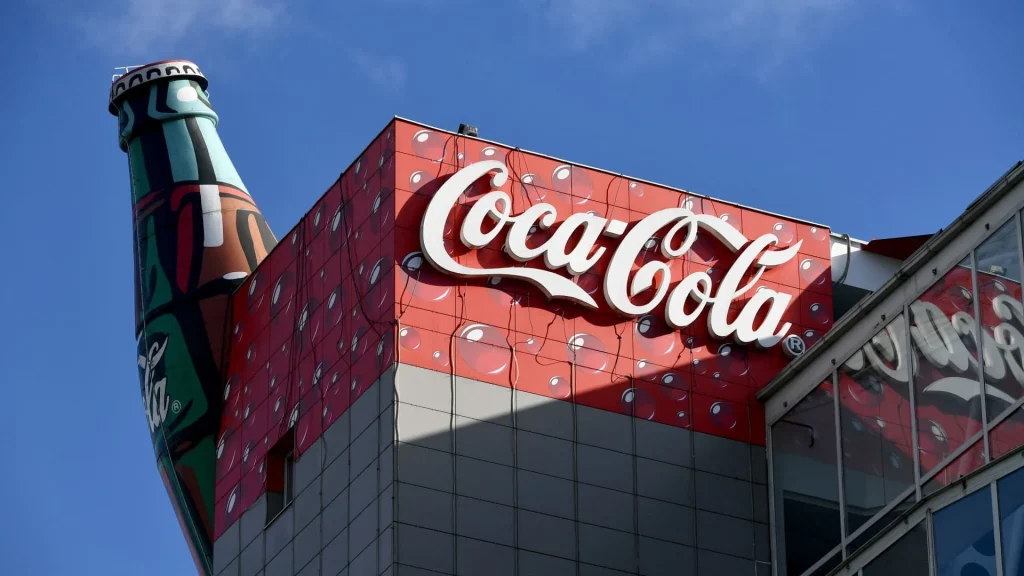
Coca-Cola is more than just a beverage, it is a cultural icon that embodies the American way of life and has become a symbol of global recognition. Since its inception in 1886, Coca-Cola has transcended its role as a simple refreshment to represent moments of joy, togetherness, and tradition. It can be safely said that the iconic Coca-Cola logo has become deeply embedded in popular culture, appearing in advertisements, films, and social events worldwide.
Today, Coca-Cola stands as the world’s most renowned beverage company, boasting an extensive portfolio of soft drinks and products enjoyed by millions daily. Its signature logo, designed by professional logo design services, is among the most recognizable symbols in history. Whether on billboards, vending machines, or store shelves, the Coca-Cola logo instantly evokes familiarity and nostalgia, reinforcing its strong presence in the beverage industry.
It is rare to encounter someone who has never seen or heard of Coca-Cola, as its influence spans across continents, languages, and generations. From bustling cities to remote villages, the iconic drink is readily available, making it a staple in daily life for many. Through decades of strategic, Coca-Cola has cemented itself as not just a carbonated beverage but a powerful global brand symbolizing happiness. If you want to know about the history of Coca-Cola logo, read this article in detail to get all the information.
Why Coca-Cola is Popular Worldwide?
Coca-Cola’s global popularity can be attributed to its powerful personal branding, extensive marketing, and consistent product quality. From the beginning, Coca-Cola has focused on creating a strong emotional connection with consumers through memorable advertisements, catchy slogans, and iconic imagery. Campaigns like “Share a Coke” and “Open Happiness” have resonated across cultures, reinforcing the brand’s message of togetherness and joy. By associating itself with major events, Coca-Cola has ensured that its name remains in the public eye, fostering loyalty and recognition.
Another key reason for Coca-Cola’s worldwide success is its vast distribution network, which allows the beverage to reach even the most remote locations. The company has built an extensive supply chain that enables its products to be available in over 200 countries. Whether in small roadside stalls, or high-end restaurants, Coca-Cola is a staple that consumers can rely on. Its ability to adapt to local markets by offering different packaging sizes, flavors, and marketing strategies tailored to different cultural preferences has also played a crucial role in maintaining its dominance.
Lastly, Coca-Cola’s consistent product quality and ability to evolve with consumer trends contribute to its enduring popularity. The original formula has remained largely unchanged, giving consumers a sense of familiarity and reliability. At the same time, Coca-Cola has introduced a variety of products, including Diet Coke, Coca-Cola Zero Sugar, and other flavored versions, catering to different dietary preferences and health-conscious consumers. By staying relevant while maintaining its classic appeal, Coca-Cola has successfully sustained its status as one of the most beloved beverages in the world.
History of Coca-Cola Logo
Coca-Cola is a brand that has a long rich history in the beverage industry. The first logo of the brand was introduced way back in 1886, and since then, the emblem ruled the market with stunning dominance. If you want to know about the complete history of Coca-Cola logo, take a look at the entire evolution timeline defined below.
Coca-Cola Logo – 1886
The very first version of the Coca-Cola logo, introduced in 1886, was the most simplistic design the brand has ever used. Unlike the elaborate and stylized script that later became synonymous with Coca-Cola, this early version featured a straightforward, unembellished typeface. It lacked the distinctive curves and flourishes that would later define the brand’s identity, making it a minimalistic representation of what would eventually become one of the most famous red logos in the world.
Despite its simplicity, this initial design laid the foundation for the brand’s visual identity, serving as the starting point for future refinements. Over the years, the Coca-Cola logo evolved into the elegant and instantly recognizable cursive script, reinforcing its association with tradition, quality, and refreshment. The original version remains a testament to the brand’s humble beginnings, reflecting the early stages of what would grow into a globally iconic trademark.
Coca-Cola Logo – 1887
In 1887, Coca-Cola introduced a new calligraphic version of its logo, marking a significant transformation in the brand’s visual identity. This updated design featured an elegant, flowing script that added a sense of sophistication to the brand. The shift from a plain typeface to a more decorative style helped Coca-Cola stand out, making it more visually appealing and recognizable. This calligraphic logo set the stage for the company’s long-standing tradition of using stylish typography to reinforce its brand image.
The artistic lettering was the work of Frank Robinson, Coca-Cola’s bookkeeper, whose handwriting became immortalized on the labels of the now-famous soft drink. His carefully crafted script not only gave the logo a distinctive and timeless look but also contributed to the brand’s identity, making it instantly memorable. Robinson’s design laid the foundation for the iconic Coca-Cola logo that would undergo only subtle refinements over the years while maintaining its original charm.
Coca-Cola Logo – 1890
The 1890 version of the Coca-Cola logo was a dramatic departure from its original design. Unlike the classic Spencerian script that had become associated with the brand, this version experimented with a more ornate and artistic approach. The letters were embellished with intricate flourishes, giving the logo a more decorative and whimsical appearance. This redesign aimed to create a visually striking look, making Coca-Cola stand out even more in a growing market of beverages.
Despite its uniqueness, this highly stylized logo was short-lived, as the company soon reverted to a simpler, more recognizable script. While the decorative swirls added an element of elegance, they also made the logo less legible. However, this experimental phase showcased Coca-Cola’s willingness to evolve its branding elements and explore different visual styles. Although it did not become the enduring version, the 1890 design remains a fascinating part of Coca-Cola’s rich branding history.
Coca-Cola Logo – 1891
In 1891, Coca-Cola introduced an updated version of its 1887 logo. This new iteration featured a more polished and elegant appearance, with a thin and precise script that enhanced readability. One of the most significant changes was the introduction of a vibrant red color, which would later become an integral part of Coca-Cola’s brand identity. The refined lettering gave the logo a cleaner and more sophisticated look, reinforcing the company’s commitment to a strong and consistent visual presence.
The updated design was a step toward the iconic branding that Coca-Cola would continue to develop in the following years. By using a thinner and clearer script, the logo achieved a balance between elegance and simplicity. The addition of the red color helped establish a stronger visual connection with the brand, ensuring that it stood out on labels and advertisements. This evolution in the logo’s design marked an important milestone in Coca-Cola’s branding journey for the years to come.
Coca-Cola Logo – 1941
The 1941 Coca-Cola logo marked a significant milestone in the brand’s history, as it established the foundation for the company’s modern visual identity. This version retained the classic Spencerian script introduced in earlier designs but refined it for a more polished appearance. The lettering became bolder, enhancing readability while maintaining the elegant curves that had become synonymous with Coca-Cola.
What made the 1941 logo particularly important was its role in shaping Coca-Cola’s long-term branding strategy. Unlike previous variations, which underwent frequent modifications, this design remained largely unchanged for decades, reinforcing brand recognition worldwide. The iconic red and white color scheme became more standardized, further strengthening its association with Coca-Cola’s refreshing and timeless appeal.
Coca-Cola Logo – 2003
In 2003, Coca-Cola reintroduced a logo that closely resembled the one that gained immense popularity in the 1940s. This version brought back the classic Coca-Cola script that had become deeply embedded in consumer recognition. By reviving the elegant red-and-white color scheme, the company aimed to evoke nostalgic emotions. This decision aligned with Coca-Cola’s strategy of blending tradition with modern appeal, ensuring that the logo remained both timeless and relevant in the evolving marketplace.
The revitalized logo from 2003 continued to serve as the brand’s primary visual identifier. The distinctive Coca-Cola script, which had remained largely unchanged for decades, once again became the centerpiece of the brand’s marketing efforts. Its widespread use across packaging, advertisements, and promotional materials solidified its status as one of the most recognizable logos in the world. By embracing this classic design, Coca-Cola reinforced its legacy as a brand associated with quality, refreshment, and tradition.
Coca-Cola Logo Hidden Message
It may take a moment to notice, but there is a subtle hidden detail within the Coca-Cola logo that many people overlook. Upon closer inspection, a portion of the script-style lettering forms a shape that closely resembles the Danish flag. This discovery has sparked interest among design enthusiasts and branding experts, as it demonstrates how iconic logos can sometimes contain unintended or cleverly embedded elements.
The resemblance to the Danish flag is particularly intriguing because Denmark has a strong connection to Coca-Cola’s European market. In fact, the company has even used this hidden detail in promotional campaigns within Denmark, highlighting the flag’s presence within the logo. While it may not have been an intentional design choice when the logo was first created, the discovery adds an extra layer of fascination to an already globally recognized brand.
Frequently Asked Questions
| Why Coca Cola logo is popular in the world? The Coca-Cola logo is globally popular due to its timeless, bold red-and-white color scheme. Its consistent branding and deep association with happiness, nostalgia, and refreshment have cemented its iconic status worldwide. |
| What is the history of Coca Cola logo? The Coca-Cola logo has evolved since 1886, starting with a simple typeface before adopting the iconic Spencerian script in 1887. Over the years, it has undergone refinements while maintaining its classic red-and-white identity. |
| What is the color of Coca Cola logo? The Coca-Cola logo features a bold red and white color scheme. The red background enhances brand recognition, while the white Spencerian script adds a timeless and elegant touch. |
Final Words
That sums up our entire blog in which we have discussed the complete evolution timeline of Coca-Cola logo. It is one of those emblems that is hugely popular in the beverage industry. Not just that, but the association of Coca-Cola with different industry giants has also made it a renowned entity in the global market. The logo of Coco-Cola is therefore known to everyone, especially to those who are die-hard fans of carbonated soft drinks.
Logopoppin
Logopoppin is a graphic design agency that specializes in logo designing, web development, video production and advanced branding services. We love to innovate businesses with new age technologies, allowing them to improve their visual reputation.

