
Table of Content
Know Why Dollar Tree Logo Became Popular Among the Masses
When it comes to rank retail stores having historic significance in the US, the name of Dollar Tree always comes first to ones’ mind. It is a famous chain of retail stores in the US that is loved by many people. Launched in 1986, Dollar Tree grabbed the attention of the market by making “Only $1” as their main selling motto. This made the Dollar Tree logo quite popular in the industry, making the brand an instant viral hit in the market.
Today, Dollar Tree operates over 15,000 variety stores across North America, serving millions of customers with an extensive selection of affordable products. These stores provide a diverse range of items, making it a convenient one-stop shop for budget-conscious shoppers. With its commitment to offering everyday necessities at exceptionally low prices, Dollar Tree has become a go-to destination for individuals and families seeking quality products without overspending.
In addition to groceries and household goods, Dollar Tree carries a broad assortment of health and personal care items to meet the daily needs of its customers. By maintaining its focus on affordability and variety, Dollar Tree continues to expand its presence across the US effectively. In this blog, we will take a detailed look at the history of Dollar Tree logo, so that you can understand how it was transformed by different logo design services to keep the branding of the company fresh.
What is Dollar Tree?
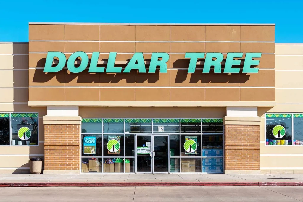
Dollar Tree is a well-known American discount retail chain that operates thousands of stores across the United States and Canada. It specializes in offering a wide variety of products, including groceries, household essentials, party supplies, seasonal décor, health and beauty products, and more—all at low, fixed prices. Traditionally, most items were priced at one dollar, though the company has since introduced slightly higher price points on select products to accommodate rising costs and expanding inventory.
What makes Dollar Tree particularly famous in the U.S. is its ability to provide everyday essentials at remarkably low prices. Shoppers can find everything from cleaning supplies and kitchenware to school supplies and snacks, making it a one-stop shop for families, and bargain hunters. Many customers appreciate the store’s ability to offer value-driven alternatives to big-box retailers. Additionally, the store’s seasonal and holiday-themed merchandise, such as decorations and party supplies, attract customers looking for festive items at a fraction of the cost found elsewhere.
Dollar Tree’s widespread presence and consistent low pricing strategy have made it a staple in American retail. Unlike other discount stores that sell items at various price points, Dollar Tree built its reputation on the concept of fixed and low-cost shopping. The company has also expanded its reach by acquiring Family Dollar stores, allowing it to serve an even broader customer base. With its strategic locations, , Dollar Tree continues to be a go-to choice for millions of American shoppers looking for affordable and convenient shopping solutions.
History of Dollar Tree Logo
Launched in 1986, Dollar Tree is operational in the US from nearly 40 years. This tells a lot about the solid base of a company that is built on the motto of serving customers economically. The company also transformed its logo from time to time throughout all these years. If you do not know much about the previous Dollar Tree logos, take a look at the complete history given below.
Dollar Tree Logo – 1986
When Dollar Tree was first established and introduced its initial logo concept in 1986, its branding looked significantly different from the familiar green tree emblem recognized today. At the time, the company had yet to adopt the “Dollar Tree” name and instead operated under the brand “Only $1,” reflecting its commitment to selling all products for just one dollar. This early identity influenced the design of its first logo, which featured a bold, neon-style banner displaying the store’s name.
Many might assume that a business named Dollar Tree would naturally feature a tree in its logo, but the company’s original branding focused more on emphasizing its unbeatable pricing rather than a symbolic image. The neon sign-style vintage logo aimed to attract bargain shoppers by making the store’s unique selling point, offering everything for just one dollar immediately clear. As the business grew and evolved, so did its branding, eventually leading to the recognizable Dollar Tree name and its now-iconic tree logo.
Dollar Tree Logo – 1991
In 1991, Dollar Tree introduced a new visual identity that marked a significant shift in its branding, laying the foundation for the logo we recognize today. This redesign was a departure from the original neon-style banner and reflected the company’s evolving identity as it transitioned from “Only $1” to Dollar Tree. The updated logo concept incorporated a stylized green tree, symbolizing growth, value, and reliability.
A defining feature of this redesigned wordmark logo was the integration of a bold black number “1” as the trunk of the tree. This design choice cleverly reinforced the store’s commitment to affordability while visually tying the logo to the Dollar Tree name. The incorporation of natural imagery, combined with the strong numerical element, helped establish a more recognizable and enduring brand identity. This prototype set the stage for the modern Dollar Tree logo, which has since become an iconic symbol.
Dollar Tree Logo – 1995
In 1995, Dollar Tree introduced an updated logo that retained the core elements of its previous design but underwent key refinements to create a more visually appealing identity. While the stylized green tree with the black “1” as its trunk remained, the tree itself was repositioned, taking a more central and prominent place above the store’s name. This adjustment not only made the logo more balanced but also reinforced the company’s connection to its name, making the tree a stronger focal point.
Another notable change in the 1995 redesign was the enhancement of the tree’s color. This subtle yet impactful modification added energy to the logo, making it feel more inviting to customers. The updated look helped establish a stronger visual identity that resonated with shoppers while maintaining the brand’s commitment to affordability. These refinements set the stage for Dollar Tree’s continued growth, ensuring that its logo would remain recognizable as the company started expansion.
Dollar Tree Logo – 2006
In 2006, Dollar Tree introduced a redesigned logo that placed a stronger emphasis on the logotype while making only subtle refinements to the emblem. This update reflected the company’s desire to create a bolder and more modern visual identity while maintaining the recognizable elements that customers had grown familiar with. The text in this minimalist logo became more prominent, ensuring that the brand name stood out clearly and was easily readable across different marketing materials.
While the primary changes centered around the typography, the emblem itself remained largely unchanged. The design was slightly refined to enhance clarity and maintain consistency with the updated logotype, but the core elements of the emblem—its shape and signature colors—were left intact. By retaining these familiar visuals, Dollar Tree was able to modernize its branding while ensuring that loyal customers could still easily identify the store.
Frequently Asked Questions
| What is Dollar Tree? Dollar Tree is a popular American discount retail chain offering a wide range of products. Known for its fixed low-cost pricing model, it provides affordable shopping options across thousands of locations in North America. |
| Why is Dollar Tree logo famous in the US? The Dollar Tree logo is famous in the U.S. for its distinctive green tree emblem with a black “1” as its trunk. Its simple yet recognizable design has become an iconic representation of budget-friendly shopping across North America. |
| What is the color of Dollar Tree logo? The Dollar Tree logo features a vibrant green color, symbolizing growth, value, and affordability. It is often paired with black or white elements for contrast, ensuring a bold and recognizable brand identity. |
Final Words
That concludes our entire article in which we have discussed the complete history of Dollar Tree logo. It is a highly reputed retail store franchise that is active in all the major cities of the US. Starting with a simple motto of “Only $1”, Dollar Tree expanded its operations and services quite tremendously during the last couple of decades. This made the Dollar Tree logo highly popular in the market, as people loved the idea of economical shopping through a one-stop shop. Today, this logo has built a strong presence in the market, giving the brand an indisputable lead over other retail stores.
Logopoppin
Logopoppin is a graphic design agency that specializes in logo designing, web development, video production and advanced branding services. We love to innovate businesses with new age technologies, allowing them to improve their visual reputation.

