
Table of Content
Discover the Top Yoga Brand Logos and Witness Their Secrets to Success
Today, people are more mindful about the concept of mental peace and physical wellbeing going hand in hand. This has given rise to many meditative regimens that nourish both mind and soul. And foremost among them is yoga.
Nowadays, yoga-based brands can be found all around us, from yoga studios to stores that sell organic foodstuffs, apparel, and general yoga-related paraphernalia. But have you ever wondered what is the though process behind the creation of those yoga logos? What inspired those designs, and how were those inspirations incorporated within the design of the logos?
Some of the most generic iconography that some brands use include art of a woman doing yoga, or imagery related to chakras. And while they can be great to use with a little tweaking and visual trickery, they are quite boring without them.
So, think about it. Let’s say you have to create your own yoga brand logo. How will you go about that process? That is because even if you outsource your project to a professional logo design agency, you would still need to give them some idea about the direction you want to go.
So, let’s dive in and take a look at some of the elements that make yoga brand logos a success, as well as study some professional yoga brands to see what their logos represent.
What Defines Great Yoga Logos?

When we get down to the core of yoga logos, we see that there are a few elements common among all of them. Now that doesn’t mean that there isn’t any originality in their design. On the contrary, most of the well-known yoga brands have logos that incorporate those elements in a unique and interesting manner.
The reason they use those elements is a simple one. Every industry has some elements that are common to their logo designs. Those elements act as a sort of identifier for those brands, and their purpose is to help the viewer instantly categorize it into the right niche, while also achieving balance in design.
For example, most auto mechanic logos have some sort of power tools like wrenches, or some form of automotive imagery in their design. Therefore, when a viewer looks at it, they instantly understand that the brand has something to do with automobiles.
Getting back to the topic at hand, let’s take a look at the elements commonly found in successful yoga brand logos.
The Addition of Lotus Pose and Flower
This is arguably one of the most common logo symbols in this industry, found often in both good and mediocre yoga logos. What separates the two is the implementation of this element in design. That element is the lotus. Now, the lotus is generally used here in one of two different forms – in the form of the lotus yoga pose, or as the lotus flower. However, it is important to note that just because many of the yoga brands have logos with such symbology in it, does not mean that you cannot create a great design without them.
Now, the reason that the yoga pose is named after the flower is that if you look at the shape of a well-executed lotus pose, it takes the general outline of an open lotus flower. And as the flower is often associated with rebirth and serenity, its inclusion into yoga brand logos is something obvious. Moreover, it has many other associated meanings as well, and has been in use in the time of ancient Egyptians, and then by the Buddhists and Hindus as well.
However, brands need to find innovative ways to incorporate that in their design. That is because the element is so overused in the industry that in its basic form, it looks lackluster at best.
The Use of Purple, Pinks, and Blue Shades
The next element we need to talk about is the color palette. The color combinations often used for yoga logos feature shades of purple, pink, and blues quite extensively. Now, we understand that yoga is often associated with women, as its mostly they who opt for yoga in the first place.
Moreover, it colors pink and purple give it a sense of pleasure, warmth, and comfort, while blue adds a nice visual accent as well as portrays the wellness aspect of these brands. However, subtlety is the name of the game here.
Too many colors clashing together ends up affecting the impact of the design itself, which can result in the design failing to attract the right users. Therefore, carefully planning your color palette, including the specific shades of the colors you have chosen, is imperative to the success of your yoga brand logos.
Geometric Element in Design
Next is the importance of geometric patterns in the design of the logos for yoga brands. You will often notice that many of these yoga logos are circular in design, or have circles incorporated within the design prominently.
Circle logos represent the circle of life, an important tenet in many eastern religious beliefs. It represents the process of birth, living your life, dying, and then being reborn again. Similarly, other geometric symbols related to Buddhism and Hinduism can be included into the design as well, thus enhancing the message portrayed by the logo.
Significance of Specific Colors in Yoga Brand Logos
We discussed that specific design elements can work to enhance the impact and meaning of a brand logo, especially for something spiritual like yoga logos. However, it isn’t just visual design elements that have that impact. Colors too can be used to add meaning to your design.
Why do you think many fast food brands have red and yellow colors incorporated into their design? It is because these colors together are perfectly designed to make the viewer hungry and passionate, both important feelings for a food outlet. Hunger would make you want to eat more, and the concurrent passion would help you associate that brand and its food with the feeling of vitality.
That is why color theory is considered an important topic of study for design and branding. So, let’s take a look at some of the most important colors and shades used in yoga logos.
Red Color

The first color on this list is red. Red is a color that is often seen in logo design, as red is considered a passionate color. In fact, if we look at various red logos, you will see that various shades of red, including pink, are used to denote various types of passion, from anger to vitality, and even lust and love.
Now when it comes to yoga brand logos, red helps by embodying life and vitality, and in some cases, is used to represent an essence of sexuality. In fact, in yoga meditation, each chakra is represented by a color, with red being the color of the root chakra, and denotes physical need, passion, and anger. Overall, the red palette is an important one in this industry.
Orange Color
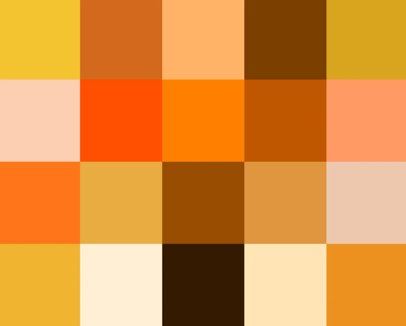
The next chakra is represented by orange. Unlike the red chakra, which is located at the base of the spine, this one is located within the lower abdomen. Known as the sacral chakra, it represents the feelings of joy, life and vitality, creativity, and elements of sexuality.
If we look at the various shades of orange, we can see that there is a major difference between some of the shades, with some being so different that we would be hard pressed to classify them as orange. However, at the end of the day, we need to find what shade works best for our purposes, rather than choose one randomly.
Yellow Color

The third chakra, also called the solar plexus chakra is represented by the color yellow. Yellow is often considered the color for happiness and energy, and is often paired with young people. The various shades of yellow are used to represent the feelings of vitality, power, and self-confidence. Which incidentally, are all the hallmarks of the very young, those who have not yet learnt the meaning of consequences.
If you look at the various color meanings, you will see yellow featured quite prominently among colors to use if you want your brand to appeal to the younger generation. And it is also why you see the color in brands such as McDonald’s and LEGO.
Green Color

The next chakra is the heart chakra, and this is represented by the color green. Now, you might be wondering what has the heart got to do with the color green? And the answer is that shades of green are used to depict feelings of harmony, brotherly love, and peace with the environment.
Green is also considered the color of nature. And that is why it is also used to depict scenarios of harmony with nature, such as using sustainable practices and equipment. Which is why many yoga logos use it to represent their connection with nature.
Blue Color

When it comes to the question of what color goes with dark green, the answer is blue. Shades of blue complement greens quite well, often used to provide a subtle contrast and transition. Now, blue represents the fifth chakra, which is the throat chakra. And this chakra is all about clear communication, with others as well as oneself, as well as being true to and accepting yourself.
Now, its affinity with green also connects its meaning with that of green. What that means is that unless you communicate properly, you would be unable to achieve peace and harmony, with others or within our own selves.
Indigo Color

Now, indigo might be a shade of blue, but indigo is a color that is often considered something distinct. Representing the sixth chakra, or the third eye chakra, indigo embodies the essence of intuition and understanding. And if you think about it, it has a deep connection to the meanings embodied by blue.
Blue is all about accepting oneself. But in order to accept it, you need to understand it. And that is where intuition and understanding come into play. By intuiting your weaknesses and strengths, you will be able to understand yourself, and that is the first step towards self-acceptance. This ties in well with yoga teachings of discovering your inner self, and accepting your true nature.
Violet Color
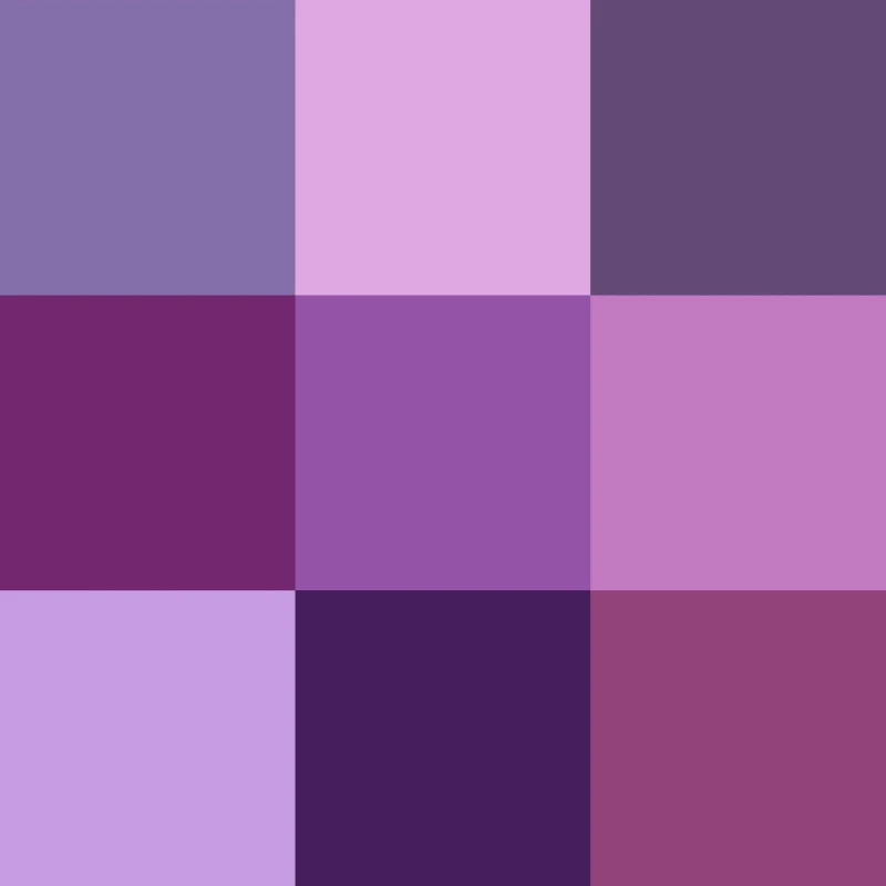
Violet represents the seventh and last chakra. Known as the crown chakra, it is located at the top of the head. This represents peace with the world as it is, and the oneness of all living beings in the world. This is the last chakra that brings about true enlightenment.
Now, violet is not a distinct shade on its own. It is a shade of purple, and in fact, some shades of purple associated with a sense of royalty, according to traditional logo color meanings. However, unlike blues and greens, some very specific shades of violet represent this chakra.
5 Inspiring Yoga Logos That Help You Find Your Center
So far we have discussed the elements and colors usually associated with yoga logos, and this theme in general. But the question is, is it enough for you to know how to create your own yoga brand logo?
Well, they may help you complete your logo successfully, but when it comes to finding the perfect starting point to that logo design, you will need to find the perfect logo ideas for inspiration. That is why we have listed a set of five yoga brand logos for you to get inspired. Let’s decipher their secrets, and see how they have managed to incorporate the essence of yoga and its teachings into their design.
Lululemon
The first yoga logo is for Lululemon. Lululemon is a popular apparel brand that specializes in active wear for women and men. If you look at its logo, you will see three major design characteristics we discussed that are incorporated within the logo design of the brand.
One, the brand has a red colored logo that denotes passion. Second, it has a circular design, which is quite sacred and important among yoga teachings, representing rebirth and the circle of life. Moreover, there is another element of geometric design inside, which is meant to denote femininity. All in all, we can say Lululemon has one of the best yoga brand logos we have seen so far.
PrAna
PrAna is another active wear apparel brand, but one that specializes in active wear for women yoga enthusiasts. Its design has an inherent eastern mystic feel to it, both the logomark as well as the wordmark.
Starting with the wordmark, the logo fonts used are designed to mimic the ancient writing style of Sanskrit, with the central “A” written in uppercase and designed to mimic a person doing a yoga pose. The rest of the wordmark is written in lowercase.
The logomark is done using a single stroke, and represents a person in the lotus pose, thus incorporating the popular design element in a simple, yet elegant style.
Gaiam
Next up is the brand Gaiam, which deals in selling sustainable yoga apparel and other items. Going for a natural, sustainable vibe, the logo is colored a bright green, and represents two main elements of classic yoga logos.
First, there is the geometrically drawn, top view of a lotus flower, represents both its connection to nature as well as to yoga and its teachings. Next, the lotus is enclosed within a circle, which gives the logo a Zen vibe, and represents the yoga teachings of life and rebirth. Overall, its simplicity is what makes it one of the best yoga logos of all time.
Beyond Yoga
Beyond Yoga is a popular active wear and accessories brand that sells apparel for yoga and wellness in general. While the rest of the logo is quite plain and minimalist, with a simple, sans-serif wordmark, the accompanying logomark has a design that uses thin strokes and negative space concepts to form the shape of a lotus flower.
This element of simplicity is something that translates well to the tenets of yoga and its teachings, and the lotus flower is a defining symbol for many yoga logos.
Alo Yoga
Finally, we come to ALO Yoga. ALO Yoga is a yoga active wear brand that offers apparel worn by some of the world’s top celebrities. Now, you may think that the brand logo has nothing related to the theme of yoga. However, you would be incorrect.
ALO stands for Air, Land, and Ocean. This defines the three physical planes of this earth, and the ones a yoga practitioner has to transcend in order to ascend the astral plane. Secondly, there is the geometric element to its design. Each letter of the logo is quite geometric, with each letter representing a single shape or a mix of geometric shapes for each letter. At the end, this logo is one that takes a true master of yoga brand logos to implement successfully.
Conclusion
In the end, finding a number of yoga logos to inspire your design won’t be very difficult. However, finding the ones that will guarantee success, now that is going to be a difficult endeavor. However, if you follow the guidelines and tenets provided in this guide, you will be able to avoid a lot of the pitfalls, and will be able to design some great yoga brand logos.
Logopoppin
Logopoppin is a graphic design agency that specializes in logo designing, web development, video production and advanced branding services. We love to innovate businesses with new age technologies, allowing them to improve their visual reputation.

