
Table of Content
Explore How the Famous American Automobile Logo Evolved
When it comes to ranking the leading automobile manufacturers in the United States, Chevrolet consistently emerges as one of the top names. With a long-standing legacy rooted in American automotive history, Chevrolet has carved out a prominent position in the industry. The brand has become synonymous with innovation, reliability, and performance, making it a preferred choice among millions of American drivers. Its wide appeal spans generations, owing to its ability to combine traditional craftsmanship with modern advancements.
One of the most recognizable aspects of the brand is the iconic Chevy logo. This emblem has come to represent more than just a car manufacturer, it symbolizes a deep connection to the American values. Created by professional logo design services, the Chevy logo evokes a sense of pride and trust, standing as a hallmark of excellence in automotive engineering. It’s a familiar sight on roads across the country, instantly linking drivers to a legacy of quality.
Throughout its history, Chevrolet has produced an impressive lineup of vehicles known for their stylish designs, and dependable performance. From SUVs to powerful trucks, Chevrolet has continually adapted to meet the changing needs of consumers. If you want to know how this brand and its logo evolved over the years, read this article in detail. It will let you know the journey of Chevrolet from the very start when the American car manufacturing industry was in a nascent stage.
History of Chevrolet Logo
Talking about the history of Chevrolet, it is quite diverse because the brand has been active in the American circuit from decades. It has changed the logo multiple times precisely to keep the brand identity fresh and updated. Let’s take a quick look at the evolution of Chevy logo right from the start.
Chevrolet Logo – 1911
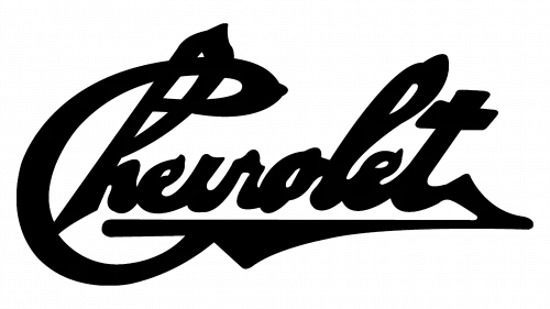
Chevrolet’s original logo featured the signature of its founder, Louis Chevrolet. This design was notable for its bold and confident appearance, rendered in a distinctive handwritten script. The typeface captured a sense of individuality, reflecting the personal involvement and legacy of the man behind the brand.
This initial branding choice highlighted the company’s focus on tradition, heritage, and the pioneering spirit of the American car brands in the early 20th century. The handwritten style conveyed a sense of reliability, aiming to establish a strong emotional connection with customers.
Chevrolet Logo – 1913
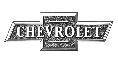
In 1913, Chevrolet underwent a significant transformation in its visual identity with the introduction of its first geometric logo. Departing from the original handwritten signature of founder Louis Chevrolet, the new design marked a bold shift toward a more modern and structured brand image.
This redesigned logo not only symbolized the company’s evolution but also laid the foundation for what would become one of the most recognizable brand marks in the automotive industry. Serving as the prototype, the 1913 geometric design helped solidify a cohesive and enduring visual identity.
Chevrolet Logo – 1914

In 1914, Chevrolet unveiled what would become its most iconic and enduring symbol—the bowtie logo. This design marked a defining moment in the brand’s visual history, cementing a distinct identity that would be carried forward for generations.
The original color palette of the 1914 bowtie logo featured a refined combination of light blue and gold, creating a sense of elegance and modernity. The lettering within the emblem was rendered in white with golden accents, adding a touch of sophistication and highlighting the brand’s attention to visual detail.
Chevrolet Logo – 1934

In 1934, Chevrolet introduced a new iteration of its emblem that reflected the evolving design sensibilities of the era. One of the most notable changes was the shift to a monochrome color scheme, replacing the previous use of light blue and gold with a sleek, black-and-white palette.
Just like evolving British car brands, the typography of the logo was also updated to feature a more contemporary and refined typeface. The letters were enlarged and styled with greater clarity and boldness, emphasizing strength, reliability, and forward-thinking values.
Chevrolet Logo – 1940

In 1940, Chevrolet made a strategic decision to return to its signature blue and gold color scheme, a move that honored the brand’s heritage while adapting it to contemporary tastes. This reintroduction of the original palette served as a visual nod to the company’s earlier success, reinforcing a sense of continuity and tradition.
The intensified blue tone not only enhanced the visual appeal of the emblem but also conveyed a message of renewed confidence and forward momentum. Paired with the rich gold accents, the logo struck a harmonious balance between elegance and boldness, symbolizing Chevrolet’s commitment to quality.
Chevrolet Logo – 1950

In 1950, Chevrolet introduced one of the most dramatic transformations to its logo since the brand’s inception. Departing from the traditional blue and gold palette, the company adopted a bold new color scheme featuring red and white.
Equally significant was the redesign of the logo’s structure. The iconic bowtie emblem was now set against a rounded red background, a stylistic departure from the more angular and linear designs of the past. This circular element softened the logo’s overall appearance, adding a sense of approachability and warmth to the brand’s image.
Chevrolet Logo – 1964
Just like various German car brands, Chevrolet introduced a minimalist redesign of its logo that marked a significant departure from the more colorful and decorative emblems of previous decades. This new version embraced simplicity and modern elegance, reflecting the design trends of the mid-20th century.
The bowtie symbol in this iteration was rendered with thin, precise contour lines, giving it a sleek and understated appearance. Accompanying this was a bold, italicized wordmark that injected a sense of movement and dynamism into the design.
Chevrolet Logo – 1976

In 1976, Chevrolet revisited its classic color palette by reintroducing blue into its logo design. This updated version featured a vibrant, medium-blue hue that conveyed trust, reliability, and American heritage. The reappearance of blue served as a visual connection to earlier iterations of the emblem, reinforcing the brand’s long-standing legacy.
To give the logo a more contemporary and three-dimensional appearance, a thin white outline was added to the inner edges of the bowtie shape, providing a clean contrast against the blue background. This white framing not only sharpened the visual clarity of the design but also added depth and refinement.
Chevrolet Logo – 1994
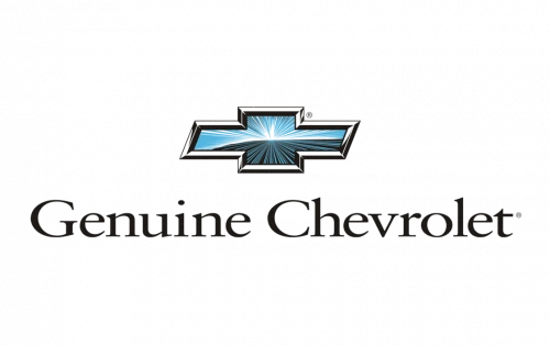
In 1994, Chevrolet unveiled a significant redesign of its iconic logo. This modern update was a bold step forward in the brand’s visual evolution, aimed at aligning Chevrolet’s image with the design and technological advancements of the late 20th century.
This enhanced version of the logo was designed to convey strength, innovation, and a sense of motion. By giving the emblem a more tactile and lifelike appearance, the brand reinforced its commitment to quality and craftsmanship.
Chevrolet Logo – 2001

In 2001, Chevrolet introduced a new version of its logo that continued the trend toward three-dimensional design. The bold red color choice marked a departure from the traditional colors, signaling a desire to experiment with a more dramatic and emotionally resonant palette.
Taking cue from the Chinese car brands, the three-dimensional styling was enhanced with shading, highlights, and subtle gradients that gave the bowtie emblem a polished, metallic appearance. These visual effects added depth and realism, making the logo quite exceptional as compared to previous designs.
Chevrolet Logo – 2002
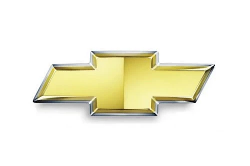
In 2002, Chevrolet officially adopted the gold bowtie emblem as its primary brand logo, marking a significant shift in its visual identity. This move was part of a broader effort to modernize the brand’s image and create a more distinctive and recognizable symbol across global markets.
By standardizing the gold bowtie as the official logo, Chevrolet aimed to strengthen brand consistency across its wide range of vehicles and marketing materials. Over time, the gold bowtie became a hallmark of the brand, prominently featured on vehicle grilles, advertisements, and promotional content.
Chevrolet Logo – 2010

In 2010, Chevrolet introduced a redesigned version of its iconic bowtie logo, adding a new layer of visual sophistication and depth to the emblem. This updated design incorporated a textured gold finish, giving the bowtie a more three-dimensional and refined appearance.
The updated logo was part of Chevrolet’s broader effort to align its visual identity with the evolving expectations of a global automotive market. By enhancing the logo’s aesthetic, Chevrolet aimed to create a more premium image that resonated with both long-time loyal customers and a new generation of drivers.
Chevrolet Logo – 2013

In 2013, Chevrolet unveiled the latest iteration of its iconic logo, further refining the emblem to reflect a more polished and contemporary brand image. This version features the classic golden bowtie at its core, now enhanced with a sophisticated textured finish that adds depth and visual interest.
The addition of the chrome outline was a deliberate design choice aimed at elevating the logo’s overall impact and aligning it with the aesthetics of today’s automotive design. The metallic edge brings a refined contrast to the warm gold center, projecting strength, precision, and innovation.
Frequently Asked Questions
| Why Chevrolet is famous in the US? Chevrolet is famous in the U.S. for producing reliable, affordable vehicles that cater to a wide range of drivers. Its deep roots in American automotive history and iconic models like the Silverado and Corvette have made it a household name. |
| When was the first Chevy logo introduced in the market? The first Chevrolet logo, known as the bowtie emblem, was introduced in 1913. It debuted on the 1914 Chevrolet H-2 Royal Mail and H-4 Baby Grand models. |
| What is the color of Chevy logo? The Chevy logo is primarily gold with a metallic textured finish, symbolizing quality and tradition. It is outlined with a sleek chrome border for a modern and refined look. |
Final Words
That sums up our entire blog in which we have discussed the complete history of Chevy logo. It is an iconic emblem that has a rich legacy in the automotive circuit of the US. Over the years, the emblem has evolved massively, just like the cutting-edge automobiles of the company. This blog has tried to cover all the iterations of the Chevy logo till to date, so that you can understand the idea and concept of every redesign properly.

Logopoppin
Logopoppin is a graphic design agency that specializes in logo designing, web development, video production and advanced branding services. We love to innovate businesses with new age technologies, allowing them to improve their visual reputation.

