
Table of Content
Discover the Transformation of the New York Yankees Logo Over the Years
The New York Yankees, a name synonymous with baseball excellence and a dynasty that has captivated generations, boasts a sports brand as iconic as its on-field achievements. More than just a sports team, they represent a cultural milestone, their pinstriped uniforms and the unmistakable Yankees logo instantly recognizable for baseball fans across the US.
The visual identity of the Yankees’ legendary franchise has evolved over its long history, reflecting changes in ownership, team names, and other reasons. However, it has always maintained a sense of tradition and excellence of its rich history. Thus, exploring the journey of the Yankees symbol provides an interesting glimpse into the history of one of the most successful and influential teams in professional sports.
From their beginnings as the Baltimore Orioles in 1901 to their relocation to New York and subsequent transformation as the Highlanders and then the Yankees, let’s explore the significant milestones in the development of the Yankees’ enduring brand. Join us as we dive into this transformation and learn how a professional logo design agency can add a similar enduring charm to other brand symbols.
A Brief History of the New York Yankees and Their Impact on Major League Baseball
The journey of the New York Yankees began in 1901 in Baltimore, Maryland, where they were known as the Orioles. This early iteration of the franchise lasted only two seasons before financial difficulties led to the team’s relocation to New York City in 1903.
Upon their arrival in New York, the team adopted the name Highlanders, a subtle nod to their elevated playing field at Hilltop Park and also possibly a reference to the Gordon Highlanders, a noted British military unit. During this period, the team began to establish a foothold in the New York sports culture, laying the groundwork for the legendary status they would eventually achieve.
The pivotal moment in the franchise’s history arrived in 1913 when the team officially rebranded as the New York Yankees. This name change marked a turning point, aligning the team’s identity firmly with the city that would become their enduring home.
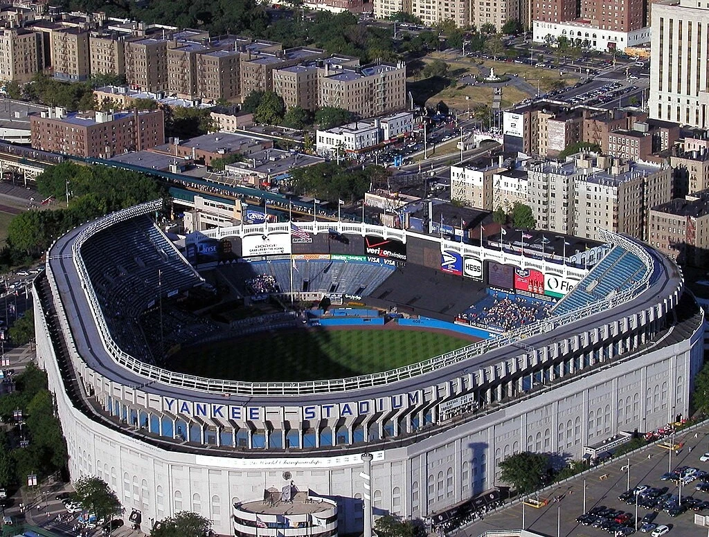
The decade that followed saw the arrival of iconic figures like Babe Ruth, whose talent and personality propelled the Yankees into the national spotlight and into an era of unprecedented success. Under Ruth’s legendary leadership, the Yankees captured their first World Series title in 1923, the same year they moved into their iconic new stadium in the Bronx. This era cemented the Yankees’ reputation as a dominant force in baseball and laid the foundation for their enduring legacy along with their NY Yank’s logo.
What Was the Impact of the New York Yankees on Major League Baseball?
The New York Yankees’ impact on Major League Baseball extends far beyond their numerous championships. The Yankees established a culture of winning and professionalism that became the standard for other teams to emulate.
Their star players, from Ruth and Gehrig to DiMaggio and Mantle, became household names and cultural icons, transcending the sport itself. The Yankees’ pinstriped uniforms, first adopted in 1915, became instantly recognizable and synonymous with baseball tradition and excellence, elevating their iconic logo into one of the most popular MLB logos ever.
Moreover, their rivalry with the Boston Red Sox is one of the most storied and intense in all of sports, captivating fans for over a century. The Yankees’ consistent success, coupled with their strong brand identity, has made them one of the most valuable and recognizable sports franchises in the world, leaving a strong mark on the history and cultural fabric of Major League Baseball.
Evolution of the New York Yankees Logo Through the Decades
As we mentioned earlier, the logo and brand identity of the New York Yankees has evolved through the years. Featuring a series of distinct logos, each design reflects the team’s name, location, and the prevailing historical aesthetic of the team’s legendary era.
Let’s take a look at the evolution of the Yankees logo in greater detail.
1901 NY Yankees Logo
As the Baltimore Orioles in their inaugural season of 1901, the team’s logo was a simple yet readable design featuring an orange letter “O.” This initial logo directly represented the team’s name and its connection to the city of Baltimore.
This early logo, while short-lived due to the team’s relocation, marks the very beginning of the visual history that would eventually become the iconic Yankees brand. It’s a reminder of the team’s origins and the initial visual representation before its move to New York.
1902 NY Yankees Logo
In their second and final season as the Baltimore Orioles in 1902, the team slightly modified its logo, changing the orange “O” to a blue block letter “B.” This minor alteration still clearly represented the team’s Baltimore identity but introduced a new color, blue, which would later become a prominent color in the Yankees’ visual identity.
1903-1904 Yankees Logo
Upon relocating to New York and adopting the name Highlanders in 1903, the team introduced its first logo representing its new city. This emblem featured the letters “NY” rendered in a black Old English font. This choice of baseball fonts conveyed a sense of tradition and connection to the established city of New York.
1905 Yankees Logo
For a single season in 1905, the New York Highlanders experimented with a new logo that featured the letters “NY” overlapping for the first time. However, this early attempt at an interlocking design was quite different from the more familiar version that would later become iconic. The letters in this 1905 logo had smooth, almost curved edges, giving it a more organic and less structured feel. However, this design was short-lived, as the team reverted to separate letters in the following season.
1906 New York Yankees Logo
In 1906, the Highlanders returned to a logo featuring the separate letters “NY,” but with a notable change in font and color. The letters were now in a lighter blue and in a different Old English style with a greater distance between them compared to the 1903-1904 version. This shift towards a lighter blue introduced a color that would become a staple of the Yankees’ visual identity.
1907 New York Yankees Logo
The 1907 logo for the New York Highlanders saw another subtle refinement of the “NY” monogram. The Old English font was retained, but the specific style was altered again to be straighter and angular, and the distance between the letters was adjusted once more.
1908 NY Yankees Logo
The 1908 logo continued the trend of evolving the “NY” monogram in the Old English style. A new style of logo fonts was introduced, and the distance between the letters was again modified. This consistent use of the “NY” in an Old English script, albeit with minor variations each year, indicates a growing recognition of the importance of these initials in representing the New York team.
1909-1912 NY Yankees Logo
The period from 1909 to 1912 marked a significant turning point in the history of the New York Yankees logo. It introduced the familiar interlocking “NY” on the Highlanders’ uniform caps and left sleeves. This iconic design, believed to have been inspired by a medal of valor designed by Tiffany & Co. in 1877 for a New York City police officer, would become the cornerstone of the Yankees’ brand.
The interlocking monogram offered a more unified and visually striking symbol compared to the previously separate letters, and was a pivotal moment, laying the foundation for one of the most recognizable sports logos today.
1913-Present Yankees Logo
In 1913, the team’s officially renamed itself the New York Yankees, with the interlocking “NY” logo undergoing a significant transformation into the bolder design we still see on the team’s primary cap. The letters became more blocky, and the curves were more exaggerated, creating a stronger and more visually impactful emblem. Today, it appears on the team’s caps, marketing materials, and is deeply ingrained in the minds of sports fans everywhere as the symbol for Ney York’s sports.
1947-1967 Alternative Yankees Logo
In 1947, the New York Yankees introduced a alternative logo that provided a different visual feel of the team. Created by sports artist Henry Alonzo Keller, this circular logo featured the word “Yankees” written in a red script across a white baseball with red stitching. A red baseball bat formed the vertical line of the “K” in “Yankees,” and an Uncle Sam hat, rendered in red, white, and blue, hung from the barrel of the bat.
This logo incorporated patriotic elements and a more illustrative style compared to the minimalist interlocking “NY.” It was used as the team’s alternate logo for several decades and offered a more dynamic and narrative visual identity, emphasizing the team’s name and its connection to American culture.
1968-Present Alternative New York Yankees Logo
In 1968, the alternative Yankees logo underwent a subtle refinement that has remained largely consistent to the present day. The core elements of the baseball bat forming the “K,” and Uncle Sam hat were retained, with the color scheme slightly adjusted, with brighter and darker shades introduced.
The sky blue underbrim of the hat was changed to white, and the overall linework was sharpened. This alternative logo continues to be used extensively in marketing, behind home plate at Yankee Stadium, and on the team’s batting helmets, providing a recognizable and spirited secondary mark for the franchise.
FAQs
| Why is the Yankees logo so iconic? The design of the logo is a callback to the Medal of Honor awarded to meritorious police officers in New York, and is thus a cultural part of the city. Its usage in the Yankees logo further cements the connection between the team and the city. |
| Why do the Yankees not have player names on the back of their jerseys? It’s a tradition for the team that harkens all the way back to its glory days. Plus, the names may ruin the vintage element of their jerseys, a brand element as important as the Yankees logo itself. |
| What does the term Yankee mean? Yankee was originally a term used by the British to refer to American colonists, in a derogatory manner. Although at the time it referred to people from New England, today it is used to refer to all Americans. |
Conclusion
The history and evolution of the New York Yankees logo and brand is an interesting story that mirrors the team’s own journey to becoming a global sporting icon. From the simple initials of the early Baltimore Orioles and New York Highlanders to the enduring legacy of the interlocking “NY” logo, each iteration tells a part of the Yankees’ rich story. Together, these logos, along with other brand elements, have turned it into a brand that transcends the sport itself, representing tradition, success, and the enduring spirit of the New York Yankees in the MLB.
Logopoppin
Logopoppin is a graphic design agency that specializes in logo designing, web development, video production and advanced branding services. We love to innovate businesses with new age technologies, allowing them to improve their visual reputation.

