
Table of Content
Explore the Complete Evolution of Dunkin Donuts Logo
When it comes to rank the top coffee and donut chains in the United States, Dunkin’ consistently stands out as a clear leader. Its long-standing presence and commitment to quality have helped it secure a dominant position in a highly competitive industry. The brand has successfully carved out a loyal customer base by offering a reliable combination of great-tasting coffee, a variety of freshly baked donuts, and quick service that appeals to people of all ages.
Created by professional logo design services, the Dunkin’ Donuts logo has become more than just a visual identity. The logo carries decades of brand history, symbolizing the company’s growth from a single shop to a nationwide powerhouse. It is instantly recognizable and evokes feelings of familiarity, reliability, and comfort. Over the years, Dunkin’ has maintained a strong presence in the fast food and beverage market, and its logo serves as a powerful reminder of the brand’s unmatched reputation as a leading food chain in the United States.
Dunkin’ is widely recognized as one of the pioneers in introducing the concept of delicious, ready-to-go baked donuts in the American market. If you want to know about the complete history of Dunkin Donuts logo, read this article in detail. It will let you know how this iconic logo evolved over they years, making the Dunkin brand a stunning hit in the market.
Why Dunkin’ is Popular in the Market?
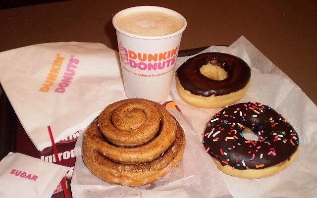
Dunkin’s popularity in the market stems largely from its ability to consistently deliver high-quality, affordable coffee and baked goods in a quick and convenient manner. For decades, it has catered to the fast-paced lifestyle of American consumers, offering a dependable spot for morning fuel or an afternoon pick-me-up. With an extensive network of locations across the country, Dunkin’ is accessible to millions, which strengthens its brand familiarity and customer loyalty.
Another key factor behind Dunkin’s widespread appeal is its innovative and diverse menu. While it began with a focus on donuts and coffee, the brand has evolved to include a broad range of offerings, such as breakfast sandwiches, espresso drinks, cold brews, and seasonal specials. This variety helps Dunkin’ appeal to a wide demographic, from traditional coffee drinkers to younger audiences seeking trendy beverages like iced matcha or flavored lattes.
Additionally, Dunkin’s strong branding and marketing have played a crucial role in its popularity. Slogans like “America Runs on Dunkin’” have resonated with consumers, reinforcing the idea that Dunkin’ is an essential part of daily life. Its approachable, no-fuss image positions it as a brand that’s both familiar and trustworthy. By combining convenience, variety, and smart marketing, Dunkin’ has established itself as a beloved staple in the lives of millions across the United States.
History of Dunkin Donuts Logo
Dunkin Donuts is one of those brands that has always tried to keep its food logo fresh and updated. If you haven’t seen the previous Dunkin logos that were equally attractive just like the current one, take a look at the complete timeline given below.
Dunkin Donuts Logo – 1950
The original Dunkin’ Donuts logo made its debut in 1950, the same year the company was founded. This initial design reflected the brand’s early identity and helped introduce its unique concept of serving high-quality coffee and donuts in a fast and friendly environment. Featuring a straightforward and classic look, the logo played a crucial role in establishing Dunkin’s presence in the local market.
For the next ten years, this first logo remained an important part of Dunkin’s branding as the company began to expand. It became a recognizable symbol of a new kind of quick-service eatery, one that focused on satisfying morning routines with fresh donuts and hot coffee.
Dunkin Donuts Logo – 1960
The signature candy pink shade that is now closely associated with the Dunkin’ brand first appeared in the logo design in 1960. This vibrant and playful color was introduced as part of a broader effort to make the brand more visually appealing and recognizable to a growing customer base. At the time, the introduction of pink—paired with warm, inviting tones—helped create a friendly and approachable image that stood out among other food chains.
Since its debut, the candy pink hue has remained a permanent part of Dunkin’s visual identity. Despite different types of logo updates over the decades, this particular shade has consistently been preserved. The lasting presence of candy pink in the logo underscores its significance in Dunkin’s branding strategy, serving not only as a design choice but as a symbol of the company’s heritage and enduring appeal.
Dunkin Donuts Logo – 1976
The first version of the Dunkin’ Donuts brand that closely resembles the globally recognized identity we know today was introduced in 1976. This marked a significant transformation in the company’s visual and branding approach, aligning it more with the modern marketing strategies of the time. The updated brand image featured a more cohesive design, along with a playful typeface that gave the logo a warm and approachable personality.
The 1976 rebranding played a crucial role in setting the tone for Dunkin’s identity as it grew from a regional favorite into a household name. It reflected the company’s shift toward building a stronger, more unified brand experience across all its locations. This branding update wasn’t just cosmetic—it represented Dunkin’s ambitions for national and international growth.
Dunkin Donuts Logo – 1977
In 1977, Dunkin’ Donuts introduced a subtle yet impactful redesign of its logo. One of the most noticeable changes in this update was the removal of the graphical emblem that had previously been positioned on the right side of the badge. By eliminating this visual element, the company shifted the focus more directly onto the brand name itself, making it the central feature of the logo.
The decision to streamline the logo reflected Dunkin’s growing confidence in the strength of its name and visual identity. By reducing visual clutter, the brand achieved a more professional and easily recognizable appearance. This move also supported the company’s expansion strategy, as a simpler logo is often more versatile and easier to adapt across a variety of formats, from storefront signage to packaging.
Dunkin Donuts Logo – 2002
The Dunkin’ Donuts logo introduced in 2002 marked a bold and refreshing update that blended tradition with a modern aesthetic. This version retained the brand’s iconic pink and orange color scheme, but presented it in a more polished and contemporary way. The word “Dunkin’” was highlighted in vibrant orange, while “Donuts” remained in the familiar candy pink, creating a lively contrast that was both eye-catching and energetic.
One of the standout features of the 2002 logo was the inclusion of a steaming coffee cup placed to the left of the wordmark. The cup, often depicted with rising steam and sometimes a stylized swirl, reinforced the brand’s role in daily routines, especially morning rituals. It emphasized that Dunkin’ was not just a donut shop, but a place where people could start their day with a comforting beverage.
Dunkin Donuts Logo – 2019
After using the same logo for over a decade, Dunkin’ Donuts made a significant branding decision in January 2019 by unveiling a new, simplified wordmark logo. This change was part of a broader rebranding strategy aimed at modernizing the company’s image. The most notable shift was the removal of the word “Donuts” from the brand name, leaving just “Dunkin’” as the official wordmark.
The new logo embraced minimalism, focusing on a clean, bold typeface that gave the wordmark a stronger and more confident presence. By streamlining the design and eliminating additional graphics, Dunkin’ aimed to create a more versatile and modern identity that would resonate across both digital and physical platforms.
Frequently Asked Questions
| Why Dunkin Donuts logo is popular in the market? The Dunkin’ Donuts logo is popular due to its bold, vibrant colors and simple, memorable design that instantly connects with consumers. Its consistent visual identity reinforces brand recognition across generations. |
| When was the first Dunkin logo introduced in the market? The first Dunkin’ Donuts logo was introduced in 1950, the same year the company was founded. It marked the beginning of the brand’s journey toward becoming a household name. |
| What is the color of Dunkin logo? The Dunkin’ logo features a vibrant combination of orange and pink. These bold, playful colors reflect the brand’s energetic and friendly personality. |
Final Words
That concludes our entire article in which we have discussed the complete history of Dunkin Donuts logo. It is one of the most famous food chain logos known in the US, precisely due to the offering of scrumptious donuts. It is not just popular among the kids, but adults as well who like something alternate to Starbucks and Dutch Bros’ coffee. This blog has therefore discussed the complete evolution of Dunkin logo right from the beginning, so that you can understand how it became popular in the market.
Logopoppin
Logopoppin is a graphic design agency that specializes in logo designing, web development, video production and advanced branding services. We love to innovate businesses with new age technologies, allowing them to improve their visual reputation.

