
Table of Content
Take a Look at the Complete History of Raiders Logo Below
Ranking the top football clubs in the United States is no easy task, but one name that consistently stands out is the Los Angeles Raiders. Known for their passionate fan base, distinctive team culture, and bold Raiders logo, the club has earned a prominent place in the history of American football. Though their journey has taken them through different cities, their impact on the sport remains significant, often placing them among the elite franchises in discussions of football excellence.
Originally established in Oakland, California, the Raiders began their professional journey in the American Football League before merging into the National Football League. Their origins in Oakland played a crucial role in shaping the team’s identity and legacy. The franchise has gone through several relocations, yet they are still often associated with their time in California. Throughout these transitions, the Raiders have remained a symbol of resilience and competitive spirit in the league.
The team has a rich and dynamic legacy filled with memorable moments, legendary players, and significant contributions to the game. They are known not only for their championship wins and playoff appearances but also for their influence on football culture. Created by professional logo design services, the Raiders logo is therefore quite popular in the US football circuit which is very huge and highly competitive in nature.
Popularity of Los Angeles Raiders
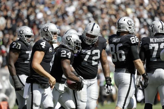
The Los Angeles Raiders, part of the storied Raiders franchise, have achieved significant milestones that contribute to their lasting legacy in American football. One of their most notable accomplishments came during their time in Los Angeles when they won Super Bowl XVIII in 1984, dominating the Washington Redskins with a commanding performance. This victory marked the franchise’s third Super Bowl title, reinforcing their status as a powerhouse in the NFL.
The team has also produced numerous Hall of Fame players and influential coaches over the decades, helping shape the modern game. Their consistent competitiveness, particularly during the 1970s and 1980s, earned them a reputation as one of the league’s most formidable teams. The popularity of the Raiders across the U.S. stems not only from their on-field success but also from their unique identity and culture.
Known for their rebellious image and aggressive playing style, the Raiders cultivated a loyal and diverse fan base that spans far beyond their home cities. Their fans, famously dubbed the “Raider Nation,” are known for their fierce loyalty and presence at games, creating one of the most intense atmospheres in the league. The team’s association with pop culture and urban fashion also helped cement their popularity nationwide. This blend of athletic success, and fan devotion makes the Raiders one of the most recognized and respected franchises in American football history.
History of Raiders Logo
The history of Raiders logo is quite diverse as it is active in the football circuit from a very long time. If you do not know about different Raiders logos that have historically remained popular in the industry, take a look at the list of emblems given below.
Raiders Logo – 1960
The initial logo of the Oakland Raiders featured a distinct color scheme of white, black, and gold. These colors were carefully chosen to reflect the team’s bold and dynamic identity. The combination of black and white, symbolized strength, while the addition of gold highlighted the team’s ambition and prestige. The use of these colors set the tone for the Raiders’ visual identity, which became instantly recognizable to fans and players alike. This logo was a crucial part of the franchise’s early years, helping to establish the team’s unique image in the eyes of the public.
The design of the logo was a significant part of the Raiders’ brand from its inception. It depicted a fearsome-looking pirate, complete with an eye patch, reinforcing the tough and rebellious nature that the Raiders wanted to project. The color palette perfectly captured the team’s fierce determination and no-nonsense approach to the game. Over time, this logo became a symbol of not just the Raiders’ on-field prowess, but also their influence in American football culture, making it one of the most iconic and enduring NFL logos in sports history.
Raiders Logo – 1963
In 1963, the Raiders made a notable change to their color scheme by removing the gold color and replacing it with a silver hue. This transformation was part of the franchise’s effort to refine and modernize its visual identity while still retaining the powerful and bold elements that fans had come to associate with the team. The switch to silver, a color often linked with prestige and excellence, brought a fresh, sleek look to the team’s uniform and logo.
The decision to replace gold with silver was more than just a cosmetic change; it was a representation of the Raiders’ ongoing ambition and their desire to remain relevant in an ever-changing league. Silver was a fitting replacement, as it complemented the team’s signature black and white colors, creating a visually striking and cohesive look. Over time, this updated color scheme became just as synonymous with the franchise as the original one, contributing to the Raiders’ iconic status.
Raiders Logo – 1964
During this period, the Oakland Raiders made a deliberate effort to simplify their iconic sports logo. The adjustments made to the logo were aimed at giving it a cleaner, more modern look while maintaining its strong association with the team’s identity. One of the most notable changes was the modification of the shield. The original shield was reworked into a solid black shape, eliminating some of the earlier complexity. This alteration gave the logo a more unified and powerful visual impact, which was in line with the Raiders’ tough, no-nonsense persona.
The decision to make the shield entirely black was a significant one, as it reinforced the team’s signature colors of black, silver, and white. This change in design also served to heighten the logo’s prominence, making it instantly recognizable. By simplifying the overall look, the Raiders sought to create a stronger, more enduring symbol for their franchise. This bolder version of the logo helped to solidify the team’s image in the public’s mind, reflecting their commitment to innovation while staying true to their core values of strength, resilience, and intensity.
Raiders Logo – 1995
In 1995, the Raiders made another significant move in their history, returning to their original home city of Oakland after spending several years in Los Angeles. This relocation marked a new chapter for the team, as they reconnected with the roots of their fan base and embraced the city that had first seen the rise of the franchise. Despite the change in location, the Raiders made a conscious decision not to alter their iconic vintage logo, which had remained unchanged for decades.
The decision not to modify the logo was a reflection of the Raiders’ desire to maintain continuity and honor their rich history. The logo had become a symbol of the team’s legacy, representing not just the football club itself but also the unique culture and spirit of the franchise. Even as the team moved back to Oakland, they recognized that the logo was a powerful part of their brand, deeply ingrained in the minds of fans across the country.
Frequently Asked Questions
| Why the Raiders logo is popular in the US? The Raiders logo is popular in the U.S. due to its iconic design, which symbolizes toughness, rebellion, and resilience. It has become a powerful cultural symbol, embraced by fans nationwide, representing not just a football team but a bold identity. |
| When did the Raiders move to the Los Angeles for the first time? The Raiders moved to Los Angeles for the first time in 1982, after spending their early years in Oakland. This relocation marked a new chapter in the team’s history, bringing them to a larger market with a fresh fan base. |
| What is the color of the Raiders logo? The Raiders logo features a color scheme of black, silver, and white. These colors represent strength, prestige, and unity, aligning with the team’s bold and resilient identity. |
Final Words
That concludes our entire article in which we have discussed the complete history of the Raiders logo. It is an iconic emblem having a rich legacy in the US football circuit. Over the years, the team has remained on top of the football charts in the US. It not only enhanced the popularity of the logo but also made a distinctive name for the club in the vast football circuit of America. This is the reason why the Raiders logo also didn’t changed much over the years, as the club kept its iconic identity to preserve its legacy in the circuit.
Logopoppin
Logopoppin is a graphic design agency that specializes in logo designing, web development, video production and advanced branding services. We love to innovate businesses with new age technologies, allowing them to improve their visual reputation.

