
Table of Content
A Brief Look How the Prestigious Dallas Mavericks Logo Evolved
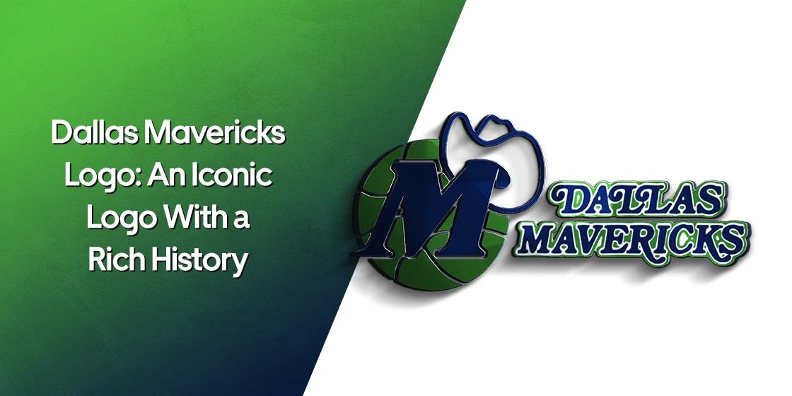
Speaking about popular NBA teams, the name of Dallas Mavericks always comes on top of the list. It is a renowned NBA team that has won many titles and produced several stars over the past few years. The iconic Dallas Mavericks logo is therefore popular in the US, as the team is loved and supported by many people in the country. Designed by professional logo design services, the sturdy headshot of horse illustrated in the logo has become a core identity of the team, showcasing a great class of power and royalty in the design.
Looking at the history, the team has a rich legacy in the circuit of American basketball. Founded in 1980, Dallas Mavericks has evolved rapidly during the last couple of decades. Today, they are ranked among the most competitive teams in the NBA that always comes up in the tournament with aggressive gameplay and renowned stars. This is the reason why the branding and logo of the club has become popular among the people, especially the kids who are die-hard fans of the club.
If you want to know about the complete history of Dallas Mavericks logo, read this article in detail. It will let you know how this iconic team emblem evolved and became a strong Dallas team identity during the last few years. Let’s first understand why Mavericks are hugely popular in the NBA circuit.
Popularity of Dallas Mavericks
The Dallas Mavericks are popular in the United States largely due to their success on the basketball court. Founded in 1980, the Mavericks quickly established themselves as a competitive franchise, culminating in their first NBA championship in 2011. Led by exceptional stars like Dirk Nowitzki and others, the Mavericks built a strong national fanbase. Their thrilling playoff runs, particularly the underdog 2011 championship victory over the heavily favored Miami Heat, created lasting memories for basketball fans across the country.
Another reason for the Mavericks’ popularity is their connection to a dynamic and modern city, Dallas, which itself has a strong sports culture and significant media presence. The team’s colorful and outspoken owner further elevated their profile. Cuban’s approach—mixing business innovation, and frequent media appearances—helped the Mavericks stay relevant both on and off the court. His willingness to invest in player facilities, technology, and team marketing created a model of how a franchise could thrive in the 21st century.
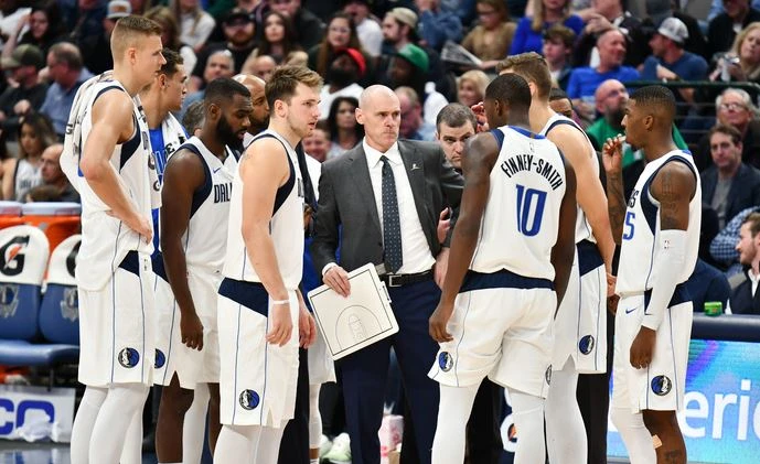
The Mavericks have consistently embraced both tradition and evolution, balancing loyalty to their roots with efforts to appeal to younger fans. Their consistent rebranding efforts, creative marketing, and engagement through social media platforms have kept them in the public eye. Players like Luka Dončić have ensured that the Mavericks remain competitive and exciting to watch, attracting new generations of fans. As a result, the Dallas Mavericks have remained a well-known and beloved franchise throughout the US sports landscape.
History of Dallas Mavericks Logo
Established in 1980, the Mavericks have a rich history of bringing style and innovation in the branding. Their NBA logo is a clear evidence of that fact, showcasing a class of solidity and boldness in the design. Here’s a quick look at the history of Mavericks logo below.
Dallas Mavericks Logo – 1980
The original logo for the Dallas Mavericks was introduced in 1980. This initial design reflected the spirit and energy of a new team entering the NBA. The logo featured a distinctive green and blue color scheme, which was chosen to represent growth, ambition, and a modern sense of style fitting the city of Dallas. At the center of the design was a stylized letter “M” set against a basketball, topped with a cowboy hat, symbolizing both the team’s Western roots and the city’s proud Texan heritage.
The decision to incorporate a cowboy hat into the logo was particularly significant. This combination of basketball elements and regional symbolism helped the Mavericks stand out among other NBA franchises, many of which at the time opted for more traditional sports logos. The unique design was seen as playful yet serious, a reflection of the spirit the Mavericks hoped to bring to the league — one of competitiveness, flair, and a touch of local pride.
Throughout the early years of the franchise, the original logo served as a crucial piece of the Mavericks’ brand identity. It appeared on everything from jerseys to promotional materials, helping to build recognition among basketball fans both locally and nationally. It marked the start of their journey in the NBA and laid the foundation for the strong, distinctive image the team continues to cultivate today.
Dallas Mavericks Logo – 1993
In 1993, the Dallas Mavericks underwent a logo redesign, although the changes made were relatively subtle and respectful of the original design. The franchise chose to retain the overall structure and key elements of the original 1980 emblem, preserving its familiar and recognizable look. The iconic features, such as the stylized “M” with the cowboy hat set against a basketball, remained intact, ensuring that the team’s visual identity would continue to be easily associated with its roots and early history.
The most notable adjustment in the 1993 redesign centered on the logo’s typography. In this updated version, the lettering was presented in a solid blue color, free of any extra outlines, shadows, or embellishments. This move toward a cleaner and more straightforward typeface reflected a broader design trend of the early 1990s, where minimalism and bold, flat colors were becoming increasingly popular in professional sports branding.
By opting for only slight modifications, the Mavericks demonstrated a desire to modernize their appearance. The cleaner wordmark gave the logo a fresher and more polished look while maintaining the spirit and traditions that fans had come to associate with the team. This approach allowed the Mavericks to remain visually relevant in a changing NBA landscape while still honoring the legacy they had built over more than a decade of competition.
Dallas Mavericks Logo – 2001
In 2001, the Dallas Mavericks unveiled a completely new logo. This new emblem represented a bold step forward, aiming to give the team a more modern, professional, and dynamic visual identity that would align with the new era of the franchise. Moving away from the playful and somewhat traditional look of the original logo, the Mavericks opted for a sharper, more aggressive design that emphasized strength, competitiveness, and a forward-thinking attitude.
The redesigned logo featured a fierce-looking horse’s head set within a contemporary shield. The horse was drawn with sleek, angular lines that gave it a sense of motion and intensity. Complementing the horse emblem was a bold, stylized wordmark that used modern typography to enhance the overall impact of the design. The new color combination conveyed a sense of sophistication and toughness, while still maintaining subtle links to the original colors to honor the team’s heritage.
This transformation in 2001 was more than just a cosmetic update. Under the ownership of Mark Cuban and the leadership of star players like Dirk Nowitzki, the team was entering a new phase of competitiveness and high expectations. The sleek and memorable new logo perfectly captured this momentum, helping to strengthen its presence both nationally and internationally among basketball fans.
Frequently Asked Questions
| Why Dallas Mavericks is popular in the US? The Dallas Mavericks are popular in the U.S. due to their championship success and iconic players roster. Their exciting style of play and strong connection to the vibrant city of Dallas further boost their nationwide appeal. |
| How many titles Mavericks have won? The Dallas Mavericks have won one NBA championship title, which they captured in 2011. They defeated the Miami Heat in a memorable six-game Finals series. |
| What is the color of Dallas Mavericks logo? The Dallas Mavericks logo features navy blue, royal blue, silver, and black. These colors create a bold, modern look that reflects the team’s strong and dynamic identity. |
Final Words
That concludes our entire article in which we have discussed the complete history of the Dallas Mavericks logo. It is an iconic emblem with a rich history of power and dominance in the NBA. Just like the club itself, the logo has evolved rapidly during the last few years. This blog has therefore discussed the complete timeline of the evolution of Mavericks logo that is quite popular among the basketball fans in the US.
Logopoppin
Logopoppin is a graphic design agency that specializes in logo designing, web development, video production and advanced branding services. We love to innovate businesses with new age technologies, allowing them to improve their visual reputation.

