Table of Content
Understanding the HBO Logo and Its Evolution Over the Decades
The iconic HBO logo, a simple yet instantly recognizable black and white monogram, has become synonymous with high-quality, groundbreaking home entertainment for over four decades. More than just a visual marker, the logo represents a legacy of innovative programming, cinematic excellence, and a commitment to delivering premium, commercial-free content directly to viewers’ homes.
Its evolution, though relatively subtle, mirrors the growth and transformation of Home Box Office from a regional cable group to a global entertainment powerhouse. Understanding the history of the HBO wordmark helps us trace the trajectory of a company that fundamentally reshaped TV and continues to be a hallmark of quality in an increasingly crowded media market.
From its early, more descriptive wordmark iterations to the streamlined and time-enduring design we know today, each transformation reflects strategic decisions aimed at enhancing brand recognition, conveying sophistication, and adapting to changing visual trends.
In this article, we will dive into the fascinating history of the HBO brand and its logo, exploring each significant design from the eye of professional logo design services, and understanding how a simple monogram became a powerful symbol of quality home entertainment. Let’s begin.
Exploring the History of HBO and Its Role in Home Entertainment

Home Box Office (HBO) holds a significant place in the history of home entertainment due to its pioneering the concept of premium cable television. Founded all the way back in 1972 by Charles Dolan and initially owned by Time Inc., HBO was the first pay television network in the United States, offering subscribers commercial-free access to movies and live sporting events for an small monthly fee.
This premium channel model was revolutionary at the time, as it shifted the paradigm of television consumption from advertiser-supported broadcasting to a direct subscription service. HBO’s launch on November 8, 1972, marked the beginning of a new era in how viewers accessed and experienced entertainment in their homes.
Initially, HBO was a regional service, utilizing microwave relays to deliver its signal to cable systems in northeastern Pennsylvania. However, a pivotal moment in its history occurred in 1975 when it became the first television network to transmit its programming via satellite. This technological leap enabled HBO to expand its reach nationwide, transforming it into the first national cable television channel.
This expansion was crucial for its growth and established the foundation for the premium cable industry as we know it today. By offering uncut movies, exclusive original programming, and a commercial-free viewing experience, HBO differentiated itself from traditional broadcast television and quickly gained a loyal subscriber base.
How HBO Evolved From A Cable-Channel to An Online Streaming Giant
Over the decades, HBO’s role in home entertainment has evolved significantly. Beyond simply delivering movies, the network became renowned for its groundbreaking and critically acclaimed original programming. Series like “The Sopranos,” “The Wire,” “Sex and the City,” “Game of Thrones,” and many others redefined the standards of television storytelling and production quality, often rivaling that of feature films. HBO’s commitment to bold, innovative, and often-controversial content cemented its reputation as a purveyor of prestige television.
Furthermore, HBO expanded its offerings with multiple multiplex channels, video-on-demand services (like HBO on Demand and HBO Go), and its own streaming platform (HBO Max, now simply Max), adapting to the changing ways in which audiences consume content in the digital age. Its focus on quality and its willingness to take creative risks have solidified HBO’s position as a symbol of premium home entertainment worldwide.
The Evolution of the HBO Logo Over the Years
The HBO logo has undergone a series of transformations over the decades, each reflecting the company’s evolving identity and its position within the home entertainment landscape. Let’s take a look at these three-letter logos in greater detail.
1972-1973 HBO Logo
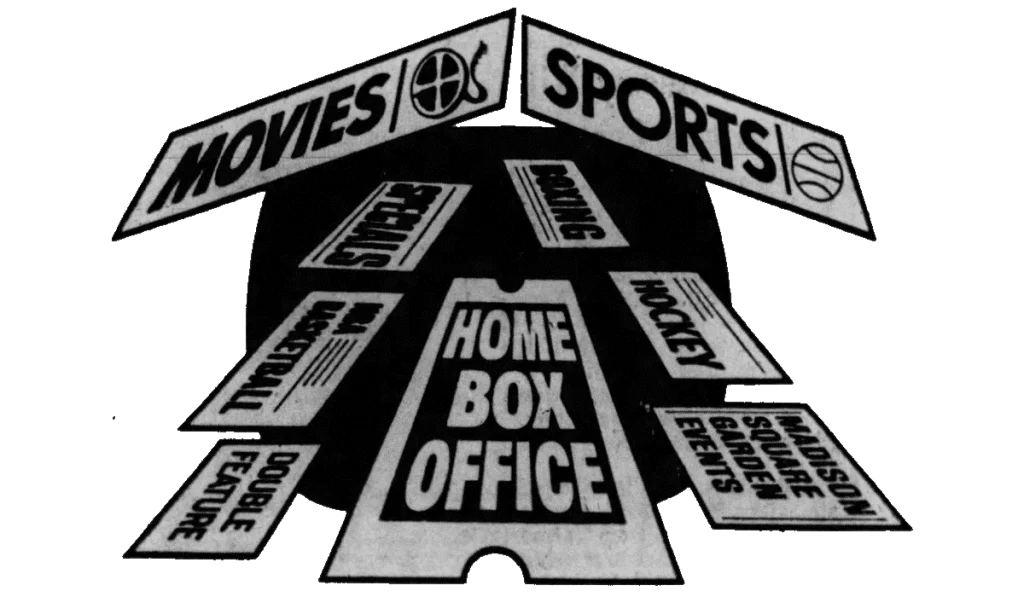
The first HBO logo used by the brand during its initial years, from 1972 to 1973, was significantly different from the minimalist monogram that would later become iconic. This early design was more descriptive and aimed to directly communicate the service’s offering.
The primary element of this first logo was the full name of the company, “Home Box Office,” rendered in a straightforward, sans-serif typeface, reportedly Westinghouse Regular. This direct approach prioritized clarity and immediate understanding of the service’s name. Accompanying the text was a stylized graphic of a ticket stub, a clear visual metaphor for accessing entertainment, reminiscent of purchasing tickets at a movie theater.
This imagery directly supported the “Home Box Office” name, reinforcing the idea of bringing cinema into the home, making for an interesting example among the various types of logos featured here.
1973 Secondary HBO Logo
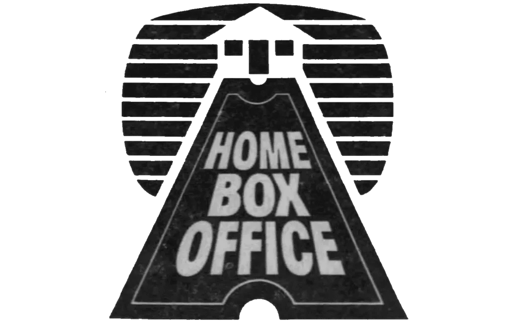
Briefly used as a secondary logo in 1973, this design represented a transitional phase, retaining some elements of the original while hinting at the simplification to come. This iteration maintained the full “Home Box Office” text but presented it in a slightly different, bolder typeface. The ticket stub graphic was still present, though often rendered in a simpler, larger, and more linear style. The most notable addition was the introduction of the house design, with the ticket stub serving as the red carpet, and the background done in black and white stripes reminiscent of a CRT TV.
1973-1975 HBO Logo

This logo, used for a short period between 1973 and 1975, marked a significant step towards the iconic monogram. It retained the “Home Box Office” wordmark, but introduced a new, bolder typeface and a key visual element of a ticket stub within the frame. The adoption of a bold, sans-serif typeface for the wordmark conveyed a sense of strength, authority, and modernity.
The color palette began to solidify around black and white, although variations with other colors might have still existed during this transitional phase. The stark contrast of black and white would eventually become a defining characteristic of the HBO brand, suggesting sophistication and a serious commitment to quality programming.
1975-1981 HBO Logo

The logo introduced in 1975, and used until 1981, further refined the monogram concept and is considered the immediate precursor to the current iconic design. It maintained the bold “HBO” acronym with the circle within the “O,” but with slight adjustments to the letter positioning. This iteration introduced the chunky, bold, sans-serif “HBO” acronym and the central circle within the “O,” showing the subtle “camera lens” allusion.
The typeface remained a bold, sans-serif style, closely resembling a customized version of Avant Garde Gothic Bold. The consistent use of black and white as the primary color palette was firmly established during this period, reinforcing the brand’s image of quality and sophistication. The specific weight and spacing of the letters were carefully considered to ensure legibility and visual balance, even with the overlapping “B” and “O.
1981-Present HBO Logo
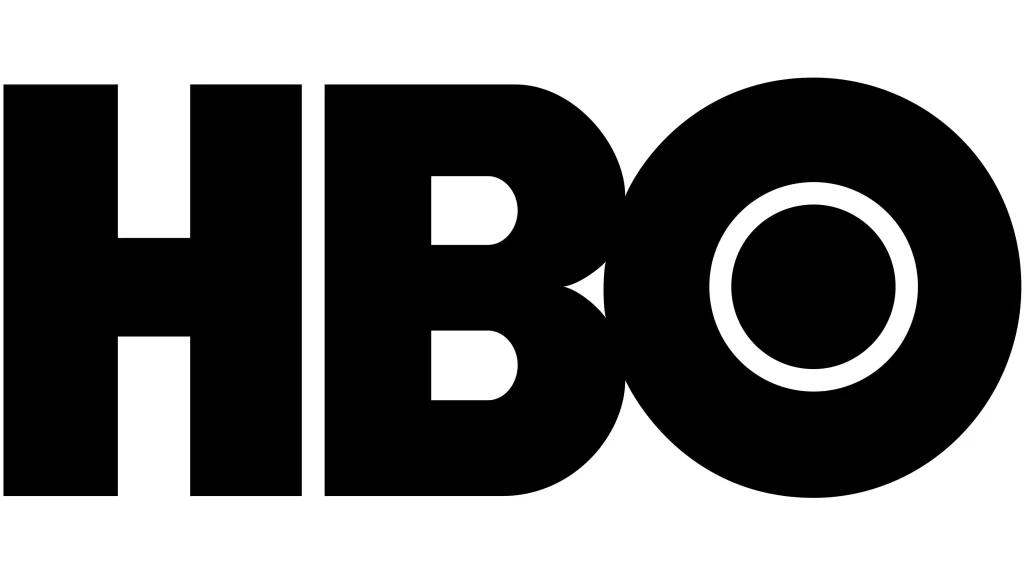
The current and most enduring HBO logo, introduced in 1981, is a subtle yet significant refinement of the 1975 design. It has remained virtually unchanged for over four decades, testament to its effectiveness and timelessness. The core elements of the bold “HBO” acronym and the central circle within the “O” were retained. However, the key modification was the adjustment of the “O” and “B” positioning.
While the letters still touched at two points, the “O” was shifted slightly to the right, reducing the degree of overlap with the “B.” This subtle change addressed a minor legibility issue where, at a distance or in certain contexts, the partially obscured “B” in the previous logo could sometimes be mistaken for an “E.” The “H” continued to stand independently to the left. The circle within the “O” maintained its suggestion of a camera lens or a point of focus, making for one of the most interesting movie logos.
FAQs
| What does HBO stand for? HBO stands for Home Box Office, signifying the facility of seeing movies at home. |
| Who designed the HBO logo? The HBO logo is designed by Bemis Balkind. |
| What font style is the HBO logo? The HBO logo mimics the style of popular font Avant-Garde Gothic. |
Conclusion
The history of the HBO logo is an interesting visual narrative that mirrors the company’s remarkable journey from a regional cable experiment to a global leader in premium entertainment. From its initial, descriptive “Home Box Office” ticket stub design to the refined and enduring black and white “HBO” monogram, each evolution reflects strategic decisions aimed at enhancing brand recognition.
The consistent thread of quality and innovation that has defined HBO’s programming is equally evident in the thoughtful and deliberate changes to its visual identity. The current logo, a testament to effective design and brand building, stands as a powerful and instantly recognizable symbol of exceptional home entertainment, a legacy HBO continues to cultivate and uphold.

Logopoppin
Logopoppin is a graphic design agency that specializes in logo designing, web development, video production and advanced branding services. We love to innovate businesses with new age technologies, allowing them to improve their visual reputation.


