Table of Content
Discover What the Autobots Logo Stands for in the Wider Transformers World
The Transformers franchise, since its explosive debut in the 1980s, has captivated audiences with its epic battles between sentient robots from the planet Cybertron. At the heart of this conflict are the heroic Autobots, dedicated to the protection of life and freedom.
Their unwavering ideals are powerfully represented by their iconic logo, a stylized red emblem that has become instantly recognizable across countless iterations of the Transformers universe. This symbol, more than just a brand identifier, embodies the Autobots’ courage, resilience, and unwavering commitment to their cause, serving as a beacon of hope in their ongoing war against the Decepticon forces of tyranny.
Understanding the genesis of the Autobots logo involves delving into the early conceptualization of the Transformers universe and the visual identities created to distinguish the heroic faction from their villainous counterparts. The logo’s design, while seemingly simple, carries a weight of meaning and has remained remarkably consistent throughout the franchise’s long history.
In this article, we will explore the initial concept of the Autobots and discuss the widely recognized logo used since the original 1984 series. We will also investigate the story behind the short-lived variation of the Autobots logo that appeared in the mid-1990s, understanding its failure from the perspective of a professional logo design agency.
Who Are the Autobots? A Brief Overview of the World of the Transformers
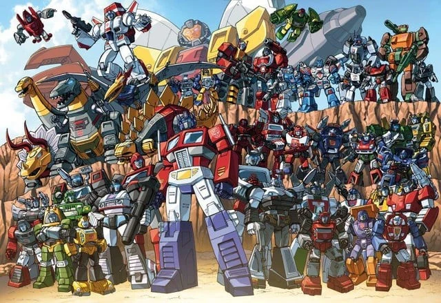
The Autobots are the primary protagonists in the Transformers franchise, a faction of sentient, autonomous robotic beings hailing from the technologically advanced planet Cybertron. Unlike their Decepticon adversaries, who are driven by a lust for power and galactic conquest, the Autobots are generally depicted as benevolent, valuing peace, freedom, and the protection of organic life.
In most continuities, the courageous and wise Optimus Prime, whose unwavering moral compass and dedication to justice serve as the guiding principles for the entire Autobot faction, leads them. Their core belief, often reiterated throughout the various Transformers storylines, is that “freedom is the right of all sentient beings.”
The Autobots are characterized by their ability to “transform” from their robot forms into various alternate modes, most commonly vehicles such as cars, trucks, and aircraft, especially after their arrival on Earth. This unique ability is a defining trait of all Transformers and is integral to their strategies in combat and their ability to blend in on different planets. And it is also the reason that the Autobot and Decepticon symbols make for some interesting toy logo ideas.
The Origin of the Autobots Faction
While the specific origins and motivations of the Autobots can vary slightly across different Transformers universes (cartoons, comics, movies, video games), their core values of heroism, selflessness, and the fight against oppression remain consistent. They are often portrayed as the defenders of the innocent and the primary opposition to the Decepticons’ destructive ambitions.
The Autobot ranks are filled with a diverse cast of characters, each possessing unique skills, personalities, and transformation capabilities. From the skilled medic Ratchet to the brave warrior Ironhide and the agile scout Bumblebee, each Autobot contributes to the overall strength and effectiveness of the team.
Their camaraderie and loyalty to one another are often highlighted, emphasizing their unity in the face of the Decepticons’ relentless attacks. The ongoing conflict between the Autobots and Decepticons forms the central narrative of the Transformers franchise, with the Autobots consistently striving to protect the universe from the Decepticons’ tyrannical aspirations.
Understanding the Iconic Autobots Logo We All Know and Love (1984-Present)
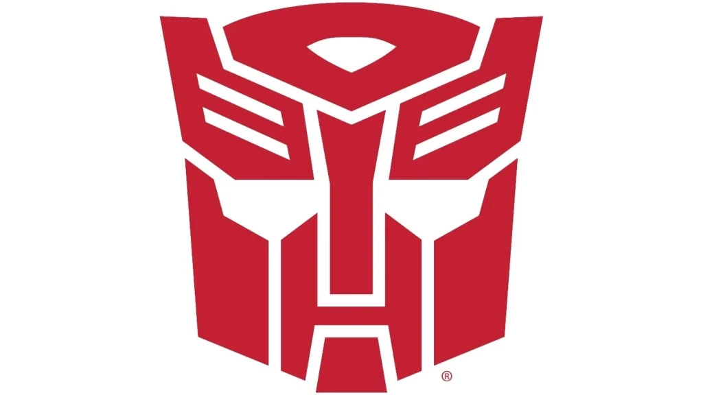
The Autobots logo that debuted with the original Transformers toy line and animated series in 1984 has become the definitive symbol of the heroic faction and has remained remarkably consistent throughout the vast majority of the franchise’s history. This enduring emblem is a stylized, predominantly red depiction of a robot’s face or head, often described as a mask-like design, and now often portrayed alongside the Marvel logo.
It features distinct angular shapes forming the brow, eyes, nose, and mouth area, conveying a sense of determination, strength, and a hint of noble resolve. The clean, geometric lines of the logo make it easily recognizable and adaptable across various media, from toy packaging and animation cells to comic book panels and live-action film designs.
While the exact in-universe origin of the Autobots logo has been explored in various Transformers continuities with differing explanations, the real-world inspiration for the design is believed by many to be derived from the head of the Autobot character Prowl from the initial line of Transformers toys.
Prowl, a stoic and logical strategist, possessed a head design that bears a striking resemblance to the now-iconic Autobot symbol. This visual connection suggests that the toy designers may have taken inspiration from existing character designs to create faction-specific logos that would immediately differentiate the heroes from the villains.
Interestingly, some sources also suggest that the Autobots logo was intended to evoke the face of the LastAutobot, a mythical figure from Cybertronian lore who was said to be a guardian prepared by the deity Primus. This Autobots symbol origin adds a layer of ancient significance and destiny to the symbol, imbuing the Autobots with a sense of a long-standing lineage of protectors.
Regardless of the precise initial inspiration, the Autobots logo has transcended its potential origins to become a powerful visual shorthand for heroism, justice, and the unwavering fight against evil within the Transformers universe. Its consistent use across decades has solidified its place as one of the most recognizable and beloved symbols in science fiction.
What’s the Story Behind the Design of the Short-Lived Autobots Logo from 1993-1995?

While the classic red Autobots logo has been the dominant and enduring symbol of the heroic Transformers, there was a notable, albeit short-lived, variation introduced during the mid-1990s, specifically between 1993 and 1995, coinciding with the “Generation 2” era of the Transformers franchise.
This alternate logo presented a significant departure from the traditional design, featuring a more abstract and angular representation of the Autobot insignia. It retained the predominantly red color scheme but incorporated sharper edges, a more stylized and less overtly “face-like” appearance, and often included additional geometric elements or a more complex layered design. This gen2 logo was more in line with that era’s logo design trends.
The rationale behind this redesign for the Generation 2 era was likely multifaceted. The early 1990s saw a shift in design aesthetics across various toy lines and media, often embracing more aggressive and “extreme” looks to appeal to a new generation of children.
The redesign of the Autobots logo could have been an attempt to modernize the brand’s visual identity and align it with these prevailing trends. The more angular and abstract design might have been intended to convey a sense of greater power, technological advancement, or a more “hardcore” image for the Autobots in this new iteration of the franchise.
However, this redesigned Autobots logo ultimately did not achieve the same level of recognition or lasting impact as its classic predecessor. While it was featured prominently on Generation 2 toys, packaging, and promotional materials, it was eventually phased out, and the franchise reverted to the traditional red Autobot emblem that had become synonymous with the brand.
This return to the classic logo suggests that while attempts were made to update the visual identity, the original design held a stronger connection with the fanbase and possessed a timeless quality that resonated more deeply with the core essence of the Autobot characters. The short-lived Generation 2 logo serves as an interesting, albeit less widely remembered, chapter in the visual history of the Autobots, highlighting the challenges of updating such an iconic and established symbol.
FAQs
| Who is the Gen1 Autobots logo based on? According to the official company lore, the gen1 logo that we all know today is based on the Autobot Prowl’s face. |
| Who is the Decepticons symbol based on? The symbol used by the series antagonist, called the Decepticons, is in the likeness of Megatronus Prime, one of the original Thirteen Primes, and the Megatron’s namesake. |
| Who were the first four Autobots introduced? The first four Autobots to be debuted include: Optimus Prime Ratchet Bumblebee Bulkhead |
Conclusion
The Autobots logo stands as a powerful and enduring symbol within the Transformers franchise, representing the heroic ideals and unwavering spirit of Optimus Prime and his Autobot warriors. While its exact in-universe origin remains a subject of varied interpretations across different continuities, the real-world inspiration likely stems from the head design of the original Autobot Prowl, solidifying its connection to the franchise’s initial toy line.
The classic red emblem, with its determined and noble visage, has remained remarkably consistent since its introduction in 1984, becoming an instantly recognizable icon of good in the ongoing battle against the Decepticons. The brief experimentation with a more abstract design during the Generation 2 era underscores the enduring power and resonance of the original logo, ultimately leading to its reinstatement as the definitive symbol of the Autobots. This iconic emblem continues to inspire and resonate with fans worldwide, embodying the timeless message that freedom and justice are worth fighting for, no matter the cost.

Logopoppin
Logopoppin is a graphic design agency that specializes in logo designing, web development, video production and advanced branding services. We love to innovate businesses with new age technologies, allowing them to improve their visual reputation.

