
Table of Content
Discover What Makes the Top American University Logos Special Today
In the competitive landscape of higher education, a university’s logo is considered much more than just a visual identifier. It is a strong symbol that combines its history, values, and aspirations. And the truly iconic American university logos possess a memorable charm that resonates with students, alumni, faculty, and the wider public, fostering a sense of pride, tradition, and institutional identity.
These symbols often combine historical references, academic symbolism, and modern design principles to create a lasting visual representation of the university’s unique character. And with a well-designed logo at their helm, they accomplish more than just recognition, contributing significantly to brand perception, recruitment efforts, and the overall prestige of the institution.
For universities, especially those looking to establish or reinforce their brand identity, understanding the elements that add to the memorability and impact of these iconic logos offers valuable insights. In this article, we will explore ten of the most iconic American university logos. We will also discuss the design elements that help increase the enduring memorability of the institutions they represent, from the practical viewpoint of a professional logo design agency.
Let’s begin.
The Importance of Assessing Iconic American University Logos for Your Varsity’s Symbol
For any university, the logo acts as a visual cornerstone of its brand identity. It is the first visual cue that prospective students, faculty, alumni, and the broader public encounter, shaping their initial perceptions of the institution. A well-designed and memorable logo can convey a sense of tradition, academic rigor, innovation, or community, depending on the institution’s core values and strategic goals.
On the other hand, a poorly designed or forgettable logo can affect a university’s ability to establish a strong and lasting brand presence, especially for someone competing with the Ivy League. Therefore, for universities seeking to enhance their visibility and strengthen their identity, understanding the principles behind iconic university logos is of paramount importance.
Evaluating and assessing the logos of established and respected American universities provides a valuable benchmark for evaluating your own varsity’s symbol. By analyzing the design elements, color palettes, typography, and underlying symbolism of these iconic emblems, institutions can gain insights into what makes a logo truly memorable and effective.
The process of assessing iconic American university logos is not about imitation but rather about extracting valuable design principles and strategic considerations. It’s about understanding how visual elements can effectively communicate an institution’s unique story and values.
By analyzing the successes of others, universities can make informed decisions about their own visual identity. This ensures that their logo effectively represents their brand, fosters a sense of pride within their community, and helps in attracting talent, securing funding, and building a lasting legacy.
Top 10 American University Logos That Personify a Dignified Memorable Charm
The American higher education is filled with numerous distinctive university logos. But some have achieved an iconic status, exuding a dignified and memorable charm that transcends the mere purpose of identification. Here are ten of the top American university logos, each with its own unique story and design elements.
University logos are more than just design elements – they represent the identity and values of an institution. Many top universities embed symbols of strength, knowledge, and wisdom into their emblems, reflecting their traditions and academic focus. Preparing for higher education requires thoughtful planning and readiness to learn. Thanks to https://ca.edubirdie.com , students can receive online assistance with any writing-related issue. In the era of digitalization, online support has become fundamental for students.
Let’s take a look at them in detail.
University of Georgia
The University of Georgia’s iconic arched logo is a powerful and instantly recognizable symbol. Moreover, the simple, bold, and slightly slanted capital “G” in red (often with black or white outlines) has become synonymous with the university’s athletic programs and, by extension, the institution itself.
The strength of this logo lies in its simplicity and dynamism. The forward-leaning wordmark suggests modernism and progress, while the metal archway conveys strength and tradition. The consistent use of the signature red color further reinforces brand recognition. This logo effectively balances a sense of tradition with a dynamic and energetic feel.
Boston University

Boston University’s logo features a stylized depiction of its wordmark, often presented in scarlet and white. The central element is an intricate design that also serves as the university seal. While the full seal is intricate, the simplified, stylized versions used in branding retain key elements like the inner shape and the prominent use of scarlet.
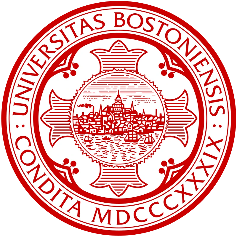
The inclusion of the Latin motto adds a layer of academic gravitas and tradition. The consistent use of the distinctive scarlet color further enhances the logo’s memorability and its strong association with the university’s identity and history within the city of Boston.
Brigham Young University
Brigham Young University’s primary logo features a stylized lettermark of the university’s initials, often rendered in navy blue with white accents. The simplicity and boldness of the logo, representing the university’s namesake, Brigham Young, contribute significantly to its memorability.
The clean, geometric lines convey a sense of stability and tradition, while the strong navy blue color often evokes feelings of trust and authority. And that is despite the fact that the university was founded and is managed today by the Church of Latter Day Saints, specifically its founder Brigham Young, who many mainstream Christians view with profound distrust. The logo’s simplicity allows for easy reproduction and recognition across a wide range of applications.
The University of Chicago

The University of Chicago’s logo is a stylized depiction of the university shield, often presented in black and white or a deep maroon. The central element is a phoenix rising from flames, symbolizing the city of Chicago’s resilience after the Great Fire of 1871 and the university’s own founding in its aftermath.

Above the phoenix is the Latin motto “Crescat Scientia; Vita Excolatur” (Let knowledge grow; let life be enriched). The powerful imagery of the phoenix and the consistent use of the university’s colors contribute to its memorable and dignified charm. The logo effectively communicates a sense of historical significance, intellectual rebirth, and the university’s pursuit of knowledge.
University of California, Los Angeles (UCLA)
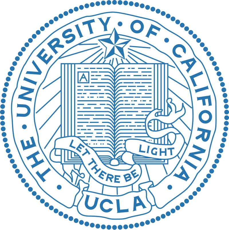
UCLA’s iconic logo features the bold, interlocking “UCLA” letters often rendered in their signature true blue and gold. The stacked and slightly overlapping design creates a visually distinct and memorable mark. The use of the university’s full acronym ensures immediate identification, while the bold typography conveys strength and academic presence.

The consistent use of the vibrant blue colors further enhances brand recognition and evokes a sense of energy and optimism, particularly associated with the Southern California location. This straightforward yet impactful design has become instantly recognizable and is widely used across the university’s academic and athletic endeavors, embodying the institution’s prominent stature and vibrant spirit.
Duke University
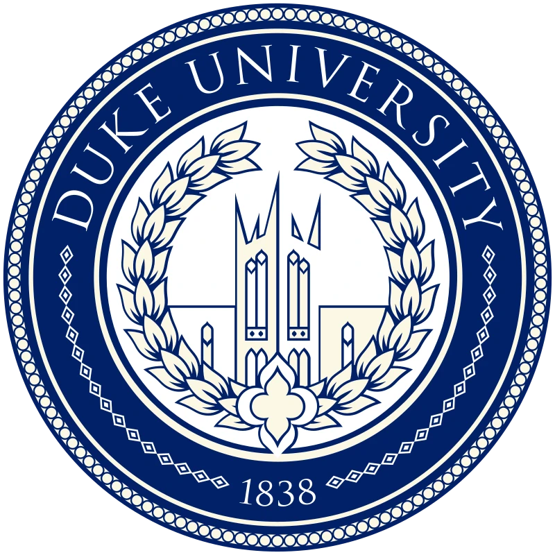
Duke University’s primary logo features a stylized wordmark, rendered in their signature Duke blue and white. The wordmark clearly identifies the university, the classic font adding a touch of tradition and elegance, referencing the university’s rich heritage.
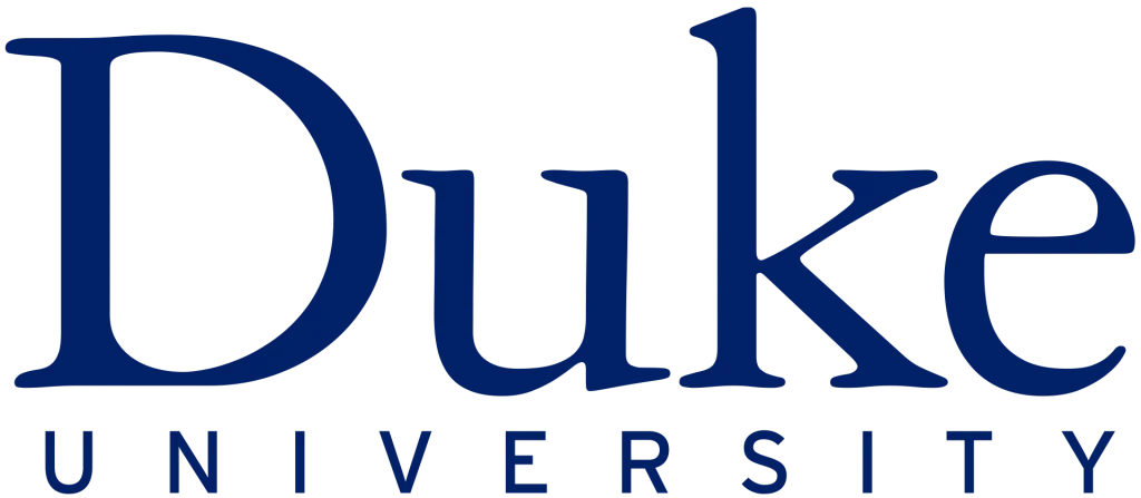
The consistent use of the distinctive Duke blue color is crucial to its brand recognition and evokes a sense of prestige and academic excellence. Over the years, variations of the logo have existed, but the core elements of the wordmark and the intertwined motif have remained central, contributing to its enduring and dignified memorability.
Cornell University
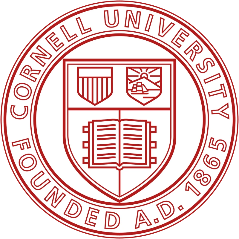
Cornell University’s logo features a stylized seal presented in a bronze or red color. The accompanying wordmark directly connects the logo to the university’s origins and its commitment to its founding principles.

The simplicity of the logo makes it easily recognizable, while the choice of a classic color palette adds a sense of tradition and historical significance. Sometimes, the seal is used alone, while at other times it is accompanied by the university’s name in a classic serif typeface. This logo effectively communicates a sense of history, leadership, and the enduring legacy, contributing to its dignified and memorable charm.
John Hopkins University
Johns Hopkins University’s logo is a stylized representation of the university’s seal, often presented in navy blue and white. The central element is a shield featuring a book open to the words “Veritas Vos Liberabit” (The truth will set you free), surrounded by elements alluding to the Hopkins family’s Baltimore heritage.
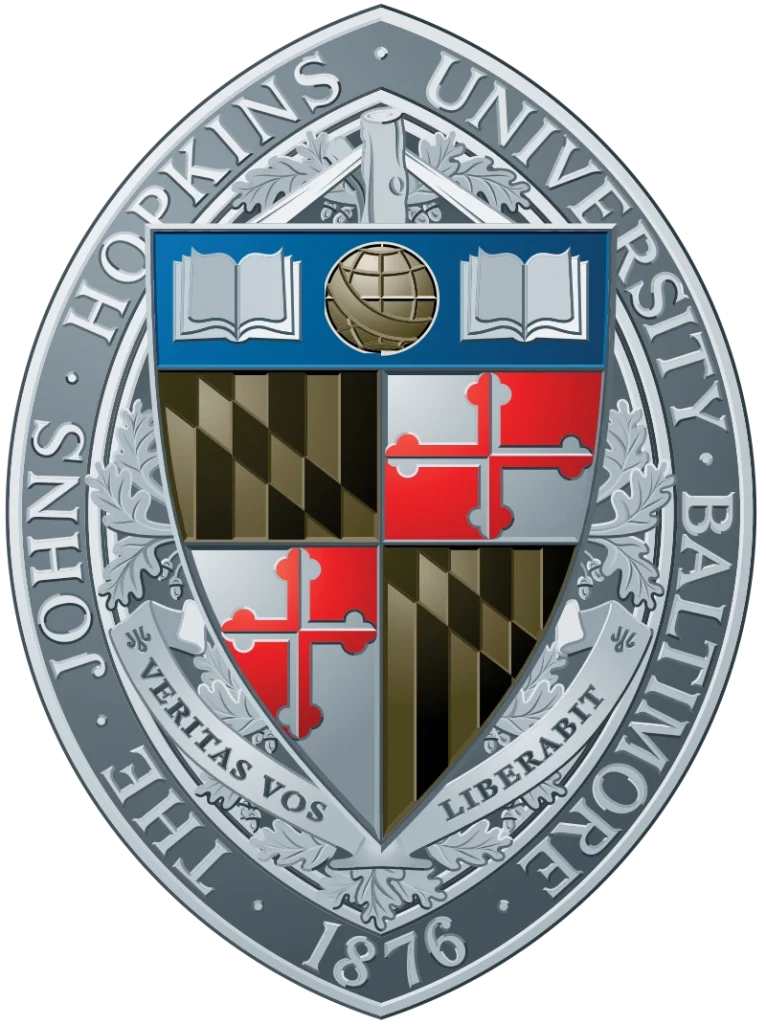
While the full seal is detailed, simplified versions used in branding often emphasize the shield shape and the prominent use of navy blue. The inclusion of the Latin motto underscores the university’s commitment to knowledge and truth. The classic color combination and the symbolic imagery of the open book convey a sense of academic rigor, tradition, and the pursuit of intellectual freedom, contributing to its dignified and memorable impact.
Carnegie Mellon University

Carnegie Mellon University’s logo features a stylized wordmark of the name often rendered in a vibrant tartan pattern, reflecting the Scottish heritage of its founder, Andrew Carnegie. Alternatively, the tartan is now often replaced with a vibrant red-maroon color, one of the more popular options among college logos in the US.
The wordmark represent the union of the Carnegie Institute of Technology and the Mellon Institute of Industrial Research. The bold and distinctive color palette conveys a sense of energy, innovation, and a unique identity within the academic landscape. This unconventional yet deeply symbolic logo effectively communicates the university’s distinctive history and its forward-thinking approach.
Brown University

Brown University’s logo features a simple yet elegant shield often rendered in red, brown, and white. The shield is typically divided into sections, sometimes featuring a book, a sun, or other symbolic elements related to knowledge and enlightenment, and has been used in its various forms since the founding of Brown University.

The use of the university’s name, often in a classic serif typeface accompanying the shield, further reinforces its identity. The straightforward and traditional design of the shield conveys a sense of history, stability, and academic tradition within the Ivy League. The logo’s understated elegance and historical connotations contribute to its dignified and enduring charm, and showcase the understated elegance of an institution that played a prominent role in shaping the American Ivy League.
FAQs
| Which university has the best logo? Harvard University’s red logo is often considered to be the most iconic university logo from the United States. |
| What is the world’s number 1 university? University of Oxford in England is considered the number 1 university in the world today. |
| Which is the oldest university in the world that is still operational today? The University of Bologna in Italy is considered the oldest university in the world that is still operational today, which was founded in 1088. |
Conclusion
The iconic American university logos above are more than just visual marks; they are powerful symbols that embody the institutions’ histories, values, and aspirations. The ten logos explored in this article demonstrate the power of thoughtful design in creating a memorable and dignified brand identity. By understanding the design principles, historical context, and symbolic meanings embedded within these successful emblems, universities can gain valuable insights for assessing and potentially refining their own varsity’s symbol.
Logopoppin
Logopoppin is a graphic design agency that specializes in logo designing, web development, video production and advanced branding services. We love to innovate businesses with new age technologies, allowing them to improve their visual reputation.

