
Table of Content
Discover How the Buffalo Bills Logo Became an Iconic NFL Team Logo
Few NFL team logos have achieved the iconic status and enduring appeal of the Buffalo Bills logo. For over five decades, the charging blue buffalo with its distinctive red streak has represented not just a football team, but an entire region’s identity and fighting spirit. This emblematic design has become one of the most recognizable symbols in professional sports, ranking third overall in Yahoo Sports’ 2024 NFL logo rankings.
The journey of the Buffalo Bills logo reflects the broader evolution of sports branding in America. From its humble beginnings as a cluttered football-themed design to the streamlined powerhouse symbol we know today, this logo tells a fascinating story of artistic vision, fan loyalty, and design excellence that has withstood the test of time.
What makes this transformation even more remarkable is how the current logo has remained virtually unchanged since 1974, making it one of the most enduring designs in professional sports. Let’s explore the captivating evolution of this iconic emblem from the perspective of a logo design agency and discover how it became a symbol of pride for Bills Mafia worldwide.
The Origins: 1960 Buffalo Bills Logo Birth
The Buffalo Bills logo story begins in 1960 when the team joined the American Football League as a charter member. The original design reflected the era’s approach to sports branding, where logos functioned more as narrative illustrations than the streamlined symbols we recognize today.
The inaugural Buffalo Bills symbol from the AFL logos roster featured a blue football frame containing a busy scene with multiple buffaloes and two football players in team uniforms. Above this crowded design, the words “BUFFALO BILLS” curved in bold uppercase letters using a solid serif font.
The original logo embodied the American Football League’s emphasis on establishing identity through detailed imagery. Teams felt compelled to include multiple elements that would immediately communicate their connection to both football and their regional heritage. This approach, while comprehensive, created challenges for reproduction across different media and merchandise.
Although this first Buffalo Bills logo lasted only until 1962, it established crucial elements that would influence future designs, like the team colors of blue, red, and white and the buffalo imagery.
The 1962 Refinement: Simplifying the Vision
The first major evolution of the Buffalo Bills logo came in 1962, representing the team’s initial attempt to modernize their visual identity while maintaining the essential elements that fans had begun to recognize.
The 1962 redesign retained the football-shaped frame but significantly simplified the interior composition. Instead of multiple buffaloes and players, the new design featured a single buffalo rendered in grainy sepia tones alongside one player dressed in blue and white gear. Most notably, the wordmark was completely removed, improving the logo’s scalability across different applications.
This iteration introduced a more sophisticated color approach, with brown taking center stage as the dominant color. The subtler palette aligned with early 1960s modernist design trends that favored more restrained color schemes. This approach mirrored successful logo redesigns across other American football logos as well as various industries, where companies were discovering that simpler designs performed better across different media and were more memorable for consumers.
The 1970 Transformation: Embracing Minimalism
The third iteration of the Buffalo Bills logo marked a dramatic departure from previous designs, embracing the minimalist design philosophy that was gaining momentum in professional sports branding during the early 1970s.
In 1970, the team completely abandoned the football frame concept, introducing an all-red silhouette of a standing buffalo facing right. This represented the most minimalistic approach the team had ever taken, featuring only the essential buffalo image with a white-eye detail. The stark simplicity made this design incredibly versatile for reproduction across helmets, uniforms, and merchandise.
The red standing buffalo offered significant practical advantages for a growing sports franchise. The simplified design reduced production costs for merchandise, created stronger brand recognition at distance, and established a cleaner aesthetic that aligned with contemporary design trends. This logo also performed better in black-and-white reproduction, crucial for newspaper coverage and television broadcasts of the era.
The 1974 Masterpiece: Stevens Wright’s Iconic Creation
The most significant transformation in Buffalo Bills logo history occurred in 1974 when commercial illustrator Stevens Wright created the charging buffalo design that continues to represent the team today. This logo represents one of the most successful sports design achievements in NFL history.
Stevens Wright, an aerospace designer and commercial illustrator working primarily with McDonnell Douglas, received this career-defining assignment through his wife. Jere Wright served as a production manager at NFL Properties at the time. David Boss, director of NFL Properties’ creative services division, commissioned him to create a new logo for the Bills during the summer of 1973.
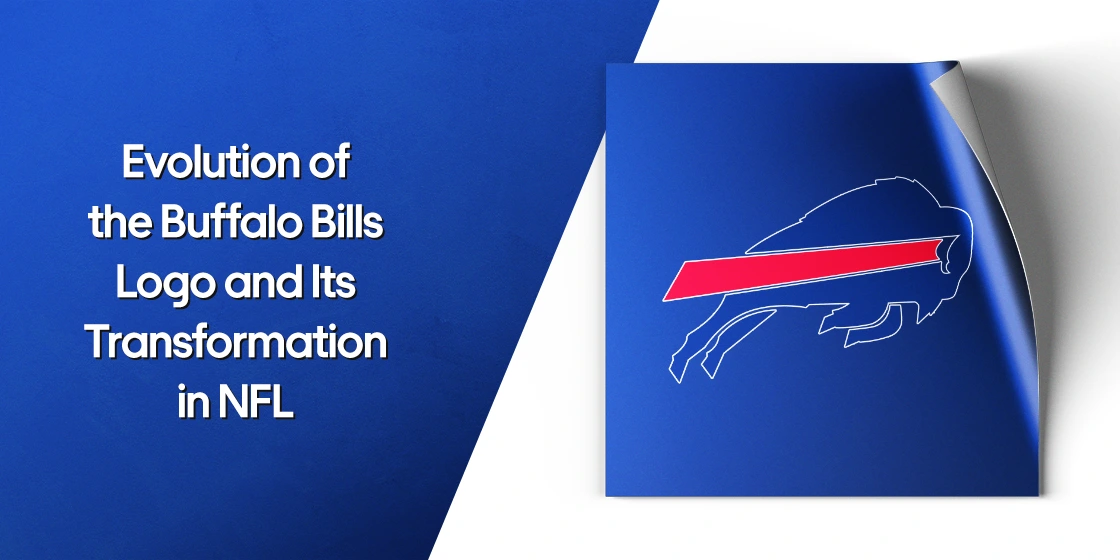
The new Buffalo Bills logo featured a royal blue buffalo in mid-charge, with its front hooves lifted off the ground, conveying explosive forward momentum. The addition of a red velocity stripe extending from the buffalo’s white horn created an unmistakable sense of speed and aggression that perfectly captured the team’s competitive spirit, making it one of the most iconic NFL logos today.
Design Elements and Symbolism of the Modern Logo

The 1974 Buffalo Bills logo succeeds through its masterful combination of symbolic meaning, visual impact, and technical excellence. Each element serves both aesthetic and functional purposes that have contributed to its remarkable longevity.
The logo’s royal blue, red, and white color palette creates powerful psychological associations while maintaining perfect alignment with the team’s uniform colors. The blue buffalo represents strength, reliability, and trustworthiness. The red streak symbolizes energy, passion, and speed, while the white accents provide contrast and clarity.
The charging pose captures a moment of explosive action, with the buffalo’s lifted front hooves suggesting powerful forward momentum. The red streak functions as a visual representation of velocity and intent, giving the static image some dynamic action.
The Failed 2002 Redesign: Fan Power in Action
The attempted redesign of the Buffalo Bills logo in 2002 serves as a fascinating case study in fan loyalty and the risks of altering beloved brand symbols. This episode demonstrates the powerful emotional connection between sports logos and their communities.
General Manager Tom Donahoe spearheaded a comprehensive rebranding effort in 2002, introducing new uniform designs and proposing a dramatically different logo concept. The approach attempted to incorporate both the team’s initials and buffalo imagery in a more complex composition.
The reaction from Bills fans was swift and overwhelmingly negative. The new design was criticized for being too busy, losing the iconic simplicity that made the 1974 logo so effective, and abandoning the charging motion that had become synonymous with the team’s identity.
Faced with such strong resistance, the organization quickly abandoned the redesign and returned to Wright’s 1974 creation.
Frequently Asked Questions (FAQs)
| Who designed the current Buffalo Bills logo and when was it created? The current Buffalo Bills logo was designed by Stevens Wright, a commercial illustrator and aerospace designer, in 1974. Wright created the iconic charging blue buffalo with red streak design that has remained virtually unchanged for 50 years. He received the assignment through his wife, Jere Wright, who worked as a production manager at NFL Properties. The logo debuted on the team’s helmets for the 1974 season and has become one of the most enduring designs in NFL history. |
| Why did the Buffalo Bills reject the 2002 logo redesign attempt? In 2002, General Manager Tom Donahoe proposed a new logo featuring a stylized letter “B” made from two bullets (one red, one blue) topped with a more detailed buffalo head. However, fans immediately rejected this design, criticizing it for being too complex and losing the iconic simplicity and motion of the 1974 charging buffalo. The overwhelming negative reaction from Bills fans forced the organization to abandon the redesign and return to Wright’s original creation, demonstrating the powerful emotional connection between the logo and the fanbase. |
| What do the colors and design elements in the Buffalo Bills logo symbolize? The Buffalo Bills logo uses royal blue for the buffalo, which represents strength, reliability, and trustworthiness. The red streak symbolizes energy, passion, speed, and forward momentum, while white accents provide contrast and clarity. The charging pose with lifted front hooves conveys explosive action and determination. The red velocity stripe extending from the buffalo’s horn creates a visual representation of acceleration and intent, transforming a static image into a dynamic symbol of motion and power. |
| How does the Buffalo Bills logo rank among other NFL team logos? According to Yahoo Sports’ 2024 NFL logo rankings, the Buffalo Bills logo placed third overall, behind only the Dallas Cowboys and Oakland Raiders. The logo is widely recognized by design professionals as one of the most successful sports branding achievements in NFL history. Its 50-year longevity places it among an elite group of only six NFL teams that have maintained their primary logos for four decades or more, demonstrating exceptional design durability in professional sports. |
| What was the controversy involving Howard University and the Bills logo? Howard University used a nearly identical charging bison logo from 1974 until 2014, when the NFL’s trademark enforcement forced them to change their design. Former Howard student John Dupree claims he created the original charging bison concept that influenced both logos. The similarity between the two designs led to legal issues when the Bills organization enforced their trademark rights more strictly than some other NFL teams. Howard was ultimately required to adopt a new logo, ending their 40-year use of the charging bison design that closely resembled the Bills’ iconic symbol. |
Conclusion
The evolution of the Buffalo Bills logo represents one of the most successful sports branding stories in NFL history. From its cluttered beginnings in 1960 to Stevens Wright’s masterful 1974 creation, this journey demonstrates how exceptional design can create lasting cultural impact that extends far beyond its original purpose.
The logo’s golden anniversary in 2024 marked not just five decades of consistent use, but fifty years of building one of the strongest brand identities in professional sports. As the Bills continue their pursuit of a championship, they do so carrying a symbol that embodies everything their fans believe about their team: strength, determination, and an unstoppable forward charge toward victory.
Logopoppin
Logopoppin is a graphic design agency that specializes in logo designing, web development, video production and advanced branding services. We love to innovate businesses with new age technologies, allowing them to improve their visual reputation.

