
Table of Content
Explore the Rapid Evolution of KFC Logo Over the Years
Logos are more than just pictures or designs. They carry the story of a brand, its journey, and its identity. That is why every company prefers to take professional logo design services to create a masterpiece for its branding. Considering the example of restaurants, one of the most famous logos in the fast-food world is the KFC logo. It’s a symbol known to millions of people all over the globe.
For many, the image of Colonel Sanders, with his white suit and friendly smile, brings memories of crispy chicken and tasty meals. The KFC logo has changed over the years, but it has always kept its connection to the man who started it all. Each version tells a story about the brand’s growth and the times in which it existed.
Understanding the history of the KFC logo is like taking a trip through the past. From simple beginnings to a modern brand, the logo reflects how KFC has evolved. Let’s explore the journey of KFC and how its logo became such a powerful symbol.
KFC – A Leading Global Fast Food Chain
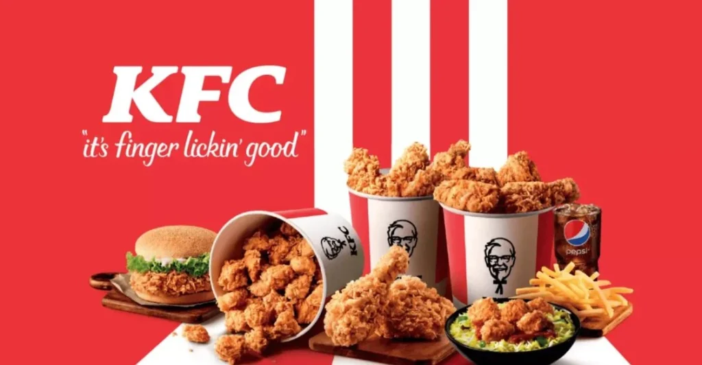
KFC, or Kentucky Fried Chicken, is one of the world’s largest fast-food chains. It was founded by Colonel Harland Sanders. He started selling fried chicken from a roadside restaurant in Kentucky during the Great Depression.
The business quickly grew thanks to his secret recipe of 11 herbs and spices. People loved the taste, and the brand began expanding across the United States. Soon, KFC became a name known worldwide.
Today, KFC has thousands of restaurants in over 150 countries. It serves millions of customers each day. Beyond just chicken, KFC sells sandwiches, sides, and desserts. But no matter how the menu changes, fried chicken remains the heart of the brand.
The brand’s success isn’t only about its food. KFC’s image, marketing, and of course, its logo, play a huge role. The smiling face of Colonel Sanders continues to be the symbol of trust, quality, and tasty meals.
History of KFC Logo
Just like other popular food logos, the history of KFC symbol is also quite diverse. Let’s dive into the fascinating timeline of how the KFC logo has evolved over the years.
KFC Logo – 1954
The first official KFC logo appeared in 1954. It was simple yet iconic. It featured a detailed illustration of Colonel Harland Sanders’ face. He wore his famous white suit, black string tie, and glasses.
This early logo was black and white. It looked like a sketch, giving it a personal touch. It showed the Colonel as the face of the business. This logo helped customers connect the brand directly to the man behind the chicken recipe.
The 1954 logo was not flashy. But it set the tone for KFC’s image. It made the Colonel the star and established trust and familiarity.
KFC Logo – 1959
In 1959, KFC updated its logo for the first time. The Colonel’s face remained, but the design became sharper and more refined. His features were clearer, and the lines were smoother.
One big change was the addition of the “Kentucky Fried Chicken” name next to his portrait. This helped people know exactly what the brand offered. It made the logo more informative and professional.
The logo was still in black and white, keeping a classic feel. This version appeared on signs, packaging, and advertisements. It helped KFC build stronger brand recognition as it grew across America.
KFC Logo – 1978
By 1978, KFC was expanding quickly. The brand wanted a modern, cleaner look. The 1978 logo reflected this change. It introduced bolder lines and a neater drawing of the Colonel’s face.
In this version, the Colonel’s face appeared inside a circle. The brand name “Kentucky Fried Chicken” curved around the image. The text was simple and easy to read.
This new design looked more professional. It worked well on signs, menus, and marketing materials. The circular layout helped the wordmark logo fit nicely on all kinds of packaging and store signage.
The 1978 logo showed that KFC was growing from a local brand to a major national player. It kept the Colonel’s warm image but added a touch of modern style.
KFC Logo – 1991
The 1991 logo marked a big turning point for the brand. KFC officially changed its name from “Kentucky Fried Chicken” to simply “KFC.” This was part of a strategy to create a modern, shorter brand name.
The 1991 logo kept the Colonel’s image but updated it for a fresh look. His portrait was simplified, with fewer lines and clearer shapes. He looked cheerful and inviting.
The letters “KFC” appeared in bold red type. This made the logo more eye-catching and modern. The color red became strongly linked with the brand’s identity.
This change also helped KFC distance itself from the word “fried,” as people were becoming more health-conscious. The new logo helped the brand keep up with changing times while honoring its heritage.
KFC Logo – 1997
The 1997 logo took the Colonel’s portrait and made it more dynamic. This time, the Colonel was drawn with a larger head and smaller body. It gave him a friendly, cartoon-like look.
Red stripes were added as a background behind the Colonel. These stripes gave the logo energy and made it stand out. The red-and-white color scheme became a key part of KFC’s brand.
The letters “KFC” were placed next to the Colonel’s image. The font was bold and modern, making the name easy to read.
This logo was playful and bright. It fit well with KFC’s marketing at the time, which was more fun and focused on family and enjoyment. It appeared on packaging, signage, and ads around the world.
KFC Logo – 2006
In 2006, KFC updated its logo again. The brand wanted to keep the Colonel’s friendly look but give it a more modern style.
The Colonel was redrawn with a more detailed face and a brighter expression. He looked happier and more approachable. His white suit was updated to include an apron, connecting him to the kitchen and the idea of freshly cooked food.
The red background stayed, but the stripes were simplified. The overall design looked clean and bold. The letters “KFC” remained strong and clear.
This logo showed KFC’s desire to keep up with modern design trends while holding onto its heritage. It balanced tradition with a fresh, updated feel.
KFC Logo – 2014
In 2014, KFC made smaller changes to its logo. The brand wanted a flatter, simpler look. Many companies were shifting to minimalist designs, and KFC followed this trend.
The Colonel’s portrait was refined with fewer lines. The logo dropped extra shadows and effects, making it look cleaner. His apron remained part of the design, keeping the connection to cooking and hospitality.
The red color became slightly brighter. The letters “KFC” were modernized, using a simpler font.
This version fit well on digital screens, packaging, and marketing materials. It kept the warmth of the Colonel’s face while staying stylish and modern.
KFC Logo – 2018
The 2018 logo brought the brand closer to its roots. KFC wanted to celebrate its heritage while keeping a modern edge. The design looked fresh but paid tribute to earlier logos.
In this version, the Colonel’s face returned to a more classic look, similar to older sketches. He looked friendly and wise, reminding customers of KFC’s history.
The logo brought back vertical red stripes behind the Colonel, echoing designs from the past. The word “KFC” appeared below the portrait in bold letters.
The red-and-white color scheme remained strong. The overall design felt both traditional and modern, connecting the brand’s rich past with its future.
The 2018 logo appears on packaging, signage, and digital media around the world. It shows how KFC has stayed true to its story while evolving for new generations.
Frequently Asked Questions
| Why KFC is popular in the world? KFC is popular worldwide for its unique, flavorful fried chicken recipe and fast, convenient service. Its iconic brand and the friendly image of Colonel Sanders also make it memorable and trusted globally. |
| When was KFC founded? KFC was founded in 1952 by Colonel Harland Sanders in Salt Lake City, Utah. It began as a small franchise selling his famous fried chicken recipe. |
| What is the color of KFC logo? The KFC logo uses red, white, and black as its main colors. Red symbolizes energy and appetite, while white and black highlight Colonel Sanders’ image and add contrast. |
Final Words
The KFC logo has seen many changes over the decades. Yet one thing has remained the same—the smiling face of Colonel Harland Sanders. He is the heart and soul of the brand, a symbol of delicious fried chicken and Southern hospitality.
Each version of the logo tells a piece of KFC’s story. From a simple black-and-white sketch to a bright, modern emblem, the logo has followed the brand’s journey from small roadside restaurant to global fast-food giant. The changes reflect not only KFC’s growth but also shifts in design trends and customer tastes.
Today, the KFC logo is recognized worldwide. It stands for tradition, taste, and trust. As KFC keeps expanding and changing, its logo will likely continue to evolve. But the Colonel’s face will always be there, reminding everyone where it all began.
Logopoppin
Logopoppin is a graphic design agency that specializes in logo designing, web development, video production and advanced branding services. We love to innovate businesses with new age technologies, allowing them to improve their visual reputation.

