Table of Content
Discover How the GE Logo Has Evolved Over General Electric’s Long History
For over 130 years, the GE logo has stood as one of the most recognizable corporate symbols in the world, embodying innovation, reliability, and industrial progress. This iconic monogram has weathered technological revolutions, market transformations, and cultural shifts while maintaining its essential character and visual appeal. From its mysterious origins in the 1890s to its modern blue iteration, the General Electric logo represents far more than a simple corporate identifier.
What makes the GE logo particularly fascinating is its journey from a utilitarian marking on ceiling fan guards to a global symbol of technological advancement. The logo has appeared on everything from household appliances to jet engines, from nuclear power plants to medical equipment, making it one of the most widely distributed corporate emblems in history. Its enduring design speaks to the power of simplicity and the importance of consistent brand identity in building lasting recognition.
The story of the GE logo is also the story of American industrial evolution, reflecting changing design philosophies, marketing strategies, and corporate values across more than a century of business history. Understanding this emblem provides insights into both design evolution and the broader narrative of how companies build and maintain their visual identity in an ever-changing marketplace. Let’s explore its design and evolution through the lens of a professional logo design agency.
The Origins and Early History of the GE Logo

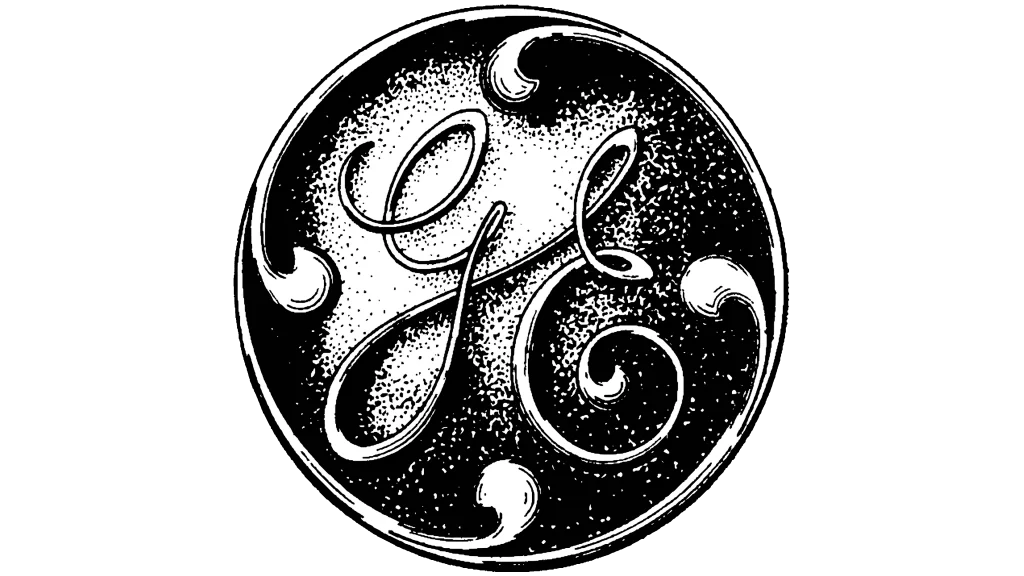
The birth of the GE logo traces back to 1892 when J.P. Morgan engineered the merger between Edison General Electric Company and Thomson-Houston Electric Company, creating the General Electric Company. However, the actual logo didn’t appear until 1898, when it was first used on a pendant that dangled from a GE ceiling fan. This Art Nouveau-inspired design featured the same scripted “GE” monogram we recognize today, encircled by a decorative ring that would undergo various modifications over the decades.
The true designer of this iconic symbol from the most famous industrial logos ever remains one of corporate America’s most enduring mysteries. Multiple individuals have claimed credit for creating the original design, including Arthur L. Rich from the company’s catalog department, Sven Stalberg, a company draftsman, and Charles Kelley, one of Stalberg’s employees. Rich’s account suggests he unconsciously wrote the initials “GE” in his everyday handwriting while thinking about what would be distinctively General Electric, then swept a ring around it and added decorative elements he called “four ingrowing dingbats.”
The controversy surrounding the logo’s origins became so intense that company lawyer Neil Reynolds eventually advised General Electric to avoid taking any position on the matter and to cease all research into the monogram’s creation. This decision was partly because the symbol had been used extensively before it became an official trademark, making definitive attribution nearly impossible. Regardless of its creator, the early GE logo established the foundational elements that would define the brand for more than a century: the intertwined G and E letters within a circular frame, decorated with flowing Art Nouveau-style ornamental elements.
Design Evolution Through the Decades
The GE logo has undergone several significant transformations since its introduction, each reflecting the design sensibilities and technological requirements of its era.
Let’s take a look at them in greater detail.
GE Logo (1900-1909)

The 1900 version refined the original the original concept by placing the elegant cursive letters within a clearer circular frame, adding decorative “loops” that created an illusion of motion and energy. This early iteration established the circular boundary that would become a permanent feature of the logo’s identity, firmly establishing its position among the best emblem logos today.
GE Logo (1909-1969)

Throughout the early-to-mid 20th century, the logo underwent subtle but important refinements. The 1909 redesign eliminated gradient shades and three-dimensional effects in favor of a cleaner, more reproducible monochrome design.
GE Logo (1969-1987)

By 1969, designers had thickened and emboldened the letter strokes while adding more elaborate swirls to the “E,” creating a sense of movement and dynamism that reflected the company’s progressive spirit. These changes made the logo more impactful across various media, from television advertisements to product labeling.
GE Logo (1987-1998)

The 1987 modification, handled by Landor Associates, represented a move toward greater sophistication and modern sensibilities. The monogram was reduced in size relative to the circular frame, and the decorative elements were transformed into more elegant, drop-like shapes. This version balanced tradition with contemporary design trends, creating a logo that felt both timeless and current. The careful attention to line weights and proportions demonstrated how even minor adjustments could significantly impact a logo’s visual effectiveness and brand perception.
The Revolutionary 1998 Transformation That Birthed the Iconic 2004 Blue GE Logo

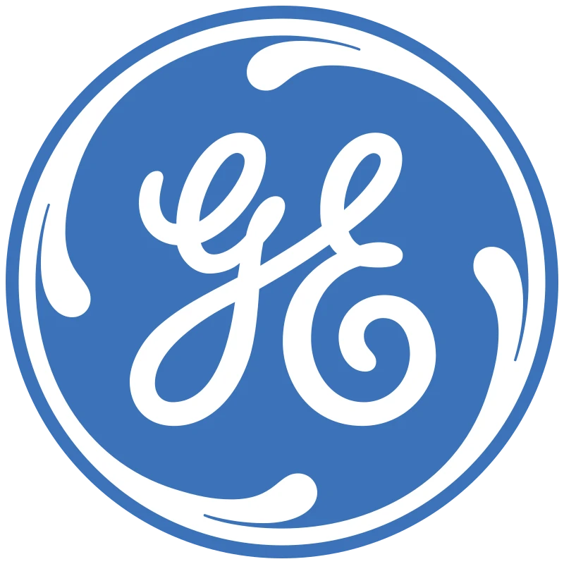
The most dramatic change in the GE logo’s history occurred in 2004 when the company abandoned its traditional 1998 black-and-white color scheme in favor of a signature blue design. This transformation, developed by Wolff Olins, wasn’t merely aesthetic—it represented a fundamental shift in how General Electric wanted to present itself to the world. The new blue logo aimed to make the company’s image warmer, more approachable, and more relatable while maintaining its reputation for trust and professionalism.

The choice of blue was strategically significant, as this color psychologically conveys stability, intelligence, unity, and conservatism—qualities that aligned perfectly with GE’s business objectives. The blue transformation coincided with the introduction of the company’s new slogan “imagination at work,” replacing the long-standing “we bring good things to life.” This comprehensive rebranding effort demonstrated how color changes can dramatically alter brand perception without requiring structural modifications to the logo design itself.
The 2004 redesign also involved subtle refinements to the monogram’s form. The swirls were softened, and the letter strokes were fine-tuned to create a cleaner, more polished appearance that worked effectively across digital platforms and traditional media. This update ensured the logo would remain relevant and impactful in an increasingly digital world while preserving the essential elements that had made it recognizable for over a century. The blue color palette created a sense of lightness and modernity that helped position GE as a forward-thinking technology company rather than just a traditional industrial manufacturer.
Global Applications and Brand Extensions
The GE logo’s versatility has enabled its successful application across a remarkably diverse range of products and services worldwide. From massive industrial turbines and medical imaging equipment to consumer appliances and financial services, the logo maintains its effectiveness and brand recognition regardless of context. This adaptability of one of the most iconic initial logos has been crucial as GE evolved from primarily an electrical equipment manufacturer to a diversified global conglomerate.
International applications of the GE logo have required careful consideration of cultural sensitivities and local market conditions while maintaining global brand consistency. The logo’s abstract nature and lack of culturally specific imagery have facilitated its acceptance across diverse markets, while its association with quality and innovation has translated effectively across different economic and technological contexts.
Recent corporate restructuring has introduced interesting challenges for logo application as GE splits into separate companies (GE HealthCare, GE Vernova, and GE Aerospace). Each new entity will maintain the classic monogram design while adopting distinct color schemes—purple, green, and blue respectively—demonstrating the logo’s continued relevance and adaptability even as the company structure evolves.
Future Considerations and Legacy of the GE Logo
As GE continues its transformation into three separate companies, the iconic logo faces new challenges in maintaining its unified brand recognition while serving distinct corporate entities. The decision to maintain the core design while varying color schemes represents a sophisticated approach to brand evolution that preserves equity while enabling differentiation. This strategy acknowledges the logo’s value as a cultural and commercial asset while adapting to new organizational realities.
The logo’s longevity and continued effectiveness demonstrate timeless design principles that remain relevant despite dramatic changes in technology, media, and corporate structure. Its success suggests that the most enduring corporate symbols achieve their impact through fundamental design excellence rather than adherence to temporary trends or fashions. The GE logo’s ability to maintain recognition and respect across more than a century provides valuable lessons for contemporary brand designers and corporate identity strategists.
Looking forward, the GE logo’s legacy will likely continue through the three successor companies, each carrying forward aspects of the original brand equity while developing their own distinct market positions. The logo’s proven adaptability suggests it will continue evolving to meet future challenges while maintaining the essential characteristics that have made it one of the world’s most recognizable corporate symbols.
Frequently Asked Questions
| Who originally designed the GE logo? The true designer of the GE logo remains disputed, with multiple individuals claiming credit including Arthur L. Rich (catalog department employee), Sven Stalberg (company draftsman), and Charles Kelley (Stalberg’s employee). The controversy became so intense that GE’s legal counsel advised the company to avoid taking any official position on the logo’s origins. |
| When did the GE logo change from black and white to blue? The GE logo underwent its most significant transformation in 2004 when the traditional black-and-white color scheme was replaced with the signature blue design. This change, developed by Wolff Olins, aimed to make the company’s image warmer and more approachable while maintaining its reputation for trust and professionalism. |
| What do the design elements of the GE logo symbolize? The circular frame represents completeness and unity, reflecting GE’s role as a connector of industries. The intertwined G and E letters suggest collaboration and integration, while the flowing Art Nouveau-style elements add movement and energy, symbolizing innovation and progress. The overall design balances tradition with forward momentum. |
| How has the GE logo evolved over the decades? The GE logo has undergone several refinements since 1898, including changes in 1900 (circular frame addition), 1909 (elimination of gradients), 1969 (emboldened strokes), 1987 (refined proportions by Landor Associates), and 2004 (blue color transformation). Each change reflected contemporary design trends while preserving core brand elements. |
| What will happen to the GE logo as the company splits into three entities? As GE splits into three separate companies (GE HealthCare, GE Vernova, and GE Aerospace), each will maintain the classic monogram design while adopting distinct color schemes—purple, green, and blue respectively. This strategy preserves brand equity while enabling differentiation among the new entities. |
Conclusion
The GE logo stands as a masterpiece of corporate identity design, demonstrating how thoughtful symbolism, careful evolution, and consistent application can create lasting brand value. From its mysterious origins in the 1890s to its modern blue incarnation, the logo has successfully navigated more than a century of technological, cultural, and economic change while maintaining its essential character and market recognition.
The logo’s success reflects several key principles: the power of simplicity in creating memorable designs, the importance of adapting to changing conditions without losing core identity, and the value of consistency in building brand equity over time. These lessons remain relevant for contemporary designers and brand managers seeking to create identities that will endure across changing market conditions and consumer preferences.
As General Electric continues its transformation into three distinct companies, the iconic monogram will carry forward the legacy of innovation, reliability, and excellence that it has represented for more than 130 years. The GE logo’s remarkable journey from ceiling fan ornament to global cultural icon demonstrates the potential for well-designed corporate symbols to transcend their commercial origins and become lasting elements of our shared visual culture.

Logopoppin
Logopoppin is a graphic design agency that specializes in logo designing, web development, video production and advanced branding services. We love to innovate businesses with new age technologies, allowing them to improve their visual reputation.


