
Table of Content
Discover How the Mondelez Logo Has Changed in Over a Decade of Service
The Mondelez logo stands as a vibrant symbol of one of the world’s largest snack food companies, representing a global empire built on beloved brands like Oreo, Cadbury, and Toblerone. Since its introduction in 2012, this distinctive purple and red logo has become synonymous with quality snacking experiences across more than 160 countries worldwide.
What makes the Mondelez logo particularly fascinating is how it encapsulates the company’s mission to create delicious moments of joy for consumers globally. The carefully crafted design elements, from its rich purple wordmark to the playful red accents, tell a story of innovation, luxury, and accessibility that resonates with millions of snack lovers.
Understanding the evolution and design philosophy behind the Mondelez logo provides insight into modern corporate branding strategies. Moreover, it shows how visual identity can effectively communicate a company’s values and global aspirations in the competitive food industry. Let’s take a more detailed look at the topic from the perspective of a logo design agency.
The Origins and History of Mondelez International
The story of Mondelez International begins long before its current identity, tracing back to 1903 when James Lewis Kraft started selling cheese from a wagon in Chicago, Illinois. This humble beginning marked the foundation of what would eventually become one of the world’s most recognizable food companies and the catalyst for the creation of the Mondelez logo we know today.
During the 1920s and 1930s, the Kraft Cheese Company expanded rapidly through strategic acquisitions and product innovations. The company introduced iconic brands like Velveeta in 1928, Miracle Whip in 1933, and Kraft Macaroni & Cheese in 1937, establishing itself as a household name across America. These early decades laid the groundwork for the diverse portfolio that would later influence the Mondelez logo design.
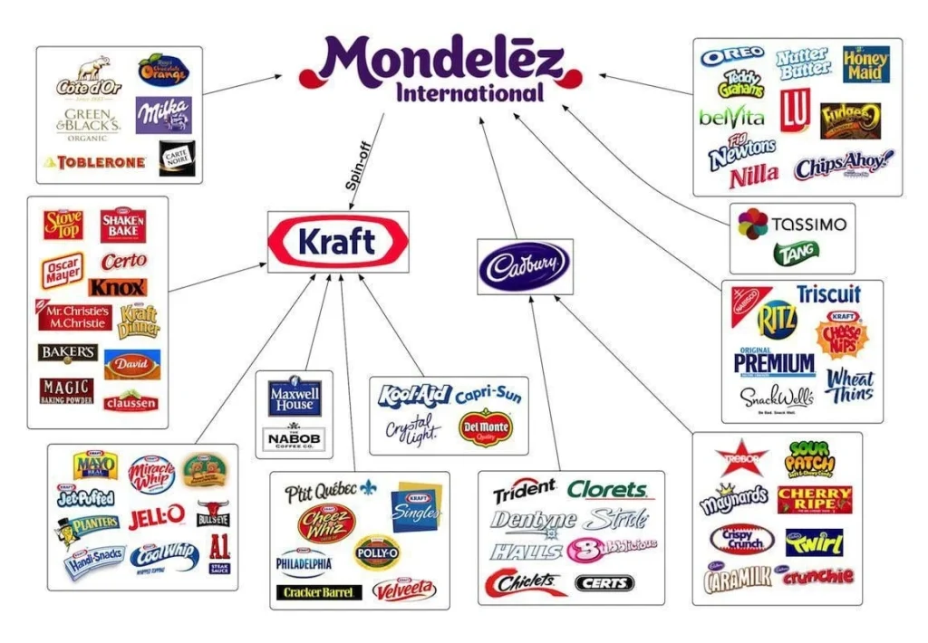
The company’s transformation accelerated through the latter half of the 20th century with major acquisitions and mergers. In 1988, Kraft was acquired by Philip Morris Companies (now Altria Group) and later merged with General Foods, creating a formidable presence in the global food market. The 2000 acquisition of Nabisco Holdings brought legendary brands like Oreo and Ritz into the fold, setting the stage for the eventual creation of Mondelez International.
The Birth of Mondelez: From Kraft Foods to Global Snacking Giant
The pivotal moment in Mondelez history came in 2010 when Kraft Foods acquired the British confectionery giant Cadbury for $19.5 billion. This strategic move significantly strengthened Kraft’s position in the global snacking market and introduced beloved brands such as Dairy Milk and Toblerone to its portfolio, ultimately influencing the design philosophy that would inform the future Mondelez logo.
In August 2011, Kraft Foods announced a groundbreaking decision to split into two independent companies: Kraft Foods Group, focusing on North American grocery products, and Mondelez International, dedicated to global snack foods. This separation was completed in October 2012, marking the official birth of Mondelez International and the need for a distinctive new corporate identity.
The name “Mondelez” itself reflects the company’s global ambitions and mission. Created by combining “monde” (French for “world”) and “délice” (French for “delicious”), the name embodies the company’s commitment to bringing delicious snacking experiences to consumers worldwide. This linguistic foundation would prove crucial in shaping the visual elements of the Mondelez logo.
The Design Philosophy Behind the Mondelez Logo
The Mondelez logo was carefully crafted to reflect the company’s core values and global aspirations when it debuted in 2012. The design team focused on creating a visual identity that would convey approachability, creativity, and international appeal while maintaining the sophistication expected of a major multinational corporation.
The logo features a distinctive two-tiered wordmark design, with “Mondelez” prominently displayed in larger letters above “International” in smaller text. This hierarchical arrangement ensures instant brand recognition among popular food logos while clearly communicating the company’s global scope. The custom sans-serif typeface was specifically designed to be both sleek and playful, incorporating curved and pointed letter endings that add personality and warmth to the overall design.
The strategic placement of design elements in the Mondelez logo demonstrates careful consideration of visual balance and symmetry. The two bright red drop-shaped accents positioned horizontally under the letters “M” and “Z” serve multiple purposes: they create visual bookends for the wordmark, add energy and movement to the design, and provide a striking contrast against the purple background that enhances memorability and brand recognition.
Typography and Visual Elements of the Mondelez Logo
The typography of the Mondelez logo represents a masterful blend of modern sophistication and approachable friendliness. The custom sans-serif typeface bears similarities to Denis Serebryakov’s “Appetite” font, known for its contemporary and fluid design characteristics. This typographic choice reinforces the company’s position as an innovative leader in the snacking industry while maintaining accessibility across diverse global markets.
The smooth, curved letterforms in the Mondelez logo create a sense of flow and continuity that mirrors the company’s commitment to creating seamless snacking experiences. The pointed ends of certain letters add a distinctive flair that makes the wordmark instantly recognizable and helps differentiate it from competitors in the crowded food industry landscape.
The proportional relationship between “Mondelez” and “International” in the logo design serves both aesthetic and functional purposes like food packaging design. The larger primary wordmark ensures strong brand recognition, while the smaller secondary text provides necessary context about the company’s global reach without overwhelming the overall composition or compromising readability at various sizes.
Color Psychology and Brand Symbolism
The rich purple color dominating the Mondelez logo was deliberately chosen to convey specific brand attributes and emotional responses. Purple has long been associated with luxury, creativity, and imagination—qualities that align perfectly with Mondelez’s positioning as a premium snacking company committed to innovation and quality. This color choice helps establish the brand as sophisticated yet approachable in the minds of consumers worldwide.
The strategic use of red accents in the Mondelez logo serves multiple symbolic and practical purposes. Red is universally recognized as a color of energy, passion, and excitement, perfectly complementing the company’s mission to create joyful snacking moments. These red droplet elements also provide visual grounding and stability to the design while creating a vibrant contrast that enhances overall visibility and memorability.
The combination of purple and red in the Mondelez logo creates a dynamic color palette that works effectively across various cultural contexts and marketing applications. This thoughtful color strategy ensures the logo maintains its impact and recognition value whether displayed on product packaging, corporate communications, or digital platforms in different countries and regions.
Logo Variations and Brand Applications
Since its introduction in 2012, the Mondelez logo has remained remarkably consistent in its core design elements, demonstrating the strength and versatility of the original concept. The primary logo configuration features the full “Mondelez International” wordmark with the characteristic purple and red color scheme, suitable for most corporate and marketing applications.
In 2018, Mondelez introduced a refined logo variant that incorporated the company’s “Snacking Made Right” tagline. This version maintains the core visual elements of the original design while adding the slogan in uppercase letters, creating a more comprehensive brand statement that reinforces the company’s commitment to responsible snacking practices and quality products.
The Mondelez logo system includes various adaptations for different contexts and media requirements. These variations include monochromatic versions for single-color applications, horizontal and vertical configurations for different spatial requirements, and simplified versions for small-scale use. Each variation maintains the essential characteristics that make the logo recognizable while providing flexibility for diverse brand applications.
Global Recognition and Market Impact
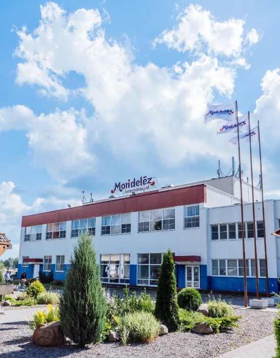
The Mondelez logo has achieved significant global recognition since its introduction, becoming synonymous with quality snacking experiences across diverse international markets. Operating in over 160 countries with annual revenues exceeding $26 billion, the company’s visual identity plays a crucial role in maintaining brand consistency and consumer trust across different cultures and regions.
The logo’s design success is evidenced by its ability to transcend cultural boundaries while maintaining its core message and appeal. The universal nature of the visual elements, combined with the globally recognized brands under the Mondelez umbrella, has helped establish the logo as a trusted symbol of quality and innovation in the international snacking industry.
Market research consistently shows high brand recognition rates for the Mondelez logo among consumers worldwide, validating the effectiveness of its design strategy. The logo’s association with beloved brands like Oreo, Cadbury, and Toblerone has created positive brand equity that extends beyond individual product lines to encompass the entire corporate identity.
Digital Age Adaptations and Modern Usage
The Mondelez logo has successfully adapted to the digital age, maintaining its effectiveness across various online platforms and digital media channels using the top food branding tips of today. The clean, scalable design translates well to web applications, social media profiles, and mobile interfaces, ensuring consistent brand representation across all digital touchpoints.
The logo’s color palette and typography perform exceptionally well in digital environments, with the purple and red combination providing strong contrast and readability on both light and dark backgrounds. This versatility has proven essential as the company has expanded its digital marketing efforts and e-commerce presence in response to changing consumer behaviors and preferences.
Social media applications of the Mondelez logo demonstrate its adaptability to different platform requirements while maintaining brand consistency. The logo appears effectively in profile pictures, header images, and promotional content across platforms like Instagram, Facebook, Twitter, and LinkedIn, helping to build a cohesive digital brand presence that supports overall marketing objectives.
Frequently Asked Questions
| When was the Mondelez logo first introduced? The Mondelez logo was introduced in 2012 when Kraft Foods split into two separate companies: Kraft Foods Group (focused on North American grocery products) and Mondelez International (dedicated to global snack foods). The logo was created as part of the new corporate identity to represent the newly independent snacking company and its global mission to delight consumers worldwide. |
| What does the name “Mondelez” mean and how does it relate to the logo design? The name “Mondelez” combines the French words “monde” (world) and “délice” (delicious), reflecting the company’s mission to bring delicious snacking experiences to consumers globally. This linguistic foundation influenced the logo’s design philosophy, emphasizing global reach and quality, which is visually represented through the international wordmark and sophisticated color palette. |
| What do the colors in the Mondelez logo symbolize? The Mondelez logo uses a rich purple as its primary color, symbolizing luxury, creativity, and imagination—qualities that align with the company’s premium positioning in the snacking industry. The red droplet accents under the “M” and “Z” represent energy, passion, and excitement, reflecting the company’s commitment to creating joyful snacking moments. Together, these colors convey both sophistication and approachability. |
| What font is used in the Mondelez logo? The Mondelez logo features a custom sans-serif typeface specifically designed for the brand. The font is similar to Denis Serebryakov’s “Appetite” typeface, characterized by its modern, fluid design with curved and pointed letter endings. This custom typography creates a distinctive, sleek, and playful appearance that helps differentiate the brand in the competitive food industry. |
| Has the Mondelez logo changed since its introduction in 2012? The Mondelez logo has remained remarkably consistent since its introduction in 2012, with only minor refinements. In 2018, the company introduced a variant that incorporated the “Snacking Made Right” tagline while maintaining the core visual elements. The logo’s stability demonstrates the strength of the original design concept and its effectiveness in representing the brand’s values and global mission. |
Conclusion
The Mondelez logo represents more than just a corporate symbol; it embodies a company’s journey from humble beginnings to global snacking leadership. Through its thoughtful design, strategic color choices, and consistent application, the logo has successfully communicated the brand’s values of innovation, quality, and global connectivity to millions of consumers worldwide.
The evolution from Kraft Foods to Mondelez International demonstrates how effective rebranding can revitalize a company’s identity while honoring its heritage. The logo’s success lies in its ability to balance sophistication with accessibility, creating a visual identity that resonates across diverse markets while maintaining strong brand recognition and consumer trust.
As Mondelez International continues to expand its global footprint and evolve its product offerings, the logo will undoubtedly remain a cornerstone of the company’s brand strategy. Its enduring appeal and effectiveness serve as a testament to the power of thoughtful design in creating lasting brand value and consumer connection in the competitive global marketplace.
Logopoppin
Logopoppin is a graphic design agency that specializes in logo designing, web development, video production and advanced branding services. We love to innovate businesses with new age technologies, allowing them to improve their visual reputation.

