Table of Content
Discover How the Campbell Logo Evolved Since Its Birth at the End of the 19th Century
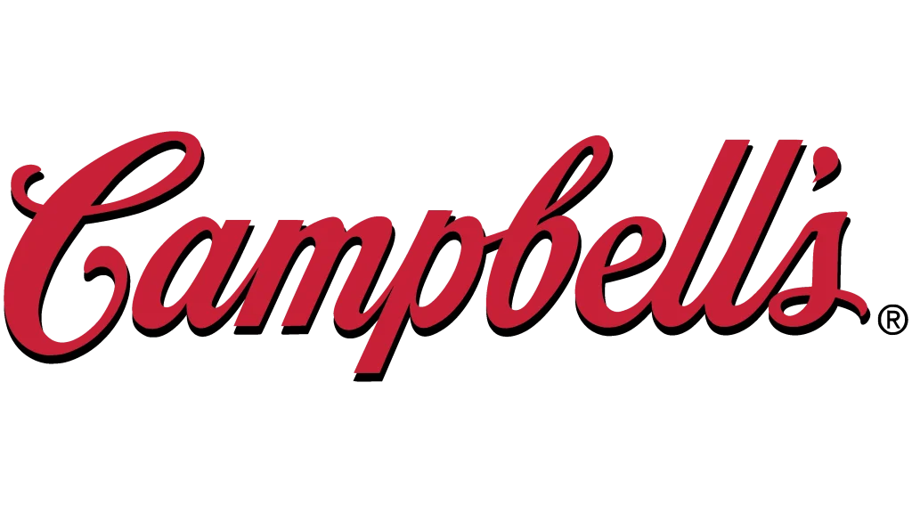
The Campbell’s logo stands as one of the most recognizable brand symbols in American history, transcending its humble origins as a simple soup can label to become a cultural icon. For over 150 years, this distinctive red and white design has graced kitchen pantries across the world, representing comfort, quality, and the timeless appeal of homemade cooking in convenient form.
What makes the Campbell’s logo truly remarkable is its journey from a functional product label to a celebrated piece of American pop culture, immortalized by Andy Warhol’s famous 1962 art series. The logo’s enduring appeal lies not just in its visual design, but in its ability to evoke feelings of warmth, nostalgia, and reliability that span generations of consumers.
Today, as Campbell’s continues to evolve its brand for modern audiences, the logo remains a testament to the power of consistent visual identity and the emotional connections that great design can create with consumers worldwide. Let’s explore its transformation from the lens of a professional logo design agency.
The Origins and Early Development of Campbell’s Logo

The story of the Campbell’s logo begins in 1869 when Joseph A. Campbell, a fruit and vegetable vendor, partnered with Abraham Anderson, an icebox manufacturer, to establish Anderson & Campbell in Camden, New Jersey. The company’s initial focus on canned tomatoes, vegetables, and jellies laid the groundwork for what would eventually become one of America’s most beloved food brands.
During its early years, the Campbell’s logo underwent several transformations as the company experimented with different design approaches. The original logotype featured elegant arched lettering in gold color with ornate decorations that reflected the Art Deco aesthetic of the late 19th century. This sophisticated design approach was intended to convey quality to consumers who were still adjusting to the concept of commercially canned foods, serving as one of the top brand positioning examples today.
The company’s transition from Joseph Campbell Preserve Company to Campbell Soup Company in 1922 marked a significant milestone in both business strategy and brand identity. This name change reflected the growing importance of soup products in their portfolio and set the stage for the logo designs that would define the brand for generations to come.
The Birth of the Iconic Red and White Design Campbell’s Logo

The transformation of the Campbell’s logo into its most recognizable form occurred in 1898, thanks to a serendipitous moment at a college football game. Herberton L. Williams, the company’s treasurer and general manager, attended a University of Pennsylvania versus Cornell football game and was struck by the dynamic visual impact of Cornell’s red and white uniforms.
Williams immediately recognized the marketing potential of this bold color combination and convinced the company to adopt the carnelian red and bright white color scheme for their soup can labels. This decision proved to be one of the most successful branding choices in corporate history, as the red and white Campbell’s logo became instantly recognizable on grocery store shelves across America.
The timing of this color change coincided with Dr. John T. Dorrance’s invention of condensed soup, which revolutionized the industry by making nutritious soup more affordable and accessible to families. The combination of innovative product development and striking visual design positioned Campbell’s for unprecedented success in the emerging mass market for processed foods.
Evolution of Typography and Design Elements of Campbell’s Logo

The Campbell’s logo typography has evolved carefully over the decades while maintaining its distinctive handwritten script appearance. According to corporate archivist Jonathan Thorn, the script closely resembles the signature of founder Joseph Campbell, creating a personal connection between the brand and its origins. This handwritten style was strategically chosen to appeal to housewives of the era, evoking the handwritten recipes that women traditionally exchanged.
The custom cursive lettering featured in the Campbell’s logo underwent various refinements throughout the 20th century, turning into one of the most significant food logos of that era. The 1953 version introduced thicker, more elongated letterforms with rounded angles that enhanced readability and created a more modern appearance while preserving the logo’s traditional charm and authenticity.
Throughout these typographic evolutions, designers maintained the logo’s core characteristics: the flowing script style, the distinctive letter spacing, and the elegant curves that gave the Campbell’s logo its unique personality. These elements worked together to create a sense of warmth and familiarity that distinguished Campbell’s products from competitors using more corporate or mechanical typefaces.
Design Modifications and Modernization Efforts in the 21st Century

The Campbell’s logo has undergone six major modifications throughout its operational history, with each change carefully balancing modernization with preservation of brand equity. In 2000, the company experimented with subtle modifications to specific letters, particularly the ‘e’ and ‘s’, but reverted to the previous design in 2003 after determining that the changes didn’t significantly improve brand recognition or consumer appeal. This decision reinforced the company’s commitment to maintaining the logo’s traditional elements while selectively incorporating modern design principles.

The 2003 restoration removed black shadow details and elevated the red color to a lighter, brighter shade that performed better in digital and modern printing processes like food packaging design. These technical improvements ensured the Campbell’s logo remained vibrant and legible across all platforms while preserving its distinctive visual character.
The 2021 Logo Refresh and Contemporary Updates

Campbell’s introduced its most recent logo update in 2021, marking the first significant redesign in 50 years. This modernization effort focused on subtle refinements that would appeal to new generations of consumers while maintaining the logo’s iconic recognition value. The changes included eliminating shadows, cleaning letter contours, and shortening decorative tails to create more separation between individual letters.
The updated Campbell’s logo features a slightly darker, more intense red color with burgundy undertones that performs better across digital platforms and modern packaging materials. The refined typography provides better legibility at smaller sizes while preserving the handwritten character that consumers associate with the brand’s heritage and authenticity.
These contemporary updates reflect Campbell’s strategy to “reimagine” the brand for consumers who increasingly cook at home, particularly following pandemic-related lifestyle changes. The company aimed to maintain the logo’s comforting, familiar qualities while ensuring it appears fresh and relevant to modern audiences who encounter brands across multiple digital touchpoints.
Cultural Impact and Brand Recognition
The Campbell’s logo has achieved extraordinary cultural recognition that extends far beyond its role as a product identifier. The red and white design has become synonymous with American comfort food, representing values of convenience, quality, and family tradition that resonate across demographic boundaries. Market research consistently shows the logo among the most recognized brand symbols in American consumer culture.
The logo’s influence extends to digital culture, where even the canned food emoji bears clear Campbell’s influences, demonstrating how deeply the design has penetrated popular consciousness. This level of cultural integration represents the ultimate achievement for commercial logo design: becoming so iconic that it transcends specific product categories to represent broader cultural concepts.
The Campbell’s logo has also influenced design trends across the food industry, with many competitors adopting similar red and white color schemes or script typography in attempts to capture some of the emotional associations consumers have with the Campbell’s brand identity.
Color Psychology and Visual Communication
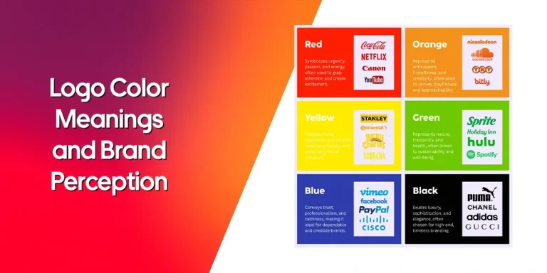
The red and white color combination of the Campbell’s logo leverages powerful psychological associations that contribute to its marketing effectiveness, popular among modern food branding tips. Red stimulates appetite and creates feelings of warmth and energy, while white suggests purity, cleanliness, and quality—ideal associations for food products that emphasize nutrition and family care.
The specific shade of carnelian red used in the Campbell’s logo has become so closely associated with the brand that it functions as a proprietary color in the marketplace. This color ownership creates instant brand recognition even when the logo typography isn’t visible, as consumers unconsciously associate this particular red with Campbell’s products.
The high contrast between red and white elements ensures excellent visibility across different environments, from bright grocery store lighting to dim pantry shelves. This practical consideration, combined with the colors’ psychological impact, explains why the Campbell’s logo color scheme has remained unchanged for over a century.
Andy Warhol and Pop Culture Integration
The Campbell’s logo achieved unprecedented cultural significance in 1962 when artist Andy Warhol created his famous “Campbell’s Soup Cans” series, featuring 32 paintings of different Campbell’s soup flavors. While Warhol didn’t design the logo itself, his artwork elevated the Campbell’s brand identity from commercial design to high art, cementing its place in American pop culture history.
Warhol’s choice of Campbell’s soup cans as artistic subjects was partly personal—he reportedly ate Campbell’s soup for lunch every day for 20 years—but also reflected the logo’s powerful symbolic value. The artwork transformed an everyday consumer product into a commentary on American consumer culture, mass production, and the democratization of art through commercial imagery.
The relationship between Warhol’s art and the Campbell’s logo created a unique feedback loop where commercial design influenced fine art, which in turn enhanced the cultural value of the original brand. This phenomenon demonstrated how effective logo design could transcend its commercial origins to become part of the broader cultural conversation.
Legacy and Continuing Brand Evolution
The Campbell’s logo represents more than a century of thoughtful brand stewardship that has successfully balanced tradition with innovation. From its origins as a simple product label to its status as a cultural icon, the logo demonstrates how consistent visual identity can build powerful emotional connections with consumers across multiple generations.
The company’s recent transition from Campbell Soup Company to The Campbell’s Company reflects broader portfolio diversification while maintaining the logo’s central role in brand communication. This strategic evolution shows how established logos can support business transformation while preserving valuable brand equity built over decades of market presence.
As Campbell’s continues expanding beyond its soup heritage into broader food categories, the logo’s flexibility and strong recognition value provide a solid foundation for future growth. The design’s ability to convey quality, tradition, and innovation simultaneously makes it well-suited for supporting the company’s evolving product portfolio and market positioning.
Frequently Asked Questions
| When was the Campbell’s logo first introduced? The Campbell’s logo in its most recognizable red and white form was first introduced in 1898 when company treasurer Herberton L. Williams convinced the company to adopt Cornell University’s red and white color scheme after attending a football game. However, the company had been using various logo designs since its founding in 1869, with the original featuring gold lettering and ornate decorations. |
| Who designed the Campbell’s logo? The exact designer of the Campbell’s logo is unknown, as it was the result of a collaborative effort involving multiple people. According to corporate archivist Jonathan Thorn, the printing company Sinnickson Chew & Sons played an important role in developing the original design. The script is based on founder Joseph Campbell’s signature, and the color scheme was proposed by Herberton L. Williams. |
| How did Andy Warhol influence the Campbell’s logo’s fame? Andy Warhol didn’t design the Campbell’s logo, but his 1962 art series “Campbell’s Soup Cans” featuring 32 paintings of different soup flavors elevated the logo from commercial design to high art. Warhol’s artwork transformed the everyday soup can label into a symbol of American pop culture and consumer society, significantly increasing the logo’s cultural significance and recognition. |
| What do the colors in the Campbell’s logo represent? The red and white colors in the Campbell’s logo were chosen for practical and psychological reasons. The carnelian red stimulates appetite and creates feelings of warmth and energy, while white suggests purity, cleanliness, and quality. This color combination was inspired by Cornell University’s football team uniforms and chosen specifically for its visual impact and ability to stand out on grocery store shelves. |
| How has the Campbell’s logo changed over time? The Campbell’s logo has undergone six major modifications since 1869, with the most recent update in 2021. Key changes include the transition from gold to red lettering in 1898, various typography refinements in 1953 and 1989, and the 2021 modernization that eliminated shadows, cleaned letter contours, and slightly darkened the red color. Despite these updates, the core red and white design and script typography have remained largely consistent for over a century. |
Conclusion
The Campbell’s logo stands as a masterpiece of American commercial design, demonstrating how effective visual identity can transcend its original functional purpose to become part of cultural heritage. Through careful evolution over more than 150 years, the logo has maintained its essential character while adapting to changing market conditions, consumer preferences, and technological requirements.
From its inspiration at a college football game to its immortalization in Andy Warhol’s pop art, the Campbell’s logo has consistently captured public imagination while serving its primary function as a brand identifier. This unique combination of commercial effectiveness and cultural significance establishes the logo as one of the most successful brand designs in business history.
As Campbell’s continues navigating the modern marketplace, the logo remains a powerful asset that connects the company’s heritage with its future aspirations. The enduring appeal of the red and white design proves that great logo design can create lasting value that extends far beyond simple product identification to encompass emotional connections, cultural meaning, and brand loyalty that spans generations.

Logopoppin
Logopoppin is a graphic design agency that specializes in logo designing, web development, video production and advanced branding services. We love to innovate businesses with new age technologies, allowing them to improve their visual reputation.


