Table of Content
Discover How the State Farm Logo Has Transformed Into an Icon of American Insurance
The State Farm logo stands as one of America’s most recognizable corporate symbols, instantly evoking trust and reliability in millions of consumers’ minds. This distinctive emblem, featuring three interlocking red ovals, has become synonymous with dependable insurance coverage and neighborly service across the United States. For over a century, State Farm has carefully crafted its visual identity to reflect the company’s core values and expanding services.
From its humble beginnings as a simple oval badge in 1922 to its current streamlined design, the State Farm logo has undergone strategic transformations while maintaining its essential character. Each evolution tells a story of a company growing from a small farmers’ insurance provider to America’s largest property and casualty insurer, adapting its brand image to meet changing market demands while preserving the elements that customers trust most.
Understanding the State Farm logo requires examining not just its visual elements, but the deeper meaning behind each design choice and how these symbols have shaped public perception of one of America’s most enduring insurance brands. Let’s take a look at it in detail from the perspective of a professional logo design agency in the US today.
Evolution of the State Farm Logo Over the Years – A Detailed Look
Since its inception more than a century ago, the State Farm logo has changed its form multiple times. As times changed, so did the consumer perceptions. And with it, the brand felt the need to revamp and tweak their symbol to reflect the needs of each era more clearly.
Let’s take a look at this transformation, and discover the journey that brought us the current brand logo for State Farm Insurance.
The Origins of State Farm Logo and The Brand’s Visual Identity (1922-1936)

The original State Farm logo emerged in 1922 when George J. Mecherle founded the State Farm Mutual Automobile Insurance Company in Bloomington, Illinois. This inaugural design featured a horizontal oval badge with a distinctive double outline, placing emphasis on the company’s automotive insurance focus. The centerpiece displayed a monochrome vintage automobile image, surrounded by four key principles that defined the company’s mission: “Service, Satisfaction, Safety, and Economy.”
The early logo incorporated the full company name “STATE FARM MUTUAL AUTO INS. CO.” along with “BLOOMINGTON, ILL” in bold sans-serif logo fonts. This black-and-white design established the foundation for all future iterations, with the oval shape becoming the enduring signature element of State Farm’s brand identity. The comprehensive text elements served practical purposes, clearly identifying the company’s location and services during an era when brand recognition was primarily local.
This original design reflected the straightforward, no-nonsense approach that Mecherle envisioned for his insurance company. The emphasis on text and clear service descriptions aligned with the founder’s goal of providing transparent, farmer-friendly insurance policies. The oval’s symbolic representation of completeness and protection would prove prophetic, as this shape remained central to the State Farm logo throughout all subsequent redesigns.
The Revolutionary Three-Oval Design State Farm Logo (1936-1953)

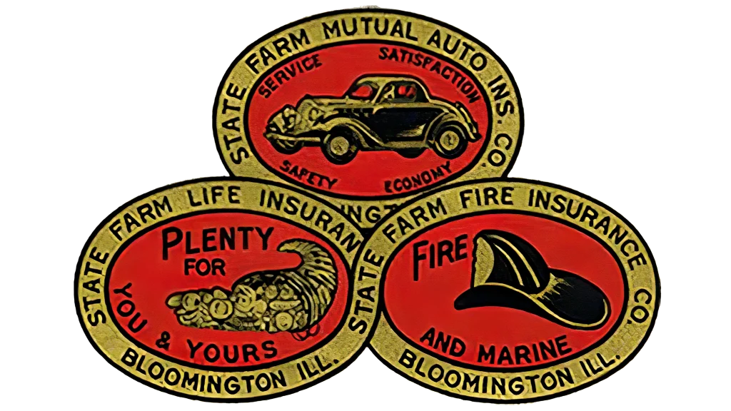
In 1936, State Farm introduced what would become its most iconic visual element: the three-oval configuration arranged in a triangular formation. This redesign marked a pivotal moment in the company’s branding history, reflecting its expansion beyond simple auto insurance into multiple coverage areas. Each oval depicted specific imagery that illustrated State Farm’s growing service portfolio: an automobile representing auto insurance, a fire engine symbolizing fire protection, and a cornucopia filled with various crops indicating agricultural and life insurance coverage.
The transformation introduced a bold red and gold color palette, dramatically enhancing the logo’s visibility and memorability compared to its black-and-white predecessor. This color choice proved strategic, as red would become permanently associated with the State Farm brand identity. The three ovals were arranged with two at the bottom and one at the top, creating a stable triangular structure that conveyed strength and reliability.

This period established several design principles that would endure for decades. The interlocking oval concept symbolized interconnected protection, suggesting that State Farm’s various insurance products worked together to provide comprehensive coverage. The slight redesign of 1943 also demonstrated the company’s willingness to evolve its visual identity to reflect business growth, setting a precedent for future logo updates that would balance innovation with brand continuity.
The Classic Era of the State Farm Logo: Refinement and Recognition (1953-2006)

The 1953 redesign produced what many consider the most recognizable iteration of the State Farm logo. This version transformed the three ovals into solid red circles with white outlines, each containing specific text identifying the insurance types: “Auto,” “Life,” and “Fire.” The design was enclosed within a square frame with rounded corners, creating a balanced and professional appearance that would remain largely unchanged for over five decades.
Above the three-oval emblem, “STATE FARM” appeared in bold, uppercase letters, with “INSURANCE” positioned below in the same style. This configuration created clear brand hierarchy while maintaining visual harmony. The interlocking design of the bottom two ovals formed an infinity symbol, subtly suggesting eternal protection and continuous service. This symbolic element resonated with customers seeking long-term insurance relationships.
The longevity of this design speaks to its effectiveness in communicating State Farm’s brand promise. For nearly sixty years, this logo appeared on everything from policy documents to television commercials, building tremendous brand equity and consumer recognition. The consistent red and white color scheme reinforced brand memorability, while the clear identification of insurance types helped customers understand State Farm’s comprehensive service offerings. Marketing research consistently showed high logo recognition rates, validating the design’s success in the marketplace.
State Farm Logo’s Modern Adaptation: The 2006 Evolution

Recognizing the need for greater flexibility in an increasingly digital marketplace, State Farm updated its logo in 2006 while preserving the beloved three-oval emblem. This redesign positioned the traditional square-framed symbol alongside an enlarged, italicized “State Farm” wordmark in matching red typography. The elegant sans-serif font featured smooth lines and distinctive letter-end cuts, creating a more contemporary appearance while maintaining professional credibility.
This dual-element approach provided valuable versatility for different applications. The wordmark could appear independently for situations requiring simplified branding, while the complete logo maintained connection to State Farm’s historical identity. The italicized text suggested forward momentum and progress, aligning with the company’s expansion into financial services beyond traditional insurance products.
The 2006 update reflected State Farm’s growth into banking, mutual funds, and comprehensive financial services. By maintaining the three-oval symbol while modernizing the typography, the company successfully bridged its insurance heritage with its evolving business model. This transitional design acknowledged that while State Farm’s core mission remained consistent, its service delivery methods were adapting to meet 21st-century customer expectations and technological capabilities.
The Contemporary State Farm Logo (2012-Present)

On January 1, 2012, coinciding with State Farm’s 90th anniversary, the company unveiled its most streamlined logo design to date. Created by the prestigious New York design firm Chermayeff & Geismar, this contemporary version eliminated text from within the ovals while preserving their triangular arrangement. The simplified approach removed specific insurance type references, acknowledging that State Farm had evolved far beyond its original three-category service model.
The current State Farm logo features three clean red ovals with white outlines, positioned adjacent to the “State Farm” wordmark in a refined sans-serif typeface. This minimalist approach serves multiple purposes: it reduces visual clutter, enhances scalability across digital platforms, and allows for greater interpretive flexibility as the company continues expanding its service offerings. The removal of “Insurance” from the wordmark reflects State Farm’s diversification into banking, investment, and other financial services.
According to Pam El, State Farm’s marketing vice president during the redesign process, the change was necessary to create “a bolder presence that could compete in today’s digital world.” The simplified logo, which still retains the essence of its earlier circle logo design, performs better across various media formats, from smartphone screens to billboard advertisements. The timeless three-oval configuration maintains brand continuity while the clean execution ensures the logo remains effective in rapidly evolving digital environments.
Color Psychology, Typography, Perception, and Brand Recognition
The State Farm logo’s consistent use of red and white creates powerful psychological associations that support the company’s brand positioning. Red traditionally symbolizes strength, confidence, and reliability – qualities essential for an insurance provider. This bold color choice ensures high visibility across all media platforms, from traditional print advertising to digital applications. The psychological impact of red also conveys urgency and importance, appropriate for a service that customers rely on during critical moments.
White provides crucial contrast and suggests honesty, transparency, and cleanliness. The combination of red and white creates a trustworthy yet dynamic visual identity that appeals to diverse consumer demographics. Market research consistently demonstrates high recognition rates for the State Farm logo, with the red and white color combination being a primary factor in brand recall. This color palette has remained consistent across decades, building tremendous brand equity and consumer familiarity.
The strategic use of color extends beyond mere aesthetics to practical considerations. The high contrast between red and white ensures visibility across various backgrounds and lighting conditions. This reliability in visual performance mirrors State Farm’s promise of consistent service delivery, creating subconscious associations between logo recognition and brand dependability.
Symbolism and Meaning Behind the Three Ovals
The three-oval configuration represents more than just visual design – it embodies State Farm’s comprehensive approach to customer protection. Originally, each oval specifically represented auto, life, and fire insurance, the company’s core service offerings. While contemporary versions no longer include text labels, the three-oval structure continues to suggest comprehensive coverage and multi-faceted protection, along with its iconic slogan.
The triangular arrangement creates inherent stability, both visually and symbolically. In design theory, triangular compositions convey strength and balance, qualities consumers seek in insurance providers. The interlocking nature of the bottom two ovals suggests interconnected services working together for customer benefit. This visual metaphor effectively communicates State Farm’s integrated approach to financial protection and services.
The oval shape itself carries significant symbolic weight. Unlike angular shapes that might suggest rigidity, ovals convey completeness, continuity, and protection. The smooth, unbroken lines suggest reliability and consistency – crucial attributes for building consumer trust in insurance services. The pyramidal arrangement with one oval above two others creates visual hierarchy while suggesting that all services are equally important and interconnected.
Typography and Font Evolution
Throughout its history, the State Farm logo has employed various typography styles that reflect contemporary design trends while maintaining professional credibility. Early versions used bold, uppercase sans-serif fonts that prioritized legibility and authority. The 1953 design continued this approach with clear, readable text that performed well in print media applications.
The 2006 redesign introduced italicized typography, creating a sense of forward movement and modernization. The custom font selection balanced elegance with accessibility, ensuring the wordmark remained readable across various sizes and applications. The italicized treatment subtly suggested progress and innovation while maintaining the conservative appearance appropriate for a financial services company.
The current logo employs a refined sans-serif typeface that exemplifies contemporary design principles. The font choice prioritizes clarity and versatility, performing equally well in digital and print applications. Subtle refinements in letter spacing and proportions demonstrate attention to detail and professional craftsmanship. The typography works harmoniously with the three-oval symbol, creating a cohesive brand identity that feels both timeless and contemporary.
Digital Age Adaptations and Future Considerations
The State Farm logo’s evolution reflects broader changes in how brands must function in digital environments. The 2012 redesign specifically addressed challenges of scalability and clarity across various screen sizes and resolutions, especially in terms of accessibility for insurance website design. The simplified design ensures that the logo remains recognizable whether displayed on smartphone screens or large digital billboards.
Social media platforms and mobile applications require logos that function effectively at extremely small sizes while maintaining brand recognition. The State Farm logo’s clean lines and high contrast make it well-suited for these applications. The removal of internal text and simplification of design elements ensures that the essential brand elements remain visible even at thumbnail sizes.
Future logo considerations must account for emerging technologies and changing consumer behaviors. The current design’s flexibility and simplicity position it well for applications in virtual reality, augmented reality, and other emerging platforms. The timeless three-oval configuration provides a stable foundation that can accommodate future technological adaptations while preserving brand continuity and recognition.
Frequently Asked Questions
| What do the three ovals in the State Farm logo represent? The three ovals in the State Farm logo originally represented the company’s core insurance services: auto, life, and fire insurance. While modern versions no longer include text labels, the three-oval design continues to symbolize comprehensive protection and the company’s multi-faceted approach to customer service. The triangular arrangement suggests stability and interconnected services working together for customer benefit. |
| When did State Farm change its logo to the current design? State Farm introduced its current logo on January 1, 2012, coinciding with the company’s 90th anniversary. This redesign was created by Chermayeff & Geismar, a prestigious New York design firm. The update simplified the previous design by removing text from within the ovals while preserving the iconic three-oval configuration that customers recognize and trust. |
| Why did State Farm choose red and white for its logo colors? State Farm selected red and white for their powerful psychological associations and practical benefits. Red symbolizes strength, confidence, and reliability – essential qualities for an insurance provider. White suggests honesty and transparency. Together, these colors create high visual contrast for excellent visibility across all media platforms while building subconscious associations between the logo and brand dependability. |
| Has the State Farm logo always featured three ovals? No, the original State Farm logo from 1922 featured a single horizontal oval with a vintage car image and company text. The iconic three-oval design was introduced in 1936 when the company expanded its services beyond auto insurance. This triangular arrangement of three ovals has remained the central element of State Farm’s visual identity for nearly 90 years, though the specific design details have evolved over time. |
| What font does State Farm use in its current logo? The current State Farm logo uses a custom sans-serif typeface that prioritizes clarity and versatility across digital and print applications. The font is similar to Frutiger Bold Italic, designed by Adrian Frutiger. The typography features smooth lines, distinctive letter-end cuts, and careful spacing that works harmoniously with the three-oval symbol to create a cohesive, professional brand identity suitable for modern marketing needs. |
Conclusion
The State Farm logo represents more than corporate branding – it embodies nearly a century of American business evolution and consumer trust. From its origins as a simple oval badge serving Illinois farmers to its current status as one of America’s most recognized corporate symbols, the logo has successfully balanced tradition with innovation. The three-oval design has become an enduring symbol of comprehensive protection and reliable service, transcending its original insurance-specific meanings to represent broader financial security.
The logo’s evolution demonstrates how thoughtful brand management can preserve essential identity elements while adapting to changing market conditions and consumer expectations. Each redesign has honored the company’s heritage while preparing for future challenges and opportunities. The consistent use of red and white, combined with the distinctive three-oval configuration, has created a visual identity that remains instantly recognizable and trusted by millions of Americans.
As State Farm continues expanding its services and adapting to new technologies, the logo stands ready to represent the company’s evolving mission while maintaining the trust and recognition built over decades of consistent brand presentation. The State Farm logo proves that effective corporate symbols can endure and thrive across generations, serving as both historical markers and forward-looking brand promises.

Logopoppin
Logopoppin is a graphic design agency that specializes in logo designing, web development, video production and advanced branding services. We love to innovate businesses with new age technologies, allowing them to improve their visual reputation.


