Table of Contents
Take a Look at the Famous Logos That Came Out in 1970s
When it comes to talk about the emergence of modern design industry, we can see the roots going back to the classic era of 70s. It was the time when new trends were knocking the door of design industry. Many companies took inspiration from those emerging trends, and changed their logos to keep the company branding aligned with the latest standards. These logos have a unique style because they were created with an aesthetic touch. The 1970s logo trends are therefore considered an important development in the rise of modern design industry. They brought several new ways of designing that gave marketers a new perspective related to logo branding.
The design practices that emerged during the 70s era are called retro style. These practices are still very much popular in the industry, as designers love to use them to exhibit different styles. The logo branding is specially influenced by these trends because they still look very catchy to the eye. The usage of attractive colors and classic typography precisely indicates how well those 1970s logo trends are still followed by many designers in the world. Sometimes, they offer specialized logo design services based on those trends, which is what makes them quite popular in the industry.
However, to create a logo design adjacent to that of 70s style, you need to work with a mindset. A lot of times, beginners struggle to get ideas related to retro designing. This is where they need to take some sort of inspiration from the renowned logos of that era. It will help them to get some ideas and work accordingly with a precised classical mindset.
In this blog, we have listed some of the famous 1970s logos that are still looked upon for design inspiration. Let us first start from the basics below understanding why designers around the world still love to go with retro styling.
1. Why Designers Still Like Retro Styling?
When it comes to create branding materials with uniqueness, designers are always required to work with an open mindset. This means that they can get ideas from anywhere irrespective of the region and time. This is the major reason that takes them back to the era of 70s when the modern design world was shaping up with some new trends. Though these practices might look old to many, but their flair still looks very much intact with the modern design world.
The art of using flashy colors in the logos started back in 1970s. Before that, people were used to work with only few colors in which black and white were quite common. The brand logos created in that era also had similar monotone styling which is something still used in some emblems. These particular colors started to become outdated in 70s, allowing designers to move towards new trends. This was the time when fresh design practices emerged and took the industry to the new heights.
Now, due to being highly attractive, the 70s and even 80s graphic design trends are still followed in the industry. Many logo designers prefer to take inspiration from them when designing anything with a retro vibe. The reason for that is clear, that is to showcase some sort of classic uniqueness in the design. From logos to business cards and more, these styles are efficiently used in different branding materials that require a touch of classical styling.
Famous 1970s Logo List to Take Design Inspiration
If you are avid fan of retro styling, you must need to take design inspiration from those components that were created in that era. This is a practice that should be considered while creating anything having a retro style. If you are designing a logo, you must need to take a look on those emblems that were popular in that era. This is not a difficult job, yet some people often ignore it due to some lame reasons.
For your convenience, we have listed below some of the popular logos of 1970s that are still loved by many people around the world. They have been created with a unique style that makes their identity a bit different from others. Let’s take a look at them below.
HBO
Every movie enthusiast know about the prominence of HBO. It is considered one of the first TV channels in the world that started to play movies on high definition quality. It is specifically popular among those who want to watch movies by just sitting in their homes. This channel is watched by millions around the world, which is why its popularity is unmatchable with anyone. From Europe to Central Asia, HBO is widely known as the best channel where you can see latest movies in HD quality.
Speaking about the foundation, HBO was launched way back in 1975 when there were only few TV channels available for home viewers. With the immediate launch, the channel got immense attention as people started to take interest in all its content. The logo of HBO became known among the movie enthusiasts as it was designed quite aesthetically. Till to date, this logo is widely popular, as people precisely term it as the branding identity of one of the pioneer movie channels in the world.
Space Invaders
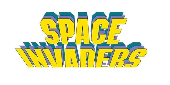
Those who are gaming aficionados must have known about Space Invaders. It is an old but highly popular game in the world that was launched way back in early 1970s. It was the time when the gaming world was not known to many. The computers were not introduced in the market, which is why games did not had any attraction. The arrival of Space Invaders however changed the momentum to some extent, as it introduced a new way for youngsters to have some fun time with interactive video games.
The logo of Space Invaders specially got more attention. It was created in a unique manner that precisely turned the heads of everyone. The colors chosen for the logo were creatively aligned with each other to give an overall fabulous look of the logo. This emblem is still considered a great piece for inspiration, as it defines a way how logo can be designed with a unique horizontal look.
Kodak
When it comes to talk about photography, one name that always strikes the mind is the name of Kodak. It is one of the first companies in the world that introduced photography for general people. Here, we are talking about budget cameras that came up in the market during mid 1970s. Kodak was one of those names that brought this innovation for the general public. It introduced portable cameras that can take quality pictures anytime, anywhere.
Talking about the branding of the company, Kodak always paid huge attention towards it. The logo of the company is certainly a perfect example of this case. It is designed quite uniquely with a hidden shape of camera that you can barely notice it. This is done on purpose, as it is related directly to the background of the company. The color combination chosen for this logo is red and yellow. These shades are used quite smartly on the logo, so that the overall image can give an astounding look.
Atari
Atari was yet another a famous gaming box that came to prominence in late 70s. Many kids who have not seen that era, cannot relate with this iconic product. However, its popularity and name still lives in the gaming industry. It could be said that Atari was one of the first gaming consoles that was introduced for general public. The craze for this product was so high that Atari generated millions of dollars from sales within just a few years. It offered a huge stack of games that including many popular names such as Donkey Kong, Pac-man, Mario Bros and more others.
Talking about the logo of Atari, it is indeed an artistic piece of craft. It is not a conventional logo in which you will see any shape or symbol. Instead, it is just designed with a simple abstract figure that looks quite creative from every perspective. Moreover, the usage of rainbow colors in the logo gives it a more alluring look, which is what makes the Atari emblem very special.
Ruffles
Ruffles is a renowned potato chips brand that was founded way back in 1970s. It instantly became popular among the people, as the brand produced quality fried chips in a very nominal price tag. The branding of the company was also noticeable, as its logo was created in a unique playful style. These type of logos are hard to create, but Ruffles did it perfectly by using smart design collaboration between different elements. Though it is a wordmark, but it illustrated how even a simple typography can be presented in a creative manner.
The color combination used for the logo is strong red which certainly looks good with the white background. If you want to design a wordmark logo that can exhibit a classy brand identity, take a look at this creative stuff. It is certainly a great illustration how a retro styled logo should be created using cheeky design techniques.
Frequently Asked Questions (FAQs)
| Why 1970s logos are still famous in the world? The reason behind the popularity of 1970s logos is that they were designed quite uniquely. Their styling still looks very much relevant, which is what gives them prominence in the industry. |
| What type of colors were used in 1970s logo? The logos that came out in 1970s had different types of colors. They were created with a find blend of different shades, which is also the major reason behind their success in the market. |
| What type of fonts were used in 1970s logo? Based on the given requirements, 1970s logos used different types of typography styles. From recursive to futuristic fonts, you can see different types of styles in the logos of famous 70s brands. |
| What is a retro style logo? It is a term specifically used for those logos that are created with a retro style. Generally, the classic theme of 60s or 70s are termed retro, hence the logos created in such style are called retro logos. |
| Name some of the famous logos that came out in 1970s? In 1970s, many new brands entered in the market. Their company logos also illustrated a fresh theme of creativity that made them popular in the market. Among different notable names, the logos of Kodak, Chupa Chups, Nintendo and more became famous in the market during that era. |
Final Words
That takes us to the end of this blog in which we have listed different 1970s logos that are still quite popular in the industry. These logos are created with an aesthetic touch that makes them look special even in the modern era. This is the reason why these logos can be looked upon as a great source of design inspiration. Being a beginner, you can learn a lot from them, and can use their design techniques in your own work as well.
Meanwhile, if you are looking for an agency that can help you to design quality brand logos, get in touch with us today. We have got plenty of experience in the design industry, hence our professionals can help you to create unique emblems as per the given requirements.

Logopoppin
Logopoppin is a graphic design agency that specializes in logo designing, web development, video production and advanced branding services. We love to innovate businesses with new age technologies, allowing them to improve their visual reputation.

