

Table of Content
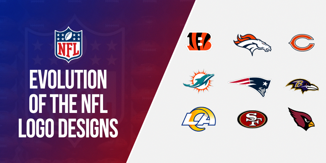
Discover All 32 NFL Teams Logos and Explore the Meaning of What They Represent
An NFL team’s logo or emblem is its most iconic identifier. All it takes is a glance at an iconic NFL logo like Chicago’s red bull or Miami’s leaping dolphin. You will instantly recognize which team that imagery signifies.
With 32 teams currently playing in the National Football League, NFL logos are far easier to remember and associate than the teams’ names. And with rumors that there are plans to add more teams to the roster in coming years, a relatable and recognizable NFL team logo will be all the more important then.
Now, every NFL logo design has been tweaked with the times, even for teams like the Dallas Cowboys and the Oakland Raiders who haven’t changed their logos properly since they joined the NFL. Others like the Washington Redskins and the LA Rams have worked quite the opposite. The ones who haven’t changed their logos, or have tweaked them only slightly, can cash in on the benefit of high recognition. Other teams though have to work hard to establish their logo’s recognition every time they change their logo.
Let us now look at the best sports logos of the teams and find out what these iconic NFL team logos represent in 2024.
The NFL Logo History – NFL Shield Logos over the Years and Their Evolution
Few sports associations or organizations have a logo as iconic as the NFL logo. Also called the NFL shield, the logo has been in use by the organization for a very long time. Designed in-house, the current design is a cosmetic derivative of the original design created all those years ago.
Studies conducted on the topic report that there are about 3.7 NFL logo changes in life on average. This comes out to about 14 years before a change is required, barring any extenuating circumstances such as in the case of the Washington Commanders (Previously known as the Washington Redskins). And it’s the same stats for the primary NFL shield as well. However, these stats do not include seasonal variants used for different Christmas or Halloween marketing ideas.
The NFL shield logo still looks quite similar to the one used at the NFL’s inauguration in 1920. Moreover, there have only been minor NFL logo redesigns through the years, and all done to modernize it. And it was in the 1940s that the logo came into its current form.
The word NFL was moved down, and the star was moved to the top of the shield. Finally, the stripes behind the NFL wording were made pink. Thus, the current logo came into being, which is still going strong eight decades later.
The first significant change in the logo came in 2008. The font was changed to make it sharper. The shield was made a little longer and thinner, and the color shades were darker. The stars on the top were reduced from 25 to eight, turning it into the pro football emblem we all know and love today.
Besides the primary NFL logo, various variants are also designed to commemorate various events. They include the NFL draft logo, the NFL 100 logo celebrating the centennial birthday of the League, and many others.
The NFL Logo Font
As for the typeface used for the various NFL or NBA logos, there is no standard NFL logo font. Every team uses their proprietary font for their wordmark logo, and therefore, no two symbols look the same.
The Super Bowl Era and Its Various Branding Symbols
After the NFL-AFL merger, the championship game between the respective champions of each conference was called the Super Bowl. As a major sporting event that drew in millions in of viewers as well as investors, each season featured a unique logo that represented some aspect of that year’s game.
Now, while not exactly a part of what one might consider NFL logos, one cannot talk about professional American football without discussing the various Super Bowl logos fans have known and loved over these past 58 years.
National Football Conference
The National Football Conference or the NFC is one of the two associations of the NFL. Each of these NFL associations consists of sixteen teams. The teams in each association are divided into four divisions. Each division; east, north, south, and west; consist of four teams. It allows the NFC to schedule matches between its teams in shorter groups, allowing for better planning and scheduling.
The current defending champion for the NFC is the San Francisco 49ers. They defeated the Detroit Lions for the NFC Championship title in 2024, and are set to face the Kansas City Chiefs for a shot at the Super Bowl.
NFC – East Division NFL Team Logos with Names
The NFC- East division is one of the four divisions of the NFL’s National Football Conference. It consists of four teams, with the Dallas Cowboys as its current division champion.
This division has had all four of its teams win at least one Super Bowl. This is a feat unmatched by any other division in the entire National Football League. Moreover, the division is one of the most successful in the NFL as well. The teams have won 22 NFC Championship titles and 13 Super Bowl titles since the 1970s.
This division is a true NFL contender made up of four of the top ten ranked NFL teams.
Dallas Cowboys NFL Logo Evolution
The Dallas Cowboys are one of the most successful NFL teams, with ten Super Bowl appearances and five wins. Additionally, they hold the most NFC Championship titles, with eight wins over the years.
Joining the NFL as an expansion team in 1960, they have seen massive success over the years. That resulted in the franchise being valued at $5 billion in 2018. It also holds the record for being named the highest valued NFL team for 12 years straight in 2018.
The Dallas Cowboys wordmark and logomark NFL logo is straightforward.

- At the time of the team’s induction into the NFL, their logo consisted of a solid blue five-pointed star. This logo was used from 1960-1963 when it was changed for the 1964 season.
- The new team NFL logo now featured a blue outline around the solid-blue star. They were separated by a thin white strip of white all around the design. The blue color used was also a few shades darker than the one used before, making the logo more prominent.
New York Giants NFL logo
The New York Giants are one of the oldest teams in the NFL, who joined in 1925 along with four other teams. They are the only one of those five teams still playing in the NFL. The New York Giants have the third-highest number of NFL Championship titles. They have won eight NFL titles over the years with 19 Championship appearances.
The oldest team in the Northeastern US has a famous rivalry with fellow division team Philadelphia Eagles. It has been called one of the best rivalries of this century, which has been going on since 1933.
The primary NFL logo for the New York Giants has seen many changes over nearly a century of gameplay, and has a design that is commonly associated with many classic MLB logos.

- After WW2, the New York Giants released their first logo in 1945, which featured a quarterback throwing the ball superimposed over the New York skyline.
- This NFL logo representing the team was modified in 1950. The image was blown up in size, the picture was sharpened for better clarity, and the colors were changed. The new logo now featured a blue and white quarterback on a similarly colored New York skyline over a red background. The logo was surrounded by the name of the team, the “New York Football Giants.”
- Today’s NFL team logo is a stylized lowercase NY, which was first used from 1961-1974, then a modified version of it was used for 1975.
- From 1976-1999, it featured the word “Giants” as its logo. That was changed to NY in 2000, using the design from 1961 and the color theme from the 1976 logo.
Philadelphia Eagles NFL logo
The Philadelphia Eagles have been a part of the NFL since 1933. They were formed to replace the then bankrupt Frankford Yellow Jackets. Over the years, many top-tier pro players have passed through the team ranks. Moreover, many of them have been inducted into the NFL’s Pro Football Hall of Fame.
Their highly-famed rivalry with the New York Giants is called one of the best rivalries in the NFL. And it has been going on for nearly a century. Additionally, their list of rivals includes illustrious teams such as the Pittsburgh Steelers, the Washington Commanders, and the Dallas Cowboys.

- Revealing their first official Philadelphia Eagles logo in 1948 after WW2, their logo featured an American bald eagle flying with a football clutched in its claws. The emblem was highly detailed and was done in a shade of green called the Kelly green. This logo was used from 1948-1995.
- The 1969-1972 era logo featured a more stylized image of the eagle.
- For the 1996 season, the logo was altered quite drastically. It now featured just the head of a bald eagle, colored in white and accented by silver and black. The image was designed to look less realistic and was drawn in the style of cartoons.
The last change made the logo better suited for the modern design aesthetic while still keeping to the roots of the initial logo. And in case you’re intrigued by these animal logos in the NFL, know that animals are some of the most iconic symbols in logo design, even outside the world of sports too. Take the Ferrari badge, or the Spiderman logo.
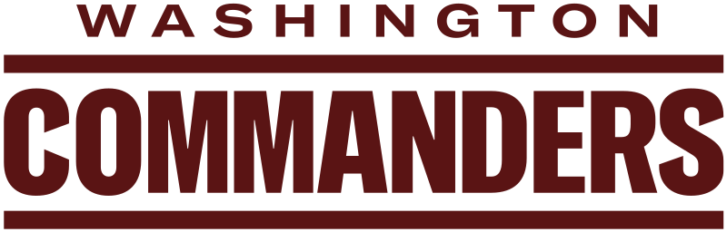
Washington Commanders NFL logo
The Washington Commanders is one of the oldest teams in the NFL, formed in 1932. Initially called the Washington Redskins, the professional football team has played over a thousand games. It is also one of the five NFL teams to record more than 600 wins throughout their career.
They were the first NFL franchise to hire a marching band and devise an anthem. The adoption of a native American caricature for their logo drew a lot of criticism, just like the symbol for the Chicago Blackhawks, once one of the more popular NHL logos. This highlights the importance of tweaking your logo over time due to changing design perceptions, a case that resulted in the Washington Commanders logo redesign being one of the biggest NFL logo changes in recent history.
- The first Washington Commanders logo was revealed in 1935, which featured a Native American man. This version was used from 1935-1959, with the only change within that time in 1952. That is when the caricature of the native American man was given additional details.
- From 1960-1964, the logo symbols remained the same but done in the team color of burgundy offset by white. Then from 1960-1969, the logo was changed to a native American spearhead.
- In 1970, the logo was redesigned and featured a bold uppercase R within a circle, both drawn in team colors, with a couple of feathers attached to the circle’s left edge.
- In 1970, the logo was redesigned and featured a bold uppercase R within a circle, both drawn in team colors, with a couple of feathers attached to the circle’s left edge.
- In 1972 the logo was redesigned again. The letter R was replaced by a native American man’s caricature within the circle.
- 2020 saw the logo changed again, this time due to the fact that the team’s name and iconography was akin to native American cultural appropriation, and as such was considered socially insensitive. The new design featured a simple wordmark of the team’s new name, Washington Football Team, and used simple logo fonts to write it in.
- Playing under the moniker of “Washington Football Team” for two seasons, they rebadged themselves as the Washington Commanders for the 2022 season with a new, lettermark logo like that of the Green Bay Packers.
This version of the Washington Commanders logo was unveiled for the 2022 NFL season, with a new design featuring the team colors, and a great design.
NFC – North Division’s Classic NFL Team Logos with Names
One of the four divisions of the NFC, the North Division, is known as the “The Black and Blue Division.” That is due to the intense rivalry and competition between this sector’s teams. Three of the four division teams have played against each other since the mid-1930s, with the fourth team joining them in 1961.
With five NFL championship titles, this division is known for its rough style of play. The current defending champion for this division is the Detroit Lions. The Minnesota Vikings hold the highest number of division titles at 21 wins.
Chicago Bears NFL Logo Evolution
Starting as the Decatur Staleys, the Chicago Bears came into being in 1919. In 1921, the franchise moved the team to Chicago and was renamed the Chicago Staleys. And finally, in 1922, the visionary team owner George Halas changed the team’s name to the Chicago bears.
It is one of two original franchises who have been playing since the founding of the National Football League in 1920. The other team is the Cardinals. It is their long history in the NFL that helps them play with one of the more minimalist logos in the league without affecting their following.

- The iconic Chicago Bears logo with a large, stylized C was released in 1962, featuring the beautiful design of the letter. Initially colored white, it was modified in 1974. It featured the same logo, with a new color scheme of orange with a white outline. This version of the logo was used for nearly five decades, but was replaced for the 2023 season.
- The new logo features a large, snarling bear’s head. The navy blue color is used for the outline of the design, as well as the highlights. However, the bear’s head is colored in the franchise’s iconic burnt orange, which adds to the league’s list of unique, aggressive NFL logos.
Over the years, the franchise has tried out different variations of its classic, C logo. And that is why, despite the fact that the team has been playing with a vastly different logo for two seasons now, people still know and recognize the previous design.
Detroit Lions NFL logo
Originally called the Portsmouth Spartans, the franchise came into being in 1930. Over the next four years, financial issues forced the team to move to Detroit in 1934. Honoring the native MLB franchise’s naming theme, the Tigers, they renamed the Detroit Lions.
From 1935-1957, the Lions won four NFL Championship titles. Since then they have only won a single playoff game in 1992. However, they haven’t been able to advance further than the NFC Championship. That makes them the oldest and only NFC team to not participate in the Super Bowl despite being active the entire era.

- The first logo for the franchise appeared in 1952. It featured a crouching and snarling lion beside a football player getting ready to run. This logo saw use until 1960, where the logo received a massive change.
- The new logo features a white lion superimposed on two bars colored blue, a dark blue, and a light blue. This logo was used from 1961-1969.
- In 1970, the Detroit lions logo was redesigned again to form a lunging blue-colored lion accented in white. The logo’s general shape has stayed the same since then. The only difference is the various color accents added and the outline refined to make it look sharper and refined.
Green Bay Packers NFL logo
Based in Green Bay, Wisconsin, it is the third-oldest franchise in the NFL. It is also the only community-owned major league professional sports team based in the US. Inaugurated in 1919, it is the last of the typical small-town teams common in the NFL’s early days.
The smallest pro-sports team in the country, the team was worth an estimated $2.63 billion in 2019. This made them the 27th most valuable sports team globally. The team has also been one of the most successful teams in the NFL, with nine pre-Super Bowl NFL championship wins and four Super Bowl titles to their name.

- The team’s first logo was released in 1921, which featured the name “Acme Packers” in gold upon a dark blue background. This logo was not an official team logo and was used to appease the original sponsors for the playing equipment.
- The following logo was released in 1951 and was used till the 1955 season. It featured the word “Packers” in bold capital letters colored dark green, superimposed over an orange football.
- The logo was redesigned for the 1956 season, which featured a quarterback superimposed over the map outline of Green Bay, with the entire image placed in the middle of an upright football. It was used till 1960.
- For the 1961 season, the new logo was an elongated letter G, made in the style of emblem logos and designed with a football shape. This logo has been in use since then, with minor cosmetic changes.
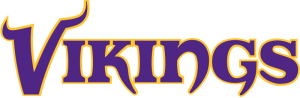
Minnesota Vikings NFL logo
Started in 1960 as an expansion team, the Minnesota Vikings have the highest winning percentage in the NFL. It is a feat unheard of for a team that has never won a Super Bowl, with the highest playoff loss score of 30 losses.
Moreover, they have the highest playoff runs, the highest conference championship appearances, and the most division titles for any team in the NFL.
Minnesota is home to a large population with Scandinavian lineage. The name and the logo for the franchise pay homage to that fact.
- The team’s first logo was released in 1960, which featured a left-facing Viking man with a classic horned helmet and long braids. The helmet and the hair were colored a light gold with a purple band encircling the helmet, which was the only colored element of that logo.
- The logo saw a revamp for the 1966 season, which featured the same logo with only minor changes. The face on the logo is now faced right instead of left. The golden and purple colors were made a little brighter, and the Viking man’s face was colored light pink.
- The current iteration of the Vikings logo is just a minor variation of the previous logo. The new logo is a little bigger and bolder, which sharper lines and clear outlines.
This version of the logo has been in use since 2013 and has been quite a hit with the fans.
NFC – South Division NFL Team Logos with Names
Formed as a division before the 2002 NFL season, it consists of three teams from the NFC West and one team from the NFC Central, now the NFC North. The defending division champions are the Tampa Bay Buccaneers, with six division titles since the start of the division in 2002.
Atlanta Falcons NFL logo
The Atlanta Falcons team has an interesting origin story. They came into being when the NFL offered their owner at that time, Rankin Smith, a franchise in the League. They were worried that he might join the American Football League, which was the rival football association to the NFL at that time.
The franchise came into being at the end of the 1965 season, and in the 55+ years since they started, their logo has seen some minor design changes.

- The first logo was released in 1966 and featured a flying falcon reaching out with a claw. The design was done in simple, solid black on a white background.
- In 1990, the logo was modified slightly, given a thin black outline separated by a band of white, which made the design stand out better.
- In 2003, many teams, including the Falcons, modified their logos with modern design techniques, making them in cartoons. The new logo shortened the design and removed everything after the falcon’s wing, and added maroon accents to the design.
The team is using this design to this day.
Carolina Panthers NFL logo
One of the youngest franchises in the NFL, the Carolina Panthers franchise started in 1995 as an expansion team in the NFL. Unlike many other teams supported by their home states, the Panthers are claimed and supported by both South Carolina and North Carolina. This unlikely friendship has fostered hashtags such as the #OneCarolina, which signifies that they are the team for both states.
In the short time since they joined pro football, their logo has seen some minor changes.

- The first logo featured a snarling head of a black panther, accented by blue. Since its release in 1995, the design is still used to this day.
- The logo was tweaked a little in 2004. The colors were made darker, and the white whiskers of the panther were changed to the same blue as the accents.
With a robust initial design for their logo, they have not needed to make any changes to it so far.
New Orleans Saints NFL Logo
The New Orleans Saints started in 1966 and is one of the older teams in the NFL. Featuring a mix of gold, white, and black as their colors, they pay homage to their legacy as the brainchild of oil business people.
The team’s name was chosen as Saints for the iconic jazz music called “When the saints go marching.” Moreover, as the New Orleans area is predominantly French-influenced, it is easy to see why they chose a fleur-de-lis logo.

- The first logo was a solid black fleur-de-lis outlined in black, separated by a band of white. Since its release in 1967, the design has been used for more than three decades.
- In 2000, the logo was modified. The new logo now had the primary design colored a dark gold, with the surrounding outline bolder.
- In 2002, the golden color on the logo was lightened a few shades, lightened even further in 2012 to turn it into almost a pale gold color.
- In 2016, the New Orleans Saints logo current iteration was formed, where the color was made darker again, making it similar to the 2002 design of the logo.
Tampa Bay Buccaneers NFL logo
The Tampa Bay Buccaneers are the franchise hailing from Tampa Bay, Florida. Joining the NFL in 1976, they have been plagued with many issues that have seen them put on a dismal display.
Formed when a tax attorney Hugh Culverhouse from Jacksonville, was offered a franchise in the NFL, the team got their first-ever win in the 13th game of their second season, starting their career with zero wins and 26 losses.
Over the years, their logo has changed three times.

- The first logo released in 1976 featured a flamboyant sailor with a dagger clutched in his teeth. The logo was done in a pale red and yellow and portrayed a daring buccaneer.
- The logo was redesigned drastically in 1997, twenty-one years after the first logo. This logo featured a pair of crossed swords under a skull, with a football between the swords’ crossed guards, all displayed on a flag mounted on a blade. The flag was a burgundy color, as well as the hilt of the sword.
- 2013 saw the logo changed again. The color of the flag was changed to a dark red-orange, the swords’ style was changed, and the skull.
- 2020 saw the flag return to that from 2013, and it is being used nowadays.
NFC – West Division NFL Team Logos with Names
Formed in 1967, this division is one of the only two divisions in the NFL whose member teams have all won at least three division titles since its inception. They are also the second division to have each member team participate in a Conference Championship game and a Super Bowl appearance.
The current defending division champions are the San Francisco 49ers, who also hold the highest number of division titles at 22 wins.
Arizona Cardinals NFL logo
The Arizona Cardinals were established in Chicago in the late 1800s, and they began as an amateur football team, which joined the NFL in 1920. After spending 40 years in Chicago, the Cardinals moved to St. Louis for the next 28 years. Finally, in 1988, the team moved to Phoenix, where they are situated to date.
Their logo, too, saw three different designs based on the city they called home at the time.

- Their first logo designed in 1920 featured the classic double C, colored a deep purplish-burgundy.
- In 1947, the logo was changed entirely, now featuring a light red colored cardinal atop a football. This logo was used for the next 12 years until the team moved to St. Louis.
- The first St. Louis logo featured a buff cardinal in football pants and cleats running under the St. Louis arch with a football. Since its design in 1960, the logo was used for nearly a decade.
- The logo was redesigned in 1970, now featuring just the head of the cardinal colored a deep purplish-red.
- Moving to Phoenix, Arizona, in 1988, the logo was retouched a little. The orange-colored beak and the color of the cardinal were lightened a few shades.
- The final change came in 2005, where the cardinal head was tilted down a few degrees, and the entire design was outlined in bold black, making it stand out better. This version has been in use to date.
Los Angeles Rams NFL logo
Established in 1936 as the Cleveland Rams, they joined the NFL in 1937. The team holds the NFL record for being the only team to win League Championships representing three cities. They won for Cleveland in 1945, Los Angeles in 1951, and St. Louis in 1999.
Their logo has gone through several changes over time, especially with them moving to different cities during their career.

- The first logo was designed in 1941 and featured a right-facing ram’s head. The design was done in blue over a white background.
- In 1944, the logo was redesigned, with the ram’s head now facing left. Additionally, the logo lines were smoothed out, and the white spaces in the logo were replaced with a light blue color.
- The 1951 redesign says the ram’s head gets more detailed, and the color of the horns a dark golden-yellow.
- In 1972, the LA Rams logo was mirrored again to look right, and the emblem removed all colors from the logo, leaving just an outline of the ram’s head.
- From 1983-1994, the logo featured the ram’s helmet, with a minor redesign in 1989, making the helmet more detailed.
- From 1995-1999, the logo was a blue and yellow wordmark with the team’s name in St. Louis.
- In 2000, the logo was a blue ram’s head and neck, accented by dark grey. The emblem was retouched in 2017, which removed the gray color from the logo, leaving white in its place.
- Finally, the LA Rams NFL logo was changed into a stylized lettermark with LA’s letters as their logo.
The LA Rams’ new NFL logo is a sharp contrast against the other teams, considering their use of a lettermark-based design.
San Francisco 49ers NFL logo
The San Francisco 49ers were formed in 1946 and joined the All-American Football Conference as a pro team. They soon became the first team from one of the four big sports to be established on the West Coast. Through the years, the logo for the team has seen little change.
- The first logo released in 1946 featured a gold miner from the San Francisco gold rush of 1849. The image showed the man firing a pair of guns, with his hat falling off.
- In 1968, the logo was redesigned quite drastically, now featuring the stylized initials of San Francisco within a red oval. The oval was outlined in black.
- In 1996, the San Francisco 49ers logo had some minor changes done to it. The white characters were outlined in black, the red of the background was made darker, the black outline around the oval was now thicker. A thin golden outline separated it from the inner red color.
- In 2009, the red color was changed to a deep crimson, and the lines of the logo were made sharper. That made the letters on the logo pop out of the image, giving a good effect.
Seattle Seahawks NFL logo
The NFL decided to award an expansion franchise to the city of Seattle in 1974, and the name Seahawks was chosen through a public contest. The first season they played was in 1976. Over nearly five decades of playing, their logo has seen just one significant design change.

- The team’s first logo featured an Auger Hawk head, colored in bright blue and pale green. Since its release in 1976, this logo saw use for 25 years of the team’s career.
- The logo saw a minor change in 2002, where the bright blue was changed to a royal blue, the green was changed to a sea blue hue, and the hawk head’s profile was made thinner, sleeker, and more aggressive.
- The logo was refined further in 2012, with the only change being that the sea blue shade was changed to a pale gray-blue. The team is still using this logo to this day.
American Football Conference’s NFL Logo History
The second Conference of the NFL, the AFC, consists of 16 member franchises like the NFC. The structure for the divisions is the same as its counterpart, with four divisions named according to the cardinal points of a compass, and each division has four teams in it.
The current defending champions for the Conference are the Kansas City Chiefs, with the New England Patriots holding the highest number of Conference titles with 11 wins.
AFC – East Division’s Professional NFL Team Logos with Names
The AFC East Division was formed in 1960 as a counterpart to the AFC West Division. The division consists of some of the best teams in the NFL, who have taken part in twenty-two Super Bowls, and won 11 of them. The current defending champion for the division is the Buffalo Bills. The New England Patriots have the most significant number of titles with 22 wins.
Buffalo Bills NFL logo
The team was initially known as the Buffalo Bisons, but in 1947 decided to rebrand themselves. Thus they named themselves the Buffalo Bills. However, the name was not theirs for long, as they were merged into the Cleveland Browns in 1950.
While that team is no more, the name was so popular that a new Buffalo Bills formed in the AFL in 1960. and the 1970 merger of the NFL and the AFL made the team join the NFL.

- In 1960, the team released their first logo, which featured a pair of football players running with the ball, followed by a bison herd. The image was done in a mix of blue and white over a blue background, with the bison colored brown.
- In 1962 the logo was changed and featured a football player in Buffalo Bills colors holding a football superimposed over an American bison’s image. The entire design was bound within an oval used to mimic a football. Except for the football player in full color, the rest of the image was done in various shades of brown.
- From 1970-1974, the logo was changed to a red standing bison.
- In 1974, the logo was altered into a running blue bison with a red streak running from its horn. This logo has been used since then.
Miami Dolphins NFL logo
The franchise was part of the AFL since 1965 when they were awarded a franchise as expansion. The early 70s were a great time for the Dolphins, where they were the first team to advance to three league championships in a row. Moreover, they are the only NFL team to have a perfect season ever, which they had in 1972.

- The first logo released in 1966 featured a dark gray-blue dolphin wearing a football helmet, surrounded by a stylized orange circle mimicking a bright Miami sun.
- In 1974, the logo was modified a bit. The image was blown up in size, and the shades of orange and blue were lightened a few shades to make them brighter.
- The 1989 season saw the Miami Dolphins logo now featuring a darker green-blue color for the dolphin and a more vibrant orange color for the sun halo at the back.
- In 1997, the logo was redesigned to give it a smoother and more detailed look. The design lost the added style accents to the sun halo at the back, and the dolphin now looked like a complex cartoon-style character.
- The 2013 redesign saw the logo losing the cartoonish aesthetic, and the helmet and the tail now up. The sun and the dolphin’s colors were lightened in several The halo at the back was given additional spikes mimicking sunrays. This logo is still being used, with a slight darkening of the colors seen in 2018.
New England Patriots NFL logo
Starting as the Boston Patriots in 1960, they were named after the people of the thirteen colonies who rebelled against the British empire. After the NFL-AFL merger, the name was changed to the New England Patriots. And with NFL superstar Tom Brady leading the team for much of their 2001-2019 domination, the New England Pats have some of the most sought-after NFL logo merchandise today.

- The first logo from 1960 featured an American soldier of the revolution getting ready to spike the ball. The design was rough yet brightly colored in navy blue and orange.
- The 1972 redesign saw the image looking more refined in design and colors becoming more profound and darker.
- The 1989 redesign saw the logo lose some of the additional colors from the previous redesign but kept the same design style.
- The radical 1993 redesign saw the logo changed entirely. The logo now features a head of a revolutionary war, elongated to look like a pennant or a banner. The colors used were the same as the previous logo.
- In 2000, the logo’s current version was unveiled, with the same design as the previous logo, with darker shades of the colors used, similar to the US flag.
New York Jets NFL logo
One of the charter members of the AFL and was called the Titans of New York. After three seasons, they changed their name to the Jets. After winning the AFL title in 1968, they played against the NFL champions in Super Bowl III. They were so successful against the opposing team that it became a deciding factor in the AFL-NFL merger.

- The first NFL team logo in the AFL was a running football player’s image with the team’s name in golden brown and black letters, released in 1960.
- After the name change in 1963, the logo was changed to a simple image of a green airplane with the words Jets written on it in white.
- In 1964, the logo redesign featured a green outline of a football, the word “NY” written using a green outline and white color. The team’s name was registered in solid green on top of the city’s initials. At the foot of the letters was a small green football.
- The 1967 redesign flipped the color scheme, with the white characters now green and vice versa.
- In 1978, the redesign lost the old style and used the team’s name in a sharp and angled typeface. The top of the letter “j” featured a straight horizontal line with an airplane profile on top.
- The 1998 redesign reverted to the older oval logo design but now featured sharper and cleaner lines and changed the lighter green to a deeper and darker, almost black shade of green.
AFC – North Division Creative NFL Team Logos
This division was formed in 2002, after the NFL restructuring. It is also the only division in the League not to have a Super Bowl hosted in its stadiums. The current reigning division champions are the Cincinnati Bengals, who took their tenth division win.
Baltimore Ravens NFL logo
The team came into being after the Cleveland Browns owner decided to move the team to Baltimore. The team needed to be renamed due to the team’s deal with the NFL that they leave the history and legacy of the Cleveland Browns name behind for a replacement team to take over.

- The first team logo was released in 1996, just after the team was established. It featured a shield with raven wings accented with purple. The shield featured a dark yellow background with a stylized B on it and the team’s name in a white over black background in a bar on top of the shield.
- In 1999, the logo was redesigned and featured a stylized raven head colored purple, accented in light gold and black, with a white beak. The initial of the city was at the back of the design colored a pale gold. The team is still using this logo, one of the prime examples of purple logos that are done well.
Cincinnati Bengals NFL logo
Under the ownership of Paul Brown, an AFL expansion team was offered for the city of Cincinnati. He named it the Bengals to honor the old AFL team who played for the town from 1937 to 1942.

- The first logo released in 1968 featured a cartoon Bengal tiger running with a football, with the team helmet flying off his head. The image was colored brightly in orange with gray and white accents.
- The new logo released in 1970 was just the team’s name in big and bold letters, and this version was used for the next decade.
- From 1981 to 1996, the new logo was used, which featured an orange helmet with black tiger stripes. The only change it saw in that time was the change in the facemask design in 1990 and the tiger stripes’ shape.
- In 1997, the team redesigned their logo to feature a cartoon-like snarling tiger head facing left slightly.
- In 2004, the current logo was released, which featured a bold letter B colored orange and accented by black tiger stripes. The team still uses this logo.
Cleveland Browns NFL logo
Started in 1944, the original Cleveland Browns were a part of the AAFC. After moving to the NFL in 1950, the team played for the League for the next four and a half decades. That was until they moved to the city of Baltimore. Unable to take the name with them, a new team was formed for the Cleveland seat in 1999.
- The first logo in 1948 was that of an elf named Brownie, holding a football and colored using shades of brown and white.
- In 1959, the logo was redesigned with the elf’s image now facing left and colored in bright orange and black, accented by white.
- In 1970, the logo was a Spartan orange football helmet with a red and white stripe running the top length of the helmet.
- In 1986, the logo was modified after a decade and a half of use. It featured a slightly more detailed helmet with a 3-D motif, featuring the new facemask and a darker shade of orange for the helmet. It was used till 2014, with only minor changes to the style of the helmet or the facemask color.
- The current version of the logo is similar to the previous version, with a cleaner line, a brighter orange color, and a new facemask style, which makes for a great NFL logo vector art if you want to add it to your designs.
Pittsburgh Steelers NFL logo
An old team, they started in 1933 and was named the Pirates like their patron baseball team. In 1940, the team owner decided to change the name to differentiate themselves from their landlord baseball team and called it the Steelers as an homage to the city’s most significant industry.

- The first logo for the team released in 1933 looked more like a seal than a logo, with an ornate shield under a castle fort’s image. The shield was black with a flowing and convoluted edge, a checkered blue and white banner running through its middle, and three gold images on it, one at each corner.
- After the US involvement in WW2, the logo was redesigned to honor the city’s largest steel production industry. It featured an oval logo with three images depicting the process of making steel. The name of the team was written in a bar that ran around the oval.
- In 1962, the logo was redesigned and featured a steelworker kicking a ball in work boots astride a steel beam. Using a simple black and gold color scheme, this logo was used for six years.
- The logo’s current form came about in 1969. Three concave diamonds colored red, blue, and yellow to the right inside a circle and the team’s name on the left edge of the ring. The ring had a thick gray outline on a white background. The logo saw a minor change in 2002, adding a thin black outline to the circle’s outer edge.
AFC – South Division NFL Team Logos with Names
One of the four divisions from the AFC, it comprises of three teams from other divisions and one entirely new team. It is often called the latest division, and it consists of teams that have played 20 or fewer seasons in their home cities. Its current division champions are the Houston Texans. In contrast, the team with the highest number of division titles is the Indianapolis Colts, with nine wins.
Houston Texans NFL logo
It was the last of the current NFL teams to be inducted into the League, joining in 1999. Named the Texans, they were the second team to hail from the state of Texas after the Houston Oilers, who moved to Tennessee in 2002.

Since their inception, the team has had one logo: an image of a steer head with the right half colored red and the left half colored blue with a single white star on that side. It pays homage to the State of Texas’s nickname as the “Lone Star State”, and is a perfect example of textbook Houston logo design.
Indianapolis Colts NFL logo
Originally called the Miami Seahawks, the team was relocated to Baltimore and joined the NFL a few years later. After the original team disbanded, a new team took the franchise’s name and became the Colts. In 1984, due to poor performance, the team owner decided to move the team to Indianapolis.

- The first logo released in 1953 featured a horse jumping over the football goal posts, wearing a football helmet, and holding a football in its front hooves.
- The 1961 redesign lost the goalpost from the image and made the blue of the design a darker shade.
- After their move to Indianapolis, the logo was changed to a bright blue horseshoe.
- For the current version, the logo was made a darker blue color in 2002, which is being used today.
Jacksonville Jaguars NFL logo
After the 1993 season, Jacksonville was offered to form a franchise for the NFL. This team and the Carolina Panthers were the first teams to enter the NFL as expansion teams in almost two decades.

- The first logo released in 1995 was a pale yellow panther head, accented by white and black colors. The image was not as sharp as some of the other logos we have discussed, but it portrayed the imagery quite well.
- It saw another redesign in 2013; the logo now featured a more detailed design for the jaguar head, with blue accents to offset the black color used for the dark areas. The yellow was also changed to a darker, sandier yellow color of the actual jaguar and added stylistic accents to make it look more realistic.
This logo design is still in use nowadays.
Tennessee Titans NFL logo
Originally hailing from Tennessee, the team was named the Houston Oilers. After moving to Tennessee, the team was renamed the Tennessee Oilers and then the Tennessee Titans. Beginning as a charter member of the AFL, the team was quite successful in the 1960s. They were also the first NFL team to play in a domed stadium, ushering in a new era of the sport.

- The original team logo released in 1960 featured a football player wearing a cowboy hat, riding boots, and holding a football. The colors used were bright blue and yellow-gold.
- In 1961, the logo was changed slightly. The hat was replaced by a safety helmet and the yellow-gold with a steel gray color.
- The 1969 logo redesign featured a simple outline of a player’s head encased in a football helmet, with an oil rig outline on the helmet.
- In 1972, the logo had colors added to it, with the outline of the head now bright blue and the oil rig now colored red.
- In 1980, the team designed a new logo, a giant oil rig drawn using a bright blue color outlined in a bold red color. This logo was carried over to Tennessee by the team as well.
- The logo’s current version features a sharp and angled uppercase T encased within a flaming circle. The design was drawn using white on a dark blue background; the ring has three red stars placed around the letter T. The flames are a lighter blue accented by red for a stimulating effect.
AFC – West Division NFL Team Logos with Names
This division for the AFC has sent a team to the Super Bowl eighteen times since its formation, starting from the first Super Bowl. As of 2020, the Denver Broncos and the Las Vegas Raiders have the most Super Bowl wins of the division, with three wins each. The current reigning division champions are the Kansas City Chiefs, with their 14th division title. The record for most wins in the division is a three-way tie between the Las Vegas Raiders, Denver Broncos, and the Los Angeles Chargers with 15 wins each.
Denver Broncos NFL logo
Established in 1959, the team was named via a naming contest, which yielded the Broncos’ winning name. Originally a part of the AFL, they joined the NFL after the AFL-NFL merger in 1970.

- The original logo released in 1950 featured a football player riding a bucking horse. The logo was done using the colors yellow and brown.
- The 1962 redesign featured a football player with the ball in hand, standing atop the bucking horse holding the reins. The color used now was a shade of orange-brown, accented with black and white to offset the images adequately.
- The 1970 redesign featured a giant letter D with a snorting and rearing horse showing through the letter’s middle. This logo ran until 1996, with a minor redesign in 1993, where the logo lines were made more evident, and the details were made sharper.
- The current Denver Broncos logo was designed in 1997 and featured a windswept bronco head drawn in a cartoon-like style. The shape is done using a dark navy blue, with the mane and the horse’s eye colored bright orange, making it one of the most iconic NFL logo symbols today.
Kansas City Chiefs NFL logo
The franchise was founded in 1960 and named the Dallas Texans. After moving to Kansas City in 1963, the team changed its name to the Chiefs. It was one of the primary figures in making the NFL-AFL merger happen.

- The team’s original logo featured a cowboy firing a gun with one hand and holding a football under the other arm, all while running. The background was a red-colored map of Texas, over which the image of the cowboy was superimposed.
- After the renaming, the image changed. Texas’s map was now devoid of all colors. The image on top was changed to that of a native American war chief wielding a hatchet while running with the football under their other arm.
- The current logo was designed in 1972, which featured the initials of their base city written in red, with an outline of a primitive native American arrowhead around the initials.
Las Vegas Raiders NFL logo
The Raiders originated in Oakland and got their name through a public naming contest. Over the years, the team has moved back and forth between Oakland and Las Vegas, finally settling to play in Las Vegas for the 2020 season.

- The original logo showed an upright football image with a pair of crossed swords behind it. It featured a football with the image of the player’s head clad in a football helmet, the pirates wearing an eyepatch – a classic piece of the pirate ensemble. The football and the hilt of the swords were colored yellow, accented by black.
- In 1963, the logo was changed and now featured a shield instead of a football. The entire image of the previous logo sans the football was added to the shield. Still, the yellow color was now replaced with a silvery gray. The name of the team was at the top of the shield.
- In 1964, the current version of the logo was formed, which simplified the shield’s design and made it solid black. The swords were also shortened to fit within the shield. A stripe was added to the middle of the football helmet. The top of the shield now only featured the nickname of the team.
This version has been in use till now.
Los Angeles Chargers NFL logo
One of the eight AFL teams that were initiated in 1959, the team started playing in 1960. After only one year of playing from LA, the team moved to San Diego. After a decade of playing for the AFL, the team joined the NFL as part of the AFL-NFL merger as the San Diego Chargers. Finally, the team moved back to Los Angeles in 2017.

- The original logo featured a shield with the head of a horse over a lightning bolt. The colors used were bright blue and yellow.
- The logo was changed in 1974. It now featured a helmet with a curved lightning bolt along the top of the helmet shell. The color of the helmet was a dark blue, with a darker yellow used for the lightning, outlined in white.
- The logo was changed somewhat in 1988, where the helmet was angled for a three-dimensional effect. The logo’s colors were also changed, as were the helmet’s visual style and the lightning bolt on top.
- The 2002 logo redesign saw the use of just the lightning bolt as the logo. The logo was designed with a double yellow and dark blue outline with a white background.
- The logo was touched up in 2017. The bolt is now a dark yellow, and the outline a double line of dark and light blue. This logo is the one being used now.
4 NFL Teams with a Star in their Logo Meaning
Nearly all of the NFL logos are iconic in their own ways, whether its due to a long-used brand symbol, or due to high exposure and popularity. But some of these franchise symbols are also unique in some other manner as well.
For example, some of the teams playing in the NFL are known for sporting iconic American football logos with a star in their design. However, for each of those teams, the meaning behind that logo symbol is different. Here’s what the star signifies in these NFL team logos.
Dallas Cowboys:
- Blue and white star logo
- Represents Texas as the Lone Star State
- Simple and recognizable design
Kansas City Chiefs:
- Red arrowhead shape logo
- White silhouette of a Native American headdress
- Yellow star in the center, representing champions
Houston Texans:
- Blue and red bull’s head logo
- Silver star within the bull’s head
- Represents unity, leadership, and excellence
- Incorporates Texas state flag colors
Los Angeles Chargers:
- Navy blue letter “L” logo
- Yellow lightning bolt running through the “L”
- Lightning bolt shaped like a star
- Represents the team’s electrifying style of play
- Blue and yellow color scheme for a vibrant identity
Frequently Asked Questions about NFL logos
| What do the eight stars on the NFL logo 2024 mean? The eight stars on the logo signify the eight divisions of the NFL, four from the AFC and four from the NFC. In previous years, the shield featured 25 stars, which signified the 25 teams who played the sport at the time. |
| Why is the Philadelphia Eagles logo facing left? Some people say that the letter E becomes visible within the design by facing the left. But the franchise has never said whether it’s true or not. And if that is true, it is a massive coincidence. |
| Was the NFL logo changed? The NFL logo has changed quite a few times during the years, in a drive to improve the symbol and make it more relatable to the teams and the fans. The current version has cleaner lines, and sharper visuals to make it look more like the current NFL team logos. |
| Who made the NFL logo? The in-house marketing team designed the current NFL logo under the supervision of the Senior Vice President of Marketing at the time, Lisa Baird. |
| What does the NFL logo mean? The NFL shield logo is meant to represent the high sporting standards that the league aims to uphold. The colors are those of the American flag, featuring red, blue, and white in its design. |
| What is an NFL logo? The NFL logo is a shield logo that represents one of the Big-Three sports leagues in the United States, the National Football League. |
| How many NFL teams have logos? Currently all 32 teams playing in the NFL have their own logos. |
| What are the most recognizable NFL logos? The Minnesota Vikings, New England Patriots, and with the recent change in design; the Washington Commanders have some of the most popular logos in NFL. |
| What colors are used in the NFL logo? The NFL logo features some interesting color combinations, combining the American red, white and blue to make their design pop. |
| How have NFL logos changed over time? Over the years, the NFL logos for the teams and the league have changed for the better, tweaking their designs for the modern aesthetic without losing their historic appeal. This way, the teams are able to attract new, younger fans while still retaining the loyal older fans. |
| Which are the most popular NFL logos and teams? While every team is dear to their local fans, the New England Patriots, Carolina Panthers, and the Dallas Cowboys enjoy a greater amount of fame and popularity than other teams. |
| What are the most iconic NFL logos? San Francisco 49ers logo design, as well as the symbol for Cincinnati Bengals and the Philadelphia Eagles are some of the most iconic designs. |
| Which are the most popular NFL logos and teams? While every team is dear to their local fans, the New England Patriots, Carolina Panthers, and the Dallas Cowboys enjoy a greater amount of fame and popularity than other teams. |
| What are the coolest NFL team logos? The top five NFL logos ranked, according to our experts, are: Green Bay Packers New England Patriots Denver Broncos Chicago Bears Dallas Cowboys |
Conclusion
In the end, the history of the NFL team logos for the franchises that play this sport is quite extensive and interesting. Covering them all in detail within a single article is doing them an injustice. But if you want to take an overview of all 32 NFL teams logos and how their current designs came to be, you will find that the article above covers the topic in comprehensive detail.
Many of the NFL team names and logos mentioned above are those you might find on sports jerseys or maybe merchandise like the NFL logo wallpaper with team symbols centered on the NFL shield. However, these are all proprietary logo designs, which require that you get permission from the owner before using them within your own art. However, you can use these designs as inspiration to create the perfect logo for your own American football team.
Latest news you want to know!
Subscribe for cutting-edge design inspiration at Logo Poppin! Elevate your brand with updates on logos, branding, web design, and video animation.
Note that by clicking “subscribe,” users may agree to our privacy policy and consent to Logo Poppin to use your contact data for newsletter purposes.
Logopoppin
Logopoppin is a graphic design agency that specializes in logo designing, web development, video production and advanced branding services. We love to innovate businesses with new age technologies, allowing them to improve their visual reputation.

