Table of Content
Discover How Animated 3D Logos Can Boost Your Brand Visual’s Authority
The primary function of a brand logo is to be memorable, in order to represent their business. As one of the first branding materials to interact with the audience, your logo needs to be unique and attractive. And what could be more unique or interesting, than a 3D logo design?
Now, with most of the business world opting to go for the minimalist route, you might think that choosing a 3D logo might seem counterproductive. But that is not so. Minimalism in your design means adding just enough design elements that your logo’s meaning is apparent, and no more. Considering that the three dimensional design elements are essential to the 3D logo’s design, we can use a three-dimensional logo with a minimalist aesthetic.
So, without further ado, let’s take a look at how a professional logo design agency creates 3D brand icons, and why you should get one for your brand too.
What Are 3D Logos?

Take a look at a general logo. It got a width, and a height, but no depth. That is what we call a 2D logo, or a two-dimensional logo. A three-dimensional logo is designed with an additional visual dimension, that makes it look like the design is popping off its medium, due to the sense of depth it portrays. And the best part – simpler designs make for better three-dimensional logos. That means you can uplift the visual impact of your minimalistic logos too.
Think of it like the same concept as that of a 3D movie nowadays. Unlike a conventional film, these videos seem more tangible, more realistic. But unlike in a movie where you have to wear special tinted glasses to get that effect, 3D logos are designed in a way that the 3D effect can be perceived by the naked eye.
So now that you know how interesting a 3D brand logo is, you might be thinking – well if it’s so great compared to 2D logos, why doesn’t everyone use them?
Well, the answer to that is quite simple. Just like there are advantages to creating and using a 3D symbol, there are a few disadvantages too. For one thing, even the simplest of these three-dimensional designs have a lot of fine detail, detail whose presence might not be perceived when there, but whose absence will be sorely felt if not.
So, unless you have specifically designed your logo to cater to specific mediums, you will find it next to impossible to use it as easily as say, a 2D logo. But not to worry. If you know the different mediums you will be printing your logo on, you can avoid these issues easily – given that you know the right tips and techniques.
Why Does Your Brand Need 3D Logo Design?
As we discussed earlier, there are a lot of reasons you might want a 3D logo design for your business. For one, you might be trying to make your brand unique among a highly saturated and competitive market. A unique logo will make it easier for the consumers to remember your brand, improving your branding strategy’s impact.
Another reason could be that you want to revamp your brand logo, and you want a design that still retains its familiarity while at the same time be completely distinct. In this, a reimagining of your logo’s design into a three dimensional logo would be a great choice.
Similarly, there may be many other situations and scenarios where a 3D logo would be a great choice to have, especially if your plan is to grow your business. The current scarcity of three dimensional brand logos will ensure that your logo is set in a league of its own.
Elements That Can Help You Create Powerful Animated 3D Logos
Now that you know how an innovative three-dimensional logo can help your business, the next step would be to learn how to design a logo that can help your brand grow with its 3D design. For the most part, the basics for creating a powerful three-dimensional logo are the same as that of designing an impactful two-dimensional logo.
However, it’s a few additional details for a 3D design that can be the difference between a successful logo, and one that fails to do its job. So, what can you do to avoid this fate?
Listed below are three of the most important elements that can elevate your logo’s impact from meh to WOW! Let’s find out what they are.
Setting The Right Tone
Truly unique logos are a thing of dreams nowadays, with many people taking more than just inspiration from their competitors’ logos. And this is where 3D logos have an edge over 2D logos. The reason for that is quite simple.
Two dimensional brand logos have just got their visuals to portray their brand message. That means they are somewhat limited in how expressive they can be about your brand message and aesthetic. That is where the tone of the logo comes in. The tone allows the logo design to express the brand more clearly than just the shape or design of the brand symbol could.
This is why you will see some of the more modern companies who aim to disrupt the current market via their offerings use 3D logo designs as their brand symbols. They want their audience to think that there’s more than what meets the eye when it comes to their companies. Their aim is to show that just like their intricate brand logo, they are fluid, amorphous, flexible.
Casting Shadows, The Right Way
One of the most common ways we differentiate three-dimensional imagery from two-dimensional imagery, is the presence of shadows and highlights. As humans, we expect something with a depth to have some sort of shadow, depending on how they are interacting with the source of light. If the light is coming from the front, the shadow should be at the back. if from the top, then the shadow should be at the bottom of the object.
The presence of a shadow tells us that the object has weight. However, positioning the shadows the right way is just as important as having them in the first place. With so much of our lives spent viewing the shadows we and the objects around us throw, our minds are attuned to them. When we see a shadow, the first thing our minds automatically do is see if the shadow suits the position of the object and the source of light.
And while its instinctual, once we feel that a shadow is out of place, it makes us uncomfortable; a feeling you do not want in your target consumers when looking at your logo. Therefore, you need to take special care about how and where you are placing your shadows and highlights within your 3D logo design.
Finding The Right Angles
Finally, three-dimensional imagery is all about finding the right angles. As it is your logo, you will have to be the ones to provide the right visual cues for your audience. Angles are very important in a 3D logo design. Along with the shadows and highlights, they are what bring your three-dimensional designs to life.
Taking a 2D square and turning it into a 3D solid cube isn’t that impressive. However, using that same cube and adding transparency layers to show the inner angles for a new twist on an existing idea – innovative. Plus, you can even add interesting color combinations into the mix, using the intersecting lines and angles as boundaries and gradients for different shades.
Types of 3D Logo Designs You Can Create for Your Brand
Knowing what it takes to design great 3D logos is just part of the equation. For something as technically complex to accomplish as creating a three-dimensional brand logo, you need to know the right vehicle for it to reach its intended destination.
The vehicle in this scenario, are the types of logos that work best for a 3D brand symbol. For example, a formal wordmark logo may be well-suited for a 2D corporate design, but for a three-dimensional logo, might not be what you imagine.
Let’s explore some of the most popular types of brand symbols that work well with a three-dimensional design.
Hand-Drawn 3D Logo Designs

Hand-drawn logos are simple, or simpler designs that use the depth effect to give an otherwise 2D design a three-dimensional look. Take a look at the amazing three letter logo design above. If you look at the right side of the UPS logo, where the shadows merge to give the shield an outward curved look, you’ll see that the letter S looks as if it is overlaid over the darker background.
The light angle, in this instance, is from the middle left side, which allows for a soft gradient of highlights gradually giving way to the darker shadows. And as you can see, the logo designers were able to use a very simple design, and give it a bit of unique flair by tweaking the way light hits it, giving it a subtle depth.
Animated 3D Logos

Animated 3D logos can be used both as a still image, as well as an animated short. But in order for that to be possible, the designers need to ensure that the design is suitable for animation. Take a look at the logo for Mozilla Firefox browser given above.
See how the flaming fox seems to curl around the sphere? Now imagine the same logo, but animated. The fox, gracefully flowing in from the left, and slowly curling around the blue and purple sphere until it comes to rest after a full circle.
That’s is what an animated 3D logo design can do. This is an effect that can only be possible with a three-dimensional design. The clarity of depth, and the spectacle of creative flair is exactly what a 3D brand logo offers your brand.
3D Logos That Incorporate Texture in Their Designs
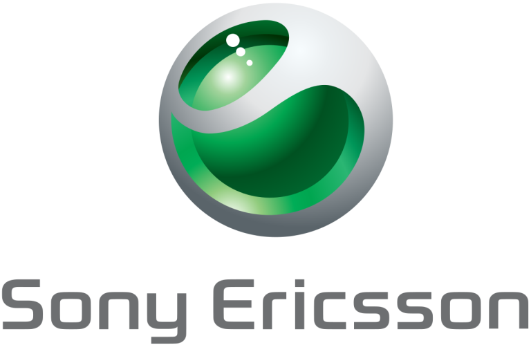
Finally, the textured 3D brand symbols. This type of logo is generally harder to find, being more popular in the late 2000s to the early 2010s. From the light-up Apple logo or the shiny metallic one after that, to the unique design sported by Sony Ericsson phone, especially the Walkman series, this era of design was truly memorable.
Take a look at the logo above. The design is meant to give the effect of something cool and smooth to the touch, like a shiny green glass sphere trapped in a shell of silver metal. Just looking at it gives us a feeling of elegance in premium technology. This is just one example of a 3D logo design that used a sense of texture to give their logo a boost, and a very popular one at that.
How Can You Make Your 3D Logo Look Better?
There are a few ways you can make your logo design look even better. Three-dimensional logos can be great, when designed well. But how exactly can you boost your logo’s impact, if you don’t know what design elements to tweak?
Let’s find out how you can make truly incredible three-dimensional logos.
Adding Layers of Depth Using Shadows and Highlights
As we discussed earlier, shadows and highlights are your friends when it comes to 3D logo design. And a great way to make your logo look even better, is to use these shadows and highlights to create multiple layers for your design.
Look at any three-dimensional shape around you. Most of them, would have multiple layers or levels to them, courtesy of these highlights and shadows. So why would you not use the same concept for your brand’s logo?
Embodying a Realistic Look
Next, make sure that your design follows the rules of realism. There is a reason that in order to depict something flowing, we add the design element of waves to it. That is because as humans, waves are what we relate with the concept of flow.
So, if your logo has a design that has one or more elements that are created in a way that goes against our mind’s sensibilities, it will be difficult for it to be widely accepted by your target masses.
People Also Ask (FAQs)
| 1. How do I create a 3D logo? You can create a three-dimensional logo in one of two ways: – Use an online 3d logo maker tool – Hire a professional design agency experienced in creating effective 3D logos |
| 2. Which design app is best for 3D logo design? The best tool to create 3D logo designs is Adobe Illustrator. It offers the best range of tools that can be used by designers to create innovative 3D logos. |
| 3. What design technique is used to create 3D logos? The design technique used to create three-dimensional logos is called skeuomorphism. It allows designers to use elements like shadows and highlights to add depth to an otherwise two-dimensional image, making it look 3D. |
Conclusion
In short, creating an innovative, carefully planned 3D logo design can help your brand stand out from the generic designs that are your competition’s logos. However, unless you take care and tweak the right design elements to give your logo a more realistic feel, you will not be able to gain the benefits that come with using a three-dimensional brand logo.
So, if you want to create a powerful brand logo that pops off the page, then hire a professional logo designer who knows how to create successful 3D brand logos.

Logopoppin
Logopoppin is a graphic design agency that specializes in logo designing, web development, video production and advanced branding services. We love to innovate businesses with new age technologies, allowing them to improve their visual reputation.

