Table of Content
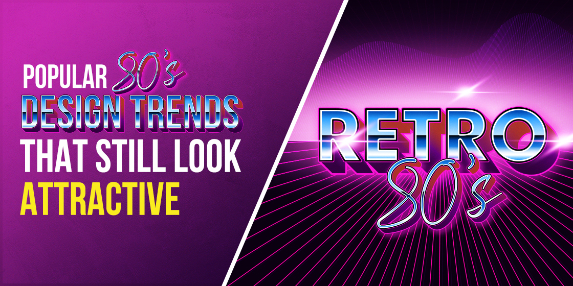
Learn About the Top 80s Design Patterns in Detail
With the advancement of new tools and technologies, the design industry has taken a huge leap in the last few years. It has offered new ways to create a graphic design, allowing companies to amplify their branding using latest practices. However, after getting all the modern advancements, it has also been seen that the classical vibe of 80s graphic design is still very much popular in the market. This is something that is rated evergreen, as people still like to design particular things using retro style.
The major reason why 80s graphic design is still loved by millions of people is the art of blending different classical colors. The combination of these colors offer a very unique look to the images, encouraging people to show interest in them at a first glance. From banners to business cards, you can see variety of branding materials still created with these types of retro designs. Their visual design certainly looks very catchy, provided all the best practices are accurately followed in the design process.
In this blog, we will be looking into the details of 80s graphic design precisely. We will talk about those tips that will help you to create retro design for different types of branding elements. This will be very beneficial for beginners who are looking to learn the art of 80s graphic designing in complete detail.
Let’s first understand how the design practices evolved, and why the specific class of 80s style is still very much popular in the world.
80s Graphic Design: History & Facts
Many people ask about the origins of 80s graphic design, as when and where did it finally evolved from the fragments of creativity. According to historical data, Memphis Group first came up with an idea of innovating the graphic design field in 1981. It was the time when graphic designing was itself not known in the market. People related from press or media only knew about this field; hence it was not seen as a field that could prosper in the near future.
However, things started to change in 1981 when Memphis Group brought refreshing design trends in the market. The group was itself named after Bob Dylan’s song which was quite popular at that time. It was a very unique group because it has members in the team from around the world. From Italy to Japan, Memphis Group gathered skilled and pioneering minds from different regions to bring something new in their graphic design services. This was basically the beginning of the new era that brought several advancements in the design world dramatically after 1981.
Prior to the refreshing 80s trend, the design industry was influenced by the classical art of 60s. Though little advancement also came in 70s, but they were not counted that significant as compared to the trends came in 80. The shift in the graphic design industry during the 80s broke the old barriers of conventionalism and simplicity. The distinctiveness of these designs quickly made their way into every industry, showcasing a great change of air in the design world.
Pop Culture & 80s Graphic Design
Among different commercial industries, the music world quickly adapted the change of 80s design in a significant manner. It was the time when clothing and apparel trends were also changing; hence the arrival of new design practices worked perfect from them. Many fashion companies also utilized these new design practices in the production of apparels. It precisely resulted in more prominence, allowing the new graphic design standards to grow rapidly.
The pop culture specifically embraced the new design trends in its videos, pictures, banners and other materials. Many famous 80s rock bands gave their identity a new touch using the classical graphic design, as it looked more cool and inspiring as compared to the earlier practices. Their branding materials like logos, banners, play cards, and more others precisely showcased this new approach to the people. It could be said that 80s graphic design played a huge role in the branding transformation of the pop culture. Different bands and media houses used the 80s styling to revitalize their overall look, precisely to grab the attention of the growing entertainment industry.
Best 80s Design Trends People Still Remember
Though the classical era of 80s introduced various types of designs, but some of them left a strong mark that people even still remember them. These styles look very catchy among the rest, as they were created with a unique modernistic approach. Not just banners or logos, but these design trends made a huge streak in different types of branding stuff. That is the reason why some of them are still used by the designers in various types of artwork depending on the given requirements.
If you do not know about the famous 80s design trends, take a look at the styles given below.
80’s Artistic Deco
Art deco was introduced way back in 1950s, but it really came to the limelight in 1980s when multiple designing patterns were blended with each other to induce creativity in the illustrations. This practice precisely became highly popular, as brands from different industries started to use the deco in their branding materials. The method of using deco in the design was quite different from the earlier practices, which is why it quickly started to gain attention in the designing world.
The deco version introduced in 80s consisted of two important things. Firstly, it utilized an artistic flare of fancy typography which specifically brought a new change in the market. Earlier to this era, designers were not used to put anything fancy in the letterings. But, the arrival of 80s deco clearly changed the game by introducing decorative typefaces in the design. Many people claim that these typefaces brought the beginning of new age masculine fonts, as new styles and shapes started to come of later after the 80s era.
The second thing that got the market attention was the usage of minimalist design. This was also a big change, because prior to this era, there was no concept of minimalism in the design world. The emergence of 80s deco illustrated how an artwork can also be created with a minimalist touch, provided you know all the basic design principles.
Digital Style
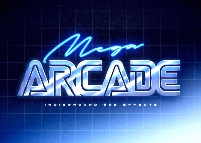
During the midst of 80s, digital lettering style was introduced in the market to bring more creativity in the artwork. This became possible with the arrival of new tools and technologies that helped designers to create different lettering styles accordingly. It should be noted that the digital lettering style was not known in the market prior to this era. So, its arrival certainly created a new buzz in the market, allowing designers to utilize the typography in different creative ways.
The digital typography was also called futuristic typeface due to its modernistic look. It was created exquisitely to embody the look of upcoming times. That is the reason why many scientific films and documentaries of that era used the digital typography in their visuals. It reflected the idea of a new generation, perfectly with a flare of artistic creativity.
These digital typefaces are therefore still used by many designers in different types of graphic designs. They not only look compact, but also stylish by every prospect. If used correctly, they can even make a simple content look outstanding and impressive for the end-users to read.
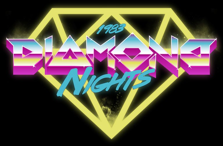
Neon Design
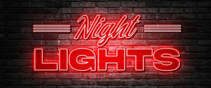
The famous neon design is perhaps the most influential design of 80s you would come across. It is still widely used in different types of artwork depending on the given requirements. The catchy and flashy vibe of neon design makes it different from rest of the others. The beauty of this retro design is that it instantly grabs the eyeballs at a first glance. They glaring colors used in a neon design are highly attractive, especially when they are used with a combination of black shaded background.
Considering the distinctive look and feel, neon design is still considered to be one of the favorite choices of designers. It is used in various types of designs to bring a unique contrast in the illustrations. From neon typefaces to logo styles, this trend has become popular since its inception. This describes the prominence neon instantly achieved when it arrived to the scene in 80s. It made headwinds into the market, allowing graphic designers to showcase different stuff with a great sparkle of glitzy style.
Memphis Milano Design
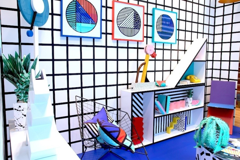
Inspired by the Memphis Group itself, this design also took the market by storm during the 1980s. The catchy combination of colors and shapes made it different from the other designs available in the market. It looked a bit funky because of the themes used in its overall design. Many designers also termed it a fresh change in the industry because of the unique texturing and color combination it used to draw illustrations. That is one of the major reasons why it got huge applause and wide adoption in the industry within just a few years.
It should be noted that the origins of this design was Italy, which is also considered as the true source of 80s graphic design. The Memphis Group was also originated from the same roots; hence this design was named after them to give a fitting tribute.
Today, the inspiration of Milano design is still very much found among the designers, as they try to use this artwork in different types of graphical illustrations. It has also been modernized a bit to meet the modern world challenges, so that everyone can use it in their work according to given requirements.
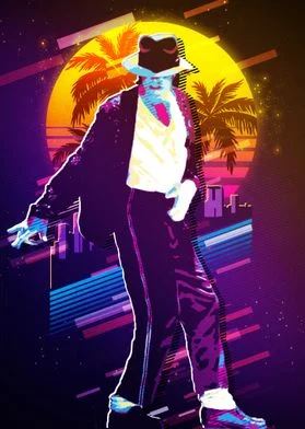
Cyberpunk Style
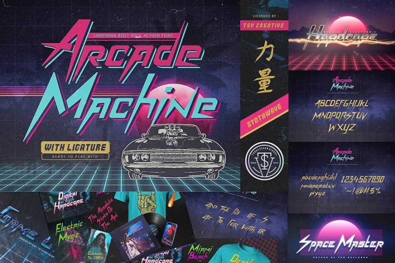
When it comes to add a bit groove in the graphic design, no one can outclass the flawless concept of famous Cyberpunk style. Its retro vibe blended with a unique modernistic look makes it different from all others in the design world. Some people claim that it offers a bit of nighty look, but that is just the core theme of this style. It looks much better with that, especially when the color combination of neon purple and black has been used in the design.
Considering the popularity, the Cyberpunk style is still rapidly used by the designers to create a variety of stuff. Generally, the style is more associated with the entertainment industry, as different bands and videographers regularly use it in their work.
The usage of typography in this style is also considered very important, as it is specifically connected with the theme of the design. Some people prefer to use sharp edged typefaces, while some go for futuristic fonts. Either way, both looks good with the style, provided they are used appropriately in the design.
Frequently Asked Questions
| 1. Why 80s graphic design is still very popular? The design trends related to classical era are still very popular due to their uniqueness among others. They still look very vibrant, which is why many designers prefer to use them in different types of illustrations. |
| 2. Which design still was most popular during the 80s? The classical 80s era saw the emergence of different design trends. However, some of them became highly popular due to their fantastic looks. These includes Cyberpunk style, Memphis Milano, Neon design and few more others. |
| 3. What is that 80s print called? The 80s print was called by many names. Some people called it by the name of “chain print”, while some used to term it the “elegance pattern”. These names helped to make the 80s design more popular, allowing people to show interest in them. |
| 4. What was the 90s design called? The 90s design was famously called the Jazz design. It introduced the concept of rock style design consisting of flashy colors and shapes. It brought a new change in the market, allowing designers to create artwork with stunning catchy looks. |
| 5. Which type of typography was used in the 80s graphic design? The 80s graphic design used different types of lettering styles. Some of the most popular names among them includes Bitcraft, Neon display, Orlando, Carosello and more others. |
Conclusion
That takes us to the end of this article in which we have discussed different types of 80s graphic design in detail. It is certainly true that people still love these retro designs very much. Apart from alluring style, they are also closed to them because of having an emotional touch. That is the reason why we still see these designs being continuously used in different types of artwork till to date. It signifies their importance; as how popular they are still in the market even after three to four decades.
If you are looking for a design agency that can help you to create unique artwork using 80s graphic design, get in touch with us today. Our professionals have vast experience in working with different types of design trends. We always aim to facilitate our clients with the best design solutions, so that their businesses can get the required attention.
Latest news you want to know!
Subscribe for cutting-edge design inspiration at Logo Poppin! Elevate your brand with updates on logos, branding, web design, and video animation.
Note that by clicking “subscribe,” users may agree to our privacy policy and consent to Logo Poppin to use your contact data for newsletter purposes.
Logopoppin
Logopoppin is a graphic design agency that specializes in logo designing, web development, video production and advanced branding services. We love to innovate businesses with new age technologies, allowing them to improve their visual reputation.