
Table of Content
Learn the Basics by Looking at Famous Abstract Logo Examples
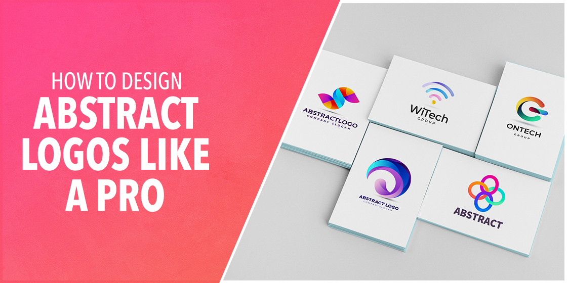
Logo designing is an art that requires skilled expertise and dedication from the designers. It plays a major part in company branding, especially at the start of the market operations. Keeping this in mind, designers are specifically asked to bring uniqueness in the logos, so that it can grab maximum attention of the people. An abstract logo design is therefore preferred over any conventional logo design. Its creative style helps to catch eyeballs, encouraging people to show rapid interest in the art used in its designing.
But, looking at the complexities involved in abstract logo designing, many people remain confused how perfection can be achieved in these logos. It is an undeniable fact that logo designing is not a piece of cake. It is not a design that could be made randomly by just adopting any casual concept or taking logo design services from any inexperienced company. Instead, it requires a greater level of understanding from the designers how different styles and colors work to form a perfect combination of a logo.
Unfortunately, many designers do not have this in-depth level of understanding which is why they usually face failures while creating any type of logo. If you are also one of them who is struggling to know the real deal of this art, read this article in detail. It will define some useful tips how an abstract logo should be created by analyzing the trends as well as branding requirements of a company.
Let’s first take a look what an abstract logo is and why it is termed different from the others.
What is an Abstract Logo?
Logos are generally created to represent the identity of a company. To do that, they normally pick shapes or images that can define this identity to the people. There are many brand logos created in this fashion, allowing people to understand the theme of the company.
But, abstract logo design is quite different from this approach. It does not use any known geometrical pattern to depict anything. It prefers to build a custom shape to represent a unique identity of any company. This technique helps them to introduce their business with a fresher look. Unlike any known image, this shape becomes a core symbol of their identity that allows to give their business better recognition in the market.
This is the core reason why abstract logo design is said to be a modern approach towards designing. It provides a new fresh look to the logos, so that it can get better attention in the market. The blend of colors and different types of shapes makes it highly unique among others. It not only exhibits a distinctive identity, but also ensures to portray a solid business theme of the company that can engage customers in the market.
How Abstract Logos Are Different from Others?
Abstract logos are not designed in a conventional style. They are quite different from the other logos because they do not follow the same practice for designing. Unlike others, abstract logos are created with a unique design concept. It does not follow any premade shape due to being too predictable in designing. The basic concept of this model is to create its own shape that can offer uniqueness to the logo.
Normally, we have seen that logos are made with conventional shapes like flowers, mascots, building and more others. These approaches have become too orthodox now due to repeating similar type of logo figures. The distinction will only come when the design methods will change, allowing people to get something new rather than reiterating the same old identity.
This is the core concept for designing an abstract emblem. Those designers who are well versed in perceiving a new idea quickly, can work easily with the abstract logos. It not only requires skills, but also great creative thinking from the designer’s end. It ensures to offer correct ideas that could make abstract emblems outstanding, rightly according to the latest trends.
Famous Abstract Logo Examples
Many popular companies in the world have designed their logos using an abstract design. They have modernized their logos to keep their branding identity aligned according to the modern trends. Here are some famous abstract logo examples you need to know about.
PepsiCo
PepsiCo is a famous American beverage company that has got footprint in all over the world. The latest redesigned pepsi logo of the company is perfectly made in an abstract style using the two iconic blue and red colors. The theme of the overall emblem is made similar to the earlier logos; however, the redesigned elliptical shape is quite different from the rest depicting a sheer class of abstract artistry.
Adidas
Adidas has always remained a top choice for fitness apparel lovers in the world. Its logo is quite unique from the rest of the apparel companies. The abstract design used for Adidas showcases three stripes made in a classical style. They have always utilized this particular theme in other logos, as it represents the main identity of their brand.
Gucci
Gucci is one of the top fashion brands known in the world. Apart from the great apparel quality, the company is quite popular because of its stunning branding style. This fashion brand logo is certainly very unique as compared to the other industry peers. The creative artistry used in its designing is stunning and high-class, illustrating the true elite branding theme of the company.
Best Tips to Create an Eye-Catching Abstract Logo
Many designers always remain confused while designing an abstract emblem. They struggle to think about the concepts that should be new to the market. This often creates a mess in their mind that eventually forces them to abandon the idea of abstract designing.
If you are also one of them who is struggling to start with abstract logo designing, take a look at the points given below. It will help you to understand the overall concept and deliver better results as required by the clients.
Shapes in Mind
Everything starts with an idea, no matter how small or big it is. This theory works perfectly well in the designing of abstract logos. It allows you to visualize some raw concepts in mind before the start of actual work. By doing this, you can get different design ideas in mind depending upon the level of expertise and brand requirements. You can visualize how the logo should be made and what components should be used to make it different from the others.
This technique is also referred as the brainstorming process in which you try to develop different ideas right from the scratch. It is not just suitable for abstract logo designing, but other types of technical jobs as well. It provides a quick overview how different tasks should be done while keeping the core objective in mind. This way, you can come up to a conclusion with some solid points, illustrating how a logo or any other branding element should be designed according to the given details.
Select Logo Colors
Once you have finalized a shape in mind, try to think about some of its most suitable colors. This will require another great session of brainstorming in which you will decide which type of color will suit best for the logo. The best way to do that is to first draw that shape on to a paper. Then, you can try coloring it with different types of shades that comes first in your mind.
Here, you would also need to keep the brand theme in mind. According to top experts, the logo color should always match with the main color theme of your brand. It helps to build connection, allowing people to see relation between the brand and its logo. If you will not pay attention to this connection, then your logo will look like a standalone element. Any ambiguity in this will be considered bad for branding, which is why the color selection should be done very wisely.
Pick Your Perfect Typeface
Next up, you need to select a typeface to write the business name and tagline beneath the logo. This will require a good internet research to see which type of fonts are currently being used in the logos. Nowadays, you can find dozens of logo fonts available in the market. However, not all of them will suit every abstract emblem. This selection should be done precisely after looking at the theme of the logo. You cannot randomly use any recursive or manly font in the logo. It should be picked after seeing the colors, styles and main structure of the abstract logo.
Another way to pick a typeface is by looking at the lettering styles of other logos. You can see which type of typefaces are currently being used in the market for particular logo classes. This will offer great help to you in terms of picking the right font. You can then further modify it by using your own size and colors in these fonts. Ideally, you should use masculine fonts in the abstract emblems. They are mostly used to write taglines, as they are quite solid in looks.
Conduct Market Analysis
After completing the first version of the logo, you need to conduct a thorough market analysis to check the quality of the logo. This is necessary because it will let you know the credibility of your logo in front of the others. A lot of designers recommend to this step to further polish their design. Its lets them know about any major mistake or how the logo should be optimized more according to the current standards.
There are various platforms where you can search these abstract logos. You can find some variations on the Google, as it lets you connect with hundreds of websites from all over the world. Though not all the abstract designs found on Google would be relatable to your niche, but they will at least offer some sort of guidance to your work. You can use their findings to further correct your logo in a variety of manners. This will include correction of colors, sizing, shape style and more others.
Finalize the Design
Once you have corrected all the mistakes, recheck again to finalize the logo design. This process would not be much lengthy as you have taken the required measures in the earlier stages. It will only confirm that all the points have been addressed correctly as well as the logo design has been made according to the client requirements.
Meanwhile, it is also recommended to consult with other team members while finalizing the logo design. It will give you better views from the other designers on the overall quality of the logo. You can use their suggestions to further optimize these abstract logos. But to do that, you need to take suggestions from the experienced designers. These guys will give you proper analysis based on their experience. You can then work on their given points to further solidify the design, rightly as per the best design standards.
Frequently Asked Questions
| 1. What is an abstract logo? An abstract logo is a type of emblem that is created with an unconventional shape. Unlike normal logos, its geometrical shape doesn’t match with any known figure. This helps to bring creativity in the logo and its overall theme. |
| 2. Why are abstract logos different from others? Abstract logos are different from others due to their unique shape. They are created to bring distinction between the normal logos and a new fresh design. It requires great thinking perspective, as well as skilled expertise to design something new from scratch. |
| 3. What type colors should be used in an abstract logo? There are no limitations for colors in an abstract logo. In fact, these logos are recommended to create with a blend of colors that looks different from the rest. You can blend red with green, blue with orange or any other color combination that suits well with your branding needs. |
| 4. What type of fonts should be used in an abstract logo? An abstract logo should be created with a unique typography. It could either be recursive or a futuristic font depending on your styling needs. Just make sure to pick those typefaces that suits well with your branding, otherwise any lettering style will look absurd with the logo. |
| 5. Which popular companies use abstract logos? Abstract logos are preferred by many top companies working in the market. You can find various popular names in this list, such as PepsiCo, Spotify, Gucci, Adidas, Reebok and several more others. |
Final Words
That concludes our entire article in which we have discussed about abstract logos in detail. These specific type of logos are different from others as they do not follow an orthodox pattern to build a design. These logos are created with a unique style that looks different from others. To create these logos, a designer should be well expert in creating shapes with out of the box design concepts. This article has defined some good tips that will help designers to create engaging abstract logos, rightly according to the modern trends.
Meanwhile, if you are looking for a logo design company that could help you to create an abstract logo perfectly, contact us today. Our professionals are quite experienced in creating abstract logos with a unique design that can help to boost your brand identity perfectly.
Latest news you want to know!
Subscribe for cutting-edge design inspiration at Logo Poppin! Elevate your brand with updates on logos, branding, web design, and video animation.
Note that by clicking “subscribe,” users may agree to our privacy policy and consent to Logo Poppin to use your contact data for newsletter purposes.
Logopoppin
Logopoppin is a graphic design agency that specializes in logo designing, web development, video production and advanced branding services. We love to innovate businesses with new age technologies, allowing them to improve their visual reputation.

