

Table of Content
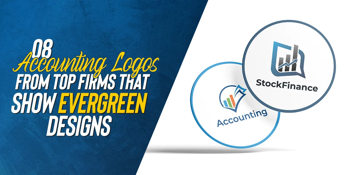
Discover How to Incorporate the Best Accounting Logo Ideas Into Your Brand Symbol
With the rest of the world changing so drastically, businesses too are evolving with the times. For accounting firms, its necessary to have accounting logos that are versatile and dynamic, without losing their precision and impact. But how can they accomplish that?
A logo serves as the visual face of an accounting firm, embodying its core values, business aesthetics, professionalism, and commitment into its design. Today, we will take a look at some truly evergreen accounting logo ideas from some of the top firms in the world, and see how a professional logo design services manage to create such hard hitting brand symbols. We will discuss the common traits found among these successful brand symbols, and see how we can incorporate the same into our own brand symbols.
Let’s begin.
The Role of Logos in Accounting Firms
Logos play an important role in shaping the identity of popular accounting firms. Beyond serving as a visual symbol representing the brand of that business, a well-designed accounting logo communicates professionalism, trustworthiness, and the core values of that firm.
It acts as a memorable symbol in the visitor’s mind that distinguishes it from its competitors in a difficult business landscape, leaving a lasting impression on the firm’s clients and stakeholders. Moreover, it also serves as a quick method of recall and memorability, allowing brand recognition at a glance, which can be an important tool in setting your brand as distinctive.
Popular Traits of Timeless Accounting Logos
For accounting logos to be considered timeless, they need to possess some classic qualities that ensure that their relevance and impact endure through changing trends over time. Simplicity and clarity are essential to this goal, allowing the logo to remain effective across various mediums and applications.
The design elements chosen should be versatile enough to withstand the test of time, reflecting a sense of permanence and reliability. And the color scheme should be neutral enough to not change its meaning drastically over time.
8 Evergreen Accounting Logos That Truly Represent Their Brands
So now, that you know what are the hallmarks of the top accounting logos, as well as the role a timeless accounting logo plays in the success of its firm’s brand, are you ready to create your own logo?
Not yet. Before that, you need to see some great accounting firm logos in action, and witness the secrets to their success. So, we have compiled a list of some amazing logos of accounting firms known the world over. Only after that will you be able to know how to design a logo for an accounting brand that is both attractive and everlasting.
Let’s dive in and decipher their secrets.
Deloitte Accounting Firm

Deloitte’s logo is a study in simplicity and sophistication. The iconic green dot symbolizes precision, financial insight, and growth. The clean, sans-serif typography adds a touch of modernity, making it a symbol of trust in the financial world.
This logo seamlessly blends simplicity and sophistication, featuring a minimalist design that conveys trust and professionalism. The choice of a classic color palette, with muted black, enhances its timeless appeal. The abstract icon, combining simple design elements, symbolizes precision and equilibrium, as well as a business-first mindset.
PricewaterhouseCoopers International Limited (PwC)
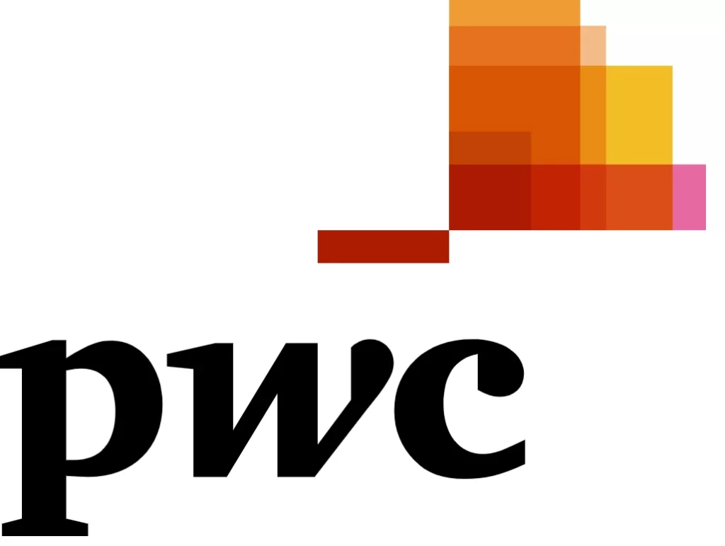
PwC’s logo is a masterpiece of simplicity and versatility. The interconnected blocks at the top of the symbol represent the data management of the financial sector, representing the collaboration and unity found in the industry. The classic clack color of the wordmark conveys trust, while the classic font adds a contemporary touch.
A timeless emblem that incorporates symbolic elements related to accounting, projecting a sense of authority and expertise. The clean lines and bold, serif typography contribute to a design that stands out. The color scheme with its unique approach, exudes a sense of financial prosperity and stability.
Moss Adams
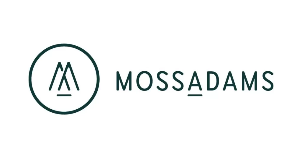
Moss Adams’ logo combines tradition with a modern twist. The stylized M and A create a distinctive emblem that reflects the firm’s commitment to innovation. The color palette, with deep blue-green, exudes a sense of stability and reliability.
Balancing modern aesthetics with traditional elements, this logo radiates professionalism. The clean and angular icon, reminiscent of a pair of pen nibs, signifies precision in financial matters. The adaptable nature of the logo allows for easy integration across various applications, maintaining its relevance over time.
Plante Moran

This logo exudes a classic charm, utilizing a timeless color palette of navy blue, gray, and black. The serif typography adds a touch of sophistication, emphasizing the firm’s commitment to tradition. The icon, a stylized symbol of a notation scribble, signifies both financial acumen and meticulous record-keeping.
Plante Moran’s logo is a testament to timeless design. The use of classic navy blue exudes professionalism, while the serif font offers a classical aesthetic, making it a lasting visual mark.
KPMG International Limited
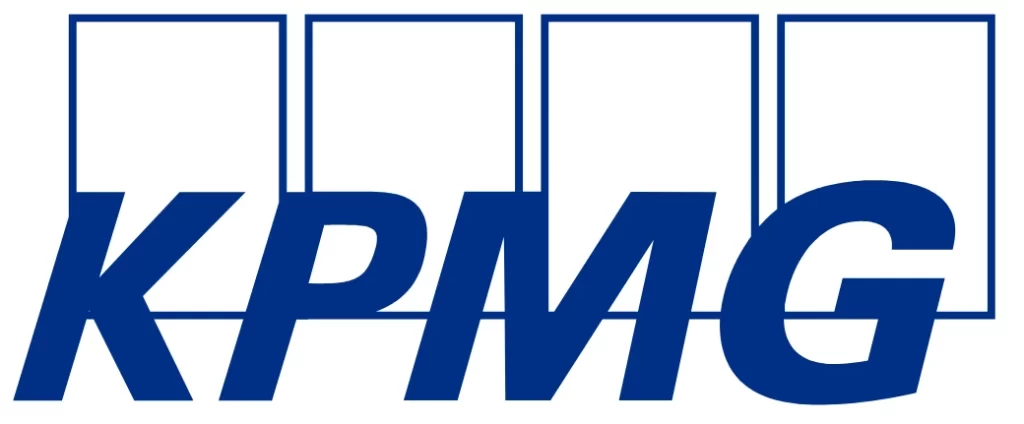
A perfect blend of modernity and tradition, this logo incorporates a distinctive icon that signifies stability. The intertwining of the wordmark and the rectangular symbols at the back add a dynamic, abstract representation of financial charts and graphs. The use of a timeless font complements the icon, creating a harmonious and enduring design.
KPMG’s logo is a balance of modernity and tradition. The bold blue over white color scheme exudes confidence, and the distinct, clean lines form a dynamic, abstract representation of collaboration and precision. The sans-serif font adds a contemporary touch.
CBIZ Incorporated
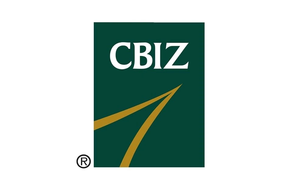
Elegance meets functionality in this logo, where a refined icon is complemented by a classic font. The abstract icon, resembling an arrow pointing upwards, speaks to the firm’s commitment to growth and expert financial services. The use of a deep, trustworthy green and gold color combinations enhances its timeless appeal.
Moreover, the CBIZ’s logo is a model of simplicity and readability. The clean, bold lettering communicates strength and reliability. The use of a distinctive color adds a sense of trust, making it a classic and enduring emblem in the financial sector.
BPM Wealth Management
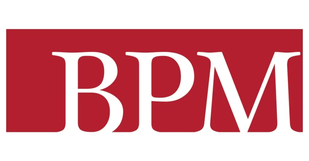
Symbolizing unity and trust, this logo utilizes a timeless icon – an interlocking, abstract representation of initials. The monogram design, paired with clean and legible serif typography, communicates a sense of reliability. The color palette, with a deep red, adds a touch of sophistication.
BPM’s logo is a blend of sophistication and approachability. The intertwining B, P, and M create a harmonious emblem, and the minimalist color palette adds a modern flair. The serif font conveys a sense of tradition and expertise.
Brown Smith Wallace LLC
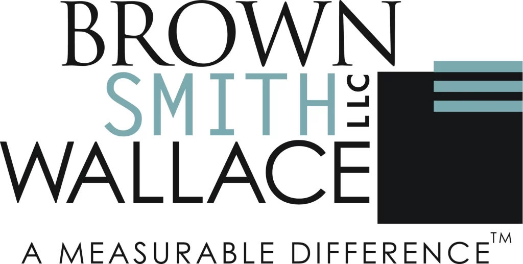
Elegance defines this logo, where a minimalist icon is paired with a classic font. The choice of a blue and black exudes a sense of trust and prosperity. The simplicity of the design ensures its enduring and versatile nature.
Brown Smith Wallace’s logo is a fusion of classic and contemporary design. The interlocking BSW of the logo symbol forms a distinctive design, and the earthy color palette adds a touch of warmth. The clean, sans-serif font enhances readability and modernity.
What are the Common Traits Among These Evergreen Accounting Logos?
While diverse in their designs, these evergreen logos share some common traits that allow them to have a timeless appeal. These traits include the likes of simplicity in design, legibility of typography, and a strategic use of classic colors collectively convey a sense of trust, expertise, and stability. By using these elements, these accounting logos transcend logo design trends and ensure a lasting impact.
Design Trends in Evergreen Accounting Logos
Design trends for logos vary from industry to industry. That is because depending on the target audience and their needs, the logo symbols for each brand in that specific industry needs to change too. For example, in the toy industry, there are some common trends of using over-the-top design elements to add a fun aesthetic to the brand logos.
Prevalent design trends in accounting logos include clean lines, minimalist aesthetics, and the use of symbols associated with financial stability. These trends contribute to the creation of logos that withstand the passage of time, remaining relevant in an ever-changing industry.
Tips for Creating Evergreen Logos in the Accounting Industry
Crafting an evergreen logo involves embracing simplicity, choosing a classic color palette, and incorporating elements that convey trust and reliability. Strategic use of typography and symbols ensures the logo remains impactful for years to come. However, it’s a delicate dance between modernity and tradition, where only those that manage to master the balance in design emerging victorious.
Conclusion
Looking at the examples of accounting logos of firms above provides us with valuable insights into the transformative power of a well-executed brand logo. These case studies highlight the impact of a timeless logo on brand perception, market positioning, and the ability to adapt to evolving trends.
In a competitive industry such as accounting or law, where trust and reliability are paramount, evergreen logos play a crucial role in shaping a firm’s identity. The logos discussed above and their common traits demonstrate the enduring power of simplicity, symbolism, and classic design elements. As accounting firms consider their visual representation, the emphasis on creating logos that withstand the test of time remains an integral part of building a lasting brand presence in the industry.
Latest news you want to know!
Subscribe for cutting-edge design inspiration at Logo Poppin! Elevate your brand with updates on logos, branding, web design, and video animation.
Note that by clicking “subscribe,” users may agree to our privacy policy and consent to Logo Poppin to use your contact data for newsletter purposes.
Logopoppin
Logopoppin is a graphic design agency that specializes in logo designing, web development, video production and advanced branding services. We love to innovate businesses with new age technologies, allowing them to improve their visual reputation.

