
Table of Content
Discover What the Forgotten Aero Logo Represented Via Its Simple Yet Iconic Design
The Aero logo represents one of the most understated yet elegant examples of automotive branding from the interwar period. Operating from 1929 to 1947, this Czech automobile manufacturer created a distinctive visual identity that perfectly captured their unique position as both aircraft and automotive producers. Unlike many car companies that opted for elaborate emblems or badges, Aero chose a refreshingly simple approach that emphasized craftsmanship and aerodynamic inspiration.
What makes the Aero logo particularly fascinating is its connection to the company’s aviation heritage. Founded by Dr. Kabes in Prague-Vysočany, Aero operated within an aircraft factory, and this aeronautical background profoundly influenced their brand identity. The logo’s design philosophy reflected the company’s belief that automobiles should possess the same lightness and grace as aircraft, creating a brand mark that seemed to float with effortless elegance.
Let’s explore the logo from the precise perspective of a professional logo design agency, and see what was it that made such a simple design so iconic.
The Origins and Development of Aero’s Visual Identity
The Aero logo emerged naturally from the company’s unique industrial setting and philosophical approach to automotive design. Founded in 1929 in Prague, Aero was established by Dr. Kabes, who had already excelled in aircraft and car building, bringing together two worlds of transportation technology under one roof. This dual expertise in aviation and automotive engineering shaped every aspect of the company’s identity, including their choice of logo design.
Unlike traditional automotive manufacturers who developed elaborate crests or geometric symbols, Aero took a deliberately minimalist approach. The brand didn’t really have any emblems per se, instead choosing to use their wordmark, written as if by hand. This decision reflected the company’s focus on craftsmanship and personal attention to detail, values that were essential in both aircraft construction and luxury automobile manufacturing.
The handwritten aesthetic of the Aero logo served multiple purposes beyond simple brand identification among the various European car brand logos of that era. It conveyed the artisanal quality of their vehicles, suggested the personal touch that went into each car’s construction, and created an immediate visual connection between the brand and the concept of flight. The flowing, organic nature of handwritten text naturally evoked movement and freedom, qualities that Aero wanted associated with their automobiles.
Design Philosophy and Visual Characteristics
The Aero logo embodied lightness and airiness, highlighting these qualities in every detail of its execution. The design was centered on a wordmark, where every line and shape was carefully crafted to evoke associations with something light, free, and natural, perfectly aligning with the company’s aviation-inspired approach to automobile manufacturing.
The logo’s primary concept was air symbolism, representing freedom and ease of movement. The font was set at a slight angle, reminiscent of calligraphic writing, which added dynamism and suggested forward motion. Thin lines and carefully balanced stroke widths heightened the sense of airiness—it seemed as if the letters were floating or ready to lift into the air, creating a visual metaphor for the company’s engineering philosophy.
The handwritten style of the Aero logo distinguished it from the more formal, geometric approaches favored by many contemporary automotive brands. While companies like Mercedes-Benz or BMW developed structured emblems with precise geometric relationships, Aero’s organic wordmark suggested a more personal, artisanal approach to manufacturing. This design choice reflected the company’s position in the market as a producer of custom luxury vehicles rather than mass-produced automobiles.
The Connection Between Aviation and Automotive Branding
Aero’s unique position as both an aircraft and automobile manufacturer created fascinating opportunities for cross-pollination between these industries, particularly in brand design. The company’s name itself, derived from “aero” meaning air, established an immediate connection to flight and movement. This aviation heritage influenced not only their logo design but their entire approach to automotive engineering and marketing.
The aerodynamic principles that Aero applied to their vehicles were reflected in their logo’s flowing, streamlined appearance, similar to the top car logos of all time. Just as their cars incorporated aviation-inspired design elements like lightweight construction and aerodynamic bodywork, their logo captured the essence of flight through its graceful, unstructured letterforms. The wordmark seemed to embody the same principles of reduced weight and optimized airflow that characterized both aircraft and Aero automobiles.
This aviation-automotive connection was particularly significant during the 1930s, when streamlining became a dominant design trend across multiple industries. Aero’s logo anticipated this movement toward aerodynamic aesthetics, positioning the brand as forward-thinking and technologically advanced. The handwritten style suggested both the personal touch of skilled craftsmen and the dynamic movement of vehicles designed for speed and efficiency.
Technical Execution and Typography
The technical aspects of the Aero logo demonstrate sophisticated understanding of typography and visual communication principles. The logo’s style could be described as elegant minimalism, emphasizing its connection to nature and lightness while maintaining the authority necessary for an automotive brand. Every stroke and curve was carefully considered to create maximum visual impact with minimal elements.
The calligraphic qualities of the Aero logo required skilled execution to achieve the proper balance between legibility and artistic expression. The letters of the wordmark logo design needed to flow naturally together while maintaining clear individual character recognition, a challenge that demanded careful attention to spacing, proportion, and stroke weight consistency. The slight angle of the text added energy and forward momentum without compromising readability.
The choice of handwritten lettering over traditional typography also allowed for subtle customization and personalization that would have been impossible with standard fonts. Each application of the logo could include minor variations that enhanced its handcrafted character while maintaining overall brand consistency. This flexibility was particularly valuable for a company that produced custom luxury vehicles tailored to individual customer requirements.
Legacy and Collector Recognition
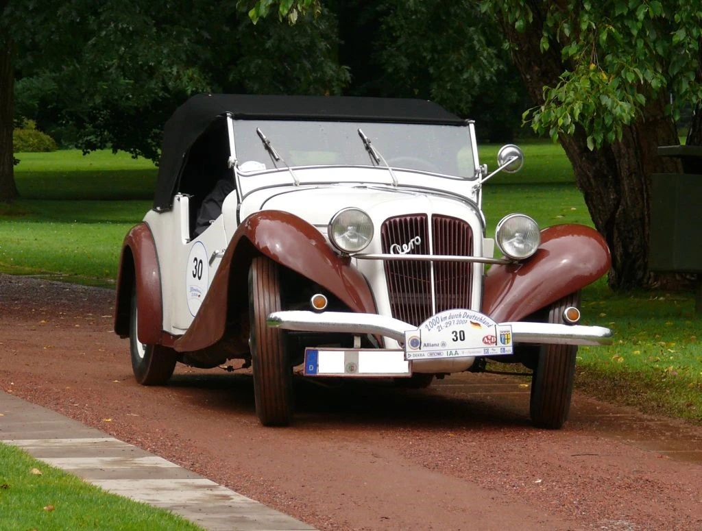
Today, the Aero logo has achieved cult status among automotive collectors and design historians who appreciate its unique aesthetic and historical significance. During its nearly two decades of operation, Aero produced about 2,500 cars, and today, the company’s luxury custom cars from the interwar period are highly sought after by collectors who regard them as shining examples of Czech automotive craftsmanship.
The logo’s association with rare and historically significant vehicles has elevated its status beyond simple brand identification. Each appearance of the handwritten Aero wordmark on surviving vehicles represents a connection to a unique moment in automotive history when aviation and automotive technologies were beginning to converge. Collectors particularly value vehicles that retain original Aero badging and documentation featuring the distinctive logo.
The influence of Aero brand’s design approach can be seen in various contemporary automotive and aviation companies that have adopted similar handwritten or script-based wordmarks. The logo demonstrated that effective automotive branding could be achieved through elegant simplicity rather than complex symbolism, a lesson that remains relevant for modern brand designers working across transportation industries.
Modern Relevance and Design Lessons
The Aero logo offers valuable insights for contemporary brand designers, particularly those working in transportation and technology industries. The logo’s success demonstrates that effective branding can emerge from authentic connections between company operations and visual identity, rather than from arbitrary aesthetic choices or market research-driven decisions.
The handwritten approach used by Aero has gained renewed relevance in an era where consumers increasingly value authenticity and craftsmanship over mass production. Many contemporary brands across various industries have adopted script-based logos that echo Aero’s emphasis on personal touch and artisanal quality. The challenge lies in achieving the same level of sophistication and purposefulness that characterized the original Aero design.
The logo also illustrates the importance of consistency between brand identity and business strategy. Aero’s minimalist logo perfectly aligned with their approach to vehicle production, creating a coherent brand experience that reinforced their market positioning. Modern companies can learn from this integration of visual identity with operational philosophy to create more authentic and effective brand communications.
Frequently Asked Questions
| What did the Aero logo look like and why was it designed that way? The Aero logo was a handwritten wordmark featuring the company name in a flowing, calligraphic style set at a slight angle. It was designed to embody lightness and airiness, reflecting the company’s aviation heritage and their philosophy that cars should possess the same grace and lightness as aircraft. The thin lines and balanced stroke widths created a sense that the letters were floating or ready to lift into the air. |
| When did Aero use this logo and how long was the company in operation? Aero used their distinctive handwritten logo from the company’s founding in 1929 until they ceased automobile production in 1947. The Czech company operated for 18 years, during which they produced approximately 2,500 cars at their aircraft factory in Prague-Vysočany before being nationalized and eventually liquidated in 1952. |
| Why didn’t Aero use a traditional automotive emblem or badge? Unlike many car manufacturers who created elaborate emblems or geometric badges, Aero chose a simple wordmark approach that reflected their aviation background and artisanal manufacturing philosophy. The handwritten style emphasized the personal craftsmanship that went into each vehicle and created a visual connection to the concept of flight, aligning with their position as both aircraft and automobile producers. |
| What makes Aero logo valuable to collectors today? The Aero logo has achieved cult status among automotive collectors because it represents one of the rarest and most historically significant Czech automotive brands. With only about 2,500 cars produced during the company’s existence, any surviving vehicles or documentation featuring the original Aero logo are considered highly valuable examples of interwar period automotive craftsmanship and design. |
| How did Aero’s aviation background influence their logo design? Aero’s aviation heritage was fundamental to their logo design philosophy. Operating from an aircraft factory, the company incorporated aeronautical principles into their brand identity, creating a wordmark that suggested lightness, movement, and aerodynamic efficiency. The flowing, organic letterforms were designed to evoke the same qualities of grace and freedom associated with flight, differentiating Aero from traditional automotive manufacturers. |
Conclusion
The Aero logo stands as a timeless testament to the art of thoughtful brand design, effectively capturing the company’s ethos of grace, freedom, and aeronautical inspiration through elegant simplicity. Despite operating for less than two decades, Aero created a visual identity that continues to resonate with automotive enthusiasts and design professionals more than seventy years after the company’s closure.
The handwritten wordmark demonstrated that powerful brand recognition could be achieved without elaborate symbolism or complex graphic elements. By drawing inspiration from their aviation heritage and manufacturing environment, Aero created a logo that was both distinctive and meaningful, establishing a visual identity that perfectly complemented their innovative approach to automobile design and production.
For modern brand designers and automotive enthusiasts, the Aero logo represents an important case study in authentic brand development. It shows how companies can create lasting visual impact by honestly reflecting their operational reality and philosophical approach rather than following generic industry conventions. The logo’s enduring appeal proves that great design transcends temporary trends to achieve timeless elegance and continued relevance.
Logopoppin
Logopoppin is a graphic design agency that specializes in logo designing, web development, video production and advanced branding services. We love to innovate businesses with new age technologies, allowing them to improve their visual reputation.
