
Table of Content
Discover the AFL Logo History and See How Those Symbols Hold Up in Modern Times
American football is the quintessential sport in the United States. Although baseball officially hold the title of being “America’s favorite pastime”, its football that draws in vastly huge number of consumers. And where would you find the best American football logos in the US? That’s right, in the NFL.
The NFL today comprises of the NFC and the AFC, two conferences with the teams equally distributed between them. The NFC consists of teams that were originally a part of the league before the AFL-NFL merger. The AFL on the other hand, consists of teams that were brought over from the merger.
Today, you will recognize some of the original AFL logos, as a few of the teams are using some forms of their original logo, modified with the help of professional los angeles logo design services. So, let’s take a look at the history of the American Football League and its logo, as well as the AFL logos and names of the franchises that were a part of it.
A Brief History of the American Football League, NFL’s Only True Rival
The American Football League started out as a major professional league. At the time, the NFL was going strong. However, there were many regions in the United States that still lacked representation in the sport, but desired it wholeheartedly.
Now, since the mid-1920s, a series of rival professional football leagues who called themselves the American Football League had popped up as rivals to the more established NFL. However, they either had been short-lived, or were outright unsuccessful. Similarly, the All-American Football Conference from the mid-1940s, which was a moderate success, folded after just three seasons of play.
Now, by late 1950s, a group of people started to gather, made up of prospective team owners who had been refused NFL franchises, as well as minority shareholders of existing NFL franchises. They formed a new professional football league, and called it the American Football League. This was the fourth iteration of the AFL over the years, and this time it was a success.
Consisting of eight franchises at its start, it consisted of two divisions. The Eastern division was made up of the Buffalo Bills, Boston Patriots, Houston Oilers, and the New York Titans. The Western division included the Denver Broncos, Dallas Texans, Oakland Raiders, and the Los Angeles Chargers.
The National Football League, a well-established pro football league at that time, was initially unconcerned. However, they took notice when the AFL signed over three-quarters of the NFL’s first round draft picks in 1960. That was the first step towards establishing the AFL’s claim that they were equal to the NFL.
In terms of gameplay, the AFL matches were more fun to watch, primarily because they allowed a far more aggressive style of gameplay, with many of NFL’s offense-related safety rules missing in the AFL. Moreover, the AFL gained national viewership with a lucrative broadcasting deal with ABC, and later with NBC too. Soon the AFL started to attract talent from many American colleges, and even the NFL.
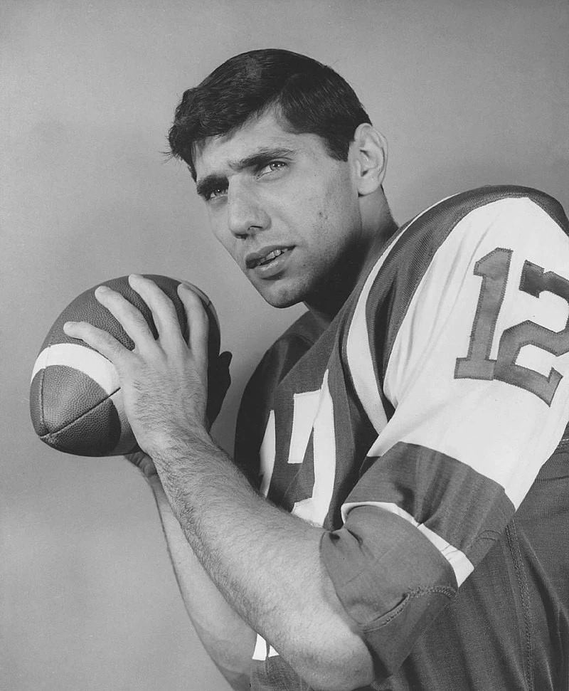
The rivalry reached its peak in the mid-1960s, when drafting competition between NFL and AFL caused player salaries to shoot up, with many star prospects like Joe Namath joining the AFL over the NFL. To control this, the American Football League and the National Football League decided to a merger in 1966. Some of the stipulations of this merger was that both leagues would have a common draft to eliminate the competition, and that there would be a championship game between the winners of both leagues.
Thus started the Super Bowl era from the 1966 season, with each year showcasing unique Super Bowl logos to commemorate the ultimate American football showdown. Up until 1970, both leagues operated separately, except for the final championship game. And during this time, the AFL added two expansion teams to its roster, bringing its franchise total to ten.
The Green Bay Packers of the NFL won the first two championships, namely the 1966 and 1967 Super Bowls. However, the AFL established its credentials in the next two years, with Super Bowl III and IV won by the New York Jets and Kansas City Chiefs respectively. And once it managed that, the AFL agreed to be absorbed into the NFL. Its franchises joined the Cleveland Browns, Pittsburgh Steelers, and the Baltimore Colts from the NFL to form the American Football Conference of the NFL.
A Look at the AFL Logo History to See How the League Symbol Evolved
Now that we have looked at the history of the American Football League, let’s take a look at the old AFL logos that the league used during its 10-year period. Now, you might think that for the period as small as that would not require more than one logo. However, due to the rivalry between the AFL and the NFL, the league needed to tweak its brand through the years.
The First AFL Logo 1960 – 1964
The first AFL logo 1960 was a design that highlighted the American connection of the AFL, meant to set it apart from its rival NFL. The logo design featured a large, white A with prominent serifs, outlined in blue. Behind the letter was a side profile of a bald eagle in flight, under which was a football. The eagle and the football were colored red, with three blue stars on either side of the lettermark.
Revamping the AFL Logo for the First Time in 1965
Just five years later, as the rivalry between the American Football League and the NFL reached its peak, the league decided to revamp its AFL logo. The two AFL logos were virtually indistinguishable, except for a thick red ring around the new version. The result was a design that looked redder than anything, making it quite similar to AFC’s NFL logo design sported by the league after merging into the NFL.
The Final AFL Logo Before the AFL/NFL Merger 1966 – 1969
A year later, as the AFL and NFL decided to join together to address many of the issues caused by their rivalries, the team decided to revamp the logo again. Realizing that their previous logo lacked balance in design due to the use of too much red color, the AFL decided to color the surrounding red band into the same blue as the lettermark’s outline.
Exploring the Old AFL Logos and Names of Teams from the America Football League
Besides the old AFL logos, the league was also represented by different AFL logos and names of famous franchises that are still playing in the NFL today. Let’s take a look at the history of these sports logos, and discover what made them such great representatives of pro football.
Boston Patriots 1960 – 1969
The Boston Patriots were the original name for the now-famous New England Patriots. The Patriots, or the Pats as they are known today, featured a caricature of “Pat Patriot” ready to hike a football. The mascot is in full military regalia of the colonial times, and is designed to represent Boston’s history from that era.
Buffalo Bills 1960 – 1969
Buffalo Bills are an active member of the National Football League, joining the NFL after the AFL was absorbed into it in 1970. An originating member of the American Football League, their two championship wins in 1964-1965 make them the most successful American sports team from Buffalo. Their logo featured a brown football as the backdrop, on which was the image of an American bison. Over the right side of the image was the design of a football player in Bills colors, carrying a football. Overall, this was a memorable logo design.
Cincinnati Bengals 1968 – 1969
Cincinnati Bengals are another American football team that moved over to the NFL after its merger with the AFL. While the Bengals are known today for their lively tiger-striped lettermark, the team’s logo at the time of the AFL featured an animated Bengal tiger with its football helmet flying off, running the ball towards the end zone. This continued the theme of many AFL logos going for a more dynamic and entertaining design that many of the NFL team symbols of that era.
Dallas Texans 1960 – 1962
The Dallas Texans played only two seasons in the American Football League before moving to Kansas and renaming themselves as Chiefs, yet they had one of the more iconic AFL logos in the league. Featuring the map profile of Texas colored red as the backdrop, the front featured a Texan cowboy with a ten-gallon hat, cowboy boots, gun belt, and riding vest, carrying a football and waving a pistol around. This represented the Wild West history of Texas, all the while representing itself as the state’s premier football franchise.
Denver Broncos 1960 – 1969
The Denver Broncos are another AFL franchise that is still playing, albeit now as a part of the National Football League. The Dallas Cowboys logo today is one of the NFL’s most memorable logos, with its blue star logo representing the city’s importance in the history and legacy of the Lone Star state. The Cowboys logo during their time with the American Football League featured a football player holding a ball in one hand, while his other hand hold the reigns of a bucking horse whose back the player is standing on. The design had a fun feel to it, and was perfect for one of the AFL’s pioneering franchises.
Houston Oilers 1960 – 1969
Houston Oilers were another pioneering AFL franchise that played first for the AFL, then moved over to the NFL after the AFL-NFL merger in 1970. Based out of Tennessee since the 1997 season, the team is known today as the Tennessee Titans. The original logo for the Houston Oilers featured a football player in Oilers kit, holding a football in one hand. To pay homage to Houston’s oil industry, the player wears a miner’s hardhat instead of the traditional football helmet. Moreover, the backdrop features a few oil wells with drilling towers representing that theme. Overall, it was one of the best AFL logos of all time, inspiring other sports teams for its logo design, such as the Oilers XFL logo.
Kansas City Chiefs 1963 – 1969
The Kansas City Chiefs were a renamed version of the Dallas Texans, after the team moved cities to get a fresh start. The franchise is still part of the professional American football today, playing as part of the NFL. While today the team is known for their subtle, rough-hewn spearhead imagery with the team initials on for a logo, the original Chiefs logo was more evocative.
It featured a football player in a traditional Native American headdress and clothing, with a football tucked under one arm, and the other arm holding a traditional battle-ax. The background was the outline of Kansas City, representing both elements of the team name. Although great by the standards of that time, such logos today will not go over well with consumers.
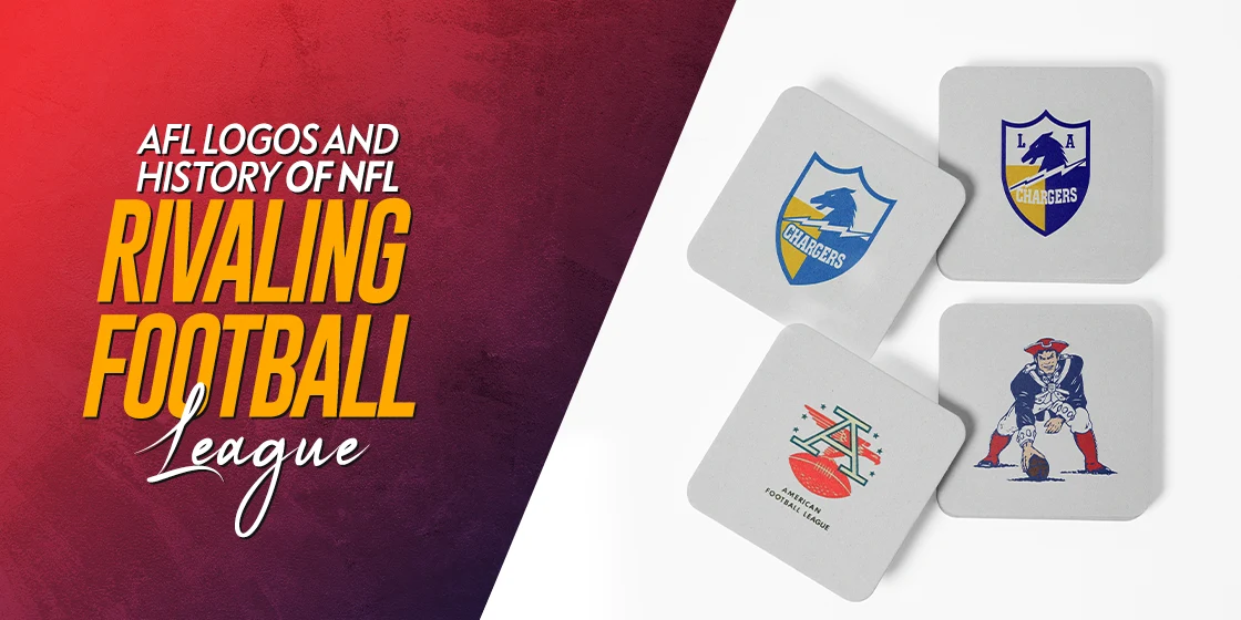
Los Angeles Chargers 1960
The Chargers are one of the more iconic NFL teams today. However, the team we know as the Los Angeles Chargers today played just one season from LA during their time in the AFL. However, for the first AFL season, the franchise then known as the LA Chargers featured a shield-based design. The Los Angeles Chargers logo had the image of a charger horse, a specially trained horse bred for battles, as well as a lightning bolt. The design was colored a beautiful dark blue, yellow, and white, making this one of the best-designed AFL logos of that era.
Miami Dolphins 1966 – 1969
Miami Dolphins were a late addition to the AFL logos roster, joining the league after the initial merger between the AFL and the NFL came to be. Starting out directly into the Super Bowl era, the team has a rich and interesting history. The Miami Dolphins logo featured a blue dolphin leaping out of the water, with a football helmet on. The backdrop featured the bright halo of a sun, colored a vivid orange. The resultant design paid homage to Miami, known for its bright, sunny days, and its proximity to the sea and variety of beaches.
New York Jets 1963 – 1969
The New York Jets are another AFL franchise that moved over to the NFL, and is still playing in the league. The team was a renamed version of another AFL team called the New York Titans, which came under new management after the 1962 season, and were rebranded as the Jets. The logo featured by the team in the AFL is quite similar to the design they used up until 2023. It depicted a green-colored football with the team’s name on it, and an image of a football underneath. While simple in its design, it was quite effective at conveying its message.
New York Titans 1960 – 1962
The Titans of New York were one of the pioneering teams of the AFL who were sold just three seasons later and renamed the New York Jets. The Titans featured one of the more elaborate AFL logos on this list, featuring a football player running to block, with the large wordmark depicting the team’s full name on the right. These types of logos are often not very successful, due to the inherent complications of using them on different mediums.
Oakland Raiders 1960 – 1969
The Oakland Raiders were one of the pioneering teams of the American Football League, and played in it for its entire tenure, before moving to the NFL after the leagues merged. However, after the 2019 season, the team moved to the Las Vegas metro area, and renamed themselves the Las Vegas Raiders.
The original logo for the team featured a play on the jolly roger flag used by pirates in the decades past. The design featured a shield design colored black, with a pair of crossed cutlasses at the back. In front of the swords was a football player’s head, with an eye patch and football helmet. A funny play on the name of the team made this one of the best AFL logos on this list.
San Diego Chargers 1961 – 1969
The San Diego Chargers were a renamed version of the original LA Chargers, a franchise that is again known as the Los Angeles Chargers in the NFL today. The design of the San Diego Chargers’ logo was a tweaked version of the original symbol used by the LA Chargers. The team lightened the shades of blue and yellow, removed the initials “LA’ from the design, and made the lightning bolt more prominent among their two logo symbols. Overall, we think that this logo was a visual improvement over the original design, although the lighter colors meant that the design lost some of its aggressiveness.
FAQs
| Which NFL and old AFL logos have a football in them? The most prominent of the NFL and AFL logos that feature a football in their design are the New York Jets and the Tampa Bay Buccaneers logo. |
| Which NFL/AFL logos have a star in them? The most popular NFL team with a star in its design are the Dallas Cowboys. |
Conclusion
To sum it up, the American Football League may have been shortlived as a rival to the NFL. However, the popularity of its various team AFL logos, even for those that did not make it into the National Football League later, is testament to its impact on the sport.
In fact, many of these old AFL logos have served as inspiration for different minor leagues and fantasy football logos. So, we can say that when the fourth iteration of the American Football League set out to establish itself as a truly equal rival to the NFL, it managed to achieve its goal when many other promising leagues failed before it.
Latest news you want to know!
Subscribe for cutting-edge design inspiration at Logo Poppin! Elevate your brand with updates on logos, branding, web design, and video animation.
Note that by clicking “subscribe,” users may agree to our privacy policy and consent to Logo Poppin to use your contact data for newsletter purposes.
Logopoppin
Logopoppin is a graphic design agency that specializes in logo designing, web development, video production and advanced branding services. We love to innovate businesses with new age technologies, allowing them to improve their visual reputation.

