Table Of Content
Know How to Design an App Logo as Per the Latest Design Trends
We all know that branding of any company depends a lot on its logo. People generally build first perception after seeing the logo of any business. Earlier, many companies preferred to have websites, but now they are becoming a bit advanced by developing mobile apps for their business. The logo of a smartphone app is not much different to the actual logo, but they do differ a bit in terms of size and colors. As a designer, you need to know about these differences, as it helps you to craft a perfect design for every platform.
Unfortunately, it has been noticed that many designers do not pay attention to the little details of app logo design. They think that by just changing size and resolution, a website logo can be converted into an app logo. This is totally a wrong approach because there are many other things involved in an app logo design that needs precise attention. These things often go unnoticed during the design process, but they do become evident once the final product comes to the front with visible errors.
Generally, this mistake is often done by the beginners, as they are new to the field and does not know about the core basics of logo design services. This blog is therefore precisely written for them, so that they can understand the principles of app logo design. It will let them know what type of design should be chosen and how it should be created to give a perfect look to the app logo.
Let us first start from the basics understanding the importance of an app logo design below.
1. Importance of App Logo Design
Just as stated above, app logo design is important to promote any application among the customers. It is the first thing that comes into their notice, hence it should be created perfectly to make a strong mark on them. If you will not create the app logo creatively, then no one will prefer to tap on it on Google Play Store or App Store. They will simply scroll down without paying much attention to your logo, no matter how creative the application is. You can also check some instant cash loan apps in UAE for inspiration.
To avoid this type of ignorance, you need to design the logo with a catchy look. Well, the main design theme will be there to copy, but you can do some little adjustments in them to make the app logo design unique among others. This is certainly an important thing that you cannot ignore at any cost. It is related directly to your branding, and people do notice it when they visit the App Store to download applications.
Besides that, if an app logo design is marketed on any branding material such as brochure or business card, then it also needs creative designing. It is certainly an important symbol that not only showcases your app, but the services it is promoting in the market. So, try to design these logos smartly, as majority of app branding depends on it.
2. How to Create an App Logo Design
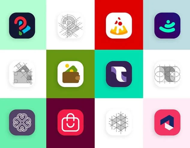
Many people think that creating an app logo design is simple and easy. They sometime see it is an icon that could be just resized by using a design tool. This is certainly a very immature approach that showcases their lack of knowledge about the field.
The app logo design is itself a complete symbol that represents the identity of an application. Though it’s styling and colors matches with the actual logo, but there are a lot of things different in it. Being a designer, you must need to know about it, otherwise you could struggle to create a catchy logo for any application.
For starters, we have defined some tips below to give them an overview about app logo design. These tips will help them to not only understand the concept, but also design app logos perfectly according to the given requirements. Let’s take a look at them below.
Research the Market Briefly
Before starting any project, it is important to research the market briefly. This practice is required for all emblem logos regardless of their category and types. A good research always helps you to design and manage projects efficiently. It lets you know what type of practices are currently being used in the market, and whether they will fit to your designing or not.
For app logo design, this information is quite crucial as it helps you to create the logo as per the best market practices. There are various things that need to be understood even by expert designers, hence the research is important for all. It is a process that clears out various confusions, as well as directs you to follow the right process for designing any application logo.
To make the research more useful for every team member, it is advised to document all the points precisely. It will let everyone know about the core requirements, as well as goals of a design project. This will provide better focus on work, and a smart approach to design the app logo.
Choose the Logo Style
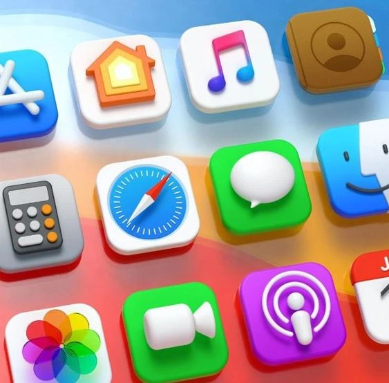
Selecting a catchy logo style is very important. It is something that needs to be done earlier, rather than making decisions at the end. A lot of times, designers do not finalize the style at the start of the process. They try to pick styles randomly or work without having any proper concept in mind. This approach leads them to nowhere, as they finally get stuck with the confusion at some stage of the design process.
To avoid having this type of situation, it is advised to first pick the style with which you will create an app logo. It could be similar to the official design, or could be different keeping in mind the background of the application. It is highly recommended to first prefer the background to design a logo, because having a resemblance of company services is considered key for logo designing.
On the other side, if you do not want to go the conventional way and want to pick a unique style, take a look at tons of examples available on the internet. It will help you to come up with a perfect idea to design a catchy logo for the app. You can use the concept of premade styles, or could also modify them with your own flare to bring better uniqueness in the logo design.
Select Logo Colors
Coming to the next part, you will now need to pick a color for the logo that could grab users’ attention. This could be a tricky job because designers often commit mistakes while selecting the logo colors. They stay confused because of having multiple options in mind. This is something that could happen with anyone who is not familiar with the background of the application.
Generally, the color combination for an app logo design should be selected keeping in view the actual theme of the logo. This means that you can either choose the same colors or could pick near adjacent shades of it. As per the best design principles, it is better to bring some uniqueness by selecting color gradients that look slightly similar to actual theme.
If you are not great at picking colors, take some help from the different color styles available on the web. You can take look at the app logos of other brands, as how they have used different shades in the logo to make it look unique among others. This works well for many logo designers, especially for those who are new to the field.
Keep Simplicity
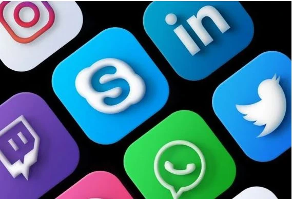
For app logos, keeping simplicity in the design is considered key for success. It is not an emblem that should be designed with a glitzy color outlook. Instead, it is a symbol that represents particular digital services, hence it should be kept simple and clean. If you will try to overload an app logo with different shapes or figures, then it would definitely look weird to everyone.
This is indeed a common mistake done by many logo designers. Not just beginners, but many experienced professionals often forget about the importance of simplicity. They try to bring extra flashy stuff in the logo which obviously do not looks good. This type of approach can be used for other branding elements, such as business cards, brochures and more others.
For an app logo design, you need to keep the visuals simple. There should not be any use of extra lettering in the logo, as it could kill the whitespaces. Similarly, try to avoid using big inner symbols, as that could also give a very bad look to the logo. These little things should be kept in mind while creating the app logo, as they become collectively important to bring cleanliness in the logo design.
Do the Comparison
Last but not the least, do not forget to do the comparison of your app logo with others in the industry. It is a very nice technique to analyze your work and see whether you have done a good job or not. Ideally, you should compare the logo with the design of popular smartphone apps known in the market. Though you cannot match them, but still having a good resemblance will do the job for your motivation.
Meanwhile, keep in mind that do not copy the whole design concept of any other app logo. This will not work in your favor, as people will easily recognize the design you’ve copied from. It will also hide your own creativity, as copying from any other design doesn’t showcases any hard work.
So, try to take some inspiration from other logos, and then mold them in your own style. It is a perfect way to bring something new while taking good clues from the popular ones known in the market.
Final Words
That brings us to the end of this blog in which we have discussed about app logo design in detail. It is quite important to know about its basics because many beginners often commit mistakes while designing it. This blog has defined some key tips that will help every beginner to design the app logo perfectly. From colors to styling, it has defined everything that will give them an idea how to design a logo as per the given requirements of any client.
Meanwhile, if you are looking for an agency that could help you to design creative app logos, just give us a call today. We will help you to design different types of logos that can help your brand to showcase a strong identity in the market.
Frequently Asked Questions (FAQs)
| 1. What is the importance of an app logo design? An app logo design is very important because it represents the identity of a mobile application. People get to know about the app after looking at its logo, hence it should always be designed smartly. |
| 2. How to create an app logo? To create an app logo, you must need to first finalize the style of the logo. Once it has been completed, you will need to select the colors and size. These things are important to design an app logo, so try to always select them wisely. |
| 3. Which colors should be used for an app logo design? You can use different types of colors for an app logo design. It basically depends on your application’s b background and the type of branding you are trying to showcase to the customers. Just make sure that the chosen colors are relatable with the main theme, so that people can easily identify them. |
| 4. What is the ideal size of an app icon? The size of an app icon can vary depending on the platform and device for which it is created. Ideally, the best dimensions for an app icon are 512×512. |
| 5. Which software tools should be used for app logo design? There are different tools available on the web with which you can design an app logo. However, some of the popular design products that are preferred by the people include Adobe Photoshop, Illustrator and more others. |

Logopoppin
Logopoppin is a graphic design agency that specializes in logo designing, web development, video production and advanced branding services. We love to innovate businesses with new age technologies, allowing them to improve their visual reputation.


