
Table of Content
Discover The Exciting History of the Apple Logo and How It Evolved into its Present Form
Apple Inc. is one of the top tech companies in the world today. In fact, it can be argued that they are one of the best and most successful companies of all time, tech or otherwise, with revenue that exceeds that of many countries around the world. And at the forefront of this phenomenon, is the sleek and simple Apple logo.
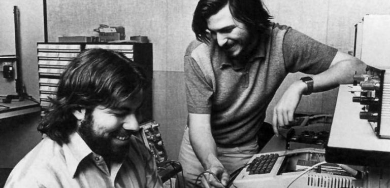
Starting out, its founders were so cash strapped that they had to sell their van and other items to buy the parts necessary to build their first computer. However, the company today employs hundreds of thousands of people worldwide, and has sold billions of devices since its inception, including iPhones, Macs (laptops & PCs), iPods, iPads, and more.
So, without further ado, let’s take a look at the evolution of the Apple logo design to discover how it adapted to represent the changing brand through the decades.
Understanding the Apple Symbol
The Apple logo today is one of the most widely known logos in the world, arguably even more so then the likes of McDonald’s or Nike logo. it represents class, sleek technological expertise, and an exquisite user experience, all rolled into one.
But what is about this invariably simple logo, that attracts such an ardent fan following? To understand that, we need to take a look at Apple’s journey, from a small company started in its founder’s garage, to the tech giant it is today.
Today, the company logo is a very simple, monochromatic, and modernized version of a design that they first introduced nearly five decades ago, in 1977. And its retention as the company’s logo throughout all those years shows that it was the perfect symbol for the brand.
Who Designed the Apple Logo?
The original logo for Apple was designed by Steve Jobs and Ronald Wayne, two of the three partners who started the company. The current logo however, was designed by Rob Janoff, a professional known to create some of the best corporate logos and business identities via his top-tier graphic and logo design services.
Over the years, the Apple symbol has produced three major variants, which were tweaked over the years according to the changing user perceptions. And today, the flat and monochromatic logo fits subtly yet perfectly on different devices including iMacs, iPhones, MacBook, and more.
Is There an Apple Logo Font?
The current Apple logo does not have a typeface associated with its design, so there is no Apple logo font to name today. However, in its earlier years, during the time of the rainbow-colored logo, the company used a smart sans-serif font with lowercase letters for its design. The font, called Motter Tektura, was quite well known among the design world, as it had been used by Reebok too.
Moreover, Apple commissioned a highly compressed version of Garamond, called the Apple Garamond. While not featuring on the logo itself, it was used in all kinds of branding materials. Since then, the company has used other fonts like Myriad and San Francisco for its branding purposes. But there has been no Apple logo font for over three decades now, as the Apple symbol has no need for an accompanying wordmark for it to be recognizable.
The Apple Logo History Through the Years
While Apple may be such a mega-brand today, it wasn’t always like that. In its earlier years, they had a hard time establishing a brand presence, given that they started out in a garage, in the mid-1970s. it took the company years to establish themselves as a brand, after working hard to boost their customer loyalty, which in turn help increase their brand awareness.
Since the beginning, the Apple company was all about enhancing and improving the user experience. From their tech offerings, to the brand packaging and styling today, that tenet of their business ideology can be witnessed quite prominently.
Let’s take a look at different versions of the Apple business logo design that have been used over the years.
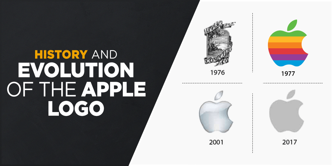
The Original Apple Logo
The first logo used by Apple was such a different style of brand symbol, that it might look as if it belonged to an entirely different brand altogether. In fact, rather than looking like a brand logo for a tech company, it looked like something you would see on a bottle of craft beer or cider.
The original was an intricate affair, one that would have been difficult to replicate for the type of deliverables the company planned on developing. It featured a design of Sir Isaac Newton, sitting under the famous apple tree, with a streaming banner displaying the company name surrounding the image.
The design concept was given by Ronald Wayne, the third partner besides Jobs and Wozniak. And just like Wayne was quick to leave the company, his logo too was quickly changed to a basic design that we all know and love today.
Apple Logo’s First Major Redesign
A year later, Jobs announced that the logo for the company was too old-fashioned to attract the right consumers, and that the design was too complicated to replicate at a smaller scale. Moreover, as a company that was aiming to be at the forefront of modern computing, a logo that represented that drive was a necessity.
To create a new brand symbol, Jobs hired Rob Janoff, a well-respected designer at the time, to create a logo that would blend the name of the company with a simple logomark. The aim was to have a design that was both modern, as well as simple enough to print on a smaller scale on different devices.
Using Jobs’ design concept, Janoff created a logo that introduced the now famous apple with a bite taken out of it. The design featured a multicolored apple with the name of the of the company in a sleek font. it featured the curve of the letter “a” nestled within the curve of the apple’s byte, making the design look great without going overboard.
The color combinations used for the logo was a bright rainbow for the apple design, while the font was a deep black, perfectly offsetting the brighter image. And it was this new design that was used from 1977 all the way up to 1998, albeit with a slight change in 1984 where the wordmark was removed from the Apple logo.
The Modern Apple Symbol, Now More of a Lifestyle Brand Icon
After being pushed out of the company he formed in 1985, Steve Jobs was hired back in 1997 to help stop the company’s rapid downfall. The first thing he decided to do, was to revamp the entire brand image of the company, as a way to start fresh.
However, one of the things that the revamp would include, would be the logo. And a logo that the people had known and loved for over two decades now. Nevertheless, he needed to change it enough to be considered a refresh, without losing the global brand awareness and loyalty they had built over the years.
To do that, he replaced the rainbow from the logo in favor of a flat black color, perfectly complimenting the sleek silver of their computer models at the time. Debuting on the newly released iMac, this new logo marked the return of Apple’s heydays.
Since then, the company has been using different variants of that same logo, with slight tweaks over the years to conform to the design trends of that time.
1998 saw the design reworked slightly to make it look like the logo was lit up and colored blue, with a glass-like finish. This was done to complement their clear-paneled plastic-based devices like the iMac G3.
In 2007, the logo was reworked again to incorporate a metallic finish to the logo, as the company had been focusing on creating aluminum-based devices in a bid to be more environmentally friendly, as well as to appeal to the crowd who wanted something sleek and elite for their devices.
However, in 2017, the company adopted a philosophy of creating minimalist logos, and opted for a flat matt monochrome logo design again. The same design is still in use today, and is available in black, white, and silver.
Today, the logo for Apple is one of the most well-recognized brand symbols in the world today. That is because in its early years, the company was able to create a logo that represented the brand well, and also resonated with the people. Then, by tweaking it slightly over the years, the brand was able to leverage those changes to their advantage by associating them with the changing directions of the company.
The Different Apple Icons Over the Years
The different apple icons over the years, barring the first one, were similar in their basic design, if not their color schemes. And just like other famous logos such as the Pepsi logo, keeping true to a basic design concept for a long time can help your brand establish a brand following that would be hard to amass if you keep changing your brand logo drastically.
For Apple, the company has been using essentially the same logo design since 1977, which is remarkable considering that it has now seen nearly five decades of use. In all this time, the company has built a massive fan following and brand recognition, that generates billions of dollars’ worth of revenue every year just because the brand is so recognizable.
Today, if the company was to change their simplistic logo design for something different, the company might end up losing a large chunk of their consumer base. That is because that change in their visual identity would result in people unable to recognize or relate with items using the new logo, which is something that the company doesn’t want.
An iPhone is recognizable from afar, due to its iconic logo displayed in the middle of the back. If there’s a different logo there, people would be unable to recognize it, and thus would not be interested in buying it. That is why when new designers learn how to design a logo that still represents a brand’s historic past, they should look at brands who have managed to do that without losing their brand awareness.
Why is the Apple Logo Bitten? Understanding the Mystery Behind This Design
Now that we have studied the evolution of the Apple logo, let’s look at one of the most popular reasons that intrigues those who study the logo design. Why does the apple in the logo has a bite taken out of it?
One of the most popular theories is that it was done to signify that the fruit was an apple, and not a cherry, due to their similar profiles. And while that seems like the most plausible answer, there are a few other theories too.
- Some say that the bite out of the apple was added to honor Alan Turing, a famed computer scientist and mathematician who took his own life after eating a cyanide-laced apple in 1954. And while the theory has been debunked by the designer Janoff himself, there are still many who hold it to be true.
- Another theory is that it was done as a play on words around “bite” and “byte”.
Whatever the reason may have been, today the logo is one of the most easily-recognized brand symbol, bite or no bite.
The Origins of the Now Eponymous Apple Name
Just like the origins of the Apple logo design, the name of the company itself is a mystery to many of the brand’s fans. The simplest, and most widely held answer, is that the company was named Apple due to Jobs’ love for the fruit.
During a press conference in 1982, Steve confessed that during one of his fruit-centric diets, he visited an apple orchard, where he evaluated the name “Apple” as something fun and non-intimidating.
Another theory is that its related to the theme of Sir Isaac Newton, whose likeness was used for the company’s first logo. Or that naming the company Apple would help it appear closer to the start of the phone book.
But whatever the reason may be, the fact is that it seems like the company was named Apple for no other reason besides the fact that Jobs loved apples.
The Apple Experience, and How It Stands Above the Competition
Apple is known for its user experience, above anything else. From their unboxing, to using their propriety interfaces, they aim to provide to an exclusive experience like no other company. They were even the first ones to offer an integrated one-platform environment, where a user could seamlessly transition from the mobile to the PC, as they all used the company’s proprietary OS.
Even today, with so many different mobile and computer device manufacturers competing for market space, Apple has maintained its presence, and is still considered the epitome of a luxury, especially for smartphones.
The one thing that has helped them stand out from the competition, is that unlike most other companies who use Android as their operating system of choice, Apple uses its own iOS. And because it is the only one that uses that operating system and interface, it is able to stand apart from the others who use Android with different UIs and skins.
However, even in this integrated ecosystem, users may occasionally face issues like a slow Mac, which can interrupt this seamless experience. Also it can be such problems like not optimized storage or malware. That’s why, IOS is not a panacea.
Overall, they are a company who disrupted the tech industry with their offerings and the user experience they offered, making the iPhone logo one of the most recognizable mobile phone logos of all time, especially in the smartphone era.
Apple Logo 2022, and How Is It So Relevant as a Brand Symbol Today
The Apple logo 2022 is a great study in how to effectively portray a brand subtly without losing your brand’s impact. the flat matt logo is often understated, especially when it comes to devices like their smartphone. However, the way it contrasts with the overall design of the device, and feels as if it is a natural, intrinsic part of the design itself, makes it perfect for a premium tech company like Apple.
In previous years, the company has used different variations to highlight to complement their specific offerings, such as the glowing blue logo of the late 1990s, or the chrome version from the mid-2000s. but today, with design trends focusing towards minimalism, the Apple logo showcases how to establish a brand in such a way that it is identifiable by a simple logomark, with no need of the company’s name being displayed nearby.
Overall, although the company has had its ups and downs, the fact is that their brand management has been one of the best, especially under Steve Jobs himself.
Frequently Asked Questions
| 1- Why was the second Apple logo a rainbow colored affair? Steve Jobs wanted to showcase the impact of digital design for their logo, therefore he tasked the designer Janoff with coloring the logo in shades of the rainbow, in order to make the logo pop and stand out from the competition. |
| 2- Who invented Apple? Apple was started by Steve Jobs, Steve Wozniak, and Ronald Wayne. However, Wayne sold his share of the company just a month later to the other two. |
| 3- Why are iPhones called iPhones? According to Steve Jobs, the addition of the letter “i” in Apple offerings like the iMac, iPhone, iPod etc, stands for internet, individual, and inspire. |
Conclusion
Overall, the Apple logo is one of the most recognizable brand symbols in the world today, and has been so for more than a decade now. The devices it features on, and the promise of an unmatched experience those devices offer, has made this logo a benchmark for quality and exclusivity.
Creating such a brand logo is not an easy task, but if you want to have a logo designed for your business that represents the essence of your brand and portrays it effectively, then Logo Poppin is here to help you. Our expert designers have worked with multiple clients, helping them create effective brand identities that made an explosive impact.
Latest news you want to know!
Subscribe for cutting-edge design inspiration at Logo Poppin! Elevate your brand with updates on logos, branding, web design, and video animation.
Note that by clicking “subscribe,” users may agree to our privacy policy and consent to Logo Poppin to use your contact data for newsletter purposes.
Logopoppin
Logopoppin is a graphic design agency that specializes in logo designing, web development, video production and advanced branding services. We love to innovate businesses with new age technologies, allowing them to improve their visual reputation.

