Table of Content
Discover How the Ariat Logo Has Evolved in Its Representation Since Its Inception
The Ariat logo, a symbol of performance and innovation in the equestrian world, has evolved over time, reflecting the brand’s growth and expansion. Born from a desire to revolutionize riding footwear, Ariat, founded in 1993, has cultivated a strong brand identity closely intertwined with its iconic logo.
The Ariat brand logo, a testament to the brand’s equestrian roots, features three stylized horseshoes arranged in a distinctive shield shape. This powerful symbol embodies the core values of the brand: strength, endurance, and good fortune, especially since the brand itself is named after Secretariat, the famed Triple Crown winner.
The three horseshoes in the design represent the three legs of the Triple Crown, a prestigious horse racing competition, symbolizing ambition and the pursuit of excellence. This connection to equestrian heritage resonates deeply with the brand’s target audience of riders and outdoor enthusiasts.
Beyond its visual appeal, the Ariat logo serves as a powerful brand identifier, instantly recognizable to riders and enthusiasts worldwide. It conveys a sense of quality, performance, and heritage, establishing a strong connection with consumers and building brand loyalty.
Let’s discover how their logo design agency managed to incorporate all that into a seemingly simple design, and whether the company has needed to tweak its logo over the years.
The Ariat Logo: A Visual Journey
Let’s first start with the design of the Ariat logo itself. While the core elements of the logo, the three horseshoes within a shield, have remained consistent, subtle refinements have been made over the years to enhance its visual impact and reflect the brand’s evolving identity. These subtle changes have managed to make the brand logo look modern and appealing over the years.
Early Years of the Ariat Logo (1993 – 2005)
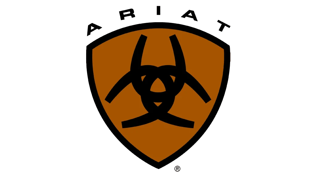
The initial Ariat logo featured a more basic design, with a simpler, flat shield shape and a less refined presentation of the three horseshoes. This early iteration served to establish the brand’s visual identity at its inception, and introduced the core symbolism of the brand to the market. The design, combined with the color scheme of leather-inspired brown and black, served as great examples of emblem logos to attract customers who wanted functional yet pleasing footwear options.
Representing Ariat’s Brand Maturation After More than a Decade (2005 – 2015)

As Ariat expanded its product line and market reach in the decade after its inception, the logo underwent subtle refinements to help it keep up with the times. These changes included adjustments to the logo fonts, color palette, and the overall proportions of the shield, horseshoes, and the wordmark too. These refinements aimed to create a more sophisticated and refined look that resonated with a broader audience in the late 2000s and the early-to-mid 2010s.
The Modern Era Ariat Logo (2015 – Today)
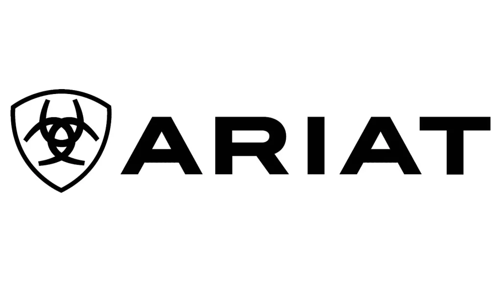
In recent years, the Ariat logo has likely undergone further refinements to maintain a contemporary aesthetic similar to many of the other top brands in the industry. This involved incorporating subtle design elements, such as monochrome palettes, cleaner lines, and subtle variation in the horseshoe shapes, to create a more dynamic and visually appealing logo in accordance with current logo design trends.
The Impact of the Ariat Logo

The Ariat logo has played a crucial role in the brand’s success. It serves as a powerful visual cue, instantly recognizable to riders and outdoor enthusiasts, despite the symbol not being considered among the top luxury fashion brand logos. The logo effectively communicates the brand’s values of performance, heritage, and innovation, resonating with its target audience.
Furthermore, the Ariat logo has contributed to the brand’s strong brand equity. It has become a symbol of quality, reliability, and a commitment to excellence in the equestrian and outdoor industries. The consistent use of the logo across all marketing channels, from product packaging to online platforms, has helped to reinforce the brand’s identity and build a strong brand image.
Essentially, the Ariat symbol is more than just a visual element; it is an integral part of the brand’s identity and a powerful symbol of its values and heritage. The evolution of the logo reflects the brand’s growth and adaptation over time, while maintaining its core essence and resonating with its target audience. As Ariat continues to innovate and expand, the logo will undoubtedly continue to evolve, ensuring that the brand remains relevant and successful in the years to come.
Conclusion
The evolution of the Ariat logo reflects the brand’s journey from a niche player to a global leader in the equestrian footwear and apparel industry. While the core elements of the logo have remained consistent, subtle refinements over the years have ensured that it remains relevant and impactful. The Ariat logo serves as a powerful symbol of the brand’s heritage, its commitment to innovation, and its dedication to providing high-performance products for riders of all levels.
By carefully evolving its visual identity, Ariat has successfully built a strong brand that resonates with its target audience and continues to thrive in a competitive market.

Logopoppin
Logopoppin is a graphic design agency that specializes in logo designing, web development, video production and advanced branding services. We love to innovate businesses with new age technologies, allowing them to improve their visual reputation.


