Table of Content
Discover the Inception and Transformation of the Arizona Cardinals Logo
The majority of the thirty-two teams who are currently playing in the National Football League have been associated with football for 50 years or more. However, some teams like the Cardinals, Packers, and the Bears have logged in a century or more in the sport.
Now, maintaining a brand for that long can be difficult task. There are often many issues that plague these brands, such as changing design trends, consumer mindsets, brand aesthetics and positions, and so on. However, we can assume that brands and their symbols like the Arizona Cardinals logo have managed to achieve that feat successfully.
The question however, is that how have these NFL logos managed to do that? What has been their secret that have helped them maintain their brand identity over a century of business, especially in an emotionally volatile business like professional athletics?
Let’s dive in and take a look at the transformational journey of the Cardinals logo, and learn how it has managed to stay relevant to its multigenerational target audience that spans a century. Moreover, we will take a look at the individual design elements of that logo to see how a professional logo design services provider can implement those elements to improve their designs.
History of the Cardinals – One of NFL’s Oldest Yet Saddest Stories

The team we know today as the Arizona Cardinals started out in 1898, when a group of neighbors from Chicago’s South Side formed a team called the Morgan Athletic Club. Local contractor Chris O’Brien acquired the team a year or so later, renaming them the Racine Normals after moving them to Normal Field on Racine Avenue.
In 1901, O’Brien bought used University of Chicago jerseys, claiming that the faded maroon coloring was called cardinal red. Soon, the team started to be called the Racine Street Cardinals. And a few years later, specifically in 1920, the team became an official charter member of the American Professional Football Association (APFA), which became the NFL two years later.
Although they had been registered in the APFA as the Racine Cardinals, they changed their name to Chicago Cardinals to prevent confusion with fellow team Horlick-Racine League. And it was with this name that they were awarded their first NFL championship, when their opponents, the Pottsville Maroons, were suspended for violating NFL rules.
And in this manner, the Cardinals enjoyed their first 2 and half decades of professional football with moderate success. It wasn’t until 1947, in the post-ww2 era that the team managed to reach the NFL championship game, twice in a row. However, they only managed to win it once in 1947, losing out the next year.
By 1960, the Cardinals had been allowed by the NFL to relocate to St. Lois. After a long string of failed seasons and a steady loss of fans to their more successful neighbor the Chicago Bears, the team had made the decision to relocate. The NFL, who were already looking for ways to counter the influence of the new yet rising in popularity AFL, granted the Cardinals permission to relocate to another region, rather than have two teams in Chicago.
The Cardinals spent the next 28 years in St. Lois, but managed to advance to the playoffs only thrice is that time. By then, the team had started to be considered a consummate loser in the league. And that, combined with the fact that their home stadium was 21 years old, meant that attendance at games was spotty at best. So, the owner Bill Bidwell, decided to move the team to Arizona.
For the 1988 season, the team renamed themselves the Phoenix Cardinals, and relocated to the state of Arizona. For the next few years, they called Tempe, a suburb just outside of Phoenix their home. However, in 1994, the team changed their name to the Arizona Cardinals, as in all that time they had never played in the city of Phoenix proper.
It was in Arizona that the team saw a slight change in their fortunes. The 1998 NFL season saw the team make the playoffs for the first time in 16 years. Moreover, they also got their first post-season win since 1947 by defeating the Cowboys in the wildcard round of the playoffs.
Then, a decade later, during the 2008 season, the Cardinals managed to win the NFC conference championship against the Eagles, and advanced to their first and only Super Bowl appearance. Not only that, the eventual champions Steelers just barely managed to defeat them in the very last seconds of the game.
Since then, the team has managed to reach the playoffs a few times, and have even advanced to another NFC championship, but have not managed to reach another Super Bowl. On the contrary, the team had a dismal showing in the 2022 season, despite an 11 – 6 record the previous regular season.
Inception of the Arizona Cardinals Logo and Its Varying Significance over the Years
If we talk about the Arizona Cardinals logo, and take a look at the history of the team, we can see that the name, and thus the logo, all goes back to the original owner of the team. If O’Brien had not decided to buy the faded, used “cardinal red” football jerseys for his team, the name and logo would not have been born.
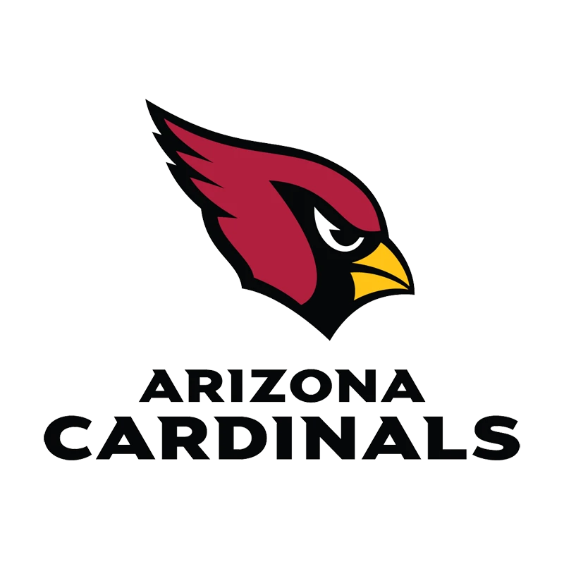
Today, the symbol of the cardinal bird makes for an attractive team logo that attracts the eye, and portrays the essence of the team. The slant of the eyes, combined with the jaunty plume at the top of the bird’s head, shows its tenacity and drive to do as it pleases, just like the Carolina Panthers logo shows ferocity. And that is what the Cardinals represent.
Throughout their time spent playing football, the team has faced a lot of defeat and bad luck. Yet they still look towards each season as a fresh start, and give their utmost to win at all costs. And it is this tenacity and strength of will that has enabled them to survive in this industry for more than a century now.
Evolution of the Arizona Cardinals Logo through the Decades
Now that we have seen the history of the team, and looked at the inspiration and the idea behind the Arizona Cardinals logo, we understand how the team adapted its branding to survive. However, the question here is, how did the team manage to evolve and transform their logo without losing its history is all this time?
And more importantly, how did they manage to keep their identity intact despite moving to three different states in their time as an NFL team? There are some team symbols, like the LA Rams logo, which actually benefitted from moving around different states. But is it the case for the Arizona Cardinals too?
Let’s take a look at the various iterations of its logo, and see how they managed to incorporate the changing team identity with their rich history.
1920 – 1934

In 1920, the Cardinals logo wasn’t the one we are used to nowadays. One reason for that is that at that time, the team wasn’t in Arizona. In fact, it was situated in Chicago, and were known as the Chicago Cardinals.
At that time, there was not much known about the importance of a well-designed team logo. Most people just thought of a logo as a simple symbol associated with the team name. And many did not spend their time and resources developing a good custom logo for the team.
In any case, the logo for the team was a stylized double C, meant to represent the initials of the team. The color was the faded maroon called Cardinal Red, as the one used by the team’s old jerseys. Incidentally, this style of the logo was adopted by the Chicago Bears logo, who removed the inner letter, and stylized the outer one for their logo design.
1944

During the height of World War II, when many Americans, including many football players, had been drafted for war. Teams were facing a massive shortage of players, so much so that in 1944, the Cardinals and the Steelers joined together to create the Card-Pitt team temporarily.
Combined, they had enough players to field a single team for the next few years, until the war ended and people started to come back. During this time, rather than go for a flashy logo design, they decided to go for a simple wordmark, like the Green Bay Packers logo from that time.
The wordmark was written in simple, serif font, in all uppercase letters and a straight, easy-to-read design. The color scheme was the same as the previous Cardinals logo, associating it with the team.
1947 – 1959

After the end of the war, once the Steelers and the Cardinals separated again, the team decided to redo the Arizona Cardinals logo of that time. The new design featured a simple, two-dimensional illustration of a football, with a cardinal bird perched upon its stitching. The overall design was good, although the logo had a little too much detail according to the modern design aesthetic.
1960 – 1961
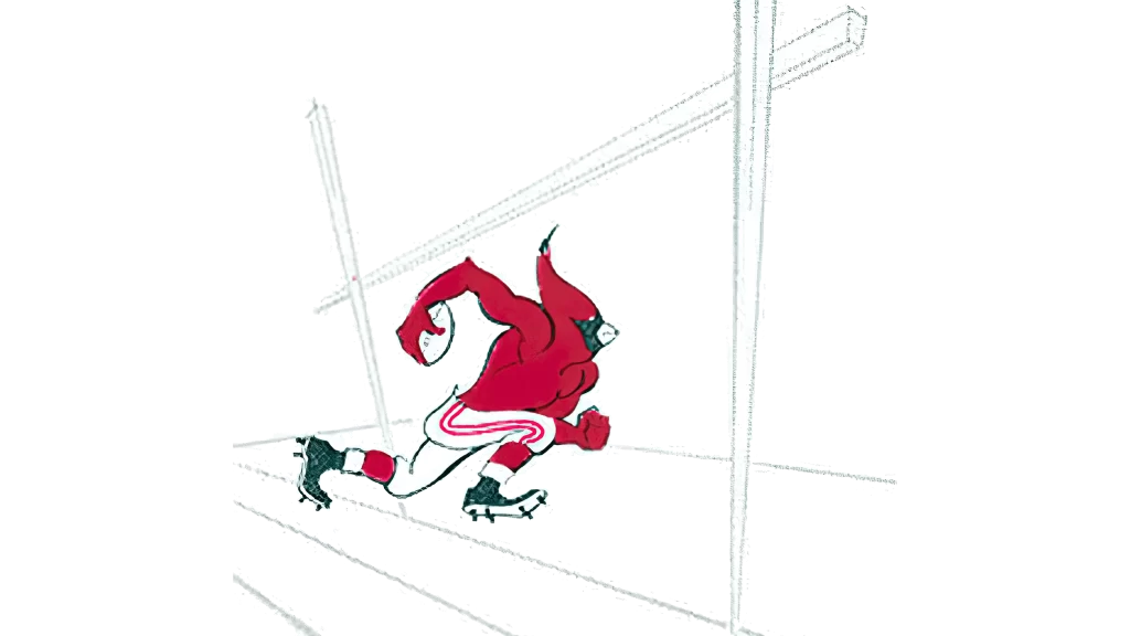
In 1960, the team decided to get with the times and go for an animated-style Arizona Cardinals logo, as was becoming more common within the league. The new design featured an anthropomorphized cardinal bird, wearing football pants and cleats, and running the ball towards the goalposts.
The design was vibrant and whimsical, with the colors popping up off the medium without much effort. And the addition of the goalposts made it easier to associate the logo with the team. Overall, this was one of the better iterations of the Arizona Cardinals logo, especially after the early styles of logos used.
1962 – 1969

Next, in 1962, the team revamped their logo again. This time, the team was celebrating their move to the city of St. Lois Missouri. Now, the majority of its design, especially the cardinal bird, was kept the same.
However, the major difference between this version and the one before included the design style the removal of the goal posts from the logo design. So, to counteract their removal, the franchise now decided to use the St. Lois arch under which the cardinal us seeing going.
The lines of the logo were made sharper, and the color of the logo were made better as well. According to established design aesthetics, this version of the logo wasn’t just good for the Cardinals, It can be said to be one of the best versions of the logo besides the current iteration of the Arizona Cardinals logo.
1970 – 1987

In 1970, the team decided to go for a stylized logomark, that could impart the elements of its design in a single glance, instead of relying on overly complicated illustrations. The new Arizona Cardinals logo featured a stylized head of a cardinal bird, which faced right. This was done to bring the design similar to the style of logos such as the Miami Dolphins logo.
The color scheme of this new design featured the majority of the bird’s plumage to be colored the dark cardinal red. The area around the eyes and the front of the face was colored black, with the beak a dark yellow-orange. When combined together into a palette, it was an aesthetically pleasing one for the team. Plus, with this design, there was nothing representing the name of city or state, and instead focused on the team’s name.
1988 – 2004

In 1988, the team moved near Phoenix, Arizona. Once they city of St. Lois, Missouri had outlived its worth as a host city for the team, the time had been right for a change. However, the team had finally come across a good brand symbol, and didn’t want to modify it again to signal their move.
Luckily, the logo had no element that linked it to either St. Lois or Chicago. Therefore, all the team did to signal their move, was to make the cardinal red and the yellow-orange of the design a few degrees lighter. The resultant logo now looked closer to the Cardinal bird of the wild, and was perfect for the team, whether they stayed in Arizona or moved somewhere else. Incidentally, their design was one of the few NFL symbols that inspired the Atlanta Falcons logo redesign.
2005 – Present

Finally, the current iteration of the Arizona Cardinals logo was introduced in 2005, where the head of Cardinal bird was made vertical. Moreover, the design was now given a few more details, such as the upwards curve of the brow ridge, or the shape of the beak now being more realistic.
The entire design now had a thick black outline that also served as accent at the back of the plume, highlighting the flow of the outer feathers. This angular style is one that can also be witnessed in the Philadelphia Eagles logo.
FAQs
| What is the bird in the Arizona Cardinals logo? The Arizona Cardinals logo features a Cardinal Bird, which is a family of birds that have bright, vividly colored plumage. |
| What was the Cardinals’ first logo? The first logo used by the Cardinals featured a stylized double C, which represented the team’s initials. However, if we talk about the first symbol for the Arizona Cardinals, after the team moved to Arizona from St. Lois, it was a stylized head of a cardinal bird. |
Conclusion
To sum it up, the Arizona Cardinals logo has reached its final form after nearly a century of gameplay. And in all this time, the team has managed to come up with designs that appealed to their target audience, even when the team itself was so mediocre that it didn’t garner much fan service.
However, as in the case of symbols like the Detroit Lions logo, which represent teams that have been exceeding unlucky, a good logo can transcend all that to get loyalty and support from their fans. And as the same phenomenon can be witnessed for teams like the MLB’s Chicago Cubs, we can say that a good logo can help overcome the disappointment that comes with years of repeat losses.

Logopoppin
Logopoppin is a graphic design agency that specializes in logo designing, web development, video production and advanced branding services. We love to innovate businesses with new age technologies, allowing them to improve their visual reputation.


